Hello Fellow ChartWatchers!
The new version of our Public ChartList area is now officially released and ready for your use. The Public ChartList area has been a real "hidden gem" of our website for years where any StockCharts member (with an Extra account) can publish their own chart analysis for everyone to enjoy. This new version adds a nice collection of new features for both Public ChartList readers and Public ChartList authors.
FOR THE READERS:
- A New, More Reliable Ranking System - The old vote-based system has been completely replaced with a new ranking system that takes into account multiple factors to determine a list's popularity. Once things settle down from the launch - in about a month - readers can be confident that the lists at the top of the "scoreboard" will be worth reviewing.
- A "Follow" System to Help You Review Your Favorite Lists Quickly - If you like a Public ChartList (and you are a StockCharts member) simply click the "Follow" button for that list and we'll make it easy to find and review that list in the future.
- List Categories Help You Qucikly Find Lists You Are Interested In - All Public ChartLists must now be categorized by their authors. Now you can quickly find all the lists about, for example, Elliott Wave Theory or Sector Rotation with just two clicks.
- Badges Help You Find Reliable Authors - You can now tell at a glance how long an author has been maintaining their list and whether or not they have done anything to stand out from the crowd.
- Automatic Downgrades for Overly Commercial Lists - We've heard continual complaints from readers about the overt commercialism in many of the old Public ChartLists. The new system automatically downranks lists that include annoying, spam-like commentary or content that offends lots of readers.
If you have tried looking at the Public ChartList area before and were not able to find interesting information there, I urge you to take another look right now by clicking here. You'll quickly find great charts and commentary like this one from Angela O'Donnell:
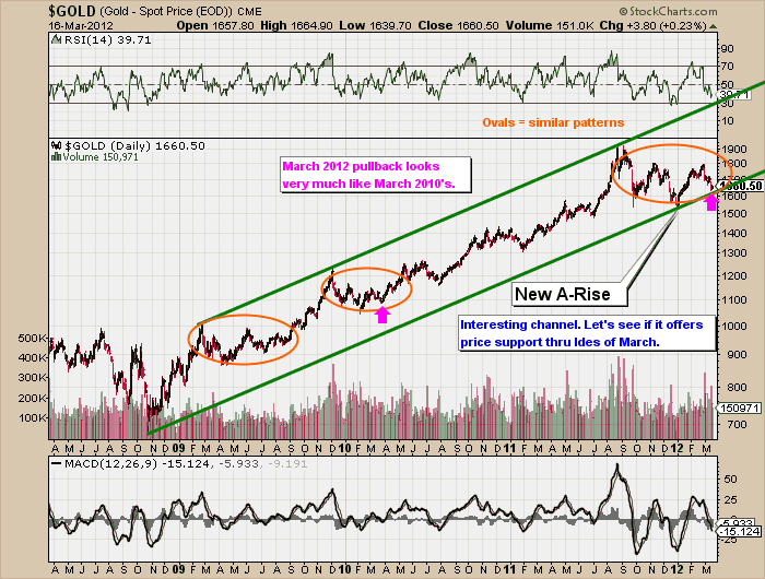
or this snippet from Espen Corneliussen's daily $GOLD chart:

Bottom Line: Every ChartWatcher should spend some time looking at the Public ChartList area and Vote For and/or Follow their favorite authors.
FOR THE AUTHORS:
- New Ranking System is Fair and Reliable - The new ranking system prevents the fraud and abuse that our old system struggled with. Trying to "game the ranking system" no longer works.
- Multiple Ways to Customize Your List Over Time - Earn perks like custom avatars and color schemes that can help your list stand out from the crowd.
- Multiple Badge Awards - Earn awards that appear next to your name and show readers your commitment to quality chart commentary.
- Earn Your Own Official Slice of StockCharts.com - Over time, popular lists will gain their own custom StockCharts.com web address along with minimal StockCharts branding and the ability to add custom HTML widgets. It will be like having your own chunk of StockCharts!
There will be some volatility in the rankings during the first couple of weeks as the system builds up its statistics. By the end of March, we expect things to be working fully. And watch our for new perks and badges that authors can earn. We plan on release more of them in the coming months to give you even more ways to customize your list. Stay tuned...
- Chip
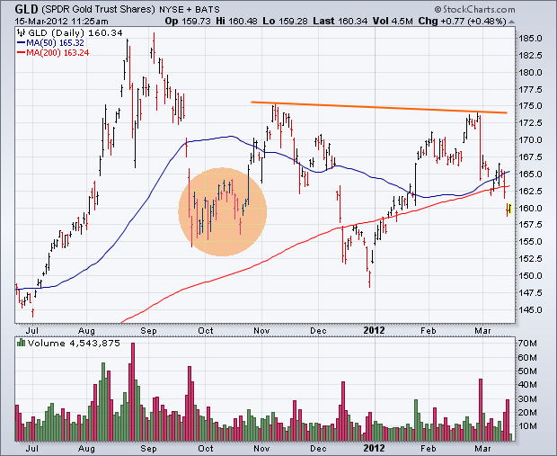
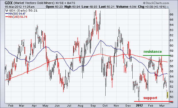
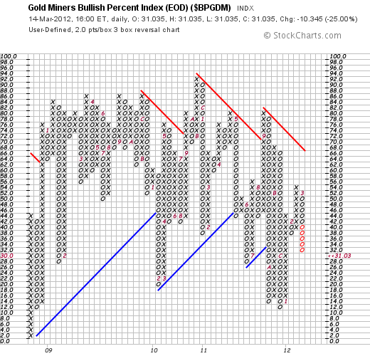
A couple of weeks ago (February 28) I wrote a positive article on precious metal assets. The entire group has taken a big hit since then. Two contributing factors have been more positive comments from the Fed, which imply little or no more quantitative easing. That pushed U.S. bond yields sharply higher earlier this week and gave a big boost to the U.S. dollar. Stocks also rallied sharply. That combination pushed gold prices sharply lower, and gold miners along with it. Chart 1 shows the Gold SPDR (GLD) tumbling to a two month low on rising volume. It has also fallen below its 200-day moving average. Even with that short-term damage, however, the GLD chart doesn't look that bad. A possible "neckline" can still be drawn over its November/February highs. That makes the current selloff a potential "right shoulder" in a bottoming pattern. The circled area shows potential chart support formed last September and October (the potential "left shoulder"). The price of gold needs to stay above that support zone to keep any bullish hopes alive. Eventually, GLD will also have to break the "neckline" to actually turn the chart bullish. Gold miners have fallen along with bullion. Chart 2 shows the Market Vectors Gold Miners ETF (GDX) falling into a test of its December low. A couple of weeks back it was testing February resistance at 58. It failed that test of resistance. The question now is whether it will survive a test of support. The February 28 message also showed the Gold Miners Bullish Percent Index ($BPGDM) on the verge of a point & figure buy signal. Chart 3 shows the p&f buy signal taking place at 46. That buy signal, however, has been negated with a new p&f sell signal at 36. Obviously, my earlier enthusiasm for precious metals has been considerably dampened.
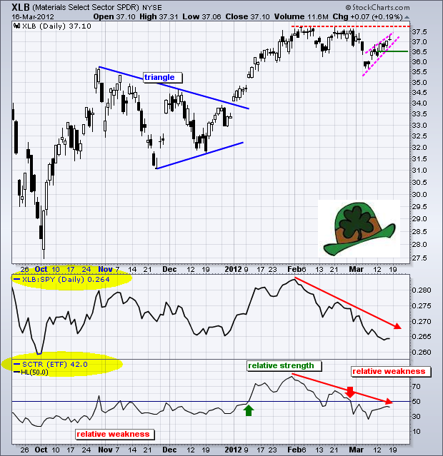
While the S&P 500 and Dow moved to new highs last week, the Materials SPDR (XLB) fell short of its February highs and continues to underperform. Also note that the Technology SPDR (XLK) and Consumer Discretional SPDR moved to new 52-week highs last week. Along with the Finance SPDR (XLF), these three are the clear market leaders right now. The chart below shows XLB breaking below its mid February low and then surging back above the support break with a seven day rally. The pink trendlines define this seven day advance, which could be a rising flag or wedge. A move below 36.5 would reverse this short-term uptrend and signal a continuation of the early March decline.
Click this image for a live leprechaun.
The indicator windows show the price relative (XLB:SPY) ratio and the StockCharts Technical Rank (SCTR) for XLB. Notice that the price relative peaked at the beginning of February and moved lower the last 6-7 weeks. Underperformance and relative weakness are confirmed by the SCTR, which also peaked at the beginning of February and moved below 50. The centerline (50) is the make-or-break level for relative performance. In general, a stock or sector shows relative strength when the SCTR is above 50 and relative weakness when below. With the SCTR below 50 and falling, XLB shows continuing relative weakness. Look for a break back above 50 for XLB to start showing relative strength again.
Apple is a great company, and AAPL has been a great stock since early-2009. From that point to the end of 2011 it rose +300% in an orderly, relentless advance. The angle of the rising trend line was conservative and sustainable. Unfortunately, since the beginning of this year AAPL has begun a vertical ascent, which is not strictly a paraboic, but the result of which will almost certainly be the same -- a price collapse.
Vertical price moves signal that a bubble mentality has taken over the market (the market in AAPL, not necessarily the entire stock market), and bubbles almost always end badly. When prices finally turn down, they usually drop as fast as they went up.
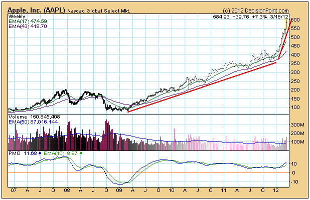
While we can be pretty sure of the outcome, we have no way to know at what price the final blowoff top will arrive. In a recent headline someone was predicting the AAPL would go to 850. Well, that is entirely possible, but who knows? At this point, one thing we know for sure is that where AAPL is concerned, rationality "has left the building." Use extreme caution from here out. Think housing bubble -- to the majority of investors the reasons it could never end seemed bullet proof at the time.
Is a price collapse the only possible outcome? Actually, no. Occasionally, parabolic stocks can enter what is called a "high-level consolidation," which is where price begins to move in a sideways trading range for several years. This has the effect of digesting the excesses of the previous advance. For example, if this were to happen now, the consolidation might have a range of between 400 and 600, and run for five to ten years. Emphasize, this is just an example, not a prediction.
Another area of concern is AAPL's effect on stock indexes of which it is a component -- the SPX, OEX, NDX, and XLK to name a few off the top of my head. These are all capitalization-weighted indexes, and AAPL has such a large market capitalization it has a strong influence on the performance of these indexes.
The Nasdaq 100 (NDX) provides us with a great example. The QQQ reflects the performance of the cap-weighted version of the NDX. Thanks to AAPL, the QQQ has moved about 10% above the resistance line drawn across the July 2011 top.
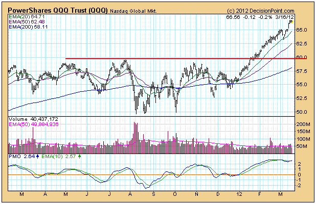
The QQEW ETF is the equal-weighted version of the NDX. Note that it has barely moved above the resistance line, because AAPL has the same weight as the other 99 stocks in the index.

Conclusion: AAPL has entered a dangerous vertical phase. We can only guess where the final top will be before a major correction or collapse begins, but extreme caution is warranted from here on. While you may not be involved with AAPL directly, be aware that radical moves by AAPL will also have an inordinate affect on cap-weighted indexes of which it is a component.
In my last article, I featured a weekly NASDAQ chart and pointed out that the MACD was coming up off the centerline and pointing higher. I indicated this was a very bullish signal for the intermediate- to longer-term and supported my belief that equity prices would continue to rise in 2012 - at least until technical indicators begin to change. I received several responses to that particular chart, with readers correctly pointing out that there was a long-term negative divergence present on the chart.
I won't argue with the fact there was a negative divergence - by definition. After all, prices were higher and the MACD was lower. But I interpret divergences different than most. Momentum moves back and forth like a pendulum. As this pendulum moves back and forth, the MACD "resets" at the centerline in my opinion and we start the game all over again.
First, let me show you the negative divergence that readers were referring to on the weekly chart of the NASDAQ:
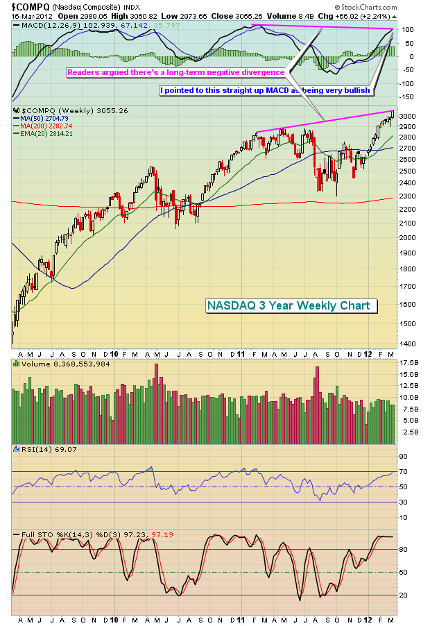
Again, by definition, that's a negative divergence. But is it really a sign of slowing momentum? Think about what the MACD represents. It's the difference between a 12 period EMA and a 26 period EMA. On a weekly chart, that means that once 26 weeks elapse between MACD readings, there is ZERO common data in the two MACD calculations. I think it's back to that old adage "comparing apples and oranges". In late 2010, we had exactly the same situation on the weekly chart of the NASDAQ. Take a look:
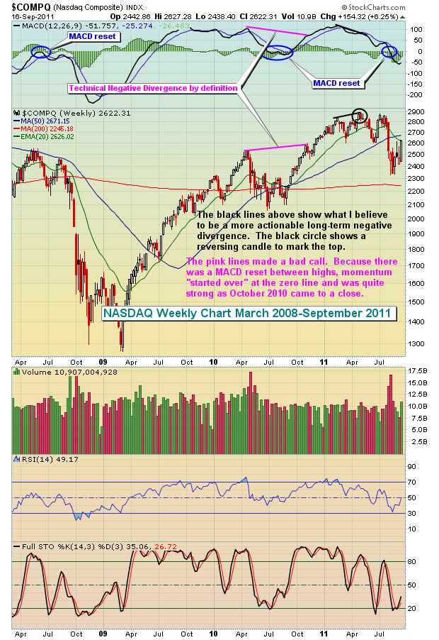
Again, this is MY interpretation and what makes sense to me. Feel free to disagree. Like I said before, by definition there is a negative divergence present. But it doesn't indicate slowing momentum in my view. Instead, I see strengthening momentum.
If you followed the technical definition of a negative divergence, you'd have missed another 10% move higher in early 2011 before the REAL negative divergence printed. As we look ahead to the balance of 2012, we have a very similar MACD on the weekly chart. The MACD has moved up from the centerline and is pointing higher as new price highs are reached. It's telling us that the shorter-term 12 week EMA is "diverging" away from the 26 week EMA. This represents strengthening momentum, not weakening momentum. A pullback can occur anytime, but it's unlikely that we'll see anything stronger than a normal correction during a very strong uptrend.
I am hosting a FREE webinar on Wednesday, March 21, 2012, to discuss the concept of the "MACD reset" and how it impacts momentum analysis. If you use the MACD in your technical analysis, you'll find this session to be invaluable. To learn more, CLICK HERE.
The S&P 500 rally continues unabated, although it has shown some signs of wear and tear given the less-than-hoped for volume patterns as well as advance/decline patterns. However, it is clear that this type of market condition does not preclude prices from moving higher and forming major negative divergences over time. Presently, we should note that the 160-week moving average has bottomed, which suggests the rally has further upside left in it, with any and all corrections - at this point - seemingly nothing more than garden variety corrections.
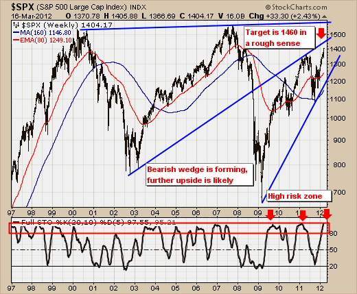
However, note that prices are now overbought via the 20-week full stochastics; which simply means the rally is growing more risky by the week. The simple speed resistance trendlines we've drawn indicate that the rally could take prices higher towards the 1460 level before any real weakness materializes. Moreover, and not shown on this chart is that prices are roughly +21% above the 160-week moving average - which is about 2 percentage points below its "speed limit" of +23% that has resulted in corrections over the past 2 decades. If prices exceed +23-to-+25%, then the past 2 instances (1985 & 1995) have shown prices to be in an upward "bubble-like" advance. So, if the S&P rallies much more off current levels - then we'll have to look for a massive spike higher towards the 1700 level in the next 2-years. This would be fed by funds leaving US and world bond markets in search of higher yields. This is the risk at present; and we'll give it more than "even" shrift of occurring given the massive amounts of liquidity force-fed into the world monetary system.