Hello Fellow ChartWatchers!
Having the right subscription level can save you a significant amount of money OR depending on how you use it, it can cost you a lot of money in the form of bad trades. At StockCharts, we offer several different membership levels - Free, Basic, Extra, ExtraRT and PRO. I want to make sure everyone knows the difference between those levels.
Our ExtraRT and PRO services provide you with charts based on complete, realtime data from the NYSE, NASDAQ and TSX exchanges. Unfortunately, those plans are also our most expensive - partly because those exchanges force us to tack on a monthly surcharge for that realtime data.
Our other three plans also provide realtime data (for most US stocks, sorry Canada) without the need for that additional surcharge. How is that possible?
It's possible because the realtime data on those charts comes from the BATS exchange. BATS (which stands for "Better Alternate Trading System") is a growing electronic exchange based in Kansas City that provides all of its trading data for free(!)
So what's the catch? Well, there are a couple:
- As I mentioned, BATS data is only available for US stocks
- Volume data from the BATS exchange is significantly less that the volume data from the NYSE/Nasdaq
- Price data for thinly traded stocks can be different from the price data from the NYSE/Nasdaq
Because the volume data is different, we only use BATS data to fill in the most recent 20 minutes on our charts. After that 20 minute delay, we replace the BATS price-only bars with the price+volume bars from the NYSE/Nasdaq. You can see that process on the following slide:
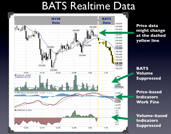
This slide shows a 1-minute price chart that a typical Basic or Extra member would see. It shows how we highlight the BATS price-only bars in yellow (because they are subject to change) and how we suppress the BATS volume data as well as volume-based indicators. None of those restrictions happen for ExtraRT members.
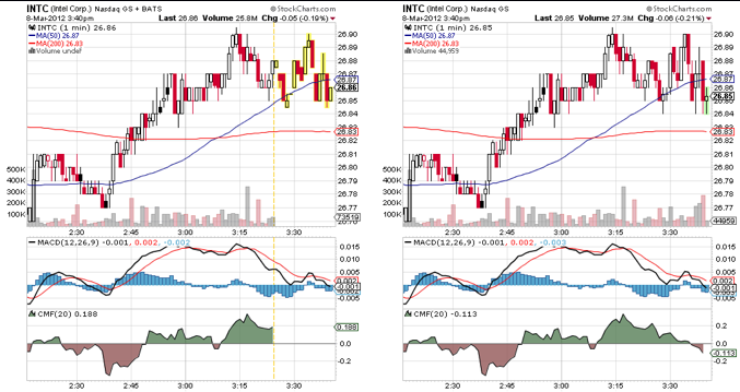
Below I have two more slides that show how BATS data and NYSE/Nasdaq data differ. The next slide shows the differences for a fairly liquid stock (INTC). The BATS version is on the left and the NYSE/Nasdaq version is on the right.
And here's a similar slide for a more thinly traded stock (EW):
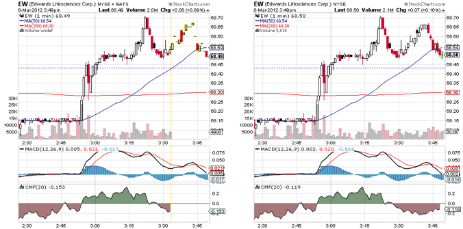
If you look carefully, you'll see that the price bars for INTC match pretty closely (but not exactly!) and that the price bars for EW have lots of differences.
If those price differences are important to your analysis or if you don't like the 20-minute delay on the volume data (or if you need realtime Canadian data) then you'll want to use either our ExtraRT or PRO service. Otherwise our less expensive Extra service should work well for you.
(Members can use the "Your Account" link at the top left corner of any page on the site to change their service level. Non-members can learn more about our different plans by clicking here.)
- Chip
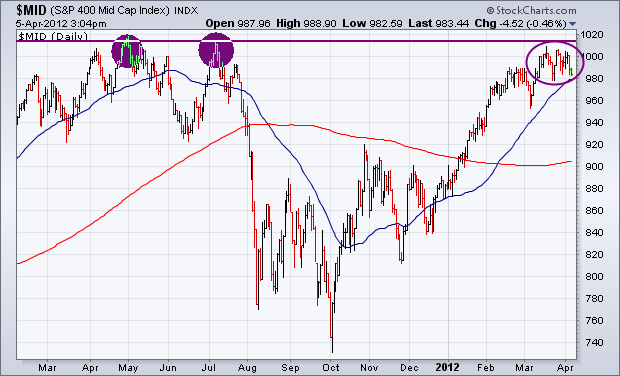
Although I generally look at the S&P 500 to get a feel for the market's trend, it's a good idea to see what other stock indexes are doing. Two of them are giving warning signals. Chart 1 shows the S&P 400 Mid Cap Index (MID) starting to meet resistance along its 2011 highs. That's a logical spot to expect some profit-taking to develop. Chart 2 shows the NYSE Composite Index which has also yet to clear its 2011 high. I suspect that's because of its heavier weight in commodity-related stocks which have been market laggards. Chart 2 shows the NYSE slipping below its 50-day average which is a sign of weakness (blue circle). Its RSI line (top of chart) and MACD lines (along bottom) have turned down. That's another warning sign.

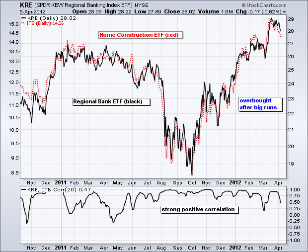
The Regional Bank SPDR (KRE) and the Home Construction iShares (ITB) have led the market higher since October. ITB is up over 50% since early October and KRE is up over 40%. The chart below shows ITB in black and KRE in red. Notice how these two moved step-for-step over the last 18 months. Both peaked in January 2011 and then bottomed in early October. Both ETFs recently recorded new 52-week highs when they exceeded their 2011 highs in February and again in March. While the trend since October is clearly up, these two are overbought and ripe for some sort of corrective period, which would involve a pullback or sideways consolidation.
Click this image for a live chart.
The indicator window shows the Correlation Coefficient (KRE,ITB) confirming that these two have been positively correlated for most of the last 18 months. In fact, the Correlation Coefficient has been above .50 most of this time, which shows strong positive correlation. With this in mind, chartists should watch the Home Construction iShares (ITB) for clues on the Regional Bank SPDR (KRE) and visa versa. As the two market leaders, chartists should also watch these two closely for signs of a broader market correction.
Good Trading,
Arthur Hill CMT
We don't look at the 4-Year Cycle chart very often, but a subscriber's comments reminded me that now would be an excellent time to view the progress of this important cycle.
On the chart below the vertical lines show the location of all nominal 4-Year Cycle troughs since 1948. The normal expectation is that the price index will arc from trough to trough, but sometimes other forces override normal cycle pressures, and the magnitude of price lows associated with the troughs are not always as pronounced as we would expect.
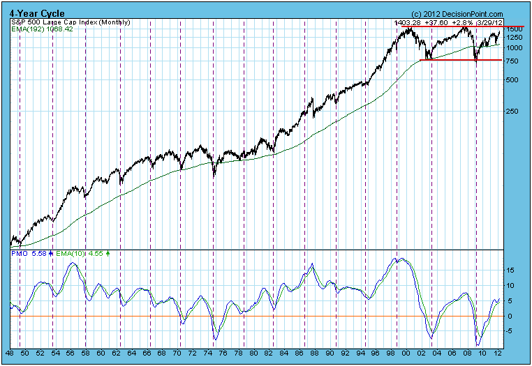
To me, the most obvious feature on the chart was that the last completed 4-Year Cycle (2003-2009) was actually over six years long, which emphasizes that we can't set our watches by this (or any) cycle. As for why that cycle was so long, we can speculate that unrealistically low interest rates fueled bubbles in stocks and housing, overriding the normal ebb and flow of the underlying cycle pressures.
The most important feature is that the current cycle is about three years old, and prices are approaching a very strong level of long-term resistance just above 1500. All things being equal, it is reasonable to assume that the 4-Year Cycle (and prices) will crest later this year, probably in the area of when 6-Month seasonality switches to bearish at the end of April.
Until prices actually crest, it is difficult to project the next trough (price low), but, assuming a crest (beginning of a bear market) in the next few months, I would assume that the bear market and 4-Year Cycle low would arrive around the middle of 2013. This is not a prediction, just a template for anticipating what prices might do in the context of the 4-Year Cycle.
The subscriber also asked for clarification on the monthly PMO. Keep in mind that the monthly PMO is not final until the close on the last trading day of the month. Currently, it is rising. When it tops, it would be a very bearish signal because it confirms that the price action to which it is reacting is worse than a normal correction.
Conclusion: Assuming a "textbook" 4-Year Cycle progression, the market is probably very close to forming a major top. The Cycle is three years old, and major overhead resistance will soon be encountered.
I'm not quite sure why, but there definitely is a positive bias towards small cap stocks as we approach the Spring season. April and May are the 2nd and 3rd best calendar months in terms of annualized returns on the Russell 2000. Only December boasts a better monthly record since 1988. Over the past five years, the absolute performance of the Russell 2000 during April and May are as follows:
2011: +0.6%
2010: -2.5%
2009: +18.6%
2008: +8.8%
2007: +5.8%
2007 through 2011 has been a tumultuous period, but the action in small caps has been mostly positive during this April through May time frame. Thus far in 2012, April has started off a bit rough with the Russell 2000 down approximately 1.5%. Further deterioration in prices in the near-term could become an opportunity based on historical trends.
Technically, the Russell 2000 is in decent shape although there is downside risk in the near-term. Given the weak job numbers on Friday, more selling is a definite possibility this week.
Let's take a look at the bigger picture. Below is a 4 year weekly chart on the Russell 2000:
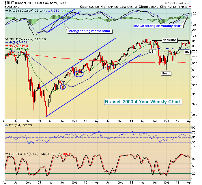
There are a number of ways to view the stock market technically. There are bullish and bearish takes. But the above technical pattern could certainly be argued in a bullish light and that's the position I'm taking until further signs of technical deterioration surface. We've seen an obvious uptrend off the March 2009 lows. It's been an extended period of buying, only temporarily derailed on a couple of occasions. If we consider the move from March 2009 through April 2011 to be "the uptrend", then a bullish consolidation pattern - the inverse head & shoulders pattern - could be a springboard to further gains later in 2012 and beyond. I'm not saying it will happen, but technically it's one pattern worth watching.
During the first six months of 2011, the Russell 2000 held price support at 773 on multiple occasions, which would represent the inverse left shoulder. Once that support level failed, the inverse head printed on the early October low. Note that the subsequent rally into the latter part of the first quarter of 2012 tested the neckline first established back in July 2011. One technical possibility is that we could be in the midst of a period of short-term weakness to print an inverse right shoulder. 773 support would be a very key price level to watch on this potential bout of selling.
Should this pattern continue to play out, the truly exciting part is the measurement, which extends from the neckline down to the inverse head, or 250 points. Therefore, an eventual breakout of this inverse head & shoulders pattern would measure up another 250 points from the 850 breakout level. That would be another 30% upside to 1100. Given other bullish big picture signs, I believe this to be a probable outcome, though certainly no guarantee. We need to see the pattern develop and a breakout occur to confirm the pattern. In the meantime, an aggressive approach would be to accumulate the Russell 2000 (IWM is an ETF that tracks performance in the Russell 2000) during the printing of the right shoulder down to 773. The closer the Russell 2000 moves to 773, the better the reward to risk of long entry.
For Monday, April 9th, I've included a small cap stock that appears to be under significant accumulation as our Chart of the Day. If small caps do hit a rough patch near-term, aggressive traders could look to a pullback in this stock as an opportunity for a trade. CLICK HERE for more details.
Happy trading!