Hello Fellow ChartWatchers!
Spring has finally sprung here in the Pacific Northwest and we are very glad that it has. I hope the weather is as nice where you are as it is here. This edition of ChartWatchers contains some great articles - not all of them quite so sunny. John Murphy points out that the sector rotation picture is changing and may have "regressed" somewhat in recent weeks. Arthur Hill looks at the picture for Energy stocks, Carl Swenlin talks about the differences between SPY and $SPX, and Tom Bowley examines the influence that Market Makers have on options expiration day.
And me? I'm going to point out a simple change you can make to your charts that can speed things up - possibly dramatically.
DENSE GRID SETTINGS CONSIDERED HARMFUL
Most of us don't pay any attention to the Grid settings for our charts. Members have the ability to change the number of grid lines that appear on their charts using the "Advanced Settings" controls in the "Chart Attributes" area of the SharpCharts Workbench. Most people are content to use the "Normal" grid settings which looks like this:
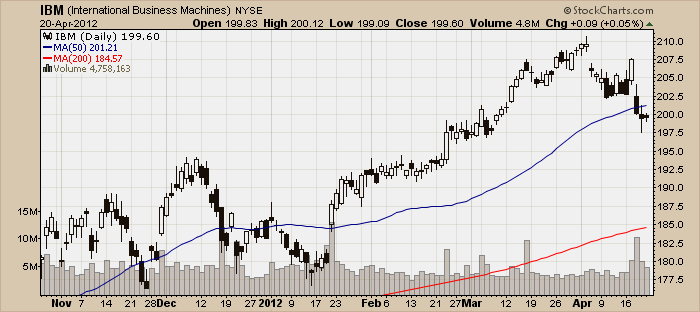
There are two other grid settings that are available however. Here's what the "Dense" grid setting looks like:

And here is what the "Off" setting looks like:
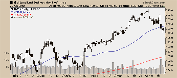
Now, deciding which of these settings to use is actually a little trickier than you might think at first glance. The reason is that the grid setting can have a very big impact on the size of the chart - not the screen size, but the amount of data that needs to be sent accross the Internet in order for you to see the chart.
Here are the statistics for the simple charts you see above:
- Normal Grid: 12,090 bytes
- Dense Grid: 12,680 bytes
- Grid Off: 10,361 bytes
That may not seem like a big difference - and with such a small, simple chart, it isn't - but even in this case, the chart without a grid is 18% smaller than the chart with a dense grid.
If you use charts that are much larger, say something with a size of 1280 and 4 additional indicator panels, the difference is more significant. Here are the statistics in that case:
- Normal Grid: 83,766 bytes
- Dense Grid: 89,678 bytes
- Grid Off: 65,963 bytes
That's a 26% difference between the size of a chart with a Dense grid and the size of a chart with no grid at all. If your Internet connection is not superfast or you are downloading lots of charts, that different will be noticeable.
Now, of course download speed is only one factor to consider when choosing a grid setting. But I wanted to make sure that it was something that you did consider. From time-to-time we have people write in to our support team asking why our site is so slow and it turns out that they recently turned on the Dense Grid setting. The bottom line here is that if you can live with the grid Off on your charts, you will see a noticeable speed improvement especially if you have large charts or a slow Internet connection.
- Chip
P.S. In case you were wondering, the name of this article is a take-off on a famous letter from the early days of computer programming.
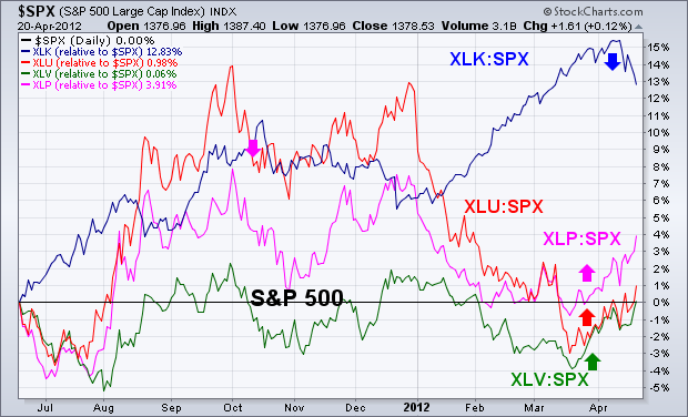
DEFENSIVE SECTOR ROTATIONby John Murphy | The Market Message One of the ways to measure the mood of the stock market is to see what sector rotations are taking place beneath the surface. Chart 1 shows that sector rotations over the past month reflect a market mood that is turning more defensive. The four sector lines are plotted "relative" to the S&P 500 which is the flat black line. In other words, the four sector lines are relative strength ratios that measure their performance "relative" to the S&P 500. The blue line shows the Technology SPDR (XLK) leading the market higher since the beginning of the year. Technology leadership is a good thing for the market. The XLK:SPX ratio has started to drop during April, however, which shows short-term loss of that leadership. In fact, technology was this week's weakest sector. The other three lines show the relative performance of the three defensive sectors which are consumer staples (pink line), healthcare (green line), and utilities (red line). Those three sectors underperformed the S&P 500 since December as the market rallied. Notice, however, that those three relative strength ratios have turned up over the last month. In fact, utilities, healthcare, and staples were this week's three strongest sectors. That's normally a sign that investors are turning more defensive and are protecting themselves from a possible market correction.
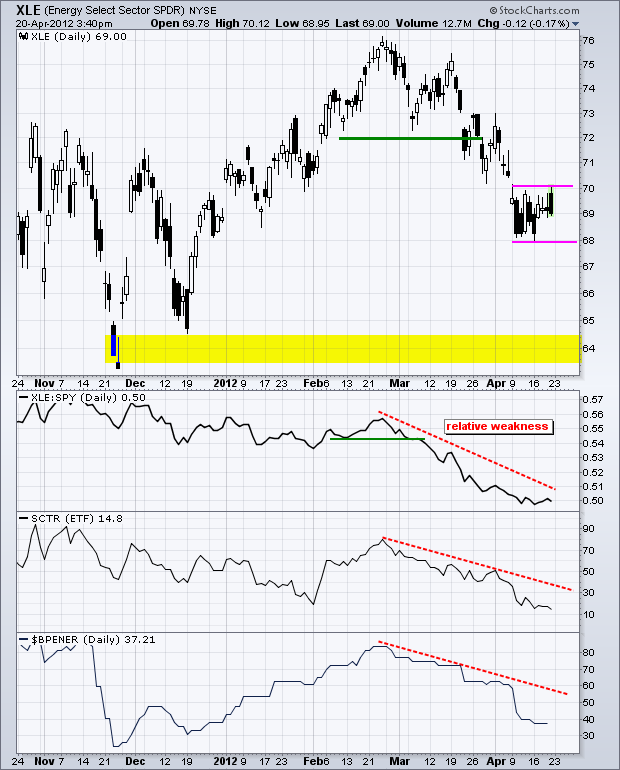
The Energy SPDR (XLE) broke key support in late March with a sharp decline and has yet to reach the next key support level. The chart below shows XLE consolidating in the 69 area over the last two weeks. This consolidation looks like a rest within the downtrend. A break below 68 would signal a continuation lower and target further weakness towards the next support zone in the 64 area. Support here stems from the lows in late November and mid December.
Click this image for a live chart.
Three indicators confirm relative weakness in XLE. The price relative, XLE:SPY ratio, has been trending lower the last six months and the decline accelerated since late February. The StockCharts Technical Rank (SCTR) also peaked in late February and moved sharply lower. Notice that the SCTR is trading below 20, which makes it the lowest of the nine sector SPDRs. The last indicator window shows the Bullish Percent Index moving below 40 this month, which is also the lowest of the nine sector SPDRs. This means that fewer than 40% of the components are on PnF buy signals. Put another way, more than 60% of the components are on PnF sell signals.
SPY VERSUS SPXby Carl Swenlin | DecisionPoint.com A subscriber brought something to my attention that I wish I had thought of before. We think (at least I did) that the SPY (ETF) and SPX (S&P 500 Index) perform pretty much the same except for some minor tracking error. However, this is not the case because the SPY historical data is adjusted for dividends, whereas the SPX is not.
For all practical purposes, the SPY is a stock, and when the SPY pays a divdend, its historical data must be adjusted so that it maintains the correct relationship with the current dividend adjusted price. This happens on all stock, ETF, and mutual fund data. (To learn more, click here.) While it may be technically possible, historical data for an index like the SPX is not adjusted for dividends, so the effect of dividends is not considered for indexes.
Let's take a look at what this means. On this SPX chart we can see two major tops, 2000 and 2007, challenging the same level of overhead resistance at about 1550. The top of the current bull market is still about 200 points below this resistance.
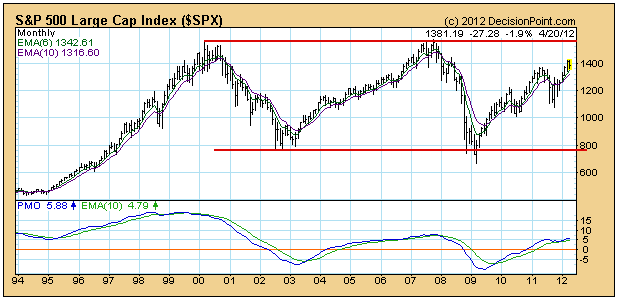
Now, looking at the SPY chart, which has been adjusted for dividends, we can see that the 2007 top exceeded the 2007 top by about 15%. And of more immediate interest, the current bull market top is virtually equal to the 2007 all-time high. This encounter with long-term resistance could spell immediate trouble for the bull market.
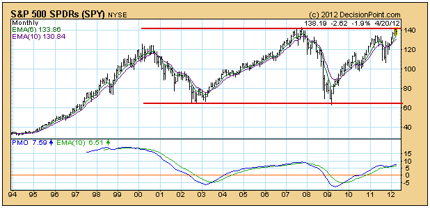
There is a new index, the S&P 500 Total Return Index ($SPXTR), that appears to accommodate dividends by using a positive adjustment to the current price, but there is not even a full year's data collected on it yet, so it is not likely to be a useful technial analysis tool during my lifetime. Besides the SPY already does the job and we have nearly 20 years of data on it.
Conclusion: The fact that indexes are not adjusted for dividends can cause them to present a different technical picture than their ETF counterparts. While many of our timing models are driven by indexes, one should always use the chart of the trading vehicle (ETF) to finalize a trading decision.
Once a month, the stock market provides us a unique opportunity. In basketball terms, it's like the market makers have the ball with time running out in the quarter - or the game - and they nearly always bury that critical three-pointer. For those more predisposed to hockey, think about the "empty net" goal to close out the game. That's probably more fitting because the retail trader is mostly defenseless as the market puck sails into the net.
Options expire the third Friday of every month. It's a day of reckoning for options traders. When the option trader buys or sells contracts, think for a minute who's on the other side of the trade. With the most fluidly traded options, it can be the retail trader on both sides of the trade. But many stocks don't have the kind of contract volume on a daily basis that's necessary to match up retail buyers and sellers and you see "open interest" build.
Enter the market maker.
Let's assume you buy 10 calls on ABC stock and the market maker sells you those calls. To appropriately manage risk, that market maker can then turn around and buy 1000 shares (10 calls represent 1000 shares as each call gives the purchaser the option to buy 100 shares at some future point at a fixed strike price). It's a familiar covered call strategy. Therefore, if ABC continues rising, the market maker is protected as they own the stock.
But think about what happens if ABC moves higher for a period of time and builds a lot of net in-the-money call premium, then reverses suddenly (and, in many cases, temporarily). The market maker owns 1000 shares, so they can potentially benefit from the gain leading up to options expiration Friday. What if that market maker sells their long position, then begins to short ABC as options expiration Friday approaches? They effectively close out their long position with a gain no doubt. Then as ABC mysteriously falls, market makers make money again on their new short position. As ABC falls during options expiration week, what happens to all of the net in-the-money call premium? It vanishes as the market maker rings the cash register again.
It's an empty net goal. Game over.
Every month, the week before options expiration, I calculate "max pain" for the SPY, QQQ and IWM. I define max pain as the point at which in-the-money call premium EQUALS in-the-money put premium. It's the market makers' version of the "perfect storm". Once I calculate max pain, I do NOT look for the major indices to reach the level of max pain. Instead, I simply use max pain as a directional indicator as I would the MACD. It's a part of my overall strategy, not my entire strategy. Last week, for instance, the SPY and QQQ showed a max pain level very close to its then current price. The IWM, however, traded at $79.54 with a max pain level of $81.65. Tuesday's high on the IWM was $81.55. Check it out:
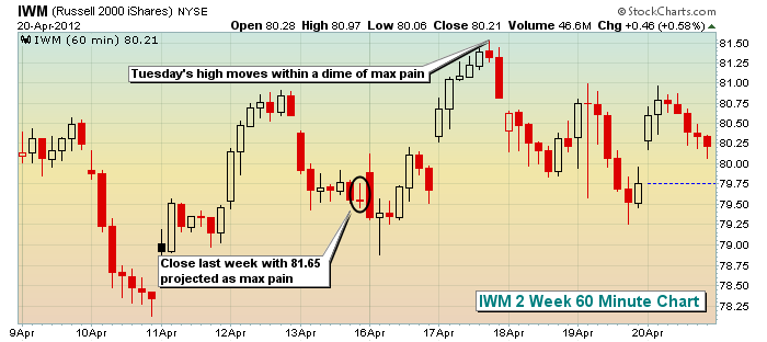
There was net in-the-money put interest, which suggested that IWM (small caps) would have a gravitational pull higher in the very near-term. In order to benefit from this potential move, you could trade the IWM or find individual stock alternatives with a similarly skewed net option interest on the put side.
On Thursday, April 26th, I will be hosting the latest in our Online Trading Series, "Profiting from Max Pain". For details, CLICK HERE
Happy Trading!