Hello Fellow ChartWatchers!
One of the big benefits of becoming a StockCharts member is the ability to access additional charting options. Today I want to show you how the "Advanced Options" section of the "Indicators" area allows you to add a "Signal Line" to any technical indicator.
A Signal Line is a (typically) short-term moving average of an indicator that can be used to create buy or sell signals. One of the most well-known signal lines is the one that automatically comes with the MACD indicator:
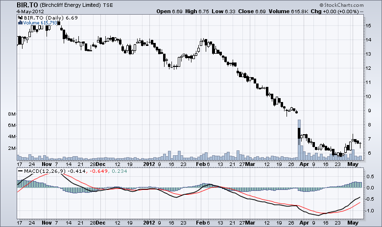
The red line on the chart above is the MACD signal line. That signal line is so well known that the MACD also includes a histogram that shows its distance away from the MACD Line.
But what if we wanted to see a signal line for a different oscillator, like the Chaikin Money Flow? Most oscillators do not have built in signal lines however, by using the "Advanced Options" section of the "Indicators" area on the SharpCharts workbench, members can add their own. Here's an example:

(Click here for an updated, live version of this chart)
So here we have a daily chart of Microsoft (from last March) with a 60-day Chaikin Money Flow indicator added to the bottom. By opening up the "Advanced Options" section and selecting "Exponential Mov. Avg" from the "Overlay" dropdown in that section, we've created the blue line that you see on top of the CMF. That blue line is our CMF signal line. When the CMF is above the blue line, it is bullish. When it is below, it is bearish.
EMA's are commonly used for signal lines because they are more sensitive to change however could also be used instead. In addition, while short periods like 9 are also common, you can actually use any period you want depending on your trading style (and I encourage you to experiment with these settings).
- Chip
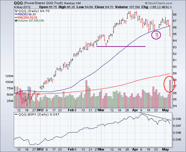
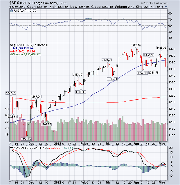
It looks like traders and investors took the "sell in May" mantra seriously this week. Stocks fell sharply after Friday morning's weak April jobs report was released. The worst performance came in the Power Shares QQQ Trust which led the rest of the market lower. Chart 1 shows the QQQ tumbling 2.5% on Friday on huge trading volume. That's a bad combination. In addition, the QQQ fell well below its 50-day moving average (blue line) and negated the "island reversal" that formed the previous week (see top circle). That puts the April low in jeopardy. A close below that low would initiate a pattern of "lower highs and lower lows" which is symptomatic of a deeper correction. The next level of potential support would then be the early March low near 63. The QQQ/SPX relative strength ratio (below Chart 1) also shows the QQQ underperforming the S&P 500 over the last month. That shows loss of leaderhip by the technology sector which is another negative development. Chart 2 shows the S&P 500 falling back below its 50-day line after failing a test of its April high. It too fell below its 50-day line. A test of its April low now appears likely. From a sector standpoint, technology was the week's worst sector. Energy and materials were close behind and were weighed down by falling commodity prices. The three top sectors -- utilities, consumer staples, and healthcare -- are all defensive sectors. That type of defensive rotation is consistent with market weakness. Bonds rallied as stocks fell, while gold attracted some safe haven buying. The dollar bounced a bit on Friday as the Euro weakened.
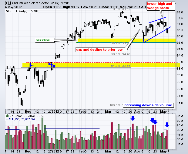
With a gap down and sharp decline, the Industrials SPDR (XLI) formed a lower high and broke wedge support. But thatâs not all. The chart below also shows a potential head-and-shoulders pattern taking shape. After hitting a 52-week high in March, the ETF declined all the way back to the early March low in the 35.50 area. This deep dip showed an increase in selling pressure. Also notice the large gap down in early April.
Click this image for a live chart.
XLI was oversold in early April and bounced back to the 37.5 area. This bounce formed a lower high, which shows diminishing buying pressure because the ETF fell short of the prior high. This weekâs wedge break reverses the April bounce and sets up a test of neckline support. A break below the March-April lows would complete the head-and-shoulders reversal and target a move to the next support zone around 34. Support here stems from the 50-62% retracement zone and broken resistance from the early December high.
The indicator window shows volume bars with downside volume (red) outpacing upside volume (green) since late March. This suggests that selling pressure is picking up steam and buying pressure is diminishing. Also notice that Fridayâs decline occurred on the highest volume in nine days.
Good trading,
Arthur Hill CMT
May 1 marked the beginning of a 6-month period of unfavorable seasonality. Research published by Yale Hirsch in the Trader's Almanac shows that the market year is broken into two six-month seasonality periods. From May 1 through October 31 seasonality is unfavorable, and the market most often finishes lower than it was at the beginning of the period.
The period from November 1 through April 30 is seasonally favorable, and the market most often finishes the period higher. (See Sy Harding's book, Riding the Bear, for an indepth discussion of this subject.) While the statistical average results for these two periods are quite compelling, trying to ride the market in real-time in hopes of capturing these results is not always as easy as it sounds. Below is the one-year chart that that shows the most recent two six-month periods. It begins on May 1, 2011 and ends on April 30, 2012.
The left half of the chart shows the unfavorable May through October period and the right half shows the favorable November through April period. The green line marks the beginning of the favorable period, the red line marks the beginning of the unfavorable period.
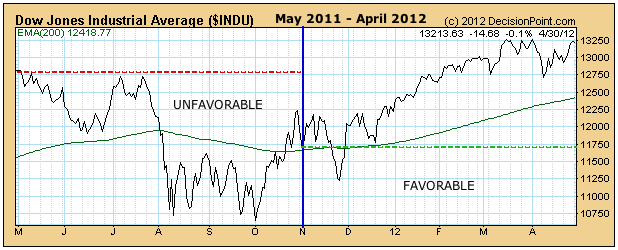
As you can see, the last two seasonality periods turned in textbook performance, with the unfavorable period closing lower, and the favorable period closing higher. However, in the members area of the website we have a series of these charts going back to 1950 (when the seasonality tendency first appeared), and we can see that, regardless of how the market performs on average, every year is different and presents its own challenges, and there is no guarantee that any given period will conform to the average. In fact, it is our observation that bull and bear market pressures will override seasonal tendencies more often than not.
Conclusion: Be aware of current seasonal tendencies, but first and foremost follow the primary trend. Currently, we are in a bull market, but it appears to be forming a top, which coincides nicely with the change to unfavorable seasonality. This does not mean that the bull will not reassert itself, but seasonality will not be assisting the bull in that endeavor.
Everything seemed perfectly aligned for the bulls. In March, slowing momentum on the bulls' side was a growing concern, but the consolidation that took place in the latter part of March and throughout April relieved that concern, so technically it appeared the bulls might resume control of the action. Take a look at the negative divergences that had become problematic:
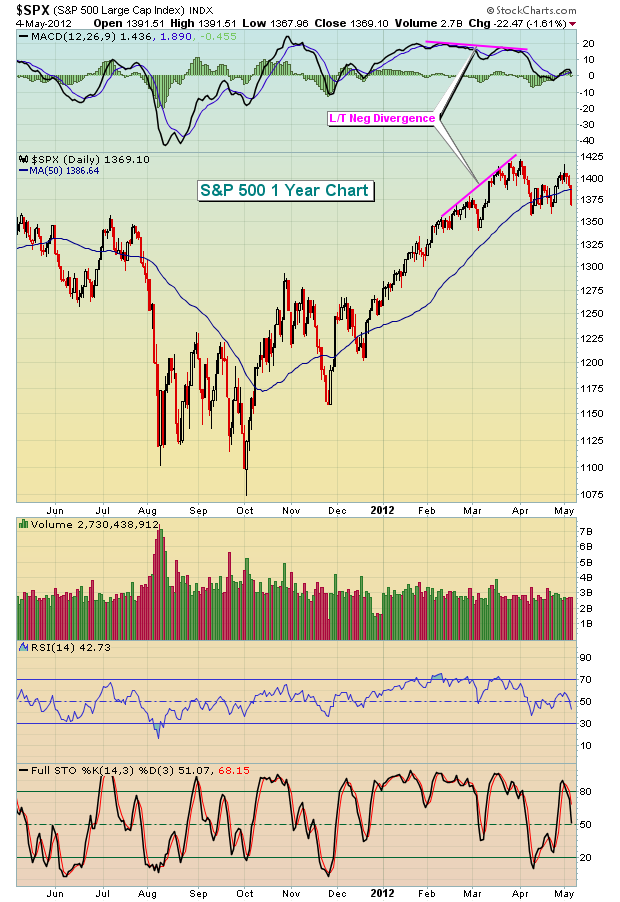

The slowing momentum was obvious. But while the short-term looked dicey, the longer-term remained strong. Here are those same charts, but on a longer-term weekly basis:
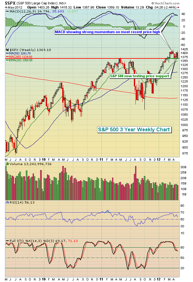
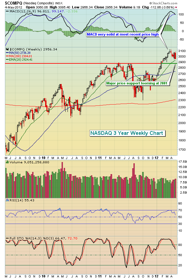
I'll be honest. I was dead wrong last week. With the unwinding of those negative divergences and the MACD back near centerline support across all of our major indices, I was looking for a rebound last week, possibly to fresh 52 week highs. Historically, the first week of a calendar month tends to be quite bullish as well as new money hits the Street. Unfortunately, the slowing global economic picture was felt here at home. After a solid start to May on Tuesday of last week, the disappointing jobs and manufacturing data took its toll with a fairly significant selloff taking place throughout the balance of week. Anyone else hearing the whispers of QE3? I've said throughout 2012 that we're going to get it because of the way the treasury market has behaved. Based on the data last week, it's getting closer, not further away.
Clearly, the market's "signals" are mixed here. The long-term charts continue to suggest the 2012 rally is not over, but the weakness last week was a stark reminder of how quickly things can change. For me, it's a fun time in the market because we've been inundated with earnings reports - some quite stellar - and I see the potential emergence of new leaders. While my focus is ALWAYS on technical indicators for timing into or out of stocks, I'm still a CPA at heart. I spent close to 20 years auditing companies so it wouldn't be prudent for me to completely ignore the fundamental data from companies that we see each and every quarter. Therefore, I like to combine my fundamental analysis around earnings time with my strong desire to follow the money flow. That's what I refer to as "cherry picking" the best companies in order to find those companies that will outperform.
Let me give you a recent example. In mid-January 2012, Tractor Supply Company (TSCO) raised its earnings guidance and the stock hasn't looked back. Check this out:
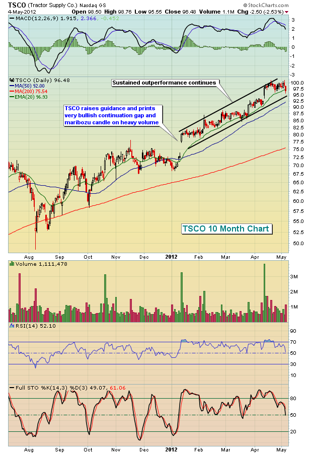
TSCO was identified as a "Diamond" selection at Invested Central in the first quarter because of its combination of strong fundamentals and strong technicals. This is a process that I use each quarter to find those "Diamonds" in the rough. Given the state of the current market, with mixed signals, trying to find the best of the best is probably not a bad strategy to stay invested while at the same time being careful with your trading dollars.
I've written a brief paper on the different types of tradable stocks that you can find during earnings season and how I use StockCharts powerful scan engine to help me identify these stocks. I'll be happy to send you a free copy. Simply CLICK HERE to leave me your e-mail address and I'll ship it out to you this weekend.
Happy trading!