Hello Fellow ChartWatchers!
Did you follow the Facebook mania yesterday? Even if you didn't have a stake in the stock, it was still fascinating to watch the chart over the course of the day as the underwriters had to step in to prop it up. I've added a snapshot chart of the first day's action (appropriately enough) to our Facebook page. Click here to check it out (no, you don't need to be a Facebook member to see it).
While the mass media has been focused on Facebook, something much more significant happened on Friday with respect to the Dow Theory. Arthur Hill's article in this week's newsletter has all the details but suffice it to say that the market is looking very weak these days.
BULLISH PERCENT INDEX LED MARKETS LOWER
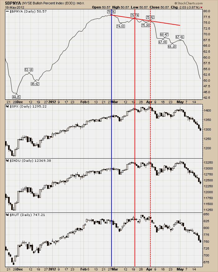
While the charts are looking very weak right now, were there any signals earlier that clearly pointed to this downward leg in the markets ahead of time? Check out this chart:
(Click here for a live version.)
This chart shows my favorite market indicator, the NYSE Bullish Percent Index ($BPNYA). The Bullish Percent Index shows the percentage of NYSE stocks that have any type of bullish pattern on their P&F chart. (For all the gory details, click here.) The NYSE Bullish Percent Index peaked at the end of February (blue verical line) well before the markets showed any outward signs of weakness. $BPNYA put in a lower peak on March 20th (solid red line) again, well before the market indexes topped. In fact, by the time the market indexes started moving lower, $BPNYA was putting in a third lower peak (red dashed line) and had formed a confirmed downtrend.
People often ask is there is a leading indicator for the market. My answer is always for people to watch the Bullish Percent Index. The chart above is a perfect example of why everyone should pay attention to it at all times.
- Chip Anderson
P.S. If you want to learn more about the "hidden gems" like the Bullish Percent Index that we have here at StockCharts, conside coming to our upcoming users conference called "ChartCon" that's being held in Seattle on August 10th and 11th. For more details, click here. I hope to see you there!
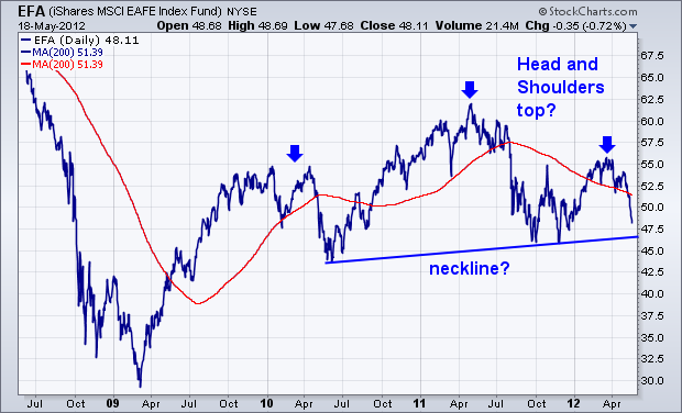
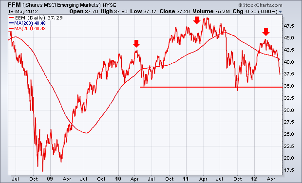
FOREIGN HEAD AND SHOULDER TOPS?by John Murphy | The Market Message What really worries me about the direction of stocks is the possibility that foreign stock indexes could be tracing out two-year "head and shoulder" tops. That's true of both developed and emerging markets. Chart 1 shows EAFE iShares tracing out a textbook "H&S" top. [A head and shoulders top is identified by three peaks with the middle peak (the "head") higher than the two surrounding "shoulders"]. The fact that the two shoulders are about the same height adds to the symmetry of the pattern. The "neckline" is the trendline drawn under the 2010-2011 lows. A decisive violation of that support line is a very bearish sign. It now looks like the EAFE will retest that trendline (or its late 2011 low). That will a very important test, and hopefully will produce an oversold bounce of some type. Chartwatchers know, however, that the overall shape of the potential topping pattern since the start of 2010 calls for a lot more caution. The same is true of Emerging Market iShares in Chart 2. If those the late 2011 lows are broken, that would be a very bearish sign for global stocks. Given the tight correlation among global stocks, any breakdowns in foreign stocks would have a negative impact on U.S. stocks as well.
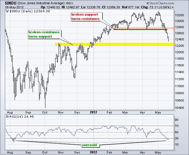
With big declines this past week, the Dow Industrials and Dow Transports both broke support levels and forged lower lows. Confirmed lower lows amount to a Dow Theory sell signal. The first chart shows the Dow Industrials forming a double top and breaking double top support with a decline below 12700 this week. Broken resistance marks the first potential support level in the 12200 area, which is not far off. The indicator window shows RSI moving below 30 for the first time since early August. While this does suggest an oversold condition, notice that the Dow traded flat in August-September and did not bounce until early October. Should the Dow bounce next week, look for first resistance from broken support in the 12800 area.
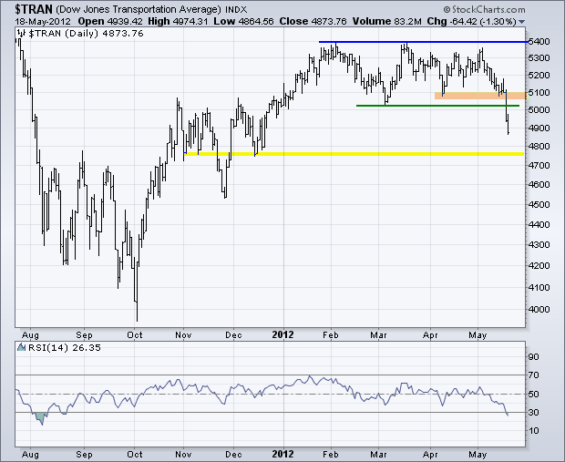
The Dow Transports peaked around 5400 in early February and traded sideways for three months. This showed an extended period of indecision or a standoff between bulls and bears. With a sharp decline below 5000 this week, the Average clearly broke support and the bears prevailed. The next support zone resides around 4750 from the reaction lows (troughs) in mid November and mid December. Broken support turns into first resistance in the 5100 area. Notice that RSI also became oversold for the first time since early August. Also note that this oversold condition did not foreshadow a lasting bounce as the Average floundered for several weeks and broke its August lows in late September and early October. Oversold is a sign of weakness because it requires strong selling pressure to push RSI below 30.
Good Trading!
Arthur Hill CMT
CORRECTION LOW MAY BE WEEKS AWAYby Carl Swenlin | DecisionPoint.com The current correction is creating very oversold conditions on intermediate-term indicators, like the ITBM (breadth) and ITVM (volume). While oversold indicators often signal final price lows for a correction, extremely oversold readings are a sign that the price low for the correction probably won't arrive until weeks after the extreme indicator lows.
On the chart below I have annotated two very good examples of this process. The red arrows show where indicator lows occurred, and the green arrows show the correction price lows, which arrived several weeks later after prices bounced out of the first low.
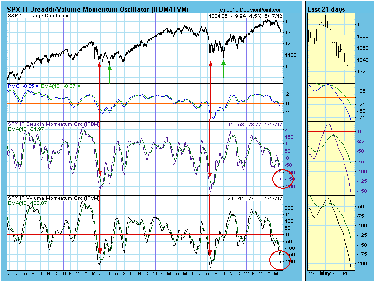
While a simialr circumstance seems to be setting up at present, in order to replicate the two previous examples I think the ITBM and ITVM need to go down a little more, and the PMO (Price Momentum Oscillator) needs to go down a lot more.
Conclusion: Current oversold indicator readings may offer hope that we will soon see a low for this correction; however, oversold conditions are approaching such extreme levels that we should anticipate that the correction will continue for several weeks before a significant low is reached.
We should also note that the two examples cited occurred during a bull market advance. If a bear market has begun, the resolution could be much more severe.
The long-term negative divergences that printed in February and March provided us clues that we'd at least see some near-term trepidation and possibly something much worse. Well, the "much worse" has arrived. There is no technical sign - bullish or bearish - that ever provides us a guarantee so a bit of cautious skepticism can go a long way for a trader. But things have changed and from a risk perspective it's certainly time to consider changing your investing or trading strategy.
When a market trends higher and the MACD gives us the "full speed ahead" sign, I tend to be more aggressive on the long side. When warning flags go up (ie, long-term negative divergences), it's ok to remain somewhat bullish, but it's important to adjust to a higher level of risk in the market. In such circumstances, selling calls against long positions make sense to reduce risk. Those who are not interested in trading options can simply sell a portion of their positions to raise cash. Then we sit back and wait to see if the higher risk translates into a bounce off key support or if the market transitions into a period of higher uncertainty and more selling. This past week, all or our major indices suggested we are clearly in that period of higher uncertainty.
What that means to me is that we'll see added volatility and more whipsaw action with both longs and shorts being regularly confused.
Let's take a look at the recent progression from what I considered to be a very strong and bullish market to one that now has turned much more bearish. First, check out the S&P 500 in early 2012:
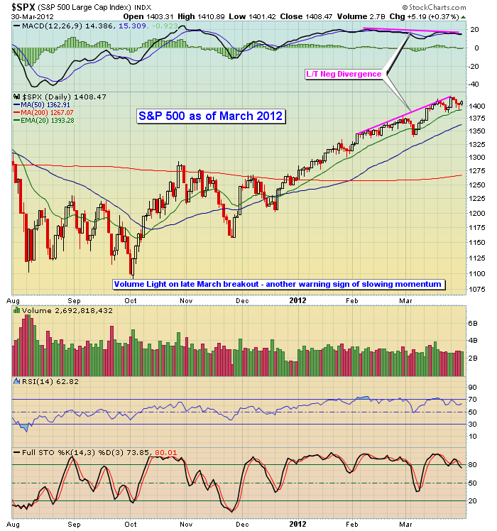
This type of long-term negative divergence absolutely sends a warning signal. But these bearish divergences usually do not provide us long-term signals. They tell us that momentum has waned in the near-term and that a short-term period of consolidation, or perhaps a period of bearishness, is to be expected (not guaranteed). It's what happens AFTER these signals that usually drives market action in the foreseeable future. In other words, can the MACD test its centerline support to "reset" the difference between the 12 day EMA and 26 day EMA back to zero. That's the definition of a MACD centerline test. Does the bullish momentum resume or do we see a bearish MACD centerline crossover that indicates momentum has turned in favor of the bears?
For that answer, take a look at the current technical picture of the S&P 500:
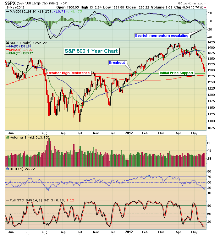
A few technical items stand out to me. First, the long-term negative divergence that indicated slowing momentum in March served as an important signal and it proved correct. Next, the subsequent decline in equity prices did test key moving averages like the 50 day SMA and we did see the MACD move back to key centerline support. The problem, however, is that the selling was not contained there. It was just beginning. Finally, check out the MACD on last week's selling. Momentum is accelerating to the downside. Because momentum now is so strong in favor of the bears, we cannot expect much more than an oversold bounce. I feel fairly confident that we will get a bounce and it'll likely move the S&P 500 towards its declining 20 day EMA. At that point, however, it'll be time to short - perhaps even aggressively - until the market proves to us otherwise.
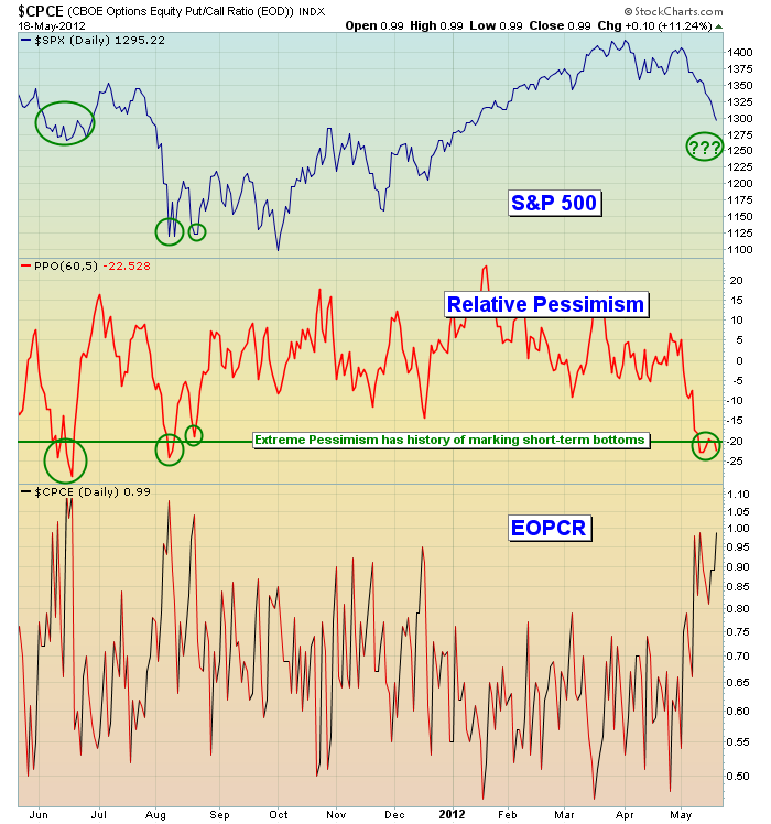
The bulls have two signs on their side as we begin a new trading week - oversold conditions and sentiment. It appears we need a capitulatory type of selling day in order to establish a short-term bottom. That will give us an opportunity to unwind what has become VERY oversold short-term conditions. It's not often when you see three of the major indices - S&P 500, NASDAQ and Russell 2000 - with its stochastic reading below 1, combined with RSI readings mostly in the low 20s. That's POWERFULLY oversold. But perhaps even more significant is the fact that options traders are piling in on the equity put side. You should know by now how closely I follow the equity only put call ratio (EOPCR) and my calculation of relative pessimism. Relative pessimism has a solid track record in helping to spot short-term market bottoms. It did it in both June and August of 2011 and is primed to do it again. Check this out:
I can tell you that my approach to trading has changed. I'm not writing off the possibility of a further move to the upside in 2012, but the market needs to prove that possibility to me first. For now, I consider bounces to be shortable. To give you an idea of what I look for in a short candidate, consider ANSYS, Inc. (ANSS), which was a short candidate and presented as a Chart of the Day on Thursday of last week. CLICK HERE for further details.
Happy trading!
TREMENDOUS AMOUNT OF RISK IN $INDUby Richard Rhodes | The Rhodes Report An important tops looks to be in place in the Dow Industrials ($INDU) by month's end if the current pattern holds true to form. Quite simply, the $INDU is forming a bearish wedge pattern, of which rising trendline support looks to be violated in the months ahead. This probability is higher given the current bearish key monthly reversal to the downside - if it holds up through month's end, and we have no reason to believe it won't given there are only 8-trading sessions remaining. And, this reversal lower is confirmed by the bearish divergence seen in the 9-month RSI.
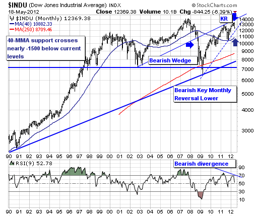
Collectively, this presumes a decline back towards the rising 40-month moving average at 10,882...or roughly -1,500 points from current levels - a not inconsiderable sum to be sure. And if this support level is violated, then the downside could be rather difficult indeed towards the 250-month moving average that was ultimately tested during the 2007-2009 bear market.
In any case, there is a tremendous amount of risk in the $INDU - and rallies of any type are to be sold, and to be sold aggressively.
Good luck and good trading,
Richard