Hello Fellow ChartWatchers!
The bears are out and pulling the market lower. All of our market commentators will discuss the latest technical developments below (including some potential "safe havens" that may benefit from the current market moves) so we decided to give you an extra-long, extended version of John Murphy's commentary in this week's newsletter. It starts in the next section.
Before I clear out of the way for John, I did want to mention two things:
First off, our Summer Special is now in effect. If you are thinking about joining StockCharts.com as a member, now is the best time to do it, period. If you are already a member and your membership expires anytime before the end of 2012, go ahead and renew now to lock in the special rate. Long-time members will tell you again and again: "Renew whenever they have a special running." Don't wait however - the special is scheduled to end before the next newsletter goes out. Go ahead and take advantage of it right now.
Secondly, I urge you not to fall into the old trap of "The market is headed lower so I don't need to watch it now. I'll wait until it turns around and then I'll get more involved." That is the exact opposite of the mindset that the charting pros have. Even if you only want to play the long side of things, it is critical to pay attention to the technical condition of the market as it declines because the technicals will tell you when the bulls are coming back long before "the mainstream financial press" or "conventional wisdom" will. Stay alert during this decline by using things like the Bullish Percent Indexes that I talked about last time as your guide.
OK, let's see what John, Arthur, Carl, Richard and Tom have to say...
Take care everyone!
- Chip
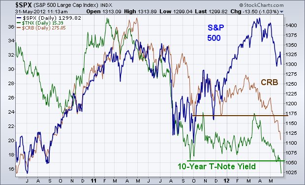
BOND YIELDS AND COMMODITIES HIT NEW LOWS... Everywhere I look I see more serious warning flags for the U.S. stock market. Two of them are coming from recent breakdowns in bond yields and commodity prices. The chart below shows the 10-Year T-Note Yield (green line) and CRB Index (brown line) falling to new lows. Bond yields are now at the lowest levels in sixty years. Over the past few years, a positive correlation has existed between commodity prices, bond yields, and stock prices. That relationship weakened during the first quarter, but now appears to be re-asserting itself. Falling commodity prices imply global economic weakness. Falling bond yields imply the same. A collapsing Euro (along with foreign stocks) is pushing money into the relative safety of Treasuries and the U.S. Dollar. Rising bond prices equate to lower yields. A rising dollar equates to falling commodity prices. Falling bond yields and commodities are now leading to falling stock prices. The rising dollar is also taking a more serious toll on foreign stocks. Their technical condition looks a lot weaker than the U.S. Problem is weakness there causes weakness here as well.
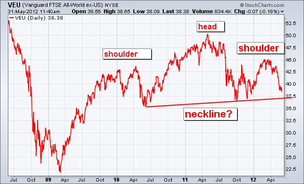
FOREIGN HEAD AND SHOULDER TOP... I wrote about the possibility that foreign stocks were forming a "head and shoulder" top a couple of weeks ago. But I believe it bears repeating. That possibility really worries me. Judge for yourself. The next chart shows the Vanguard All-World ex-US ETF (VEU) from its 2009 bottom. In my view, the price pattern since the start of 2010 has the look of a potential H&S top. [A H&S top is defined by three peaks, with the middle peak (the head) surrounded by two lower peaks (the shoulders)]. Unless I'm seeing things, the chart below appears to be tracing out a textbook H&S top. The trendline drawn undere the 2010/2011 lows represents the "neckline". A decisive drop below that support line would complete the top and signal lower prices. [An alternate bearish view requires a close below the fourth quarter low]. Either way, the pattern scares me. If foreign stocks are in fact tracing out a major top, there's no way U.S. stocks will escape more serious damage. They may not fall as far, but they will fall some more.
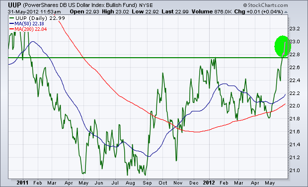
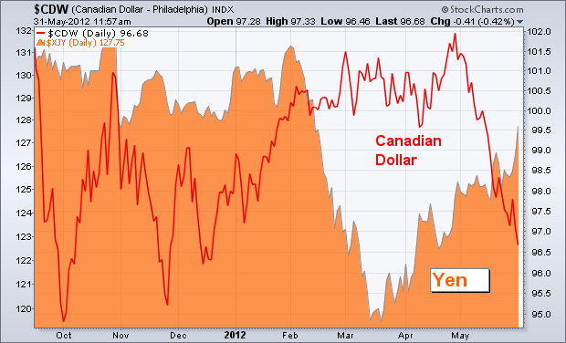
DOLLAR INDEX BREAKS OUT TO THE UPSIDE... Money continues to flow into the safe haven of the U.S. Dollar. The first chart below shows the PowerShares Dollar Bullish Fund (UUP) exceeding its January high to reach the highest level in eighteen months. Most of that gain is coming form a tumbling Euro. [The Euro accounts for 57% of the trend in the UUP]. The next chart shows the Euro tumbling to the lowest level since the summer of 2010. The last chart shows the Canadian Dollar tumblng as well (along with falling commodity prices). Some forex money is flowing into the safety of the Japanese yen (orange matter). At the moment, the four markets attracting safe haven money are the dollar, the yen, U.S Treasuries, and the German Bund.

Take care everyone,
John
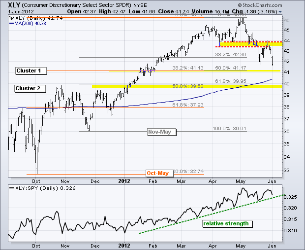
After a failure at broken support, the Consumer Discretionary SPDR (XLY) looks set for a move towards a Fibonacci cluster. The chart below shows XLY breaking support and becoming oversold in mid May. The ETF then bounced back to broken support and this area turned into resistance. It is not uncommon to see such a âthrowbackâ bounce, especially after becoming oversold. This bounce alleviated oversold conditions and this weekâs decline signals a continuation of the May decline.
Click this image for a live chart.
With a continuation signaled, it is time to start thinking about potential supports and downside targets. The first target resides around 41 and the other in the 39.5 area. I am using the Fibonacci cluster for these targets because there are two lows and one distinct high. The orange Fibonacci Retracements Tool extends from the October low to the May high. The gray Fibonacci Retracements Tool extends from the November low to the May high. I then look for clusters or where the two retracements closely overlap. The current decline off broken support looks quite strong and this leads me to believe that XLY will hit the lower cluster in the 39.5-40 area. Also notice that the 200-day moving average is right between tehse two clusers. You can read more about Fibonacci levels in our ChartSchool article.
Good trading,
Arthur Hill CMT
BONDS SOAR AS TLT MAKES NEW HIGHby Carl Swenlin | DecisionPoint.com To be honest, the actual "soaring" for bonds began last July when bonds began an advance of about 33% in two months. After a five-month period of consolidation, another up leg advanced prices about 18% off the bottom of the trading range, making a total advance of about 41% since last July.
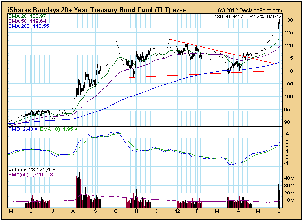
This surge was a big surprise to most people, including us, because we wondered why anybody would want to lend money to a country so deep in debt and which was borrowing 42 cents of every dollar it spent. The answer is that the U.S. is the least pathetic of the world's debtor nations. I have this picture of the sinking Titantic where one end of the ship is lower in the water than the other end, and people are moving toward relative safety on the high end of the ship. The trouble is that we're all in the same boat and the whole ship will ultimately be under water. It reminds me of an old pilot's joke. Question: What is the first indication that you have flown into the side of a mountain? Answer: You lose pitot-static pressure. (The pitot tube is that pointy thing that sticks out of the nose of the airplane, and would be the first part of the airplane to make contact with the mountain.) But I digress.
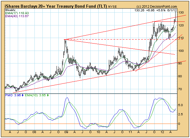
This week TLT punched through the top of a long-term rising trend channel and moved to new, all-time highs. We can see on the weekly chart that price movement is nearly vertical. The PMO is rising and has plenty of room before it reaches the overbought level of its trading range. The picture is very positive, but another period of consolidation will probably begin soon.
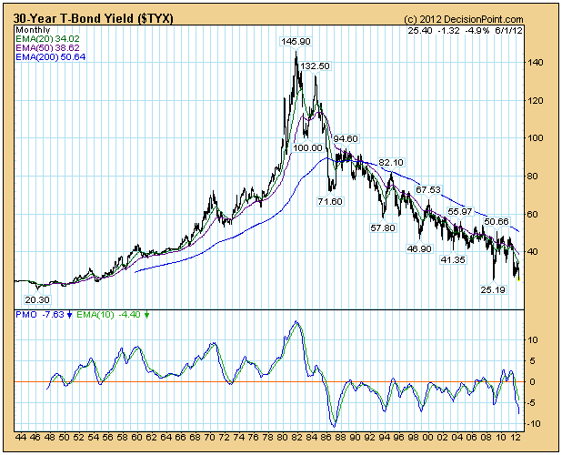
As for the upside potential of bonds, let's take a look at interest rates, which, of course, move in the opposite direction of bonds. In 2009 rates hit their lowest point in over 50 years, and that low is now close to being challenged. We think that rates have the potential to dip down to 2% (the low in the 1940s) and possibly lower. With that in mind, we would guesstimate that bond prices have the potential to move around 20% higher.
Conclusion: Our timing model has us on a buy signal for bonds because the model is driven by prices, not our perfectly rational (but wrong) view of what bond prices ought to be doing. Also, the technical picture for bonds is excellent, although there is probably some correction or consolidation not too far ahead.
Take care everyone,
Carl Swenlin
All traders must decide whether to invest their dollars aggressively or conservatively. It's a basic principle, yet following the flow of such dollars can provide us valuable clues about the likely direction of the stock market. For me, it's a simple case of tracking the 10 year treasury yield vs. the S&P 500. Before I show you any charts, it's important to understand the relationship of the PRICE of treasuries and their corresponding YIELD. When treasuries are bought, it makes sense that the PRICE will move higher. But because the coupon rate is fixed, the yield actually falls as treasury prices rise.
Using a very simplistic approach, a dollar invested in treasuries is one dollar not invested in equities. Therefore, it would also make sense that the relationship between treasuries and the S&P 500 would be an inverse one. Taking this one step further, if both the S&P 500 and the 10 year treasury yield move inverse to treasury prices, then it makes sense that the S&P 500 and treasury yields should move in direct correlation to one another - and they generally do.
Now let's look at a chart that confirms it. Below is a 10 year chart of the S&P 500 with the 10 year treasury yield reflected behind the price of the S&P 500:
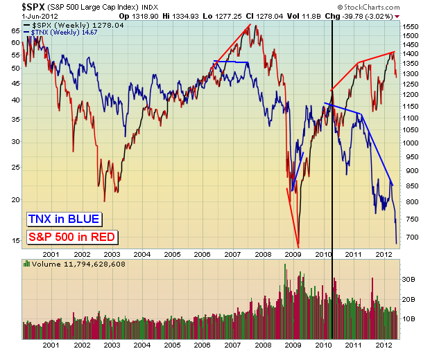
There isn't a 100% direct correlation between the two, but they do generally move in the same direction. Over the past five years, however, there have been periods where they've actually diverged, moving opposite one another. Every time, the treasury market seems to get it right with the S&P 500 reluctantly following the trend reversal in the $TNX. In other words, those investing in treasuries seem to be a bit smarter than equity investors.
I don't believe there's any doubt which way the $TNX is trending now. Yields on the 10 year treasury broke to new all-time lows last week. Money flowing INTO treasuries is driving the yield lower. The primary reason that money flows into treasuries is for safety as traders expect our economy to weaken (or possibly another round of quantitative easing). You don't want to be in equities when the music stops. Therefore, I always keep a very close eye on the direction of the yield. I have drawn a black vertical line on the chart above, however. It appears as though the mostly direct correlation between the S&P 500 and the $TNX ended in early 2010. My belief is that quantitative easing has been driving both higher. Knowing that the Fed has their collective backs, treasury traders have poured into the safety of U.S. debt instruments. At the same time, equity traders have bid share prices higher knowing that either the economy will continue expanding OR the Fed will step in and HELP it expand.
Currently, both the S&P 500 and the $TNX are moving lower. Check out the 3 month chart below:
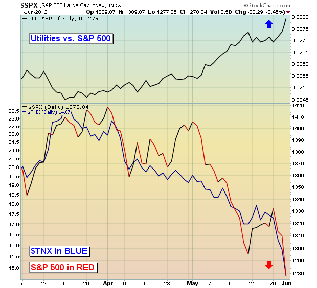
The yield on the 10 year treasury and the S&P 500 are now in lockstep with one another again. That's BAD news for equities as the yield has broken down and is reflecting the belief that our economy is putting on the brakes, possibly even signaling an upcoming recession. Economic reports are supporting this theory. The best performing sector in equities has been utilities, which makes perfect sense. First, it's a reflection of the risk off trade. Also, investors dependent on income are likely finding the 10 year treasury yield very unattractive vs. yields on utility stocks, not to mention that lower rates can have a positive effect on the earnings of utility stocks that have debt with variable interest rates.
The falling yields and strong relative performance of utilities are SCREAMING that investors do not want to take any risk. That risk off mentality leads to lower equity prices. For equity traders, the Fed's next round of quantitative easing (QE 3) can't arrive soon enough. In my opinion, the behavior of treasuries and equities are begging the Fed to act sooner rather than later. Will they or won't they? I believe the Fed will act sooner rather than later. You be the judge.
The action in treasuries is just one MAJOR warning sign I see for equity traders right now. I held a webinar on May 23rd and invited our community to attend free of charge to discuss all of these warning signs. It turned out to be quite timely as the selling has escalated. Unfortunately, all of these warning signs still apply today. You can watch the recorded webinar free of charge by CLICKING HERE.
Happy trading!
Tom Bowley
Over the past week, we've seen gold shares gain sponsorship without the physical gold metal rising. Perhaps this was the "canary in the coal mine" as they say, but gold prices roared ahead yesterday from a low of $1545 to a high of $1632 before closing at $1627. This put in place a rather bullish key reversal higher from major support between $1500-to-$1550. We find this rather positive for further gains, which many would equate to some level of European/US/Chinese liquidity measures.
But what we find more interesting is the fact that the Gold Share/Gold Futures Ratio (GDX/$GOLD) nearly reached the lows it formed in October-2008 at roughly .25. Thereafter, a rather spirited rally began to the benefit of GDX; and we look for the same type of run to develop at this point. Clearly the 30-week stochastics of the ratio is at oversold levels; and also confirming this is the longer-dated 21-week RSI that hit oversold. The last time the 21-week hit oversold, then the aforementioned spirited rally began.
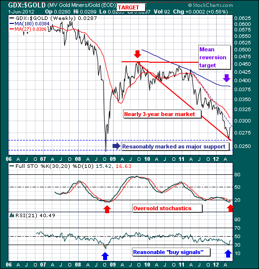
Hence, we believe we are in the nascent stages of a bullish run in gold and gold shares, with gold shares taking the lead. We are buyers of gold shares on weakness; and look to be involved in the trade for many months. Stop losses can put placed at the recent lows or a bit higher.
Good luck and good trading,
Richard