Hello Fellow ChartWatchers!
I'm pleased to announce that we have just added 4 new color schemes to our charting workbench. These schemes are specifically designed for people that like light colored charts on black backgrounds. Our older "Night" color scheme is one of our more popular schemes but it has gotten a little long in the tooth over the years. These new "Dark" color schemes bring our support for black-based charts more up-to-date. Here's what they look like:
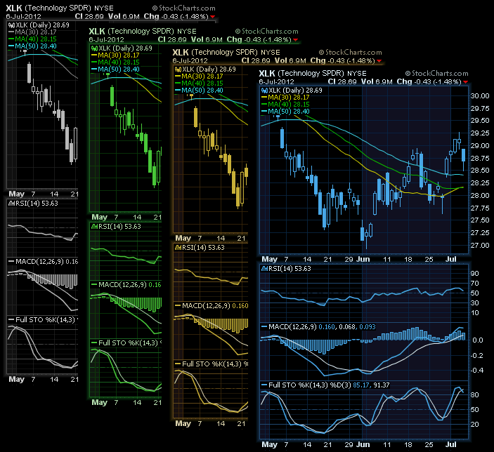
The new schemes are called (from left to right) - Dark Gray, Dark Green, Dark Amber, and Dark Blue. Click on the charts above to see a live example.
Check out these new schemes and see if they work for you. If so, then welcome of the "Dark" side. If not, don't despair. We're working on some new "White-side" color schemes and hope to have them available soon.
Take care everyone,
- Chip
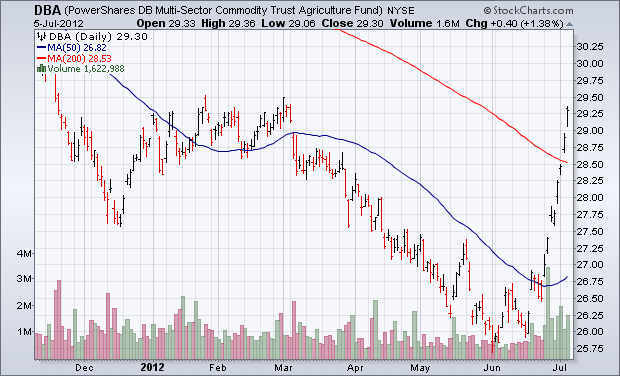
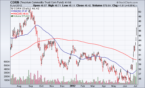
Agricultural commodities have been on a tear over the last month. Chart 1 shows the Power Shares Agricultural Fund (DBA) in a parabolic rise since mid-June. Most of that surge is coming from grain markets as the result of drought conditions in the midwest. Corn, wheat, and soybean prices have seen especially big gains. Chart 2 shows the Corn Fund (CORN) surging to the highest level in ten months. Notice the big jump in volume in both agricultural ETFs. One stock group that is starting to benefit from surging grain prices is fertilizer stocks. Farmers will need to buy more fertiilzer to plant bigger crops during the next growing season.
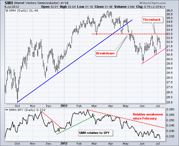
Relative weakness in the **Networking iShares (IGN)** and the **Market Vectors Semiconductor ETF (SMH)** weighed on the technology sector this week. The chart below shows SMH breaking down in May and then bouncing back to broken support in mid June. While SPY moved above its mid June high, SMH did not and showed relative weakness. The support break held and resistance has been affirmed at 33 with the decline on Thursday-Friday. The indicator window shows the SMH:SPY ratio peaking in February and moving to a new low today. Semis represent a key technology group and a cyclical industry. Relative weakness is negative for the market overall.
Click this image for a live chart.
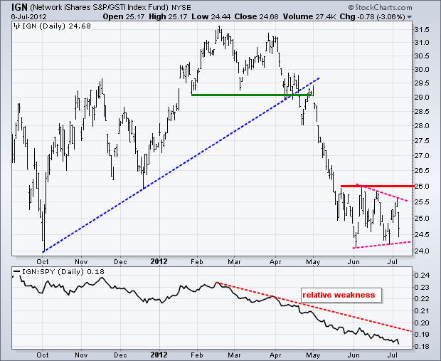
The second chart shows the Networking iShares (IGN) falling over 3% on Friday. Notice that IGN broke down in April, which was well ahead of the broader market breakdown in May. The ETF declined to its October low in early June and then firmed the last five weeks. While the broader market moved higher in June, IGN stalled and could not break above 26. This showed relative weakness, which is confirmed by the steady decline in the Price Relative (IGN:SPY ratio). The Nasdaq and technology sector are not going far unless these two key ETFs can break above their June highs.
Click this image for a live chart.
The Wall Street Sentiment Survey* is unique in that the poll is taken on Friday after the market closes, and it asks participants for their forecast for the following week. This differs from other polls that take opinions through the week during periods when the market is active and changing.
Last week's survey results (June 29 cutoff) were surprisingly one sided with 80% bulls versus 20% bears.
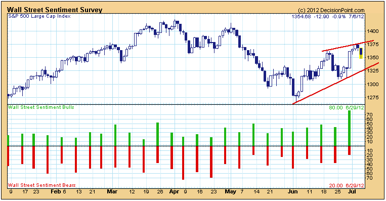
Sentiment indicators are contrarian, so with that many bulls, there was a pretty good chance that prices would close down this week, which they did, thanks to Friday's selloff.
Another point worth noting is typical price behavior after a climax. Eighty percent bulls is a climactic reading, so we normally expect a short-term top to form within a few days. After a few days of consolidation, it is possible for the rally to continue, but this week's price top has set up an ascending wedge pattern, which has bearish implications -- the rising trend line will probably be violated.
Conclusion: Climaxes can initiate a move to higher prices or signal that a move has been exhausted. In this instance it appears that the latter is the case.
*Wall Street Sentiment Survey data are provided courtesy of Mark Young of Equity Guardian Group. Data are complied from the results of a weekly survey of a group of experienced traders and technically oriented market analysts with a diverse set of analytical disciplines, originally nicknamed 'The Fearless Forecasters' from Mark's message board at traders-Talk.com. Polling is conducted after the market close on Friday, and the results are normally published late Saturday. The poll asks participants for their forecast for the next week -- bull, bear, or neutral. You can find more information on Mark Young's sentiment work at WallStreetSentiment.com.
Reasonably bullish signs have emerged, the latest being that crude oil prices (finally!) found support at 2 year lows near $76-$77 per barrel. Not only was price support tested, but slowing momentum was obvious in the form of a long-term positive divergence. It's always nice to see corroborating technicals align bullishly and that's exactly what we saw with crude oil prices. Take a look:
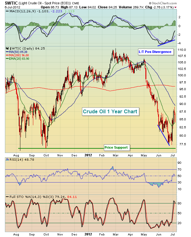
After a long-term positive divergence prints on a daily chart, I look for a test of the 50 day SMA. Many times this coincides with a centerline test, or MACD "reset". As you can see above, crude oil surged very close to its 50 day SMA and the MACD is currently rising and approaching a key MACD centerline test and reset. A long-term positive divergence doesn't have to mark a long-term bottom, although many times it does. What happens after this 50 day SMA test is critical technically. The printing of a higher low and a later breakout above $89 per barrel would signal not only higher crude oil prices, but also resumption of the S&P 500 uptrend. Alternatively, a breakdown beneath $76 per barrel would indicate slowing global demand, which in turn would likely send the S&P 500 spiraling down close to 1200. Currently, I'm banking on the former because of the longer-term bullish backdrop.
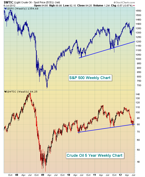
In addition to the short-term bullishness, the longer-term 5 year weekly chart is also arguing for higher equity prices in the days and weeks ahead. Crude oil prices and the S&P 500 tend to move together. Crude oil prices move higher in anticipation of greater global demand. Higher demand usually results from strengthening global economies. Strengthening economies normally produce higher corporate profits, which in turn send S&P 500 prices higher. Take a look at the fairly tight correlation between crude oil prices and the S&P 500 on this chart:
If oil prices and the S&P 500 do eventually move higher, energy stocks will certainly benefit. I've highlighted one such stock poised technically for appreciation as my Chart of the Day for Monday, July 9, 2012. CLICK HERE to view the Chart.
Gold prices are trapped we are afraid; and they are trapped between the $1584 and $1646 levels - of which the lower boundary is the 20-month moving average; while the upper boundary is the 30-week moving average. We expect Gold prices shall break higher given the bullish consolidation forming; and given the Gold/Silver is showing signs of being overbought. All "good bull markets" in Gold are led by Silver...which is another story for another day. Our upside target for Gold prices is simply to "new highs" and let the market take it from there.
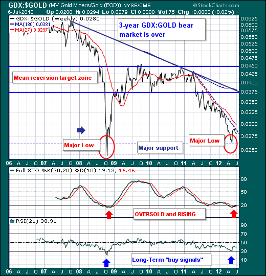
That said, if we look to play this surge in Gold prices - and we do believe they will surge in a type of blowoff that will leave many holding their breath at day's end - then we want to be long the Gold Shares (GDX or GDXJ) as they are have made their relative bottoms versus Gold prices, and are poised to move sharply higher versus Gold when the time comes.
Therefore, once the "caged" animal of Gold prices is unleashed - it should prove a terrifying and thrilling ride higher. We simply don't believe we are ready to ride the animal until $1646 is taken out and tested.
Good luck and good trading,
Richard