Hello Fellow ChartWatchers!
At StockCharts.com, we go to great lengths to make sure that our indicator values are calculated correctly as discussed in that article. Here's a repeat article from 2010 that talks about how we work hard to make sure that the data used in those calculations is as accurate as possible. Enjoy. - Chip
On Data Accuracy at StockCharts.com
First off, I want to talk about the differences between intraday data and daily data with respect to accuracy. The key thing to keep in mind here is that after the stock markets close, the daily quote (open, high, low, close and volume) for each stock is audited by the exchanges. That means that the people at the exchange go back and review all of the trades for each stock - tossing out any incorrect numbers - and then reissue the "official" values for open, high, low, close and volume for that stock. In order to make sure we have the "official" numbers, we recollect the daily data from our data vendors several times each day after the market closes. Our goal is to have "official" numbers in our database for every stock's daily values.
Having accurate daily values is important for several reasons:
- The exchanges try very hard to publish accurate daily quotes and we want to take advantage of their efforts.
- Daily data can be cross-checked from multiple public sources like Yahoo Finance and Bloomberg.
- Daily data is used to create weekly and monthly data bars.
The bottom line is that we work really hard to collect accurate daily data from our data vendors every trading day. Intraday data is a completely different story however.
Unlike daily data, Intraday data "is what it is." The exchanges do not audit intraday data values and issue corrections. There aren't any other public sources where intraday data can be cross checked. Intraday data is essentially a running record of what our data feed told us the stock was trading at during each minute of the trading day. If a bad data point gets into the datafeed somehow, we faithfully record and preserve it. Intraday data is the "chaotic wild west" of Wall Street.
That said, we still work hard to fix intraday data once it gets off the datafeed and into our databases (which happens after the markets close each day). Once the data is "ours" we can go in a fix any blatantly obvious problems like spikes and dropouts. Unfortunately, without anything else to compare our intraday data to, we often aren't sure if a spike is real or not. In those cases, we'll err on the side of caution.
ADJUSTING HISTORICAL DATA
Let me state this clearly: StockCharts.com adjusts our historical price data to eliminate the "artificial" effects of splits, distributions and dividends.
Those adjustments ensure that our technical indicators provide accurate signals at all times. Without those adjustments, incorrect buy and sell signals would occur on our charts and in our scan results whenever a stock undergoes a split, dividend or distribution because those events cause gaps to appear on the chart.
When we first created this website, we consulted all of the experts we could find on this subject. Should we adjust for splits? What about dividends and distributions? Should we adjust our data even for really small stuff that no one else notices? "Adjust your data for everything no matter how small" they said. Experts like Carl Swenlin and John Murphy were very clear - unadjusted data causes huge problems. So we did. And we have since the beginning over 10 years ago. Our goal remains the same - adjust all historical data to eliminate those "artificial" gaps.
The downside to adjusting our data is that our charts should not be used to determine past buy and sell prices. Often - around tax time - we get questions about this. "My broker said I bought this stock at $50 but your chart shows that it was at $25 on that date." Don't do that. Your broker's records are for tax purposes. Our charts are for technical analysis.
MAINTAINING DATA ACCURACY
Unfortunately, data accuracy is a never-ending struggle. We have several people here dedicated to keeping our databases in synch with the hundreds of ticker changes and updates that happen "behind the scenes" each day. One of the big benefits of using StockCharts.com is that you get all of those updates "for free" as part of our service. But don't forget that there is effort - lots and lots of effort - going into keeping our data as accurate as possible.
And yes, from time to time we miss things. We are always glad to hear from our users about a data issue that we can fix. Anything that helps us improve our data accuracy is welcome.
So as I said last time, we are fanatical about accuracy here at StockCharts because we know that our users are also fanatical about accuracy. And we will continue working hard to ensure that our charts remain the most accurate anywhere on the Internet.
- Chip
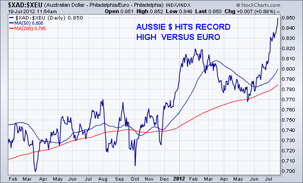
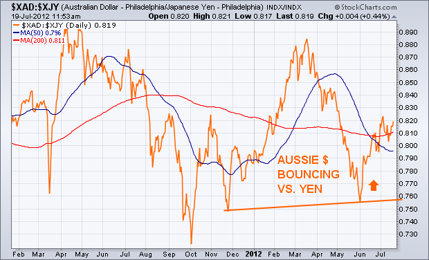
Currency trends often us something about the mood of global traders, and which way they're starting to lean. In the ongoing battle between "risk-on" and "risk-off" trades, one of the markets worth keeping an eye on is the Australian Dollar. For a number of reasons, global traders buy the Aussie when they're turning more optimistic on global stocks and commodities. That's why the recent upturn in the Aussie Dollar may be a sign of a bit more optimism among global traders. Chart 1 plots the Australian Dollar (XAD) against the U.S. Dollar over the last eighteen months. The XAD has been trading sideways over the last year. After holding above its October low, however, the XAD has just reached a new three-month high against the U.S. currency. It's done even better against the Euro. Chart 2 shows the XAD soaring to a record high against the Euro. Chart 3 shows it also bouncing against the Japanese Yen.

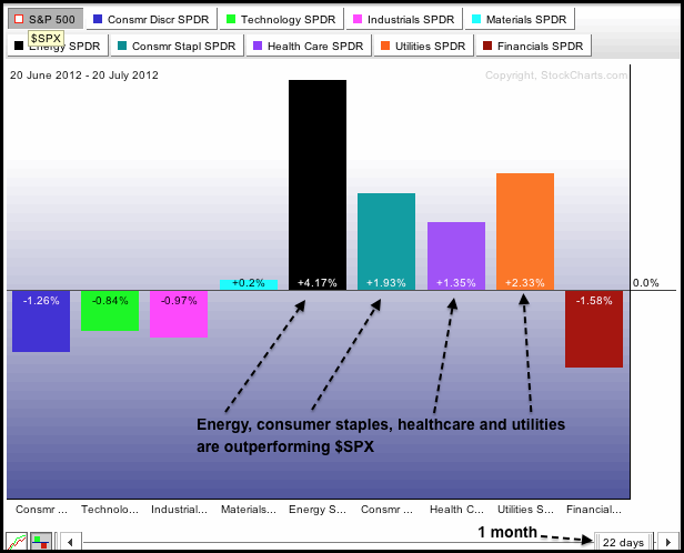
The first chart shows the S&P Sector PerfChart for the one month time frame (22 trading days) and the second chart shows the three month timeframe (64 trading days). Note that these PerfCharts show relative performance, which is the amount the SPDR is outperforming or underperforming the S&P 500. SPDRs in positive territory are leading and outperforming, while SPDRs in negative territory are lagging and underperforming. Both PerfCharts show the same picture: the offensive sectors are underperforming and the defensive sectors are outperforming. The offensive sectors include consumer discretionary, finance, industrials and technology. The defensive sectors are consumer staples, healthcare and utilities. Also note that energy is a leading sector. Relative strength in the defensive sectors indicates risk aversion and a preference for safety. Such risk aversion is negative for the broader market and could foreshadow an summer peak in the S&P 500.

Click this image for a live chart.
Good day and good trading,
--Arthur Hill CMT
Last week the Rydex Ratio was displaying very bullish sentiment, and that is still the case. In rather stark contrast AAII Investor Sentiment* (American Association of Individual Investors) reflects very bearish sentiment this week, with 22% bulls and 42% bears. The ratio of bears to bulls is 0.53.
These are levels typically seen at market bottoms, not during price advances. Looking at the chart we can see that the percentage of bulls is much lower in the last three months than it was during the first quarter. And even though the market has been rallying for about seven weeks, confidence lost during the April-June decline has not rebounded at all.
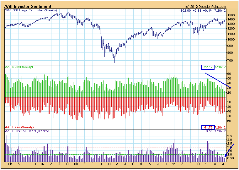
The traditional interpretation of sentiment readings is contrarian, meaning that AAII Investor Sentiment is giving a bullish signal; however, we think we should also consider that investor confidence is lower than it ought to be in the context of a rally.
(*Sentiment data is provided courtesy of the American Association of Individual Investors (www.aaii.com). Polling is conducted on the AAII web site with a Wednesday cutoff and Thursday release.)
I know many traders view the MACD to be a lagging indicator and technically it is. After all, the calculation of the MACD uses historical price data so how could it not be a lagging indicator? Well, I can only tell you that I use the MACD for advanced calls quite a bit. Recently, when crude oil was plummetting, it flashed a long-term positive divergence and VOILA! prices rebounded. You can check out my last article to see the lower crude oil prices accompanied by a higher MACD reading. The interesting part is whether the positive divergence means the selling has ended for a long period of time or just temporarily. In my opinion, the long-term divergence tells you that momentum has slowed in the direction of price TEMPORARILY. We must await additional technical signs that a more significant bottom has formed.
Let me give you a recent example. Take a look at the positive divergence that formed on Mosaic (MOS):

This chart is almost a picture perfect example of what I look for. First, note the hammer that formed on the bottom as the long-term positive divergence printed. That reversing candlestick adds to the bullishness of the technical picture. Second, once the rebound begins, I look for a move toward the 50 day SMA (point 1 on the chart), then a higher low (point 2 on the chart) before a breakout move to confirm the bottom is in. Since that pattern, MOS has been in a very bullish uptrend.
A long-term negative divergence can do the same thing, only in reverse. Once a negative divergence prints, I look for that 50 day SMA test and then see how the stock reacts. There are few areas of the market where I've seen long-term negative divergences, but the home construction area is close. Check out this chart:
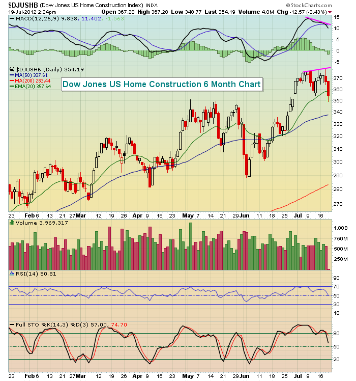
Technically, a negative divergence hasn't printed because we don't have a higher CLOSE to accompany the lower MACD. The recent highs were intraday highs and do not create the negative divergence. Remember that MACD's are calculated on closing prices, not intraday prices. But what this chart tells me is that if home construction moves to a new closing high, we should be on the lookout for a potenial near-term top, possibly more. But we'll let the technical action after the divergence forms answer that question for us.
Happy trading!
Thomas J. Bowley
Chief Market Strategist
Invested Central
www.investedcentral.com
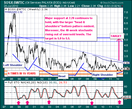
The current market environment is rather difficult to be sure; but the moving of the chess pieces underneath the market surface is what interests us at present. We are focused upon the Energy Sector (XLE) in general, and the Oil Services Group (OSX) in particular. To this end, we find OSX moving higher in absolute terms, but also poised to move higher in relative terms versus Crude Oil ($WTIC) and the S&P 500 ($SPX). Thus, we want to be overweight either the stocks that make up the OSX (SLB, BHI, NBR and others) or the Oil Services ETF (OIH).
Looking at the technicals in the Oil Services/Crude Oil Ratio (OSX:$WTIC), prices stand at 2.36, which is very close to the low range of 1.9-to-2.20 that prices have bottomed in over the past 15-years. This simply means the risk-reward is skewed towards higher prices; and indeed we find a massive "head & shoulders" bottom forming, which will be confirmed on a breakout above neckline resistance at 3.0 as well as the 600-week moving average at 2.92. This shouldn't be too difficult given the highs of the past 4-years are in the mid 3.0 range. Moreover, the 40-week stochastic reached to oversold levels, and is now rising.
Lastly, we should note that upon viewing the weekly charts of the individual stocks making up the OSX, our models are at levels back to the 2009 bottom - and they are turning higher. So, regardless of your market outlook - the trading environment for energy stocks looks to be very good indeed.
