Hello Fellow ChartWatchers!
Today I'm happy to announce that we've started rolling out several important new features for our SharpCharts charting tool. These new features include more choices for bar periods and an improved version of our interactive "Inspector" tool.
I'm even more pleased to announce that this is just the beginning of the big announcements for this upcoming week. Of course, at the end of the week we are holding our annual "ChartCon" conference here in Seattle. In addition to being a great event for everyone that attends, ChartCon provides us with a unique opportunity to annouce and demonstrate new features to a live audience of great StockCharts users.
So in preparation for ChartCon, we've been working hard to complete a long list of significant improvements to the website.
The first couple of changes happened last week when we released several new and updated color schemes for SharpCharts including our newest scheme called "Solar."
Next, we added a 2 year option to our subscription plans. These non-refundable 2-year plans drop the "per-month" cost of our service even lower by including 3(!) additional months for free. So if you use our 2-year plan for our ExtraRT service, you'll save $213.55 over the month-by-month cost. Basic members can save $103.70 via the 2-year option.
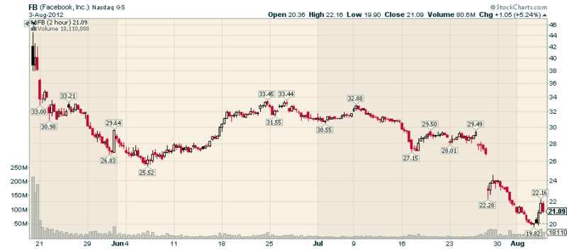
Yesterday, we added three new time period choices to SharpCharts for our members. In addition to the nine period choices thay are used to, members can now create charts with 2-minute, 3-minute, and 2-hour bars. Here's an example of a 2-hour Solar chart for Facebook going back to its IPO:
(Click the chart for a live version.)
On Monday, we plan on officially releasing a new blog called "The Best of s.c.a.n." which will contain edited "Question and Answer" articles from the "StockCharts Answer Network," our user-to-user help forum. We've combed through all of the great information on s.c.a.n. and we have selected some of the best, most informative articles that everyone should read as entries in this new blog. Again, watch for its official debut on Monday.
Now, who would like some new indicators? Well, we have 8 powerful new indicators headed your way. They should arrive by Tuesday and will be available free of charge to everyone. They are:
- Coppock Curve
- Ease of Movement (EMV)
- Know Sure Thing (KST)
- Mass Index
- Negative Volume Index (NVI)
- True Strength Index (TSI)
- Ulcer Index
- Vortex Indicator
It will take us some time to get the ChartSchool articles for these indicators created. In the mean time, you can learn more about them in Wikipedia. Again, look for them to appear on Tuesday.
What's up for the rest of the week? How about parabolas and rotating, translucent shapes in our ChartNotes tool? How about having the workbench colors match the colors on your chart? How about technical alerts? How about the ability to create your very own index? And how about a whole new service level that shatters all of the limitations of our current system?
All I can say right now is "Stay tuned!" This will be - by far - the BIGGEST week ever for StockCharts.com in terms of new announcements.
- Chip
P.S. If you live in the Seattle area and want to become a better chartist, there are still some seats available for ChartCon 2012 because of some last-minute cancellations. So, despite what it says on the website, we can still get you in if you want to sign up. ChartCon will be this Friday and Saturday in downtown Seattle. Click here for more info.
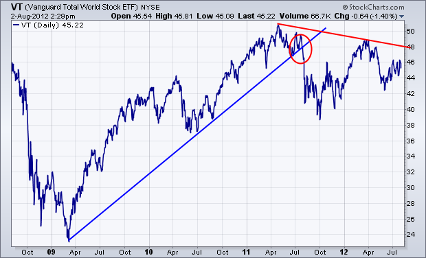
WORLD STOCK INDEX PEAKED IN 2011by John Murphy | The Market Message One of my previous messages showed a rotation out of small cap stocks into mega-caps in the middle of 2011 which continues to this day. That suggests that investors have been growing increasingly defensive over the last year. The chart below provides graphic evidence that global stocks may have actually peaked last year as well. It shows the Vanguard Total World Index (VT) since 2009. [The VT includes stocks from all over the world in both developed and emerging markets. It has a surprisingly large weight to North America (51%). Europe accounts for 22%, emerging markets 13%, and the Pacific region 12%. The chart shows a major uptrend line being broken last summer (red circle). The VT has since formed a pattern of lower peaks (red trendline). Although the U.S. stock market has held up better than other global stocks, it too is influenced by global trends. This chart isn't encouraging.
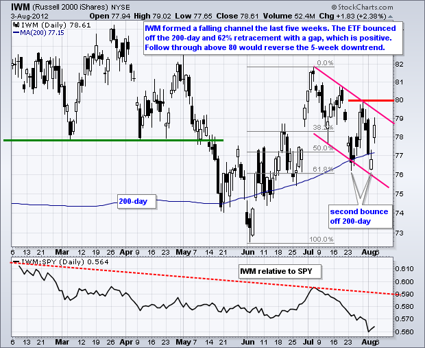
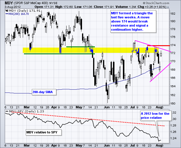
Stocks turned a negative week into a positive week with a sharp advance on Friday. The S&P 500 ETF, Dow Industrials SPDR and Nasdaq 100 ETF recouped their early week losses and exceeded their July highs. The Russell 2000 ETF (IWM) and S&P MidCap 400 SPDR (MDY), however, recovered a portion of their early week losses and have yet to exceed their mid July highs. In other words, these two remain short of breakouts and have yet to confirm strength in the other three. For now, three of the five are in clear uptrends and the bulls have the edge. I will be watching IWM and MDY to see if they can break resistance and join the rally. Relative weakness in both is casting a shadow on this bull run. The details are on the charts below.
Click this image for a live chart
Click this image for a live chart.
Good trading!
Arthur Hill CMT
WHAT IS THE PRICE OF CRUDE TELLING US?by Greg Schnell | The Canadian Technician On Thursday August 2, $WTIC crude made an interesting turn.
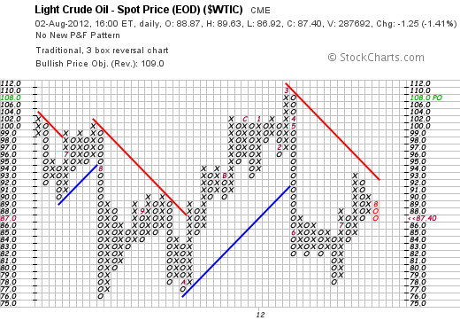
Currently crude is in a downtrend denoted by the red line.
We have started August creating a downward column of O's. The Red 8 shows the first box in August with a move of at least $3.
You can see that since June (The red 6), we were stuck in a range into July. In July (Red 7) Crude was able to push above $87. It then pulled back, roared to $93 and has since settled back to sit just around the previous support / resistance level built in June.
Upside: If Oil can rally from this level, it would be very bullish. A push through to $93 would break the downtrend line. Looking left, $93 and $94 have been resistance. A push through there would probably allow oil to surge to $102.
Downside: If Oil goes through $86, it is bearish. A break through $84 would be a bigger warning as the price has spent a lot of time there (9 X's and O's) and should have more support. Obviously the 3 O's at $82 are a significant level. We are currently in a downtrend as indicated by the red line. The $76, $77,$78 level is the major floor for this market. The last 3 years, August has been a weak month where oil pulls back and then surges into the September, October months.
Watch crude closely for hints on a major economic trend. The big picture on the chart above is higher highs and higher lows. We are just in the trading range now.
Good Trading,
Greg Schnell, CMT
Decision Point publishes a daily Tracker report of our 152 Blue Chip list. This list is composed of the stocks in the S&P 100 Index, the Dow 65, and some large-cap Nasdaq stocks. We also track the Top 10 stocks in ths list, ranked by relative strength measured by Decision Point's proprietary PMO (Price Momentum Oscillator).
I have observed this list over a long period of time, and my impression has been that the top stocks do exceptionally well during a bull market, and extremely poorly in a bear market; however, I wanted to develop a more objective way to measuring the performance of these top stocks.
To do this I constructed a "Blue Chip Top 10 Index". This is done by calculating the daily change of the Index as being the daily average percent change of the securities in the Blue Chip Top 10 list. Stocks are tracked from the day after they enter the Top 10 list through the day they drop off the list.
The Top 10 Index is equally weighted, so theoretically one could only replicate the performance of the list with real money by reallocating an equal amount to each stock each day (and somehow avoid transaction fees in the process). More to the point, the Top 10 list are a good place to look for securities that will out-perform the market, but it will be impossible for you to duplicate the Index. You could also lose a ton of money if you are long these top ranked securities during an extended market decline.
The primary purpose of the 152 Top 10 Index (BC Top 10) is to how see well these top ranked large-cap stocks are doing in relation to the broader market. Specifically, in a bull market or extended rally we expect the Index to out-perform the broad market. This is because, when stocks reach the top of the list, they tend to stay on top due to persistent upward momentum. This is a healthy condition. In an unhealthy market, stocks tend to rotate through the Top 10 rather quickly, and the performance of the index poor in relation to the broad market.
Comparing three-year charts of the SPX and BC Top 10 Indexes we can see that the Top 10 have been underperforming for the entire time. Since the June low the BC Top 10 has advance only 5.9% versus 9.5% for the SPX. And while the SPX has been trending up for the period shown, the BC Top 10 has been trending down since the February 2011 top.
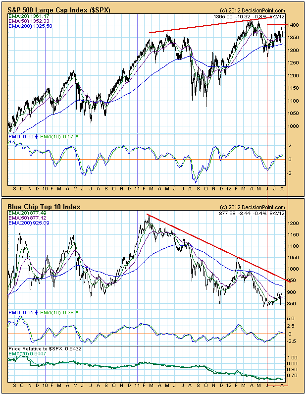
Conclusion: In spite of upward movement of the SPX, the Blue Chip Top 10 Index tells us that the leadership of the market has been rotating too rapidly, which suggests confusion and weakness. By the time a stock reaches the Top 10, it loses momentum and drops right back out again. This is evidence that for a long time the internal condition of the market has been turbulent and confusing, in spite of generally rising market prices.
Any time the S&P 500 moves to fresh new highs, I try to determine the likelihood that the move is a sustainable one. Traders need to be in the right mindset to carry prices further. They need to be aggressive in terms of where they place their trading dollars. If sector leadership comes from financials, technology, industrials and consumer discretionary, it's a sign that it's a risk-on environment, which generally is quite bullish. But as we saw in May 2011, it's never a good sign to break out with defensive areas of the market leading the way. In my opinion, market participants are not "committed" if they're only willing to invest in defensive groups.
The Russell 2000 is one of the more aggressive areas of equities to invest in. Take a look at how this group is lagging on an absolute and relative basis:
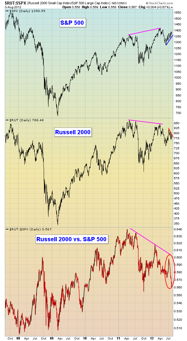
From a longer-term perspective, you can see the S&P 500 broke out in the first quarter of 2012 above the 2011 highs, but note the Russell 2000 never made that same breakout. Therefore, the bottom chart shows the relative performance of the Russell 2000 to be abysmal. On a shorter-term basis, the S&P 500 and Russell 2000 are going in nearly opposite directions with the S&P 500 climbing and the Russell 2000 weakening. What gives?
The other problem is that defensive groups are leading this rally to the upside on the S&P 500. The last time we saw this scenario in April/May 2011, it preceded a significant drop in our major indices. Check out this chart:
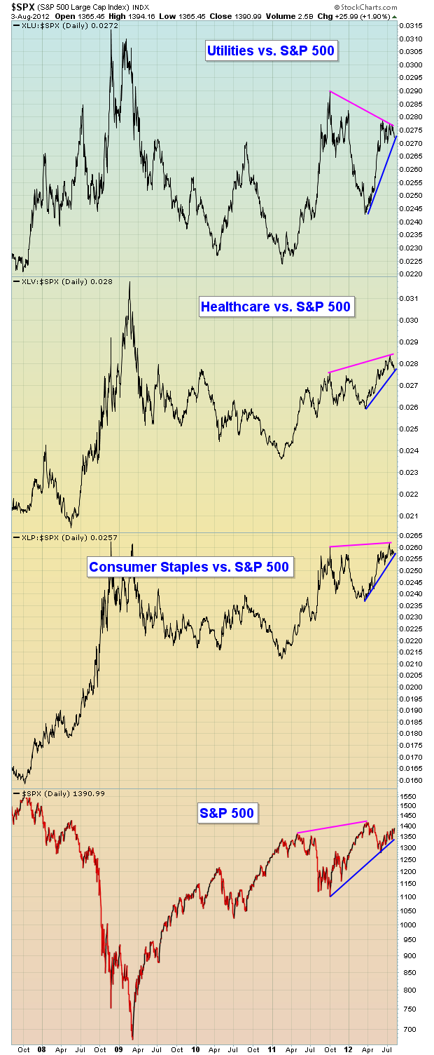
It's very unusual to see the relative strength of defensive sectors moving in the same direction as the S&P 500. If you study a chart like this over time, you'll see there is almost always a direct NEGATIVE correlation between the two. When they're both rising, we MUST take note. Will this again mark a top? It's hard to say. I remain bullish and believe we'll see another leg higher into the end of 2012 or early 2013, but short-term it's dicey with this type of relative leadership, especially since we're in the historically weak August-September period. Stay on your toes!
Listen, even in uncertain markets like the one we're in now, there are trading opportunities. We just need to make sure we monitor the reward to risk on every trade and keep our stops in place to minimize losses. One nice reward to risk trade (long-term positive divergence) to consider is featured as our Chart of the Day for Monday, August 6th. CLICK HERE for more details.
Happy trading!
ENJOY S&P 500 RALLY WHILE IT LASTSby Richard Rhodes | The Rhodes Report For now, the S&P 500 is rallying in a manner that is abrupt to say the least - several days higher, then several days lower, and then repeat. This, coupled with the European fiasco has caused investor/trader sentiment to become rather archly bearish; and therefore the short-term trend appears to be higher towards the all-time highs around the 1500 zone. Certainly the 160-week moving average defines the trend higher as it is rising; but also the 80-week exponential moving average was recent tested and held. Resistance stands at upper wedge resistance and the previous highs at 1500 - and odds are that it shall be tested sometime this fall.
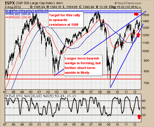
However, make no mistake about it - the highs shall prove their merit, with the pattern very similar to that of the 1970's. So, enjoy the rally while it lasts - there will be a short entry point sooner rather than later.
Good luck and good trading,
Richard