Hello Fellow ChartWatchers!
Last month we added a feature that many of you have been asking for for a long time - custom technical alerts! Today I want to spend some time showing you how they work and one of the best ways they can be used to help you make better investing decisions.
First off, let's review the typical process for investing with technical analysis:
- Use custom technical scans to search for stocks that have a chart setup that you are interested in trading.
- Use SharpCharts with your custom indicator settings to find the best scan result(s) and determine entry point and exit conditions.
- Enter the position.
- Monitor the stock for technical warning signs and/or sell signals.
- Close the position when sell signal given.
OK, so StockCharts Extra and PRO members have always had the tools to perform tasks #1 and #2. Tasks #3 and #5 are done via your trading platform. Which leaves us with task #4 - monitoring your open positions for technical warning signs and/or sell signals.
Our new Custom Technical Alert feature is intended to automate much of that task.
A technical alert is a set of technical criteria which you create (just like our Advanced Scans) that we then continually evaluate while the market is open. If the alert's criteria ever becomes true, we send you an email notifying you of that event.
So, imagine that you are a technical trader who thinks that the Parabolic SAR gives a great set of signals for tech stocks in the S&P 500. (This is a simple example for the sake of this article - real trading signals are often more complex.) Whenever you are out of the market, you are using your trusty Parabolic SAR scan to find opportunities to get back in. Here's what that scan might look like:
[group is SP500] and [group is TechnologySector] and [Today's Low x Parabolic SAR(0.02,0.2) ]
This scan finds all large-cap technology stocks that just had the dot for today's Parabolic SAR move below today's price bar - the standard (simple) Parabolic SAR signal. (Remember, the "x" in the middle means "crosses above" in our scan system.) When I run that scan for today (Sept. 1st, 2012) I get 5 results: CERN, GLW, LLTC, MSFT, and SAI.
For Task #2, you'd use our SharpCharts charting workbench to examine each of those 5 stocks in greater detail. For the purposes of this article, let's say that after you studied all 5, you decided you really liked the chart for CERN:
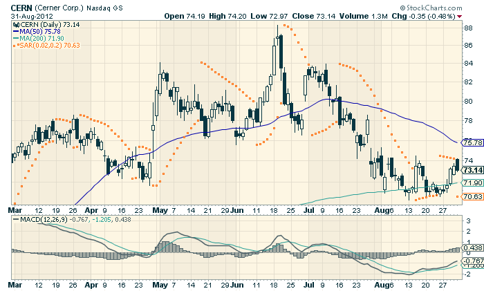
Click here for live version of this chart.
So, you then do some more analysis with that chart to determine your entry strategy, your stop locations and your exit strategy. (Dr. Elder's eBook in our bookstore is a great place to learn more about this part of the process.) You then - task #3 - place an order with your broker to buy the stock.
Terrific! All finished. Right?
No. Now, with custom technical alerts, you can finally automate task #4 - the monitoring process.
For our example, let's assume that you plan on holding CERN until the Parabolic SAR gives a sell signal (which happens when the dots first move back above the price bars). In other words, you want to be notified when the following condition is true:
[symbol = 'CERN'] and [Parabolic SAR(0.02,0.2) x Today's High]
The first part of this alert expression ties our alert to the only stock we are interested in monitoring, CERN. The second part of this alert expression is essentially the opposite of the scan expression that you used to find the stock during task #1 above. It will be true when the Parabolic SAR's dots move back above the price bars - which is our sell signal.
To enter that alert into StockCharts, Extra and PRO members can login and use the new "Technical Alert Workbench" via the link on the "Members" page:
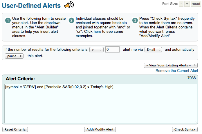
Simply enter your criteria and then click "Add/Modify Alert" to add the new alert to our system. You'll want to give your alert a name that matches what it looks for - something like "CERN Parabolic Sell Signal" in this case.
That's it! Once an alert has been added, we will continuously run the alert until its expression(s) become true. In this case, we will run the alert until the expression returns more than zero results. Once that happens, we will send you an email automatically.
Pretty neat huh?
There are some things to keep in mind when using our technical alerts:
- Extra and ExtraRT members can have up to 5 custom alerts saved in our system at any one time. PRO members can have up to 50.
- Just like our custom technical scans, our alerts are based on daily data bars. That means that you need to express your alert in terms of the technical conditions that happen on a daily chart.
- Because our alerts are based on daily data, they can only be triggered once per day. When a signal appears on a daily chart, we will alert you at that point. If, later in the same day, the signal disappears and then reappears a second time, we will not alert you about that second occurance.
- Alerts are typically associated with one ticker symbol (as shown in the example above). If you create an alert that applies to multiple ticker symbols, the alert email is not able to show you which ticker symbol(s) triggered the alert. In that case, you would need to re-run your alert criteria as an Advanced Scan to see those results.
- Unlike scans, saved alerts are continually evaluated by our servers. All saved alerts are re-evaluated at least once every minute the market is open. This makes it important that you pause/delete alerts that you are no longer interested in.
- We also publish many Predefined Alerts on this page. Predefined Alerts also generate Twitter messages with the hashtag #sccalerts when they occur.
The scenario I described above is the "standard" scenario for which we designed our technical alerts feature. That said, there are a couple of other very interesting ways this new feature can be used. Check out my blog over the next week or so for more examples and ideas on using custom technical alerts.
- Chip
My Tuesday message expressed the view that if a stock correction were to
start, this would be a logical spot for that to happen. That's
because several market indexes are testing spring highs, which is a
normal spot for chartwatchers to take some profits. I also warned that
light volume during the latest price advance during August showed lack
of bullish enthusiasm on the part of traders (who may be be paring their
bullish bets as the market nears the dangerous month of September).
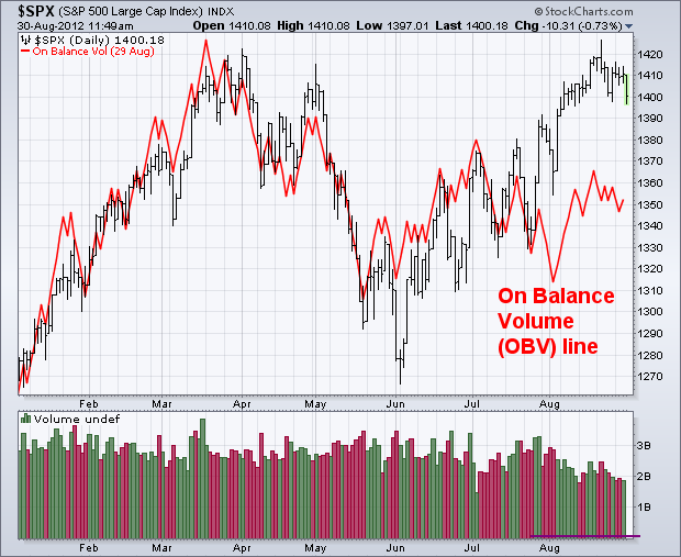
Light volume during a price advance is a warning signal. The volume
bars at the bottom of Chart 1 shows trading activity dropping noticeably
during the second half of August. In addition to that visual
comparison, there are a couple of volume indicators that show the same
lack of strong upside buying pressure The best known is on balance volume (OBV).
OBV is a cumulative measure of daily upside versus downside volume.
When prices rise, that day's entire volume is added to the total.
Volume is subtracted on down days. The OBV line and the stock index
price should trend in the same direction. A danger signal is given if
the OBV line lags too far behind (or actually starts to drop). Chart 1
compares the S&P 500 (bars) to the red OBV line since the start of
the year. Both peaked together during March and bottomed during June
(notice that the OBV line turned up first). Since that June bottom,
however, the red OBV line has lagged far behind the S&P 500. That
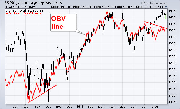
has created a "negative divergence" between the two. Chart 2
compares the two over the last 15 months. Notice that the red OBV line
turned up first last August and preceded the S&P bottom by two
months (rising trendline). The opposite is now happening. The
falling trendline this summer shows that the OBV may start leading
stocks lower.
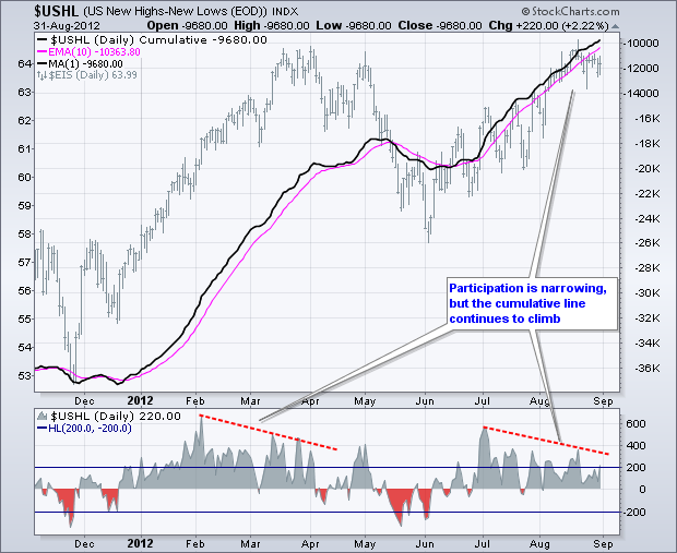
Even though the S&P 1500 Index ($EIS) is trading near its spring highs and within a few percent of a 52-week high, Net New Highs have shown less strength since early July and divergences have formed. Keep in mind that less strength is not the same as weakness. New highs are still outpacing new lows, just at a lesser rate. The chart below shows US Net New Highs ($USHL) in the indicator window, the cumulative Net New Highs line in the main window and the S&P 1500 Index. $USHL equals NYSE and Nasdaq new highs less NYSE and Nasdaq new lows. Think of it as new highs and new lows for the market overall. The S&P 1500 Index combines the S&P 500, S&P MidCap 400 and S&P SmallCap 600 into one large index.
Click this image for a live chart.
Net New Highs remain bullish overall, but a bearish divergence is brewing and this should be watched closely. Notice how US Net New Highs peaked near +600 in early July and then formed lower highs. Even though the index is up significantly since early July, Net New Highs have not expanded past +400 since early July. This indicates that participation in the advance is narrowing. Nevertheless, the bulls still have an edge as long as new highs outpace new lows. The cumulative Net New Highs line continues to rise and remains above its 10-day EMA. A break below this moving average would reflect an increase in new lows and turn the indicator bearish.
Have a great Labor Day weekend!
--Arthur Hill CMT
The Canadian mining stocks appear ready to roll over.
It is quite surprising that they've not been able to rally given the recent weakness in the US Dollar. With the move down in the US dollar, we would've expected the value of the metals and the associated miners to move up but that just isn't happening. Check out this chart to see what I mean:
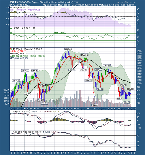
This hardly looks like a bull run off the June lows. While the weekly bars have moved a little higher, they have not moved up enough to turn the Elder Impulse System from blue to green, nor has the Full Stochastic line moved up. The MACD and Ultimate Oscillatior are slowly improving, but the RSI and relative strength lines at the top of the chart have gone sideways. If Canadian miners were really rallying, the weekly technical signals would be much more positive.
For all those reasons, caution appears warranted. A case can even be made that the 750 level makes a nice head/shoulders neckline on a long term chart!
Greg Schnell, CMT
The
National Association of Active Investment Managers (NAAIM) weekly
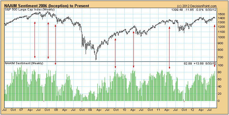
poll* shows that they are 83% long. This qualifies as an extreme level
of optimism, and should cause concern.
On
the following chart we can see that readings above 80% are not a magic
number or an automatic sell signal; however, when sentiment reaches that
level, we should begin looking for at least a brief correction. (Note
that we have not identified every reading over 80% but have placed
markers to provide points of reference.)
This
spike of optimism comes as we are entering the September-October time
period, the most seasonally negative two months of the year. We do not
view this as a happy coincidence.
* NAAIM sentiment polling is conducted by The National Association of Active Investment Managers (www.naaim.org). Cutoff for the poll is Wednesday, and the results are released Thursday.
Approximately 40 NAAIM member firms who are active money managers are
asked each week to provide a number which represents their overall
equity exposure at the market close on Wednesday. Responses can vary
widely as indicated below. Responses are tallied and averaged to provide
the average long (or short) position or all NAAIM managers, as a group.
Range of Responses
200% Leveraged Short
100% Fully Short
0% to 100% Cash or Hedged to Market Neutral
100% Fully Invested
200% Leveraged Long
Before I take a look at the bigger picture, there were a couple rather bullish signs on the one year chart for gold the past few weeks. Take a look:
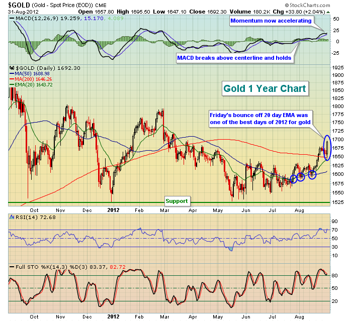
After testing descending triangle support (you'll see that in the 5 year chart below) in mid-May, gold began its ascent. Higher lows continued to print and the reaction high near 1640 in early June served as solid price resistance for the last few months. But you can see the subtle improvement in technicals in late July and early August (blue circles). The first blue circle highlights the 20 day EMA crossing above the 50 day SMA (golden cross). The next two blue circles show that the moving averages are acting as support - a bullish development as well.
Momentum has clearly swung to the bullish side. The daily MACD broke above centerline resistance in late July and it's continuing to push higher with higher prices, a classic case of accelerating momentum.
The best news of all, however, is that the long-term five year weekly chart has been in a bullish continuation pattern that has now confirmed a breakout to the upside. Check this chart out:
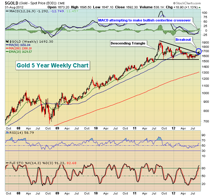
From this chart, it's much clearer to see how important that kicksave at support in mid-June was. It enabled gold to remain in its descending triangle pattern. I'd much prefer to see an ascending triangle vs. a descending triangle, but triangles represent continuation patterns. Because the prior trend was UP, I've been awaiting a breakout to the upside and it appears that's exactly what we've seen from gold.
Happy trading!
Thomas J. Bowley
Chief Market Strategist
Invested Central
http://www.investedcentral.com