Hello Fellow ChartWatchers!
The Fed spoke and the markets took off. StockCharts.com was one of the best places to watch as stocks surged in the wake of the Fed's QE3 announcement. You can read more about how it affected things from the rest of the columnists in this week's newsletter. As for myself, I'm going to talk about how you can now create and chart your own personal Bullish Percent Index with StockCharts.com.
MY OWN "SMALL CAP" BPI
In case you haven't heard, Bullish Percent Indexes are one of the best ways to measure the strength of a group of stocks. A BPI is a daily market indicator that shows the percentage of stocks in a group that have bullish looking Point & Figure charts. To compute a BPI, each day you count up the number of stocks in your group that currently have the "P&F Buy Signal" pattern on their P&F chart. You then divide that number by the total number of stocks in your group and multiply by 100 to get the BPI value for the day. After gathering these values for many days, you can then chart the results to get a sense of how strong the group has been over time.
We here at StockCharts have been automatically calculating 19 different BPI's every day including $BPNYA (the BPI for all NYSE stocks), $BPCOMPQ (all Nasdaq stocks), $BPTSE (all Toronto stocks), and many others.
But what if you want to chart a BPI for a group of stocks that we don't cover? Now, with the User Defined Index (UDI) feature of our PRO service, you can!
You start by creating a group of stocks that you want to use for your BPI. You can choose from some of our predefined stock groups or you can create a ChartList in your account, add whatever symbols you want, and use that as your group. For the sake of this example, I'm going to use the 600 stocks in the S&P Small Cap index to create my own "Small Cap" BPI.
Once you have a group in mind, you can use our Advanced Scan Engine Workbench to create a scan that shows you how many stocks in your group have a P&F Buy Signal. Your scan should have two clauses, one for your group / ChartList, and one for the P&F Buy Signal. Here's an example:
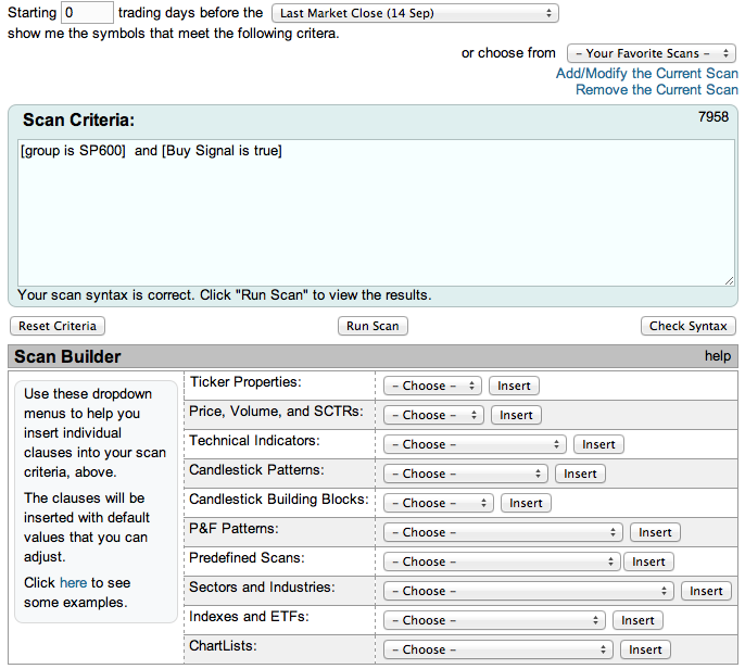
You can use the "Sector and Industries" dropdown, the "Indexes and ETFs" dropdown, or the "ChartLists" dropdown to help you create the first clause in the scan. You then use the "P&F Patterns" dropdown to add the "P&F Buy Signal" clause to the end of the scan.
Now, make sure that you have a zero in the "Starting" box at the top of the scan page and that "Last Market Close" is selected from the top dropdown, then press the "Run Scan" button. You should then see a page full of scan results. For the BPI calculation, you only need to see the "Count" of the scan results - i.e., the number of stocks that was returned. In the case of the scan I showed you above, the count is 412.
To calculate the BPI value for today, you take that count and divide it by the total number of stocks in your group, then multiply it by 100. In my example, Friday's BPI value turns out to be 68.67.
For safety sake, I recommend that you write down that value and the date that it corresponds to (Sept 14th in this example) on a sheet of paper in order to make sure your work isn't lost. Later, we'll enter that information into your User-Defined Index area.
Now, knowing today's BPI number is useful, but we'd love to see a chart of recent BPI data for our group in order to see if any trends exist. To "back-calculate" BPI values for previous days, we simply change the number in our scan's "Starting" box, re-run the scan, and recompute the BPI value for that day.
Note - It's important to record the calendar date for each BPI value you calculate. It make that easier, you can use the popup calendar that automatically appears when you click inside the "Starting" box.
Continuing our example, when I change the "Starting" box to "1" and re-run the scan, I get 400 results. So I record 400/600 = 66.67% as the value for Sept. 13th, 2012. I get 390 stocks for Sept. 12th, 388 for the 11th, 387 for the 10th, and 380 for the 7th.
Feel free to go back as far in time as you'd like but keep one thing in mind - if your group is a sector or index that changes its membership over time, the further back in time you go, the less accurate your "back-calculated" BPIs will be because you will still be using the current group membership.
Once you have a nice amount of BPI values written down, it's time to enter then into your User-Defined Index (UDI) symbol (typically called @MYINDEX) so that you can chart them.
To enter your data into @MYINDEX, go to the "Members" page and click on the link for the "User Defined Index Workbench." Once there, click on "Delete All Data" to get rid of any previous data you had in @MYINDEX and then start entering the BPI dates and values that you wrote down in the previous step.
Note: You only need to enter the date in the "Date" field and the BPI value in the "Close" field. Leave the other field blank and hit "Add Row." We'll automatically fill in the other rows.
After your data is entered, press the "View Chart" link to see the results. For our "Small Cap BPI" example, here's what I got after back-calculating date back to the start of August:
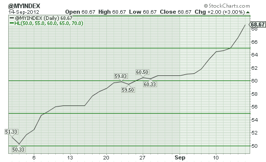
So this shows that the small-caps have strengthened significantly since August 1st confirming similar strength seen in charts of $SML and $RUT.
The larger point here is that PRO members can create and chart BPIs for any collection of stocks they find interesting using these techniques. The even larger point is that PRO members can create and chart any index they want, not just BPIs.
- Chip
Have you used our User Defined Indexes to create a new / unusual / unexpected kind of chart? If so, let us know about it and we may feature your work in a future article.
The Fed announced that it will purchase $40 billion a month in mortgage
backed securities which adds to its holdings of long-term securities and
ushers in another round of quantitative easing (QE3). The markets
have all reacted in predictable fashion. The dollar and bond prices
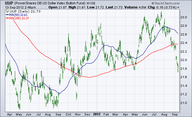
are falling while commodities and stocks are rising. Chart 1 shows
the PowerShares Dollar Index Bullish Fund (UUP)
threatening to fall below its spring lows. As is normally the case,
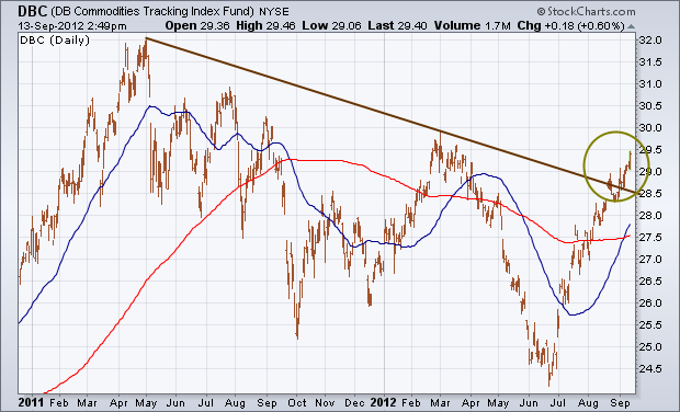
the falling dollar is giving a strong boost to commodities. Chart 2
shows the DB Commodities Tracking Index Fund (DBC)
climbing to the highest level in six months. It has also broken a down
trendline extending back to May 2011. Not surprisingly, precious
metals are leading the commodity charge. Economically-sensitive
industrial metals are also rallying.
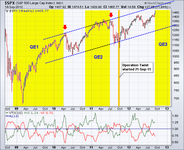
Stocks surged on Thursday after the Fed announced another round of quantitative easing, and extended their gains on Friday. Obviously, the stock market is pleased with the announcement. The chart below shows the S&P 500 since September 2008 and the yellow areas mark the beginning-end of the prior quantitative easing programs. Even though two QE cycles are not enough to establish a trend, notice that the stock market rallied during the prior two QE periods and fell sharply when they ended (red arrows). Of course, the S&P 500 was up substantially before these declines and ripe for a correction. More importantly, the index established a higher low after each decline and subsequently advanced to new highs. As the blue channel lines show, the trend is clear on this chart. Even though chartists can debate whether or not the index is overbought and ripe for a correction or pullback, there is no arguing the uptrend. Anything trading at a 52-week high is in an uptrend.
Click this image for a live chart.
The indicator window shows the Vortex Indicator, which is new at StockCharts.com. This indicator combines elements of the Average True Range (ATR), Plus Directional Movement (+DM), Minus Directional Movement (-DM) and the properties of a vortex flow. See the ChartSchool article for the all the gory details. This indicator consists of two lines: a green line to measure upward price movement and a red line to measure downward price movement. The bulls have the edge when the green line is above the red line. The bears have the edge when the red line is above the green line. As with all indicators, it is not immune to whipsaws and bad signals. The Vortex Indicator is helpful for trend identification because it is unambiguous. Either the green line is above the red line or it isnât.
Have a great weekend!
Arthur Hill CMT
Living in the Washington DC area, I'm not sure which was more exciting - QE3 or RG3!
The market was set up for higher prices as traders anticipated more quantitative easing. Fed Chairman Bernanke did not disappoint. By providing a third round of quantatative easing, the Fed aims to stimulate our sagging economy and boost employment. Traders saw an opportunity and endorsed the plan by buying equities and commodities and bailing out of the dollar and treasuries.
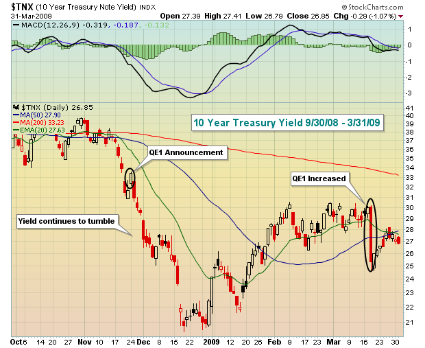
When QE1 was announced in 2008, the treasury market was caught off guard and rates fell precipitously after the Fed announcement with traders flocking into treasuries. A few months later, when QE1 was increased, again traders flocked into treasuries with the yield tumbling 50 basis points the day of the announcement. Take a look:
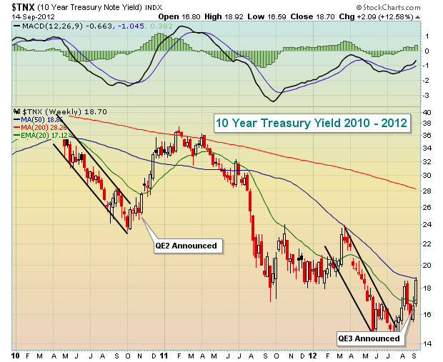
Traders did a much better job anticipating QE2 and QE3, however, with rates tumbling BEFORE the announcements. Check out how far yields had fallen ahead of the QE2 and QE3 announcements:
I've been expecting QE3 for months. The money that poured into treasuries and equities simultaneously nearly guaranteed it. Both the treasury market and stock market sent the Fed the message that further help was needed. And on Thursday, the Fed delivered and global markets soared.
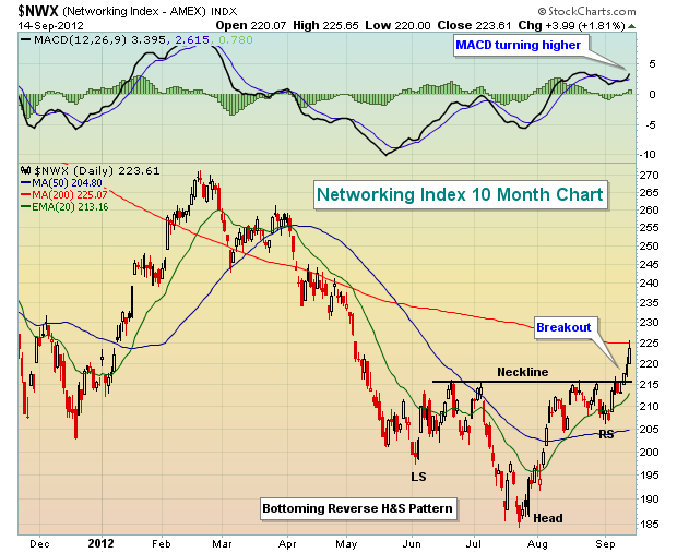
Nearly every area of equities benefitted, but the falling dollar had an exceptionally bullish effect on energy and materials. If QE3 works as intended, our economy should improve and riskier areas like technology should see rapidly rising EPS. And it's a subcomponent of technology - networking - where I saw confirmation of a bottoming pattern this past week. Technically, few areas have as much upside as networkers because they haven't really participated in prior 2012 rallies. Here's the bottoming pattern:
Several networking stocks look solid technically, but I have my eye on two in particular. For more details on these two stocks,
CLICK HERE.
Happy trading!
Well, finally the past economic/political week has passed, and we find ourselves starting down the barrel of QE-3. There is no need to go into the particulars of QE-3, but suffice to say that the Fed is buying mortgage-agency debt rather than adding to their Treasury debt holdings. This put downward pressure upon agency debt yields of course, but then it also provided for a rally in both the 10-year note yield as well as the 30-year bond. Our interest lies in rally in the 30-year bond, for it would appear that the long bear market of a decline in yields is "over", which in our mind is a "watershed" event that means higher Treasury rates for the months and years ahead.
If we look at the monthly chart of the 30-year bond ($TYX), then we find previous support at 2.50% has held; we find the distance below the 115-month moving average tested its -40% oversold level and bounced - and we are starting to see the 14-month stochastic turn higher. This all argues for higher bond yields. But what we find more than a passing interest, is that since QE policy moves have come into being since 2008 - each and every announcement always led to higher yields and a test of the 115-month moving average. If that is the case now, then we'll see the 30-year bond move from 3.08% upwards of 4.37% in the months ahead.
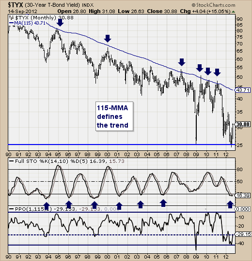
Now, we aren't worried about this yet, for market participants will use any rally in bond yields as "fuel" for the stock market. However, the higher the 30-year goes, and the speed at which it gets there - if too fast - then will certainly cause concern at the Fed as well as on Main Street. Higher rates are not what the Fed wants, but at this juncture - it would appear this could be the "unforeseen" consequences of stepping on the QE gas pedal.
Enjoy while it lasts; higher rates are going to be with us for many years into the future.
Good luck and good trading,
Richard