Hello Fellow ChartWatchers!
We've had interactive, Java-based PerfCharts going back to the very start of the website. And while those PerfCharts are very useful, they do have some limitations. For one, members cannot save them into their accounts. Also, our interactive PerfCharts cannot be annotated with our ChartNotes annotation tool.
Today, I'm pleased to announce a new feature for all StockCharts.com users - our new Performance Chart Workbench. It makes it very easy to create, annotate and save performance charts based on our SharpCharts charting engine. In addition to being much easier to use, these PerfCharts also have the "baseline" feature that our regular SharpCharts Performance charts do not have.
One of the key things this new workbench allows is the ability to create, annotate and save a Performance Chart that compares the year-to-date performance of the major markets. Here's an example:
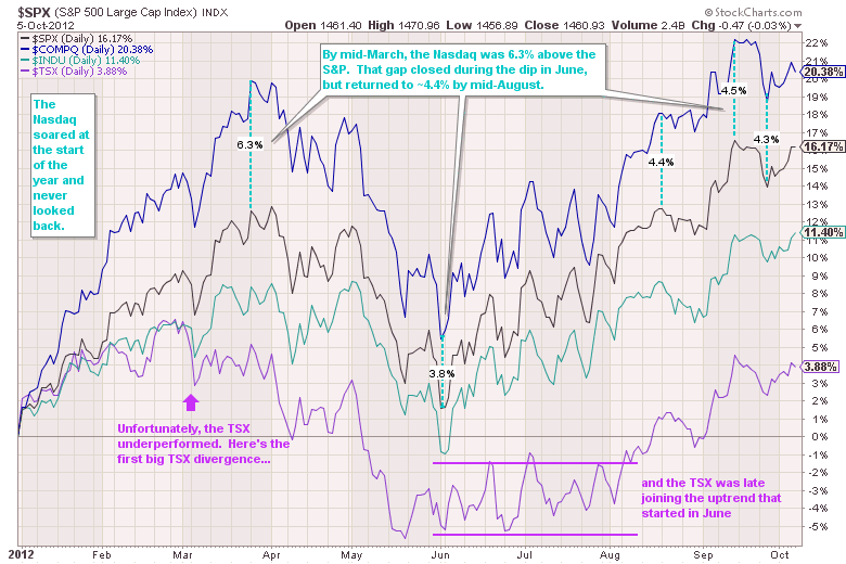
Click here for a live example of this chart using the new workbench.
(Did you notice the new percent measuring annotation I used on that chart?)
And now our PRO members - who can add up to 10 different tickers to one chart - can now easily duplicate our S&P Sector PerfChart using this new workbench and then annotate and save the result. Just like so:
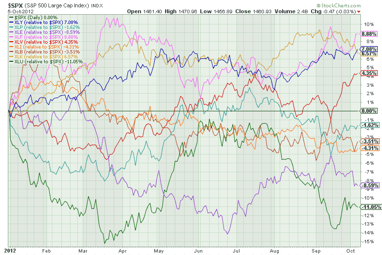
PRO members can click here for a live version of this chart.
Notice how that chart uses $SPX as the baseline - i.e., the performance of $SPX is subtracted from the performance of all the ETFs so that the S&P 500 forms the zero line on this chart.
To create your own SharpChart-based PerfChart, simply enter more than one ticker symbol into the "Create a Chart" box at the top of any of our web pages. Separate your symbols with commas and then press "Go" to see your chart.
Enjoy!
- Chip
TIPS AND GOLD RELINK AFTER QE3by John Murphy | The Market Message Two of the top performing assets since the September 13 launch of QE3
have been Treasury Inflation Protected Securites (TIPS) and gold. That
makes sense considering that both are used as hedges against inflation.
The fact is that both markets have had a strong correlation over the
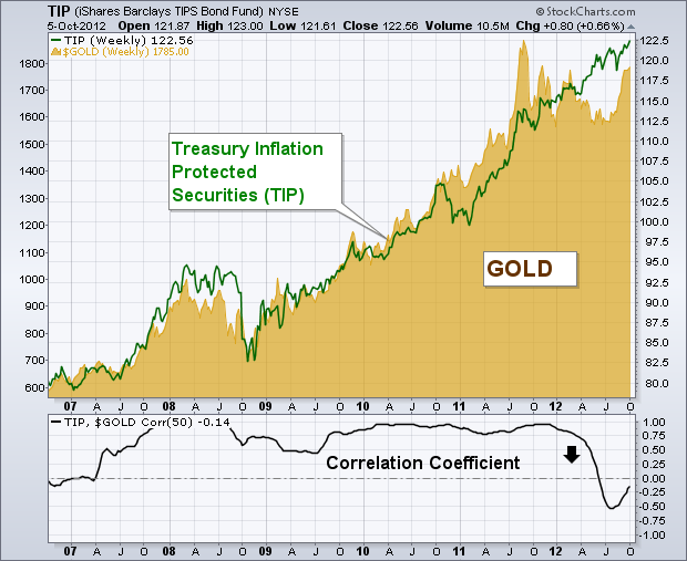
last decade. Chart 1 compares the performance of gold and the Barclays TIPS Bond Fund (TIP)
over the last six years. That visual link between the two markets is
confirmed by the Correlation Coefficient (below Chart 1) which was well
into positive territory between 2007 and 2011. Their correlation
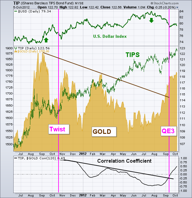
weakened during 2012 (down arrow). Chart 2 shows the two markets
diverging over the last year. While TIPS continued rising, gold
prices fell. Gold's weakness appears to have been the result of a
rising dollar (top of chart). The Correlation Coefficient (below
Chart 2) turned up during September and has turned positive. Both
markets are rallying together again. A lot of that has to do with QE3.
The two purple lines show the launch of Operation Twist last October
(first line) and QE3 on September 13 (second line). Both markets
turned up during August in anticipation of QE3, and were two of the
biggest gainers when it was launched. TIPS hit a record high during
September, while gold broke a major down trendline. QE3 also weakened
the dollar which gave a boost to gold and other commodity markets.
Another effect of quantitative easing has been to push Treasury bond
holders into higher-yield assets like high yield and investment grade
corporate bonds and dividend-paying stocks. Meanwhile, Treasuries
have become the weakest part of the fixed income group. That's due to
historially low Treasury bond yields and fears of inflation further
down the road. That's why investors are buying TIPS and gold.
SOARING GAS PRICES IN CALIFORNIAby Carl Swenlin | DecisionPoint.com According
to a news clip I just saw, there is a gas station in the Los Angeles
area currently selling regular gasoline for $5.58/gallon. Some gas
stations are shutting down because the owners don't want to buy gas at
these prices for fear that they won't be able to sell it. Prices have
been moving higher over the last few months, but the recent increases
have fallen like a ton of bricks on consumers.
My
immediate response was to check the charts for crude oil and gasoline.
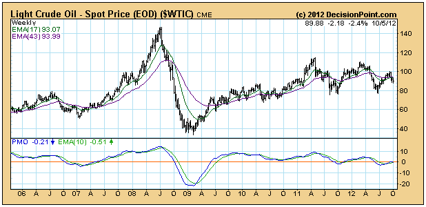
We can see from the weekly charts that crude is about midway its
five-year range, and has most recently been trending downward.
The
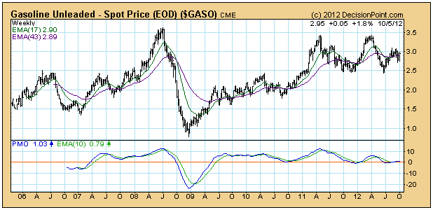
chart pattern for gasoline is not suprisingly similar to crude;
although gasoline is closer to the top of its five-year range.
Nevertheless, it too has been trending down recently. So on a national
basis it is not the price of oil or gas that is the culprit behind
California's gas crisis.
The
problem it seems is that the fragile infrastructure for gasoline
production and delivery in California has taken a few hits that have put
a crimp in the figurative pipeline. Primarily supplies are drying up
because of refinery outages.
Of
all the articles I have read on this subject I have not seen a single
chart. My purpose in writing this article was mostly to present the
charts to people who may be following this story. A lot of inorrect
assumptions and conclusions can be avoided by simply looking at the
charts first. And we can clearly see that the price increases for gas in
California are not related to a sudden rise in crude prices.
FOURTH QUARTER OUTLOOKby Tom Bowley | InvestEd Central To be honest, I'm not a big fan of providing outlooks too far into the future because prices change continually. As a technician, I realize charts can change daily. Therefore, I have to be willing to change my thinking on a dime and, if you're managing your own money, you should too. But I do like to evaluate the likelihood that a trend, either up or down, is sustainable. With that in mind, let's take a look at gold. A little over a month ago, I wrote about the "gold rush" being on. Since that time, gold has risen another $100 per ounce, or roughly 6%. I remain bullish on gold for the intermediate-term - perhaps 3 to 6 months - but short-term gold now has a few technical issues to deal with. Take a look:
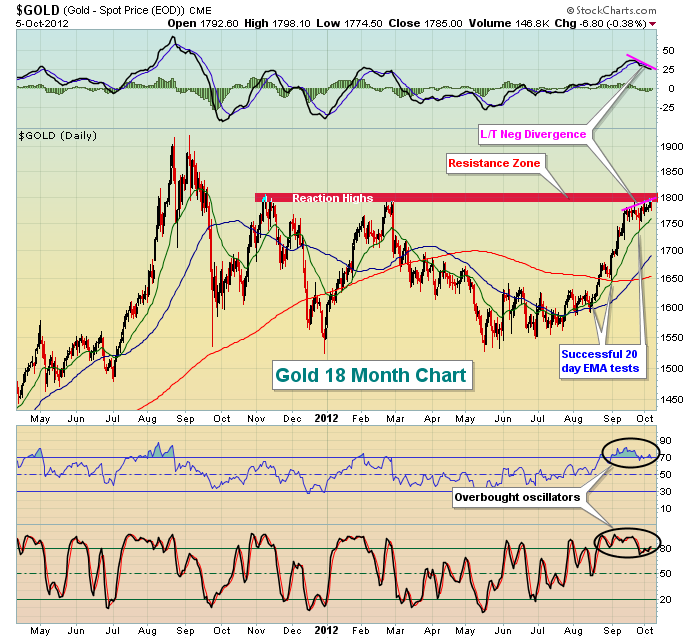
First, gold is definitely overbought, so a near-term unwinding of both the RSI and stochastic is to be expected. Second, a fairly significant area of price resistance has been reached. The reaction highs in November 2011 and February 2012 both failed between $1790 and $1810 an ounce. We saw three intraday highs last week in the $1790s. Finally, traders need to deal with slowing momentum. Take a look at the chart above and check out the lower MACD reading with the higher price action. That long-term negative divergence does NOT guarantee a pullback in price, but it does indicate the RISK of a pullback has increased. The fact that this slowing momentum is occurring simultaneously with price resistance makes it difficult to take any further long position in gold until one of two things happens. I either want to see (1) a 50 day SMA test and a MACD centerline test to "reset" this momentum oscillator, or (2) I want to see the breakout above price resistance. I'm not going to assume gold will rally right through resistance, especially when technicals are telling me that upside momentum is slowing.
On Monday, October 8th at 4:30pm EST, I will be hosting Invested Central's "State of the Market" online webinar where I'll discuss the fourth quarter prospects of gold and equities in general. This webinar is reserved for annual members of Invested Central, but we always provide new annual members a 7 day, no-questions-asked Money Back Guarantee. So if you'd like to attend this event,
CLICK HERE for further details.
Happy trading and Happy Thanksgiving Canada!
Thomas J. Bowley
Chief Market Strategist
Invested Central
Quite simply, a bear market has ended, and a bull market has begun in the Natural Gas market. This has been quite some time in the making, for the relationship between natural gas and crude oil has been skewed for a number of years in favor of natural gas. Now, we feel confident in the fact that the trend has changed in favor of natural gas on both an absolute and relative basis versus crude oil as well as the S&P 500.
Perusing the weekly Natural Gas chart, one can easily see that the simple downward sloping trend-line was violated after several touches. This simple, but elegant breakout suggests prices are headed higher over the next several years, with the 155-week moving average at $4.00 being the first target, with the $5.00 to $6.00 zone being the intermediate-term target. And, over time - given the relative valuation versus crude oil - we could very well see the highs challenged.
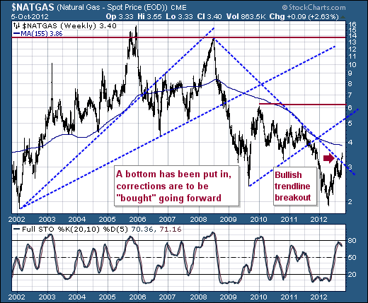
With that said, "natty" is a very volatile futures contract to trade, but there are various ETFs available to take advantage of this price rise. However, we'll urge some caution, for the "roll" between months tends to be unfavorable. One only remember trading the Natural Gas ETF (UNG) over the past several years to see the "roll" work against you. At some point, and we think that point is soon - it shall work in one's favor.
In any case, getting the "natty" trend right is paramount; with natural gas stocks such as Devon Energy (DVN) being a good proxy. Keep it simple: buy corrections against the main trend...and enjoy the ride.
Good luck and good trading,
Richard