Hello Fellow ChartWatchers!
Long-time ChartWatchers know that from the very beginning, StockCharts.com has been about the synergy of three things: Great online finanical analysis tools, Great educational content, and Great market commentary that brings it all together. Today, I'm happy to announce a significant expansion to our StockCharts University (SCU) seminar series that will bolster our educational efforts tremendously.
At this point, we've held three seminars with our initial SCU class - "Using StockCharts.com Successfully" - and all of them were very positively reviewed by the people that attended. Our latest event - in New York last week - was our most successful yet. Based on that success, we have designed a complete set of SCU courses that can help everyone regardless of their experience level. Here's what it looks like:

The chart above shows how each class builds upon the previous one, increasing both your knowledge of the tools as well as your ability to use technical analysis successfully in your investing. The 100 level classes give you a core understanding of how to use StockCharts.com, the 200 level classes classes focus on increasing your knowledge of technical trading, and the 300 level classes help you master specific, high value skills.
We will be giving these classes on a regular basis at locations throughout the US and Canada. Currently, we have the 101 class scheduled for Dallas, Orlando, and Calgary. We expect have additional classes in Los Angeles, Seattle, New York and Toronto later in 2013.
In addition to giving you the training you need to be successful, these classes are a great value because they include 3 months of our Extra service, the latest eBook from Alexander Elder, a DVD of the SCU 100 class ("Foundations of Technical Investing"), a StockCharts flash drive, and more. You also get to talk directly with the instructor about any issue you are having with the website.
Currently, I'm personally teaching the 101 classes, Over time the plan is for Greg Schnell - the author of our Canadian Technician blog - to teach the 100 level classes so I can present the 200 level classes. In addition, through the magic of the Internet, John Murphy makes a "virtual" appearance at these classes whenever possible.
You can learn more about our upcoming seminars - including the very special one Greg Schnell is giving in Calgary - by clicking here.
On a personal note, I'd love to see you at one of these events so we can meet and talk about how you can use StockCharts.com to its full potential. I hope to see you soon.
I'll conclude with a quote from Dave K. after he attended our SCU 101 class in New York last week:
"I've been using Stockcharts for a couple of years and wanted to see its full range of capabilities. The Stockscharts University seminar was perfect for this, and the material was presented in a cogent and interesting way. Back on the desk I immediately began using new functions I learned and I'm sure it will improve my trading decisions. All in all a day very well spent, and highly recommended."
Thanks Dave! Again, click here for more information on SCU.
- Chip
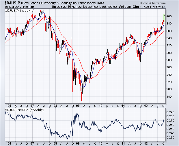
Insurance stocks are attracting a lot of new money into a reviving financial sector. Chart 1 shows the Dow Jones US Property & Casualty Insurance Index
surging to the highest level in five years. Its relative strength
line (below chart) is starting to break out to the upside. The main
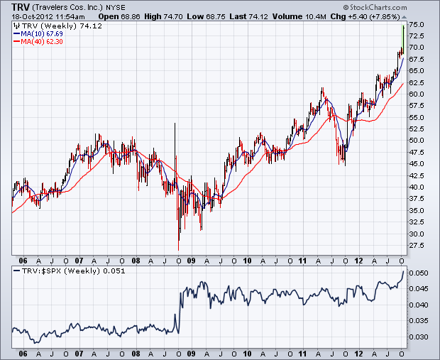
catalyst behind today's buying is coming from Travelers. Chart 2 shows
Travelers (TRV) surging to a new record high. New records are also being hit by Ace and Chubb.
As good as their performance is, many investors may shy away from
buying them because they've already had a strong run. Fortunately,
there's another insurance group that's starting to attract new money,
but looks a lot cheaper.
Weakness in the technology sector has been offset by strength in the finance sector since early September. This is why the S&P 500 is range bound the last five weeks and the Nasdaq is in a downtrend. With these two sectors cancelling each other out, chartists must turn to another sector to break the deadlock. My vote goes to the consumer discretionary sector because it is the most economically sensitive sector. One could also consider the industrials sector because it supplies companies with capital-intensive goods and services needed for their operations. Both sectors are clearly important to the economy and the broader market.
Click this image for a live chart.
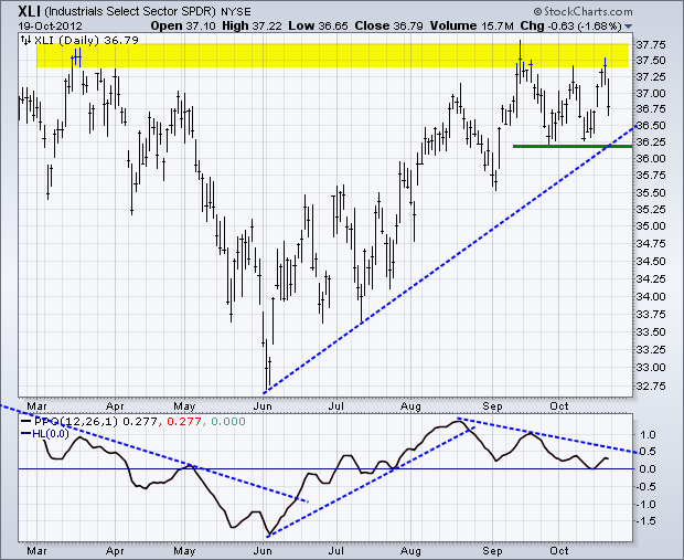
The first chart shows the Industrials SPDR (XLI) in an uptrend since June. Even though XLI did not take out its spring high, it has yet to break consolidation support. XLI established support with the last two troughs and the June trend line. Look for a break below this level to reverse the uptrend. The indicator window shows the Percent Price Oscillator (PPO) moving lower the last two months, but remaining in positive territory. The trend line breaks act as early warning signals. Note, however, that it takes a centerline cross (zero) to fully reverse momentum.
Click this image for a live chart.
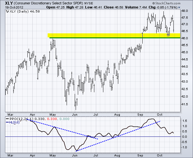
The second chart shows the Consumer Discretionary SPDR (XLY) breaking resistance from the May high and broken resistance turning into support the last few weeks. XLY declined sharply two weeks ago, but ultimately held support and bounced early last week. The ETF declined sharply on Friday to set up another important support test at 46. The indicator window shows the PPO breaking its June trend line and moving lower the last few weeks. Breakdowns in both XLI and XLY would be bearish for the broader market.
Good trading and good charting!
Arthur Hill CMT
Given the current chart for the Canadian Dollar, migrating snowbirds might want to exchange some loonies for some sawbucks very soon. The Canadian Dollar continues to hit resistance above the $1.02 level. It had a rough week chart-wise, forming a big red bar on the Elder Impulse System chart.
On the other hand, the US Dollar is strengthening, breaking to the upside compared to the Yen ($XJY), the British Pound ($XBP), the Euro ($XEU), and the Loonie ($CDW).
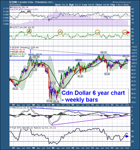
Commodities have a rough time whenever $USD is strong which is one reason that Gold behaved poorly on Friday. Even so, mining stocks held up well. We'll see if that remains true next week.
Good Trading,
Greg Schnell, CMT
It
has been 25 years since the 1987 Crash, and I thought it would be a
good time review a few things that probably won't be covered elsewhere
in the media. I may have covered these issues in the past, but a
refresher can't hurt.
One
thing that some analysts like to do is to note the similarity of past
price patterns to current price patterns, implying that the current
pattern will resolve similarly to the historical example. In 1987 we
have an example of how dangerous such assumptions can be.
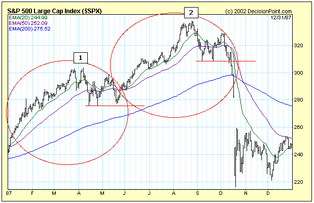
On
the chart below I have circled two price patterns that are remarkably
similar. Each has a double top, then a double bottom, then a rally out
of the double bottom, which fails, then a pullback to the support level.
At that point what follows is radically different. In example #1 prices
rally to new, all-time highs. In example #2 prices dive into one of the
worst crashes in history. Lesson: Just because history rhymes doesn't
mean that the ending will be the same.
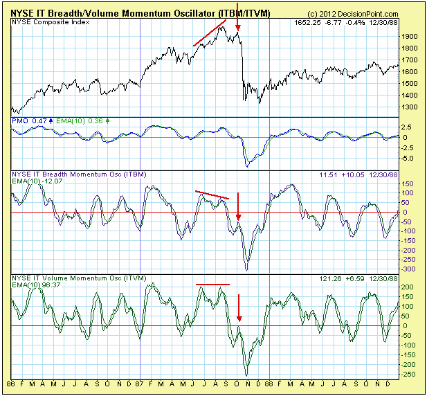
Next,
one might ask if there were any technical warnings? For the answer,
let's look at a chart of our Intermediate-Term Breadth and Volume
Momentum Oscillators (ITBM and ITVM). On the price line there is a top
in August 1987 that is higher than the previous top in June.
Corresponding tops on the ITBM and ITVM show a negative divergence, a
bearish indication.
A
more serious negative signal occurs at the final top in October before
the crash, when the ITBM and ITVM both top below the zero line (see
arrows).
To
be fair, in hindsight the signs are always obvious, and there is a lot
of ambiguity in real time. Nevertheless, negative indicator signs viewed
in the context of the final breakdown of price below support just
before the crash is pretty strong evidence, and there was adequate
warning to take action.
October has been a very strange month thus far. While most of our sectors are trading close to the flat line for the month, financials and technology are heading in opposite directions. I can't recall a two week period where the returns of these two influential sectors diverged by 8%, especially where one is performing with solid relative strength while the other completely falls apart. Take a look at this chart:
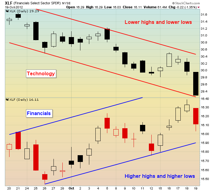
Could these two sectors be any more opposite one another? These are both "risk on" sectors, so they tend to head in the same direction. After just a couple weeks of earnings season, it appears as though banks are producing much better quarterly results and are being handsomely rewarded for it. I love to see relative outperformance by financials in general and banks more specifically. Having spent a portion of my career auditing banks, I know firsthand that expanding profits in the banking sector ultimately leads to more credit availability. Credit is a key driver to growth in other sectors and industries.
I'm a student of history. Normally, when the financial sector performs as well as or better than the S&P 500, equity prices overall rise. That seems evident to me when looking at the following chart:
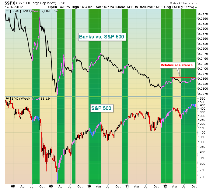
The green shaded areas represent periods of time when the Bank index ($BKX) is outperforming the S&P 500. Rarely do we see the market decline during such periods. As you can see from the above chart, the relative strength of banks is moving higher and the outperformance of financials these past two weeks should be thought of as a bullish sign. That doesn't mean we won't see additional short-term selling, however. In fact, the upcoming week is the most bearish week of the year historically, dating back to 1950 on the S&P 500. We don't see lower prices every year, but some of our worst weekly declines have occurred during this week. My reasoning? By the time 3rd quarter earnings come out, you can't keep making excuses as the year is running out. All the dirty laundry comes out for all to see. We finished last week on a VERY rough note and much of it was due to earnings (or lack thereof). A huge number of earnings will be released in the week ahead, so unless a major change takes place, we could see more of the same in terms of selling.
History does tend to repeat itself in the stock market and there are several historical rules I live by as a trader. I'll be discussing them in a webinar on Tuesday, October 23, 2012. If interested, CLICK HERE for more details.
Thomas J. Bowley
Chief Market Strategist
Invested Central
Last's week's early market rally seemingly disavowed all the bad news; which is of course what this market has been doing since the summer. However, we may be premature - but we are certain the market is changing its stripes from focusing upon "benefits" and tail-wind of QE-3; and focusing more upon the poor earnings and revenue reports coming out of corporate America. Quite simply, the European and Chinese slowdowns were bound to have an impact upon US stock prices; it was only a question of "when" within the context of an increase in monetary liquidity. Note the Google (GOOG) debacle this week; note the poorly received Microsoft (MSFT) figures - and one gets the sense that Technology in general has already made its bull market highs and lower lows lie ahead.
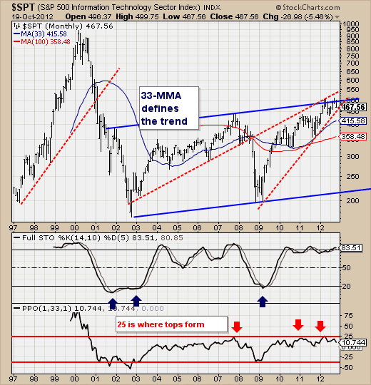
To that end, we've provided a monthly chart of the S&P Technology Sector, which is a longer-term outlook of where we have been, and the critical resistance/support levels that are in play. First, note the bearish rising wedge off the 2009 lows, which failed into overhead trendline resistance from an amalgamation of highs and lows. This seems to be rather important, for prices aren't likely to breakout above the highs forged in September. And if that is the case, then we must be worried about rising trendline support off the 2009/2011 lows...and prices are hard upon it. Further weakness will break this important support level, which would put the 33-month moving average in play at 415 as well the 100-month moving average at 359...a full 20%+ below current levels.
Therefore, technology buyers beware...there are lower prices upon which we'll be able to be comfortable buyers...but not here and not now.
Good luck and good trading,
Richard