Hello Fellow ChartWatchers!
With the market fluctuating significantly right now, the ability to spot trend changes early is critical. Here's an updated re-print of an article I wrote back in 2003 that is still very relevant almost 10 years later. It's about using our Scan Engine to find divergences - situations where one stock is going up and another is going down (or vice versa). Enjoy! - Chip
Scanning for Emerging Divergences
One of the most important technical signals to watch for on any chart is a divergence. Simply stated, a divergence occurs when prices move in one direction (up or down) and an indicator based on those prices moves in the opposite direction.
Divergences signal impending changes in the direction of a stock's price. They come in two flavors - "positive" (AKA "bullish") and "negative" (AKA "bearish"). A positive divergence happens when an indicator starts moving higher after prices have been in a downtrend (a potentially bullish development). A negative divergence occurs when an indicator moves lower while prices are still rising and is a bearish warning signal.
Any oscillating indicator can be used in a divergence study. Popular choices include the MACD, Stochastics, and Wilder's RSI. Many people also use indicators that include volume information - Chaikin's Money Flow for example - since price and volume often diverge at key turning points.
Unfortunately, like many things in the field of technical analysis, spotting divergences while they are still forming can be tricky. The biggest problem is distinguishing between a real divergence and just random "noise" on the chart. Just because a stock moves up for two days while its RSI (for example) declines, it doesn't necessarily mean that a significant divergence has developed - yet.
Often, peak-and-trough analysis is used to find divergences. If, for example, two or more rising troughs appear on the price plot (an uptrend), while two or more decline peaks appear at the same time on the indicator graph (a downtrend), a bearish divergence has been identified. This is how divergence is often taught in textbooks.
As with all forms of peak-and-trough analysis, there are two key problems with this approach. The first problem is that clear trendlines take time to form. The underlying trading opportunity associated with the divergence may be over by the time an unambiguous picture appears on the chart. The second problem is that identifying significant peaks and troughs is often very subjective - one person's significant peak is another person's random spike. For these reasons, peak-and-trough divergence detection is hard to automate (i.e., you can't create scans for it) and it is best used for finding exit signals for existing positions.
Simple divergence scans can be created by selecting (somewhat arbitrarily) a time duration (5 days for example) and seeing if prices have increased by more than a given percentage while the associated indicator has decreased by a different given percentage. Here's a sample scan that uses that technique:
[type = stock] and [close > 1.0] and [volume > 40000] and [close > 5 days ago close * 1.025] and [[[macd line(12,26,9) - 5 days ago macd line(12,26,9)] / AbsVal(5 days ago macd line(12,26,9))] < -0.08 ]
In this example, the price must have increased by at least 2.5% over the past five days, while the MACD value must have decreased by at least 8%. (Note: The advanced scan interface must be used because a function of a function (i.e., AbsVal of the MACD) is needed.)
While this technique is easy to program into a scan engine, its results are hit-and-miss. Many of the charts returned by this kind of scan are not really experiencing a negative divergence. A visual review of all stocks returned by this kind of scan is a necessity.
A different technique is to use the Min and Max functions to ensure that we are at the highest (or lowest) point on the chart for a given time duration. If the stock's price is higher than it's been in the past thirty days (for example) and the indicator is currently lower than it's been during that same period, there's a good change a divergence is occurring. Here's a sample scan that uses that technique:
[type = stock] and [close > 1.0] and [volume > 40000] and [close > yesterday's max(30,close)] and [CMF(20) < yesterday's min(30,CMF(20))]
In that example, we're looking for stock that closed higher than the highest close during the previous thirty days and that had a Chaikin Money Flow (CMF) reading that is currently lower than the lowest reading during the previous thirty days. Here's one of the charts that this scan returned for me today:
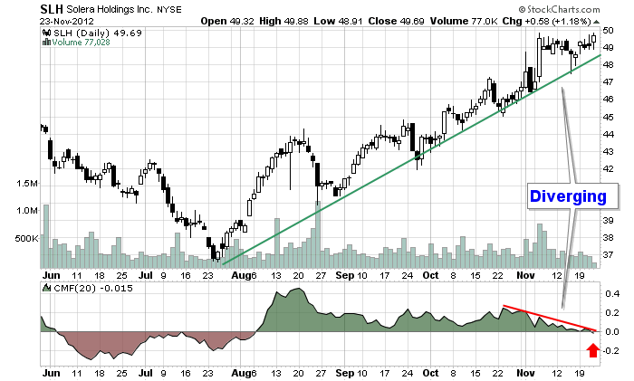
If I was an SLH shareholder (and I am not), I'd be concerned because the weakening CMF line calls into question the strength of the current uptrend.
This technique is not fool proof either and also requires visual inspection of the results. While no divergence scan is perfect, the two examples above are good starting points and can be customized to suit almost anyone's trading style. I encourage you to study them closely and incorporate them into your stock hunting toolkit.
- Chip
Overall, the world couldn't be more of a sovereign wild card. But at its weakest point, sometimes the strongest investment time is at the point of most change. While I don't forecast a quick turn, what can each investor watch for to see a global improvement? I'd like to propose the following chart could really help us.
The USA just elected a president. China just elected a new leader. Europe appointed a new ECB chairman. Japan has an election coming soon with a new leader trying to push for a plunge in the Yen. That is usually bullish for the stocks there. Germany and London have traded well. Australia has as well.
Here is why I don't want to sing a bearish tune for the long term. This chart looks excellent from a basing point. Notice the rising MACD lows while the price continues to decline. What would make a more obvious choice to start climbing than the change of leadership? It doesn't appear to be done falling yet but it is at a very interesting time.
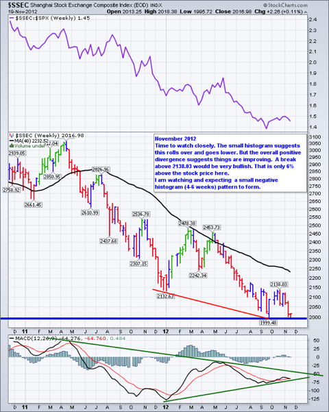
If China can make a bullish turn here that would be important. Today, the Shanghai continues to test support at 2000. The blue line at the bottom of the chart is flat at 2000. From the 2 year chart above, lets look at the 12 year chart below.
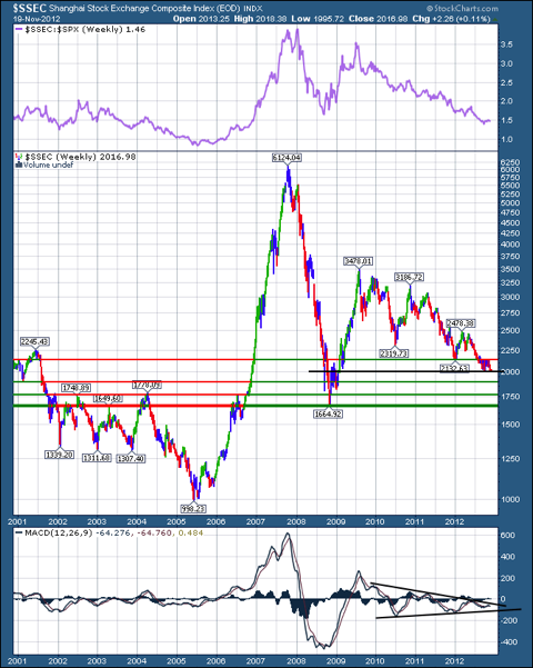
I would suggest a couple of interesting levels here. 2135 did not hold, but notice the scale levels as we go lower. Each about 5% below 2135. We currently sit near 2000. Just below this are levels at 1895, 1775 and 1665. Notice the coiling of the MACD. It is building energy here for a surge on the breakout. I didn't want to put too many lines on this chart, but an argument for a bullish wedge can be made from the 2009 high. It is called a bullish wedge because the distance between high and lows get narrower and narrower as the price falls. This creates a downward trend line on the top that has a more aggressive slope down than a trend line under the lows that has a less aggressive slope. Usually the break above the upper trend line would be fuel for a significant rise as the short positions have to cover quickly which also propels the price higher.
Have a great Thanksgiving with family and friends.
Good Trading,
Greg Schnell, CMT
On
the weekly chart below, we can see that, after making a new, all-time
high back in August of 2011, gold went into a correction/consolidation
mode, ultimately forming a descending triangle. While this formation
suggests lower prices (the flat line is the weakest), price broke up
through the top of the triangle. After a breakout the technical
expectation is for price to pull back toward the line, which it did
enthusiastically.
After
testing that support, price has reversed upward, and this week made a
strong move upward, signalling that the rally that began this summer is
probably resuming. The weekly PMO (Price Momentum Oscillator) turned up
again, which is a very positive sign.
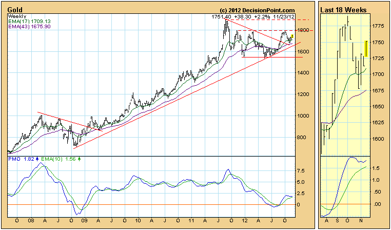
Conclusion: Gold
has completed its post-breakout pullback and appears to be resuming its
long-term advance, but this will not be "official" until the October
top is exceeded. It needs to overcome resistance in the area of 1800,
and finally the resistance at the all-time high around 1900.
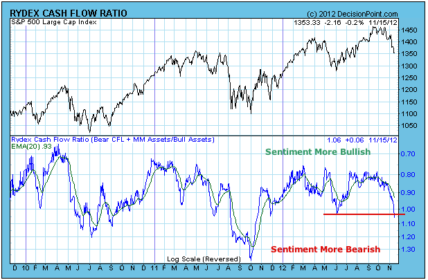
The Rydex Cash Flow Ratio gives a view of sentiment extremes by using cumulative cash flow (CCFL) into Rydex mutual funds. It is calculated by dividing Money Market plus Bear Funds CCFL by Bull Funds plus Sector Funds CCFL. (To read more click here.)
While the Ratio shows that Rydex investors are becoming more cautious,
deeper analysis of CCFL components shows that the bears are still
reluctant to engage.
The
following chart of the Ratio shows that sentiment has been becoming
less bullish, and the Ratio has reached a level that marked an important
market bottom in June. If the bull market is still viable, we could be
near an important low.
Looking
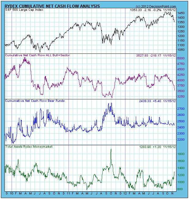
deeper into the composition of the Ratio, the chart below shows that
cash has been flowing out of Bull and Sector funds, and it has been
flowing into the Money Market Fund. Virtually no cash has moved into
Bear Funds in the last three months. The bears are in hiding.
Conclusion:
Earlier this week we observed that Investors Intelligence percentage of
bulls has become significantly smaller, but the percentage of bears has
not increased to a level we would normally see at an important low. The
Rydex Cash Flow Ratio confirms that observation.
Important
bottoms can appear when we don't expect them, so we will not be so bold
as to say it can't happen about now; but bottom picking is a dangerous
game, and we would want to see the bears becoming much more aggressive
before we seriously begin to expect an end to this decline.
All the recent talk has centered around the effect of a potential fiscal cliff. While we may or may not be subject to a fiscal cliff, each and every one of us has been subject to the recent technical cliff, especially the one since election day. Things have gone from bad to worse in the past couple weeks. We did see a series of potential reversing candlesticks print on Friday across our major indices, sectors, industry groups and leading individual stocks, however. Will that be enough to turn the table on the bears? Or will this simply turn out to be a temporary halt to the selling before another leg lower?
Take a look at the hammer that printed on the NASDAQ on Friday:
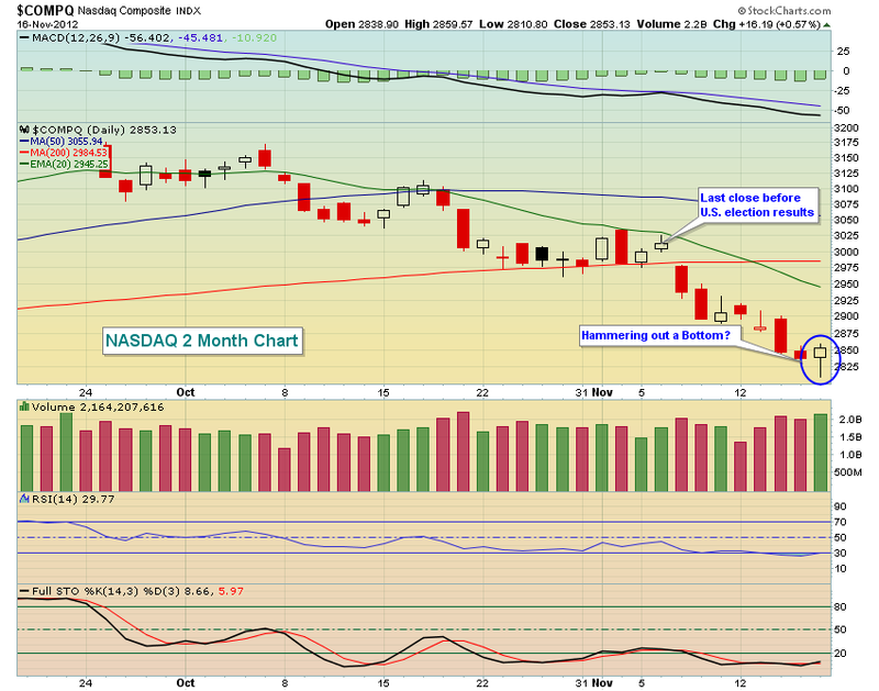
Short-term, the Friday reversal appears to be good news. The daily MACDs that are sprinting lower carry a much more ominous sign, however, as they're screaming at us that the momentum remains firmly in the bearish camp and any short-term upside move will likely be just that - a short-term one.
There was much talk last week that sentiment had turned decidedly negative and that was pushing our major indices lower. Ummmmm, I respectfully beg to differ. In fact, I'm not sure what to make of the Volatility Index (VIX), which generally moves inversely to the S&P 500. During market selloffs like the one we've seen lately, the VIX normally surges, reflecting the increased nervousness in the market. But since election day, while the S&P 500 fell more than 5% over six trading days, the VIX also fell - more than 10%! Check out the chart:
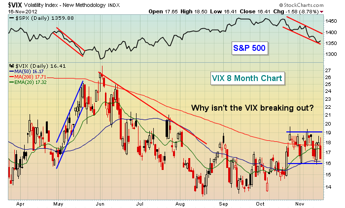
A lower VIX indicates the market is expecting lower volatility ahead. If you study history, you'll clearly see that a falling VIX is synonymous with a rising equity market. This begs two obvious questions. First, will the VIX surge near-term to play "catch up" with falling equity prices? Or is it telling us something about the duration of the wicked selling we've been experiencing - that it, in fact, won't last?
In the days and weeks ahead, we're going to learn more about both the fiscal cliff and the technical one. Please be cautious and keep your stops in place.
Happy Thanksgiving and happy trading!
Thomas J. Bowley
Chief Market Strategist
Invested Central
There is quite a bit of newsprint lately regarding the US "fiscal cliff"; and the impact of whether it goes through or not. Regardless or not of whether it is extended or not, we think it instructive to analyze the consumer discretionary stocks as they will be inordinately impacted.
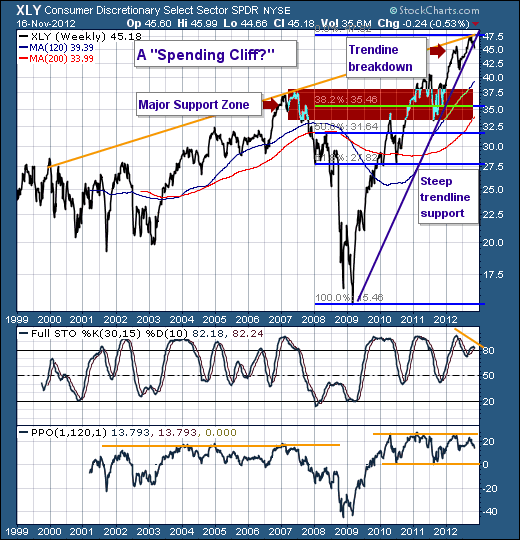
First, let us state that since the 2009 bottom, consumer discretionary stocks have rallied rather strongly through the halcyon days of the mortgage "cash out" period in which money were flowing towards all sorts of goodies. Thus, we were rather surprised at the veracity of this rally given the end of the housing bubble and the negative impact of the "cash out" refinancings. If fact, the current rally has continue to levels were never thought possible. However, there are there, and now we believe they represent an opportunity to be short a number of names int he group, or via the S&P Consumer Discretionary ETF (XLY) itself.
Second, the technical situation has begun to show signs of breaking down. The rising trend-line off the 2009 and 2001 lows was just violated, which should allow prices to plumb towards lower levels and into major support at the 120-week moving average rising towards $40.00. However, we would posit the decline will be deeper into the shaded area as this represent prior low and high support, as well as the 38.2% retracement moves. Too, the 200-week moving average crosses inside of it. This grouping if you will tends to act like a magnet - especially given the 30-week stochastics has formed and confirmed a negative divergence. Also, note the distance above the 120-week moving average in the PPO frame; it hit just above 20%, whereas in the past this has proven to be extremely good resistance.
Collectively, we would say that all the moons are lining up for traders to start exiting Consumer Discretionary shares and buying other sectors that have better defined risk-reward parameters. Certainly at TRR we will be putting our our recommendations for short positions soon; and perhaps acting upon them as well.
Good luck and good trading,
Richard