Hello Fellow ChartWatchers!
We've got a couple of significant new announcements for you in this newsletter so let's get right to it.
First off, I want to make sure everyone realizes that our Holiday Special is currently underway. Right now you can subscribe or renew your account for 6 months and get one more free. Or, you can order 12 months of service and get 2 months free. Or, you can even order 24 months of service and get 5 months(!) free. Don't forget that you can (and should) take advantage of this special even if your account doesn't expire for several more months. By renewing now, you lock in at one of our best rates of the year. Click here to get started.
Second, today we are announcing a Beta test for something we've been asked about for years and years - charts of unadjusted data. As you probably know, we have to adjust our historical data whenever a split, dividend, or distribution occurs in order to remove the "man-made" gap that those things cause on the charts. This insures our technical indicators don't give misleading signals however it also causes problems for people that are trying to find out the exact price that a stock traded at on a specific day in the past. Well now - for most of the stocks we track - you can add an underscore to the front of the ticker system and get a daily, weekly or monthly chart of that stock's unadjusted data. For example, here is a chart with both versions of COST on it:

(Click here for a live version of this chart.)
Notice how the unadjusted chart (bottom) has a big down gap on it two days ago that the upper, adjusted chart doesn't have. That's due to a $7.00 dividend that we adjusted our normal COST chart for.
Unfortunately, we currently only have unadjusted data for stocks and not for mutual funds. We hope to have unadjusted mutual fund data at some point in the future. (Of course, index data is never adjusted.) Feel free to test out of the Beta version of this feature by adding an underscore to any ticker symbol and let us know what you think.
Next up, we have a special holiday present for you - the first chapter of John Murphy's new book in PDF format! Click here to download and read it. In case you missed it, John's new book is called "Trading with Intermarket Analysis." It is a completely new, full color book on John's favorite topic - the relationships between stocks, bonds, currencies, and commodities. I think it is another must read book from John. You can learn more about ordering the entire book here.
Finally, we've expanded our User-Defined Index feature so that PRO members who want to can now share their User-Defined Indexes with others.
In case you didn't know, a User-Defined Index (UDI) is a special symbol that contains data uploaded by a user instead of by us here at StockCharts. User-Defined Indexes can be used to chart anything you want - economic data, your golf score, the results of a custom spreadsheet calculation, etc.
Until now, all User-Defined Indexes were private - they could only be charted by the person that uploaded the data. These private UDIs have ticker symbols that start with a "@" character. Now, PRO members that want to share their UDI charts can convert their Private UDIs into Public UDIs that can be viewed by anyone. Public UDIs start with a "!" character.
To illustrate what someone could do with a Public UDI, check out the following chart:

(Click here for a live version of this chart.)
The Misery Index is the sum of the Unemployment Rate and the Inflation Rate. You can learn more about it here. To create this UDI, we simply downloaded the data from that website and then uploaded it as a CSV file into a new UDI. Finally, we converted that UDI (initially called "@MISERY") into a Public UDI called "!MISERY".
I encourage everyone to try out this index. It's a monthly dataset best charted as a "Line" chart. We will continue to update this index each month. As other PRO subscribers publish more Public UDIs, anyone can learn about them using our new Public User-Defined Indexes page.
Happy Holidays everyone!
- Chip
Foreign stocks look technically stronger than the U.S. at the moment.
Tuesday's message showed EAFE iShares testing their spring high.
Emerging markets are rising as well. A more comprehensive measure of
foreign stocks that includes developed and emerging markets is shown
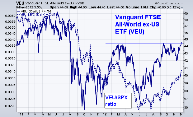
below. Chart 1 shows the Vanguard FTSE All-World ex-US ETF (VEU)
in the process of testing highs formed during the spring of this year.
An upside breakout would give a boost to foreign stocks. The dotted
line overlaid on the chart is a relative strength ratio of the VEU
divided by the S&P 500. As I suggested on Tuesday, foreign stocks
have been rising faster than the U.S. (rising ratio) since mid-year
after lagging behind the U.S. during most of the past year (because of a
falling dollar). After acting as a drag on the U.S. during the first
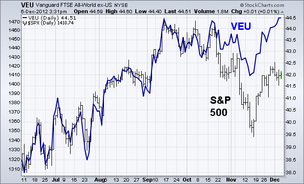
half, foreign stocks are now leading the U.S. higher. Chart 2 shows
foreign shares (VEU) in a stronger position than the S&P 500 (the
VEU has risen 20% since June versus 10% for the S&P. Since global
stocks are highly correlated, an upside breakout by foreign stocks
would increase the odds for higher U.S. shares.
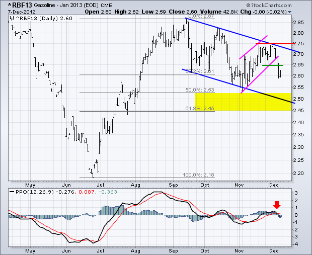
Gasoline Jan13 (^RBF13) formed a lower high and broke support with a sharp decline this week. First, notice that the trend since mid September is down with a series of lower lows and lower highs taking shape the last few months. This weekâs breakdown signals a continuation of the medium-term downtrend and targets a move to the lower channel trend line. Potential support in the 2.50 area is confirmed by the 50-62% retracement zone. The indicator window shows MACD turning bearish with a move below its signal line and into negative territory. ETF traders can refer to the US Gasoline Fund (UGA).
Click this image for a live chart.
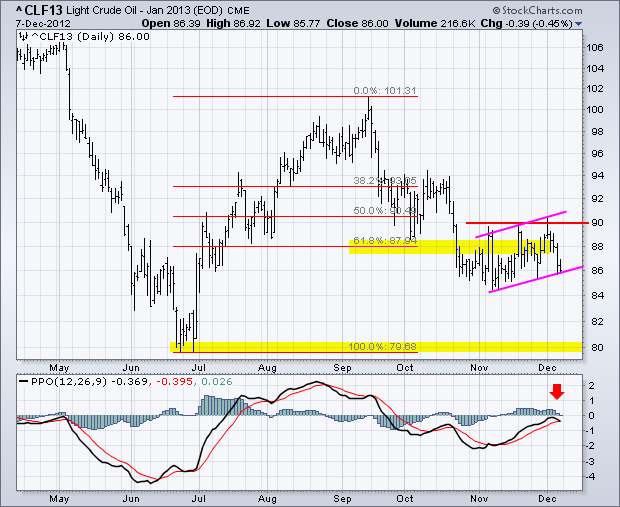
Light Crude Jan13 (^CLF13) is also sporting a bearish setup. Note that the overall trend since mid September is down. Crude is attempting to firm in the 85-90 area, but cannot break 90 to reverse the downtrend. A breakout, and close, above 90 would be medium-term bullish. Barring a breakout, note that crude formed a bear flag over the last six weeks. Flags are continuation patterns. Bearish flags slope up and bullish flags slope down. A break below flag support would signal a continuation lower and target a move to next support in the 80 area. ETF traders can refer to the US Oil Fund (USO).
Homebuilders have been a leading industry group throughout the S&P 500 rally off the 2009 lows. This strength has been particularly obvious over the past year. Looking strictly at a shorter-term chart, technical indicators couldn't look much better. Check it out:
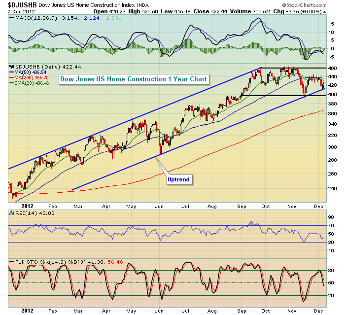
While homebuilders did fall below their 50 day SMA a month ago and the most recent attempt to move back through that 50 day SMA failed, it looks strikingly similar to what we saw in early June, just before a huge 27% one month rally. Trendline support continues to hold. In addition, homebuilders consolidated in a short-term base in late August before breaking above 400. The most recent selloff held support at 400 before rallying to test 50 day SMA resistance from underneath. I'm eventually looking for this group to break to fresh new highs, possibly even before year end.
The short-term chart is not what's bothering me. Instead, it's the long-term weekly chart where warning signs are just now starting to show. Take a look at this 10 year chart:
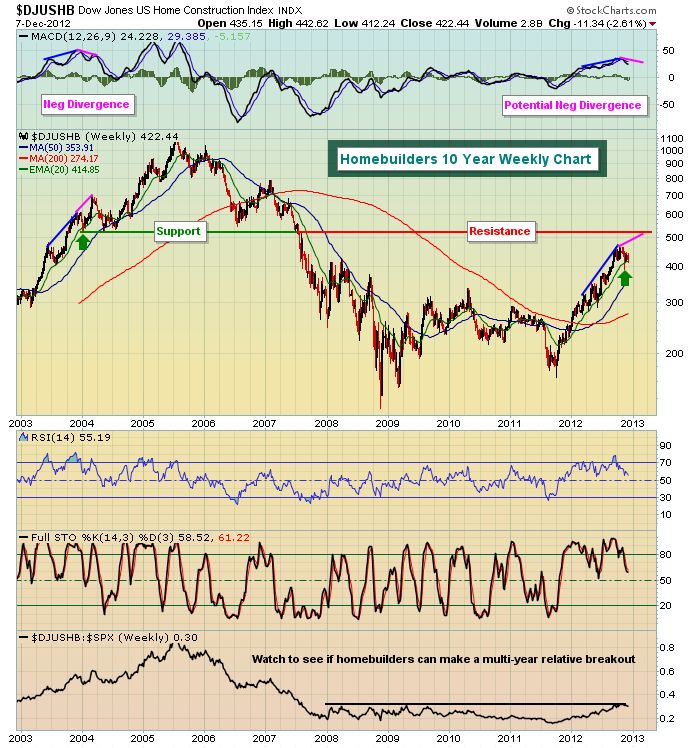
The current technical pattern is quite similar to late 2003. On the next high, in early 2004, a long-term negative divergence fomed and more significant selling followed. On the chart above, I've indicated that with the next push higher in the price of the $DJUSHB, a long-term negative divergence is likely to print. That is indicative of slowing momentum in the longer-term. Generally, more significant selling follows.
I'm not quite ready to write off homebuilders. In fact, I'm expecting them to lead at least one more push higher in equities. After that move, however, we'll need to re-evaluate and perhaps lower our expectations for this industry.
Happy trading!
Thomas J. Bowley
Chief Market Strategist
Invested Central
http://www.investedcentral.com/
The Dow Jones Transportation Index ($DJT) is on the verge of a major breakout that could see prices rise by up to +20%. Quite simply, the developing bullish pennant pattern would suggest that once a breakout of trendline resistance materializes, then a measured towards the 6000 to 6200 zone becomes a reality. In further support of this viewpoint, note the 20-week stochastic has turned higher from near the 50-level, while the 65-week moving average continues to provide major support to declines. Collectively, the risk-reward of long $DJT positions is rather good given one can measure their risk at the recent lows.
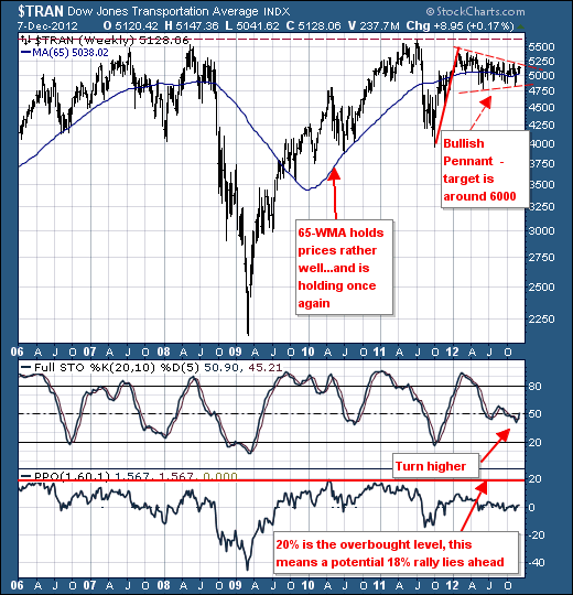
The manner in which to play this trade is several fold. One could look at the Dow Transports ETF (IYT) to mimic the index. Or, one could look at the the risk-reward of the particular stocks that make up the index such as the rails, truckers, and air freighters in general. Our particular focus is upon all of these, with CSX Corp. (CSX); FedEx (FDX) in particular, with Arkansas Best (ABFS) having potentially the largest percentage gain...but it has its flees so to speak. As with all of these stocks; do your technical homework.
Good luck and good trading,
Richard