Hello Fellow ChartWatchers!
So far, 2013 is proving to be very interesting with bullishness dominating the stock market so far. Since the start of the year, most of the major US market averages are up over 4% with the Russell 2000 (+5.12%) leading the way.
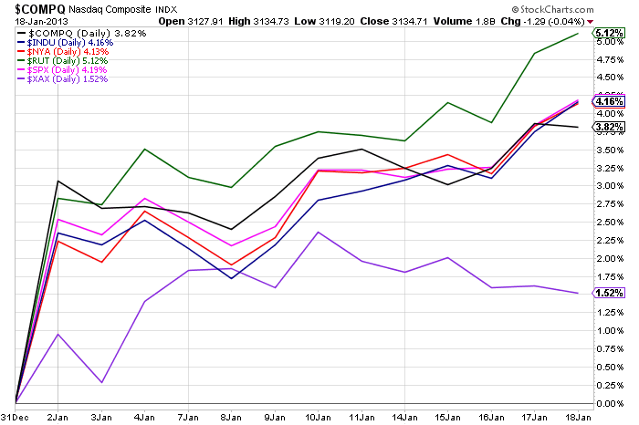
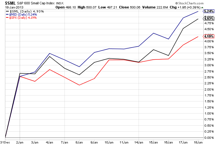
Looking at the market capitalization PerfChart, we see that everything is positive with the S&P 400 Mid-Caps (+5.24%) posting the largest gain.
On the S&P Sector side of things, everything is up however technology and utility stocks are significantly lagging the other sectors.

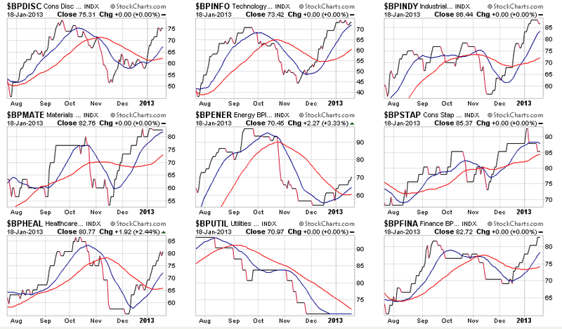
Looking at the Bullish Percent Index charts for the 9 S&P sectors, the 20-day averages for all sectors are currently moving upwards with the exception of the Utilities sector. Given that Utilities are a proxy for the Bond market and that Bonds generally move in the opposite direction to Stocks, this is more confirmation that money is moving back into stocks right now.
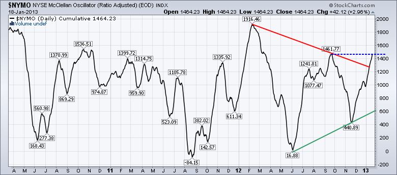
Finally, the McClellan Summation Index has just moved above its previous mid-September peak, further confirming that it is currently in an uptrend (green line).
Bottom line, stocks are current bullish.
Now, do you know how to create the charts above? Did you know that such tools existed on our website? Are you confident that you are getting everything possible from your StockCharts.com membership?
If the answer to those questions is "No" then please consider attending one of our upcoming live StockCharts University seminars. The first course, "SCU 101: Getting the Most Out of StockCharts.com" shows you exactly how to perform the top-down analysis I show above allowing you to always know where the market is heading.
But don't take my word for it. Here are some actual quotes from several of the people that attended our Dallas seminar which was held just last weekend:
"If I had left before lunch, I would have received more than full value for the cost." - C.B.
"I thought that I would pick up a few useful ideas from the seminar, but in fact learned much more than I anticipated. I came away from the course realizing that there were many useful features of the website that I was not fully utilizing to their fullest extent, and to my best advantage." - B.D.
"I learned how to make a scan that immediately paid for the class and entire weekend in the next week of trading. I strongly recommend the class." - D.J.
"If charts and technical analysis is your thing, the Stockcharts seminar is a day well spent." - P.C.
Again, I love presenting at these seminars and hope I can see you at one of them soon. This year we will be holding seminars in Orlando, Long Beach, Seattle, New York, and Toronto. The Orlando one is coming up fast and would be a great excuse to escape to Florida next month! Click here for more information.
- Chip
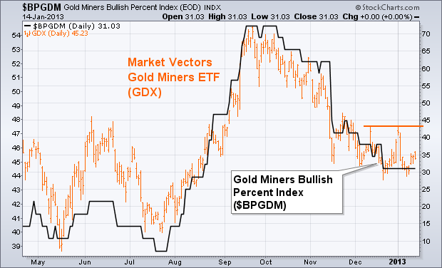
Whenever we look at gold, it's a good idea to check on the trend of gold miners. The orange bars in Chart 1 show the Market Vectors Gold Miners ETF (GDX)
still in a downtrend, but trying to stabilize. The first thing the
GDX needs to do to improve its short-term trend is to clear initial
resistance near 47.50 (orange line). It also needs to see stronger
chart action in individual gold mining stocks. The black line plots
the Gold Miners Bullish Percent Index ($BPGDM), which
measures the percent of gold miners in point & figure uptrends.
That line has been in a downtrend since October. It needs to see an
upturn to support any meaningful rally in the GDX. The BPGDM has been
flat-lining at 31. It would need to rally to 38 to signal a possible
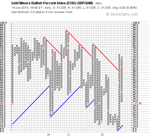
upturn. Chart 2 shows why. The most popular way to track turns in
the Gold Miners BPI is with a point & figure chart which is shown
in Chart 2. The X column shows an uptrend, while the O column marks a
downtrend. Each box is worth 2 points. In order for the current
down (O) column to achieve a three-box upside reversal and start a new X
column, it would have to rise to 38. An upturn in the GDX would
support any potential upturn in the price of gold.
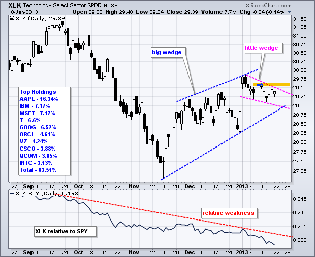
The Technology SPDR (XLK) has been lagging the broader market for some time now, but the trend since mid November remains up and a bullish continuation pattern is taking shape this month. Weighed down by its top components, XLK has been lagging the S&P 500 ETF since September. Relative weakness continued in January as the price relative fell further the last 2-3 weeks and recorded a 52-week low. Relative weakness in this key sector SPDR is negative, but the trend since mid November remains up. The blue trend lines show a rising wedge taking shape the last two months.
Click this image for a live chart
Even though rising wedges are potentially bearish, the wedge is currently rising and the trend is up as long as it rises. A break below the November trend line would provide the first sign of a medium-term trend reversal. Short-term, XLK formed a smaller falling wedge this month. Note that this pattern evolved after the 31-Dec surge and 2-Jan gap. Technically, this pattern looks like a bullish continuation pattern akin to a falling flag or pennant. A move above the orange resistance zone would reverse this fall and signal a continuation higher. Next week should tell the tale because IBM reports on Tuesday and Apple reports on Wednesday.
Good day and good trading!
Arthur Hill CMT
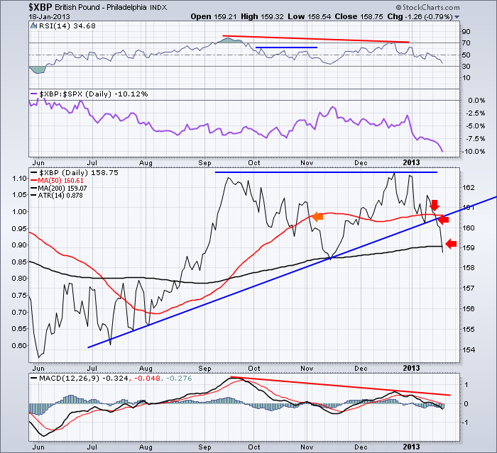
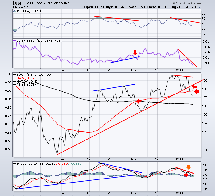
CURRENCY WARS!by Greg Schnell | The Canadian Technician Back in November I blogged about the currencies and the events around them. Recently in Early January, 4 of the currencies in the Dollar Index were testing the trend line for the dollar cross. Today, 3 of 4 of those currencies broke down this week, and the Euro is losing strength. Keep watching as currency changes can help time market breakdowns. The Euro makes up 56% of the dollar basket, so until it breaks, this bull train continues.
First of all here is the British pound. It fell dramatically this week. $XBP It lost the 50 DMA, the trend line, and the 200 DMA all in a week. Notice the purple relative strength line plunging to new lows. The negative divergence on the RSI and the MACD played out perfectly. Remember this chart style as the $XEU is setting up a similar trade.
Here is the Swiss Franc. $XSF Notice the large negative divergence between September and December. Lower peaks on the RSI between the mid-September 2012 high and the December 2012 High. The price was making a higher high, but the RSI was making a lower high. The MACD was making the identical pattern. You will also notice two short term divergences between September/ October and the current move down. The price on January 14 was near the previous high, but both the RSI and the MACD were significantly lower.
This is called double divergence. We have it on the short term (2 weeks) and intermediate term (3 months).
Notice in October, the purple SPURS line was gaining strength compared to the price. So people were enjoying the outperformance of the Swiss Franc. It was breaking down through both the 200 DMA and the 50 DMA. So this is a hard signal in real time. Notice how the Swiss France bottomed a few days before the overall stock market ($SPX) bottom of November 16.
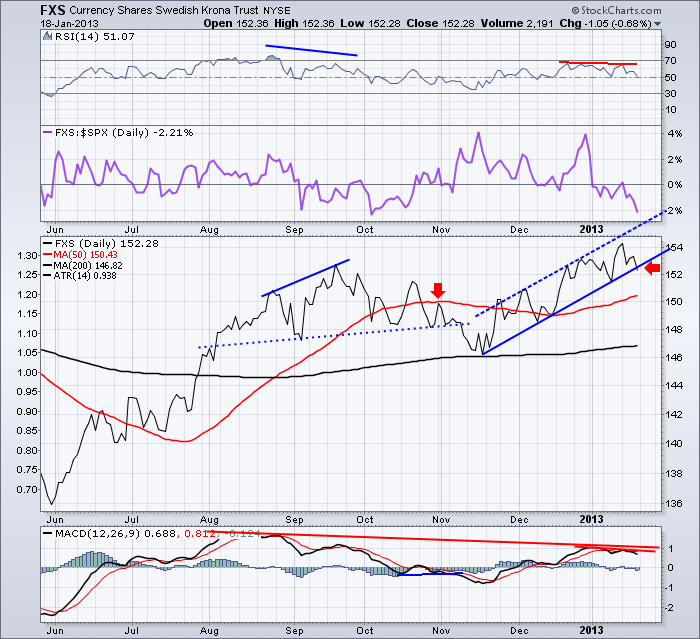
Here is the Swedish Krona. FXS You can see this chart shares many of the similarities in divergence that the Swiss Franc above shows. This market is showing even more divergence over the intermediate 3 month period. You can also see the purple relative strength breaking down. This would need to get support here immediately.
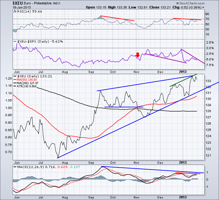
Here is the Euro. $XEU. So I won't belabour the point here. Short term and medium term divergence is apparent. The price is still clearly in an uptrend. I would suggest if the Euro starts to break lower, we'll mark a top of some sort in the equity markets.
Here is the Canadian Dollar which is also usually a good indicator of the tops and bottoms in the equity market. $CDW It had a bad day Friday losing .65 cents to the $USD. On this one we see the same short term and intermediate term divergence setting up. The Loonie has dipped below the trendline once again. Will it reverse higher again? I don't expect it to with the divergence on this chart and the divergence that has created price reversals on the British Pound and the Swiss Franc.
It doesn't really matter what I expect, it is more important to follow the price action. If both the Canadian Dollar and the Swedish Krona break their trendlines, I would not be surprised to see the Euro come down as well.
The tables on the chart label the $SPX market tops and bottoms.
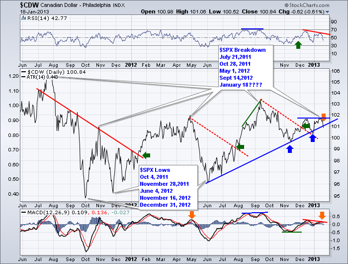
So, I expect the currencies to continue to help us with market direction. 2 of the smaller currencies have broken. Two more are testing the trendline and look to be breaking in terms of momentum and relative strength. The Euro appears toppy as well. The $DAX market and the $CAC have not been moving much this month. We'll see if this all concludes together.
I will be doing a webinar to the MTA on Wednesday January 23rd at Noon EST if you would like to hear my current macro view of the market and some unique perspectives on market analysis.
You can follow this link to login. MTA Webinar It is free to attend.
Good Trading,
Greg Schnell, CMT
I
have long been a cheerleader for equal-weighted indexes versus
cap-weighted ones, and now seems like a good time to demonstrate why. In
a cap-weighted index stocks influence the price of the index based upon
their market capitalization (price time number of shares). For example
the top 50 stocks in the S&P 500 Index represent about 70% of the
index value, with the remaining 450 stocks providing only 30%. With an
equal-weighted index all stocks carry the same weight -- all the horses
are pulling the wagon.
Decision
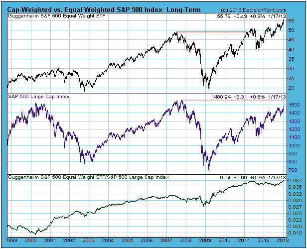
Point follows a number of equal-weight indexes, with the chart below
showing probably the most prominent -- the Guggenheim (formerly Rydex)
S&P 500 Equal Weight ETF (RSP). As you can see, RSP is making new,
all-time highs and exceeded the 2007 top two years ago; whereas the SPX
is still struggling to reach the level of the 2007 top. SInce the 2009
low the SPX has advanced about 114%, but RSP has advanced 175%.
Of
course, RSP does not always out-perform the SPX, but the relative
strength line (bottom panel above) shows that it mostly does over time.
The
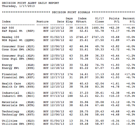
table below the mechanical signal status on various market/sector
indexes paired with their equal weight counterpart. Note how, when both
indexes have the same days elapsed, the equal weight index usually has
the largest percent profit. It is particularly notable in the case of
the Technology sector, where the problems of a few large-cap stocks
(AAPL, IBM) weighed heavily on the weighted index (XLK), but the effects
of those stocks were muted in the equal weight ETF (RYT).
Equal
weight indexes are not always the best choice -- they tend to move
faster to the downside than their cap-weighted counterparts -- but in a
bull market they should receive close consideration.
THE BEST SECTOR FOR 2013by Tom Bowley | InvestEd Central Technicals do change and I reserve the right to change my opinion as price action evolves, but the energy sector looks like THE ONE for 2013. I remain bullish the stock market overall so I expect most sectors will perform well in 2013. Keep in mind that money rotates from sector to sector to sector and last year's leaders tend to pass the torch in subsequent years.
First, let's recap 2012 performance. Of the six "aggressive" sectors (financials, technology, consumer discretionary, industrials, energy and materials), energy was the only sector with a return below 10%. The XLE finished the year with a 3.31% gain. In the meantime, financials (XLF) and consumer discretionary (XLY) posted gains of 26.08% and 21.58%, respectively. In 2011, the defensive groups led the action higher as the XLE tacked on just 1.29% for the year. That's marked two years of relative underperformance for energy and I believe that's going to change in 2013.
In fact, it already has.
The XLE was the best performer on Friday as our major indices finished strongly to close at new multi-year highs on the Dow Jones, S&P 500 and Russell 2000. I understand that one day does not make a trend, but the XLE also led the action last week and has the highest return of all sectors year-to-date (5.70% vs. the S&P 500's gain of 4.19%). Ok, that's all history. How do the technicals look? Well, the Oil Services Index ($OSX) is my favorite within the energy space as it has just broken out of a long-term symmetrical triangle pattern. I put a lot more weight on breakouts on long-term charts. They tend to establish the "big picture" from which a trading strategy can be developed. Take a look at the $OSX weekly chart over the past 5 years:
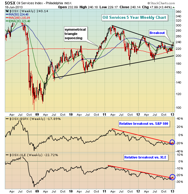
In addition to the $OSX chart looking more bullish, I also studied the
15 component stocks that make up the oil services index and just about
every one of them show improving technical strength of late. In
particular, I like Tidewater, Inc. (TDW). For more information on TDW
and the other oil services index components, CLICK HERE
- Tom Bowley
A CLOSE-UP ON AAPLby Richard Rhodes | The Rhodes Report Next week, the markets will be focused upon the incoming earnings reports; and in particular - Apple's (APPL) earnings after Wednesday's close. Over the past several months, AAPL has declined rather sharply off its highs around $700 down to its current trade at $500; which is due in large part to an increase in competitiveness of other product manufacturers such as Samsung - and a report out that AAPL is downsizing its number of component orders. Presumably, this means less iPhones and other gadgets.
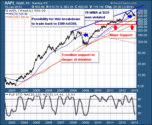
Our interest in this stems from the technical viewpoint, which in our opinion is "slightly bearish.". The reason we believe at least modestly lower prices are ahead stems from the fact prices have violated the 70-week moving average crossing at $531. The last time this occcured was 2008, with prices falling roughly -50%. Now, we aren't expecting this substantial a decline, but certainly if the earnings report is less-than-hoped for, then we very well could see trendline support violated and the $300-to-350 support zone tested. Moreover, we only have to go back to late-2011...not so long ago really.
Our only concern is the oversold 20-week stochastic; however, it has simply entered into oversold territory, but it could be a number of weeks before it bases and turns higher. Hence, while the short-term appears rather challenging for AAPL; it will be setting AAPL for a larger back towards the highs. Its all a matter of timing.
Good luck and good trading,
Richard Rhodes