Hello Fellow ChartWatchers!
The Dow moved above 14,000 yesterday at 11:04am. How do I know the exact time that happened? I know because StockCharts tweeted about it the instant it happened. Did you know we automatically tweet about a wide variety of significant technical signals, automatically alerting anyone who watches our Twitter feed? It is just one of dozens of improvements we made to the website over the course of 2012. Here are some other improvements you might not know about:
Unadjusted Data -
Just add an underscore to the front of any ticker symbol to see what the unadjusted chart looks like. (more info)
User-Defined Indexes -
Upload data from any spreadsheet and then use our tools to chart it. (more info)
Revamped Public ChartLists -
Better ways to find ChartLists that match your interests. More rewards and perks for Public ChartList authors. (more info)
StockCharts University Seminars -
Live, all-day training seminars given by myself and/or Greg Schnell in major cities throughout North America. (more info)
More Indicators and Overlays -
We now have over 50 different technical indicators including Pring's Know Sure Thing (KST), the Mass Index and the Vortex Indicator. (more info)
User-Defined Technical Alerts -
Members can now receive automatic emails whenever a specific technical situation occurs. (more info)
More Color Schemes and Skins -
Spruce, Graphite and Dark Green (among others) have been added to the Color Scheme dropdown. In addition, some of those schemes support UI "skins" that change the color of your entire charting workbench to match the color of your charts. (more info)
Gatis Roze's "Traders Journal" Blog -
Gatis' unique perspective on how real-world traders operate was a wonderful addition to our Blogs area. His "Traders Journal" articles are highly recommended - as are all our Blog articles! (more info)
Mobile Website -
You can now use StockCharts.com directly on your mobile device - phone or tablet and see pages specifically designed for touch-based interfaces. (more info)
Educational Videos -
Arthur Hill has created a wonderful collection of free educational videos about technical analysis and using StockCharts.com. (more info)
PRO Service Level -
For people that need more, our new PRO service level offers 5-second refreshing, historical data back to the 1960s, downloadable data, more User-Defined Indexes and Alerts, bigger charts, and more. (more info)
Improved ChartStyles -
Our most recent improvement is the addition of a new interface for creating, using and organizing ChartStyles. (more info)
Phew! and I probably forgot several other things we've added. So what's coming next? Well, first of all we are dedicated to continue improving the website and helping everyone get the most out of it. That said, we are hard at work on even more great improvements which you can expect to see in the coming months and years.
We believe that this dedication to continuous improvement is why AAII called us "Best of the Best" in its latest review of web-based charting tools and why, for the readers of "Stocks & Commodities" magazine have one again voted us "Best Technical Web Site" for the 11th straight year!
Here's to an even better 2013!
- Chip
FALLING DOLLAR BOOSTS COMMODITIESby John Murphy | The Market Message My Thursday message showed the Power Shares Dollar Index Bullish Fund (UUP)
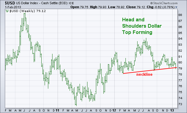
on the verge of a technical breakdown. The weekly bars in Chart 1
show the cash version of the Dollar Index. It too has a bearish look
by showing the US Dollar Index threatening to fall
below a "neckline" drawn under its 2012 lows. That would signal a
drop in the $USD to it 2011 lows. [Thursday's message showed most of
the dollar weakness coming from rising European currencies]. One
asset class that would benefit from a falling dollar is commodities.
That partially explains why commodities ended the week on a strong note.
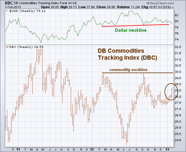
The weekly bars in Chart 2 show the DB Commodities Tracking Fund (DBC)
climbing to a three-month high (brown circle). [The DBC includes 14
energy, metal, and agricultural commodities]. Chart 2 also shows the
dollar (top of chart) and commodities trending in opposite directions
over the last two years. A "neckline" is drawn on the commodity
index over its 2012 highs (which matches the bearish "neckline" on the
USD). Commodities are also starting to play catchup to a rising stock
market and stronger economic signals. In that scenario,
economically-sensitive commodities like energy and industrial metals
should be the biggest gainers. Agriculturals and gold are commodity
laggards.
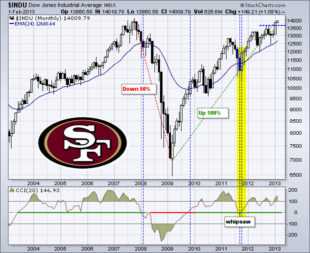
With a 150-point gain to end the week, the Dow Industrials closed above the next big number (14000) and hit a significant milestone. There is usually nothing special about round numbers, such as 14000, but this number is special because the Dow failed at 14000 in 2007. The financial crisis and subsequent swoon in financial stocks helped push the senior average below 7000 in early 2009. Fridayâs advance allowed the Dow to complete a six year round trip. What a long strange trip itâs been. The chart below shows the Dow falling 50% and then requiring a 100% advance to make up for this decline. This is a great lesson for traders. In percentage terms, it always takes a bigger advance to make up for a loss. A decline from 100 to 80 is 20%, but it takes a 25% gain to back to 100 and make up for that loss. This is why risk management is so important.
Click this image for a live chart
Speaking of risk, the Dow is short-term overbought after a 1000 point advance in five weeks. Nevertheless, the path of least resistance is up and I would consider the long-term trend bullish as long as the Dow holds its rising 24-month EMA and the Commodity Channel Index (CCI) remains in positive territory. As the vertical lines show, this combination has been pretty good at defining long-term trend changes over the last 10 years. Broken resistance in the 13650 area turns into the first support zone to watch on any pullback.
Go Niners!
Arthur Hill CMT
THE MOVE SEEN AROUND THE WORLDby Greg Schnell | The Canadian Technician Starting in the summer, some of the global stock markets started to move higher. Once Mario Draghi suggested he would do whatever it takes to save the euro, the European markets have been on a tear higher.
This is the first monthly close that all 18 global markets I track are above the 20 Month MA. Why is that level significant? Because when the entire world got above the 20 Month MA in 2003 it confirmed the global push higher and lasted 4 years. In 2009 it did it again but it only lasted into 2010 when the Shanghai started weakening. Here we sit in 2013 with all the global markets pushing higher. Here is what it looks like simplified.
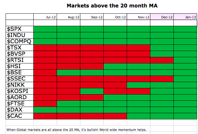
When the entire world is trying to rally together, it can be very supportive. Both exports and internal confidence grows which can be very complimentary.
So we have to maintain a bullish approach to the markets. Why fight this trend?
As regular readers of The Canadian Technician blog are aware, the commodities have not broken out yet, but are very close.
While I want to see that happen for obvious reasons, I have one interesting hurdle the markets have to overcome.
This is the chart of the 4 major commodity supply countries charts for the last 15 years. (Commodity Countries)

Now we could debate exactly where to draw each line. These lines reflect a range that has significant support and resistance in each market.
Brazil actually rose above the line in January and has since pulled back under.
A renewed interest in commodities would probably confirm the new bull market. If it was to all unwind after a giant final rally that stalled at resistance on both the commodity and equity markets, this would be the time. I see very little negative divergence on the major indices so that is positive. The $USD is testing the lower boundary of its trading range. The Euro is pretty stretched here with gapping 1 cent moves a couple of times a week. Feels like an exhaustion move to me and based on the blue boxes below it looks like this run has been at least as long as the previous bull run into the September high.
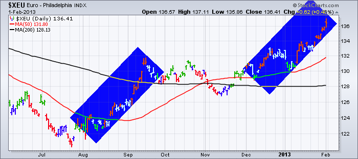
So just when everybody shouts the all clear, I see some major similarities in these charts that might take time to work through.
Maybe the bulldozer provided by central banks worldwide will break down the barriers and this will all breakout to the upside shortly.
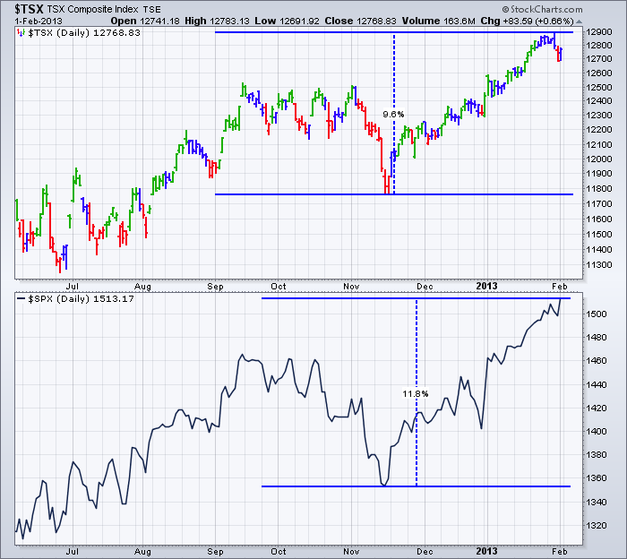
I'm Bullish and have been for months but the charts usually stair step up at a rate slower than 50% a year gains.
After a 10% move off the November lows, it might be time to expect a step. $TSX
Good Trading,
Greg Schnell, CMT
FUTURES INDEXES VERSUS ETFSby Carl Swenlin | DecisionPoint.com
READER QUESTION: I
am always curious why you elect to use a surrogate of a market to
provide a technical analysis. The one I have a concern with is using
UUP to analyze a H&S formation and mention violation of support.
However, the actual dollar chart shows that support still holds.
CARL'S ANSWER:
The first reason is that we don't have access to spot prices on
commodities because of the expense of getting a data feed from the
commodities exchanges. What we have available are futures-based indexes,
such as $USD (Dollar Index), $USB (30-Year T-Bond), and $WTIC (Crude
Oil), which report daily prices for the near futures contract. The
problem is that, as the near contract nears expiration, the index begins
tracking the next nearest contract, which is normally has a different
price. These monthly rollovers cause a lack of continuity in historical
prices, similar to stock prices that are not adjusted for splits and
distributions, and the usefulness of these indexes for the purpose of
technical analysis is somewhat degraded to say the least.
The
other reason we use ETFs for our analysis is that an ETF most
accurately depicts that actual cost of trading the commodity. It
includes transaction costs, the cost of rolling from one contract to
another, etc. Also, basically, you can't trade the index, but you can
trade the ETF.
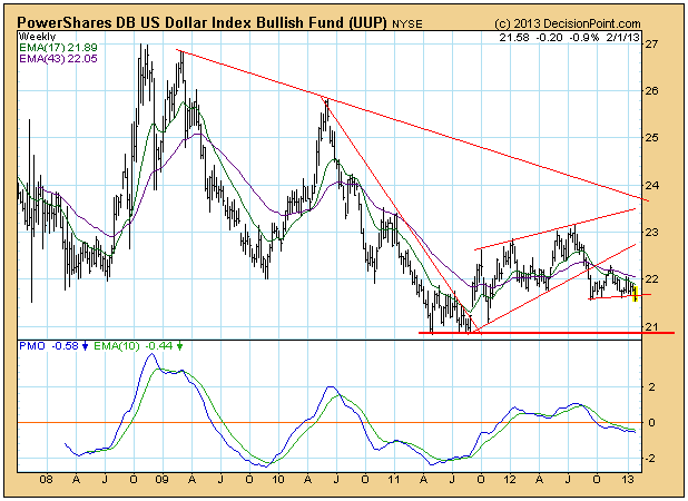
The following charts illustrate the differences. The Dollar Index presents a more optimistic picture...
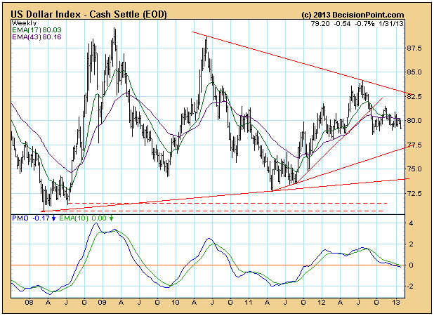
... than the ETF (UUP).
Conclusion:
We prefer to use ETFs instead of futures-based indexes because they
more accurately reflect the the results of running a fund for a given
commodity. Most important, the technical analysis we apply to the ETF
has practical value, since the ETF can be traded.
ENERGY'S RALLYING, WHAT'S NEXT?by Tom Bowley | InvestEd Central Energy apparently has more fuel in the tank. After underperforming the past couple years, it has rocketed higher to start 2013 and was the leading sector during what was a VERY solid January. As a student of history, that January strength bodes well for the stock market during the balance of 2013. Expect all-time highs on the S&P 500 later this year and those future gains are likely to be accompanied by a rapidly rising energy group. In my last article, I showed a chart of the oil services index ($OSX) that reflected relative breakouts that were just barely taking place. Given the action the past couple weeks, those relative breakouts are much more clearly defined now. Take a look:
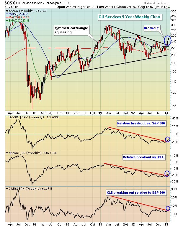
This is truly a perfect storm. Energy (XLE) is breaking out relative to the S&P 500 ($SPX). Oil services ($OSX) broke out of a symmetrical triangle on a long-term weekly chart. The $OSX is breaking out on a relative basis vs. both the $SPX and the XLE. Currently, I don't really see any better area in the market to trade than oil services.
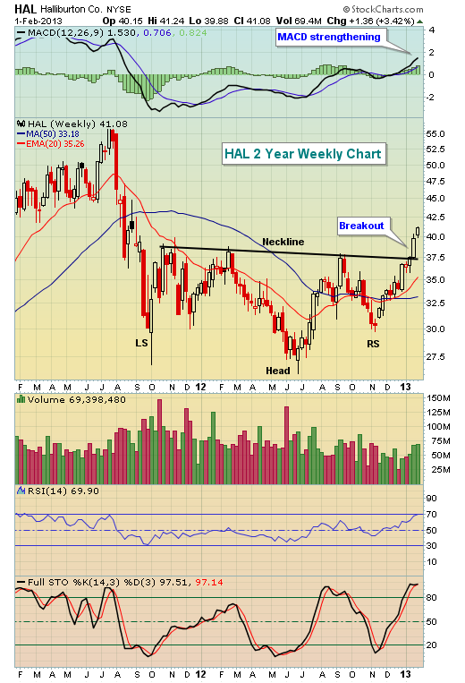
Within the $OSX, check out Halliburton (HAL), one of the many oil services components with improving technicals:
So where else can we turn? The market's overbought and chasing anything should be considered dangerous. Well, technology has been the most disappointing sector the past few months as Apple's (AAPL) struggles have been well documented and have compounded the difficulties for the NASDAQ 100 ($NDX). But let's not forget it was AAPL's strength that catapulted the $NDX on a relative basis prior to this latest period of disappointment. Could the $NDX be ready to jump back into the fray? Check this chart out and you be the judge:
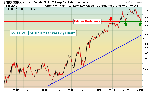
Since 2006, this relative chart has been trending higher. With every relative breakout, the previous relative support held during periods of tech weakness. According to the chart above, we're going to find out a lot about the long-term relative strength of the $NDX. Personally, I believe the group is now primed to outperform once again. But I wouldn't rush into the first component that you come across. In fact, on Friday, I listed 24 component stocks of the $NDX printing long-term negative divergences on their daily charts for the benefit of our members. I would avoid them. While that doesn't guarantee selloffs, it certainly increases the risk of holding or (gasp!) buying these stocks. The good news is that there were 32 stocks in the $NDX that looked very solid to me technically.
On Monday, I'm featuring one of these $NDX component stocks in the midst of a VERY bullish ascending triangle pattern. I expect it to lead to outsized gains, especially on a high volume breakout. If interested, you can sign up for our FREE weekly newsletter (simply provide your e-mail address) and I'll be happy to send you my annotated chart.
CLICK HERE for more details.
Happy trading!
CURRENCY WARby Richard Rhodes | The Rhodes Report There has been quite a bit of banter recently about a "currency war" developing given the Japanese Yen has fallen dramatically against the USD - roughly -15% in the past 11-weeks. This is a rather major move for a currency; and it is such that it is providing cover for Japanese exporters against those in Europe and the US as well as other emerging markets. Remember, the US continues to print money via QE-4, while Europe has simply said it "has what it takes, and believe us - it is enough. Japan on the other hand, simply said they would raise their inflation target from 1.0% to 2.0%, and employ an open-ended asset purchase plan...beginning in January 2014. One must wonder aloud why the Japanese aren't doing so now; and whether or not they are following the Europeans by jawboning the markets. In light of this, it would be wise to consider the technical condition of the US dollar as the "race to the bottom" looks to get much more interesting in the weeks and months ahead.
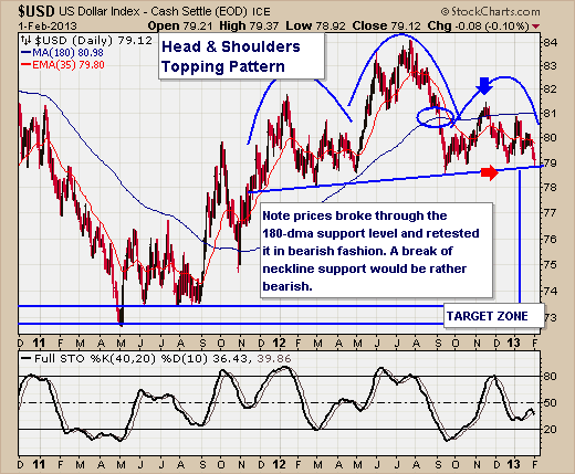
Quite simply, the US dollar is forming what is clearly a bearish "head & shoulders" topping pattern, and is on the verge of breaking down below neckline support. This would be a major violation, and thus would target the waterfall lows formed back in May-2011. And with volatility growing in the currency markets, then this decline could be just as quick over a couple of months. That said, one would ostensibly wonder which currency or currencies one would buy against the US dollar to take advantage of just such a move. In our opinion, the Euro and the Swiss Franc - with the Swissy being our favorite currency given her outstanding fiscal situation.
Lastly, we should point out that the US dollar decline to the May-2011 low was accompanied by increased volatility in the stock market - and a majority of this volatility resulting in a sideways trading pattern...ultimately resulting in a sharp decline into September 2011. So, caution is advised; especially given the recent euphoria.
Good luck and good trading,
Richard