SEARCHING FOR ANSWERS IN ORLANDOby Chip Anderson | ChartWatchers Hello Fellow ChartWatchers!
Last weekend I had a great time giving our SCU 101 seminar to a room full of people at the Dolphin Hotel in Orlando. One of the questions that came up during that seminar was "What does the solid black candlestick mean? I've looked all over your site and I can't find anything that talks about what the different candlestick colors mean."
OK, that is a very good question. It's also a question that our support team sees quite often from other users. And it is an important question that everyone needs to know the answer to. I was glad to get that question during the seminar, but I decided not to answer it directly.
Instead, I took the opportunity to show everone in the room our "Search" feature. Why? Because we rewrote it last year and it works really well however many people either don't use it or they don't use it correctly. I can make that statement because, like the candlestick question, many of the questions our support team gets each day are already answered on our website.
I told everyone at the seminar to go to our homepage, find the "Search the Site" box on the right side of the page, enter "Candlestick colors" into the box, and press the "Search" button. Here is what the results of that search look like:
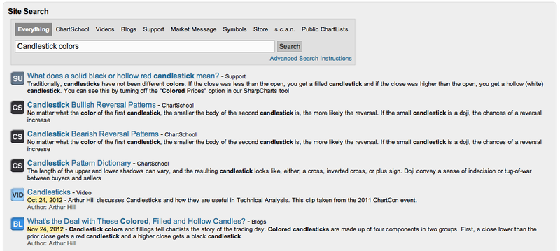
Because we programmed this search feature ourselves, we control the order of the results that you see and we can tweak those results so that the articles that are more interesting to chartists like yourself appear first. (Our old search feature was hosted by Google and Google's results weren't nearly as useful.)
The first article listed on that search results page is a direct answer to the question that was asked in the seminar. The "SU" icon beside it means that the answer was written by our Support staff and is stored in our Support Knowledgebase. The next couple of articles are labelled "CS" for "ChartSchool" and are general articles about candlesticks and candlestick patterns. We then have a link to an educational Video ("VID") about candlesticks from Arthur Hill and finally a Blog ("BL") article that Arthur wrote last November re-explaining how candlestick colors work.
So these search results are pretty useful to someone who is trying to understand how candlestick coloring works on our website. When everyone at the seminar saw this, they immediately started searching for the answers to other "great mysteries" they had always wanted to know. In other words, they had learned how to "fish."
I encourage you to take a moment and do this search yourself and then dig into some of those articles and videos and see what you discover.
Later, during the lunch break, several people told me they were very glad that I made them try the Search box because they had already discovered several new tricks and tips on their own. That was great news to my ears. It's also another example of the kind of real world value that most seminar attendees get during our courses.
So please remember to use our Search feature whenever you need help using our website. You'll be amazed at all the things you'll find.
- Chip
A lot of traders and investors are waiting for the bull market in gold
to resume. They may have a very long wait. That's because a lot of
traditional chart, technical, and intermarket signs are now working
against gold. Let's start with a long-term look.
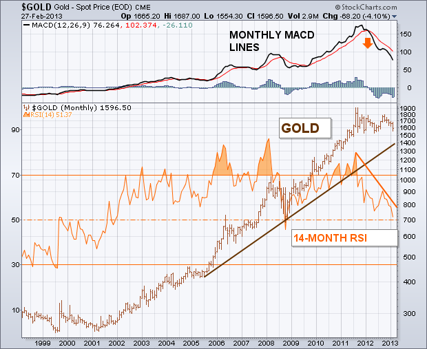
The monthly bars in Chart 1 show the major bull move in gold that
lasted from 2001 to 2011. The rising trendline drawn on the log chart
is still intact. [A log price scale measures percentage price changes
and is better for long-term trendline analysis]. But the two indicators
shown on the chart aren't. The orange line overlaid on the gold price
is the 14-month RSI line which measures long-term
market momentum. The last major peak in the RSI took place during
2011. The fact that it fell short of its 2008 peak formed a "negative
divergence" with gold. Even worse, the RSI line has been dropping
since 2011 (orange trendline). The RSI line is now approaching an
important test of its 2008 low (dashed line). It it doesn't hold
there, the long-term trend of gold should weaken further. The monthly MACD lines
(top of chart) look even worse. The two lines turned negative at the
start of 2012 (red arrow) and have fallen to the lowest level in three
years. That's the worst downturn by the MACD lines since the bull
market began in 2001.
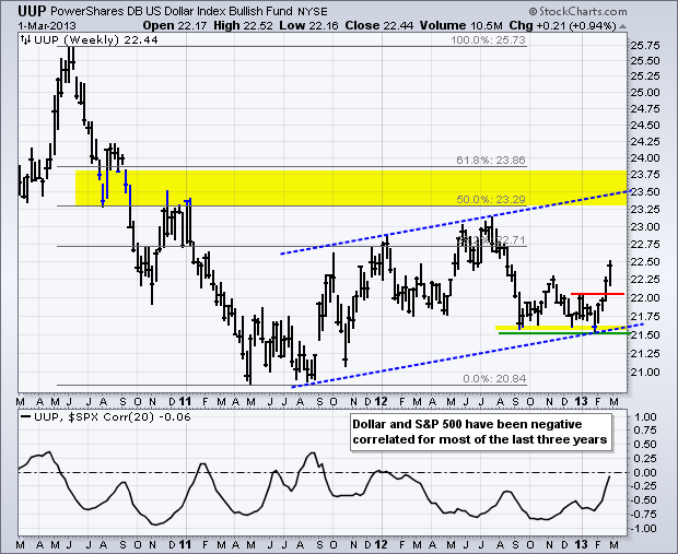
The Dollar Bullish ETF (UUP) extended its advance with a break above the mid November high this week and a fresh six month high. UUP is at levels not seen since August 2012 and this surge could weigh on stocks because the Dollar and stock market have been negatively correlated the last three years. A rising Dollar could also signal a return to a risk-off environment. On the chart below, it looks like UUP formed a higher low around 21.50 and the February breakout signals a continuation of an uptrend that has been in place since August 2011. The yellow area marks the next target zone in the 23.50 area. The upper trend line of the rising channel and the 50-62% retracements were used for this target.
Click these images for live charts.
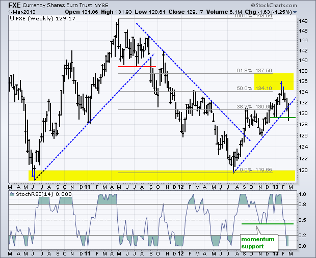
Watch the Euro for clues because it accounts for around 57% of the US Dollar Index and the Dollar Bullish ETF. The second chart shows the Euro Trust (FXE) breaking the July trend line and piercing support from the January low. This breakdown signals a continuation of the prior decline (May 2011 to July 2012), and the next support zone resides in the 118-120 area. The indicator window confirms the breakdown as StochRSI broke below its November low and below .40 for the first time since July.
Good trading!
--Arthur Hill CMT
NDX EXHAUSTION DIVERGENCEby Carl Swenlin | DecisionPoint.com Textbook
dIvergences occur when an indicator fails to keep up with price. For
example, a positive divergence is when price makes a lower bottom, but
the indicator makes a higher bottom. A negative divergence is when price
makes a higher top, but the indicator makes a lower top. In each case
the divergence signals a possible price reversal. I call them "textbook"
divergences because they are the kind that are typically referenced in
any discussion, but there is another kind of divergence, which I will
call an "exhaustion divergence," that is extremely useful but rarely
mentioned.
Let
me first apologize if the exhaustion divergence has been identified and
named something else by someone else. I am not the most widely read
person you will ever meet. But, since I do not recall ever having seen
it included in a discussion of divergences (except by me), I will take
the liberty of giving it a name for the purposes of this discussion.
Also, I seriously doubt that I am the first to have noticed and remarked
upon this type of divergence.
The
exhaustion divergence is quite the opposite of the positive or negative
divergence. In a rising trend, the price index makes a lower top while
the indicator makes a higher top. And in a falling trend, price makes a
higher bottom while the indicator makes a lower bottom. I believe it
signals the exhaustion of the price move because internals are unable to
drag price along with them.
On
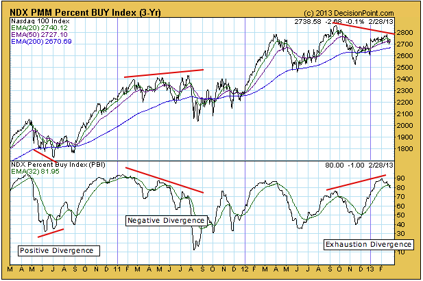
the chart below I have annotated examples of each type divergence. In
2010 we had a positive divergence which coincides with the price low. In
2011 two lower indicator tops precede the price break in July/August.
And finally, the exhaustion divergence occurring at the most recent
price top.
The
significance of the divergence becomes more obvious when we understand
the indicator. The Percent Buy Index (PBI) shows the percentage of Price
Momentum Model (PMM) buy signals for all the stocks in a given index --
in this case the Nasdaq 100 Index. (The PMM generates mechanical
medium- to long-term buy and sell signals for individual stocks.) At
it's peak in January the PBI showed that 90% of stocks in the NDX were
on buy signals (much higher than in September), yet price was struggling
below it's previous top. it reminds me of a car with its engine turning
at high RPM and the clutch slipping.
Since
the NDX is a cap-weighted index, the cause of the divergence is that
the larger-cap stocks in the index are not doing very well, not a
heaalthy situation. In addition to the divergence you'll notice that the
PBI has crossed down through its 32-EMA. This is a sign that a price
correction may be about to take place.
Conclusion:
My observation is that the exhaustion divergence is a reliable tool,
probably more reliable than the positive divergence, which tends to be
nullified during strong up trends. Currently, there are many indications
that a price correction is due. This is just one more.
In my last article, I laid out several arguments why it would make sense to be more cautious as you approach the stock market. I'm bullish for the balance of 2013 - at least as of now - but the short-term has definitely turned more dicey. One of the ways that I evaluate the strength of a move to the upside in the S&P 500 is by looking to see what areas of the market are leading the charge. As of Friday's close, healthcare and consumer staples were the two best performing sectors of 2013, indicative of a market that is tired.
The good news is that financials on a relative basis continue pushing higher. Rarely do we see overall market weakness when financials are strong on a relative basis. But here are a couple of things to watch for if our major indices break out to fresh new highs once again. First, do financials make yet another relative breakout that coincides with an S&P 500 breakout? If so, it would be a checkmark in the bulls' column for sure. More importantly, however, is whether the defensive sectors take a backseat to the more aggressive sectors on such a breakout.
Check out the chart below:

The Dow Jones and S&P 500 have been showing relative strength vs. their more aggressive counterparts - the NASDAQ and Russell 2000. Should we see a break to fresh new highs with index leadership from the Dow Jones and S&P 500 and sector leadership from healthcare, consumer staples and utilities, it'll be a breakout worth ignoring.
Healthcare stocks (XLV) broke out on Friday, but did so with a long-term negative divergence in play. In the current market environment, please make sure that you identify potential trading candidates with strong reward to risk trading profiles. I found one such healthcare stock and am including it as my Chart of the Day for Monday, March 4th. If you'd like more information, simply
CLICK HERE.
Happy trading!
The past two trading weeks in the gold market has been rather dramatic: a sharp decline followed by a sharp rally and then a recent test of the lows. The end result - quite a bit of wailing and gnashing of teeth. And, we think the wailing shall become louder before gold finally bottoms and turns higher towards new all-time highs. Quite simply, gold is in the process of providing those longs accumulated over the past 2-years with losses, and a resultant "puke point" lies ahead.
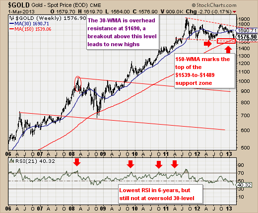
Technically speaking, we are looking for a test of the rising 150-week moving average at $1539 - much in the same manner as was seen during late 2008. However, one need understand that this moving average is likely to be violated for a short period of time, and it is likely to test the rising 40-month moving average currently trading at $1494. So, we have a zone in which to consider buying gold for an initial position; and then we would use a breakout above the 30-week moving average to add to the trade and get very very aggressive. Until then, we can wait for the yellow dog to bark.
Good luck and good trading,
Richard Rhodes