Hello Fellow ChartWatchers!
We're starting to get "Spring Cleaning Fever" here at StockCharts. Can you tell?
Exhibit #1: This! This new newsletter design! What do you think of it? We reworked things to make the newsletter more readable, more printable and more informative overall. In addition, we'll be converting all of our old newsletters into this new format and putting them in a huge archive section of our site for posterity. Watch for that in the next month or so.
Exhibit #2: Did you notice the speed-up in our servers last week? Probably not - our site has always been very fast - but we did install a new collection of 28 super-fast servers from IBM and they are going to ensure that things remain super-fast for the foreseeable future even as our membership continues to grow. For example, these new servers have made the Scan Engine 16 times faster than before!
Exhibit #3: Finally, we're cleaning off another spot on our shelf for the latest "Best Technical Website" award from the readers of Stocks & Commodities magazine - for the 12th year in a row! We are very, very honored to receive this award again and - unlike Google - we pledge to continue improving things (for example, Exhibit #2 above) for the foreseeable future.
So, I know it is still early in the year, but spring is in the air here at StockCharts. Again, we hope you like the new email format for the newsletter. Click here and let me know what you think!
- Chip
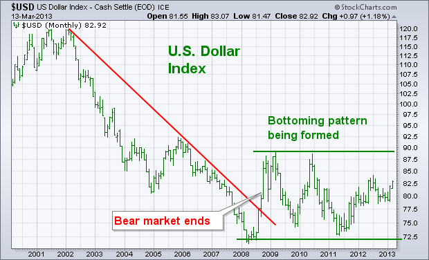
U.S. DOLLAR APPEARS TO BE BOTTOMINGby John Murphy | The Market Message The monthly bars in Chart 1 plot the U.S. Dollar Index
since 2001. Two major trends are seen on the chart. The first is the
major downtrend in the dollar between 2002 and 2008. During 2008, the
USD broke its six-year down trendline which ended its bear market.
Since then, the USD has trended sideways in what appears to be a major
bottoming pattern (see parallel lines). To complete that bullish
pattern, the USD would have to clear its 2009-2010 highs. Although
that hasn't happened yet, it isn't too soon to consider the possible
implications of the dollar becoming the world's strongest currency for
the first time in more than a decade. The most obvious implication is
that the dollar will do better than most foreign currencies. That
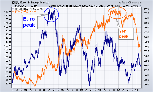
makes the dollar a much better bet. Chart 2 shows what has happened to
the world's two biggest foreign currencies since the dollar bottom
during 2008. The Euro peaked that year and has fallen since then. [The Euro has the biggest weight in the USD]. The orange line shows the Japanese Yen
peaking during the fourth quarter and tumbling during this quarter.
Forex traders have been buying the dollar and selling the Euro and yen
(as well as most other foreign currencies). Currency trends reflect
how the world views economic prospects for the various economies.
Dollar strength suggests that the U.S. economy is in better shape than
most foreign markets. There are other intermarket implications of a
stronger dollar. One of the most obvious is its impact on commodity
markets.
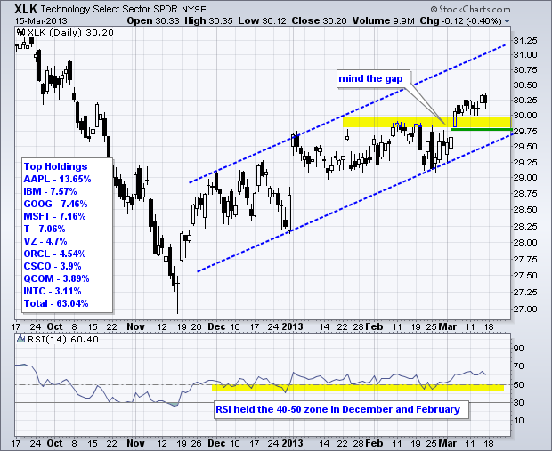
The Nasdaq 100 ETF (QQQ) and the Technology SPDR (XLK) have been underperforming the broader market, but both remain in uptrends since mid November and are holding their March gaps. Relative weakness stems from Apple, which is the biggest component for both ETFs. Microsoft, which accounts for over 7% of each ETF, has also been underperforming the broader market for several months. The first chart shows XLK breaking above resistance at 30 with a gap-surge in early March. This breakout is holding with broken resistance and the gap marking a support zone. A move below 29.75 would fill the gap and negate the breakout. RSI confirms that the cup is half full. Notice that this momentum oscillator held the 40-50 zone in December and again in February. Momentum favors the bulls as long as RSI holds above 40. I suspect that RSI would break 40 if/when XLK breaks the December trend line.

The second chart shows QQQ with similar characteristics. A small flat consolidation formed after the surge. This looks like a flag, which could be flying at half-mast. A breakout would signal a continuation higher and target a move to around 70. The flagpole extends 3 points (±66 to ±69) and this amount is added to the flag low (±68 + 3 = 71).
Happy St Paddy's Day!
Arthur O'Hill CMT
MUNICIPAL BONDS HIT A POTHOLE...by Greg Schnell | The Canadian Technician Strolling through the the mid month charts, I came across this ETF.
This ETF represents Municipal Bonds. MYI
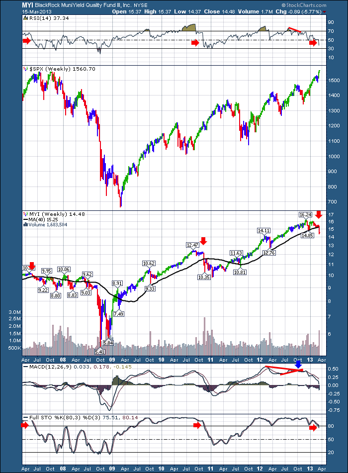
It has only moved below its 40 WMA twice in the last 5 years. Till this week. It marks the third time.
In 2007 it marked a drop early in the year and could not stay above the black line.
It tried twice in 2008 to get back above but failed in June and July. It was important.
In late 2010, it plummeted below the line, while the stock market went on a final run into April before correcting 20% in 2011.
This fund has shown more red in the last 3 months than at any time in the last 2 years.
At this point, its a heads up that something is going on in the Municipal Bond Market. We'll stay tuned to see if it has broader implications.
Good Trading,
Greg Schnell, CMT
There
are negative divergences on a lot of indicators we track (price makes a
new high, but the indicators makes a lower high), but the
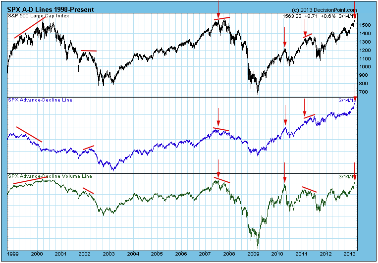
advance-decline lines for breadth and volume are actually confirming the
recent new price highs. This is reassuring but, it does not guarantee that even higher prices are coming.
As
Yogi Berra once said, "You can see a lot by just looking," and there is
a lot to see on the following chart which shows the S&P 500 Index
advance-decline lines for breadth and volume. I have annotated some of
the variations of divergences and confirmations which can occur. Let me
briefly discuss them.
First,
I generally limit comparisons to periods of no more than about a year,
because I don't think that comparisons over long periods are valid. For
example, I am not concerned that the current volume level has not
exceeded the 2007 volume top.
1999-2000: We had mixed signals. Breadth diverged negatively, while volume confirmed the price high.
2002: There was a reversal divergence on breadth and a negative divergence on volume - a thoroughly negative picture.
2007: There were negative divergences on both breadth and volume. Not a good outcome.
2011: A reversal divergence on breadth and a negative divergence on volume.
The
down-pointing arrows identify some of the times where a new high was
confirmed by one or both of the advance-decline indicators. In those
instances the price top was followed immediately by a price decline, or
the confirmed top was followed shortly by a slightly higher top, marking
the high before a significant decline. (Note: There are many other
confirmations that resulted in positive outcomes. I'm only trying to
illustrate that this not always the case.)
Conclusion:
Indicator divergences should always inject a note of caution into our
outlook, and it is best when the indicators confirm new price highs, but
a confirmation doesn't always mean that there is no immediate danger.
THE MACD RESETby Tom Bowley | InvestEd Central Personally, I love the MACD. It's one of my favorite technical tools when trading. It's not perfect - nothing is - but it does provide us a snapshot of momentum of a stock or index. The MACD is nothing more than the difference between two exponential moving averages, with the standard being the 12 period and 26 period EMAs. I follow this standard MACD.
As a refresher, here's a daily 6 month chart of Apple (AAPL) with the standard 12 day and 26 day EMAs reflected on the chart:
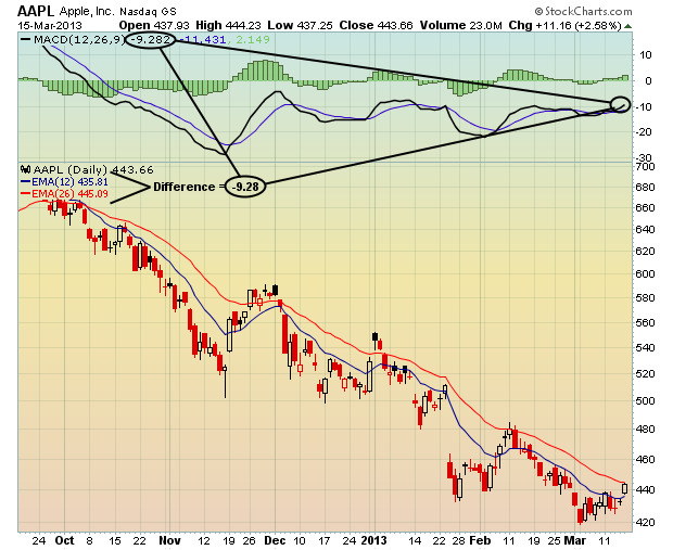
That is a static look at AAPL's MACD as of Friday's close. By changing the settings on the moving averages to the 12 day EMA and 26 day EMA, you can see clearly how all of the MACD-related numbers tie together. But it's the ebbs and flows of the MACD (momentum) that really grab my attention in order to assess risk.
Any time the price of a stock moves up, you should expect the short-term moving average to rise quicker than the long-term moving average. To the contrary, a declining stock price should see its short-term moving average falling faster than its long-term moving average. Once that relationship changes and divergence turns to convergence, it's a warning that the momentum could be waning and the RISK of a quick shift in trend direction should be considered. That's the real beauty of the MACD. It's not just a lagging indicator. It also can become a very strong PREDICTIVE indicator.
In my February 16th article, I discussed the potential risks of long-term negative divergences and how they might potentially influence the short-term direction of 5 S&P 500 stocks that were moving higher. The problem was they possessed the signs of slowing momentum - ie, long-term negative divergences. All 5 of these stocks suffered temporarily as their price fell and their MACD began moving back towards centerline support. In my view, that's all I'm looking for to the down side - a 50 day SMA test and/or a MACD centerline "reset". Below is the chart of one of these 5 stocks, Tenet Healthcare (THC), which also happens to be one of the strongest stocks in the market of late. Its SCTR rank is among the highest in the market. But check out its chart:
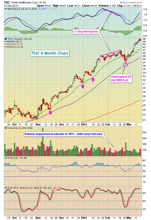
This is a perfect example that shows a long-term negative divergence offering us a warning of potential weakness ahead. In addition to the weak momentum in price action, look at the lack of volume that accompanied the breakout of THC in the first couple weeks of February. Light volume breakouts are another sign of slowing momentum and further corroborates the negative divergence on the MACD. Taking a more cautious approach to THC in mid-February - either by selling shares and moving to cash or possibly selling a covered call - would have reduced the risk of holding and enabled a long trader to hold onto profits generated through mid-February. Re-entry on the subsequent 50 day SMA test would have saved perhaps 8-10%.
Remember, long-term negative divergences are not necessarily a bearish development, especially in an otherwise bullish market environment. But they do signal that short-term risks are elevated and that it's time for the short-term trader to alter his or her trading strategy accordingly. And for those looking to take an initial long position in such a stock, it would probably behoove them to wait until a 50 day SMA test and/or a MACD centerline approaches before committing capital.
Happy trading!
Tom Bowley
Chief Market Strategist
Invested Central
The stock market's uninterrupted gains in recent months is giving rise to talk of a bubble, and perhaps this is the case within the scope of time. It is still far too soon to determine this, although further gains will cause us to consider sharply higher prices within the context of anemic economic growth. With this said, we are watching the Crude Oil futures market rather closely, for on a monthly basis - a bullish pennant pattern is forming that projects sharply higher prices...to new highs above the $150/barrel level. This would come as a surprise to many, but the fact of the matter is that there is likely to be a series of rolling euphoric moves across all asset classed stocks, commodities and bonds. Right now, it is simply stocks. But we are starting to see signs of more interest in the commodity groups than we have previously.
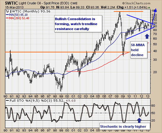
Therefore, we are interested in various energy stocks to participate in this rally, which by-the-way can occur within the context of a lower stock market just as occurred in 2007-2008. Our choices are several of the "laggards" such as Apache (APA), National Oilwell-Varco (NOV) and others. If there is risk in the long energy trade, then we would look for a monthly close below the 50-month moving average at $85/barrel level. In effect, this would suggest a mean reversion exercise towards the 200-month moving average that occurs roughly every 7-years. In this environment, we hate to think of what the world economy looks like, but suffice to say there will likely be very few long hiding places.
Good luck and good trading,
Richard