Hello Fellow ChartWatchers!
StockCharts continues to grow and expand, providing more value for its users (hey! that's you!) for free. Here are three great improvements we rolled out last week:
1.) Stocks & Commodities Articles for StockCharts Members
Our "Search" feature now automatically includes results from the complete archives of Stocks & Commodities magazine. Members can click on any of those results to see a PDF version of the article in question. Some of these go back as far as 1982!
In addition, members can now click on the "Stocks & Commodities" link on the right side of the "Members" page for free access to the current editions of S&C as well as the companion magazine Working Money.
And soon, watch for relevant S&C links to be included at the bottom of our ChartSchool articles!
Thanks again to Jason Hutson and his crew for making this happen. S&C has been an amazing resource for the technical analysis community for decades and we are thrilled to have this new partnership.
2.) Economic Indicators Added -
We've started rolling out the first of many economic indicators on our website. These new symbols all start with two dollar signs ($$). Most are monthly datasets from the FRED website. Here's an example that uses the new $$GDP symbol (the gray area plot):
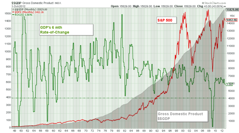
(Click the chart for a larger version. PRO users click here for a live version.)
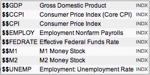
To see the complete list of the economic datasets we currently have, just type "$$" into the "Create a Chart" box at the top of any of our pages. Here's the current list (but keep in mind it will be expanding over the next couple of days and weeks):
3.) Extra Members Can Now Create and Chart Their Own Personal Data -
Last year we rolled out our User-Defined Index feature to our PRO subscribers. We've now made a limited form of UDIs available to all Extra and ExtraRT members. Those members can now create and use a single UDI called "@MYINDEX" by clicking on the new "User-Defined Index Workbench" link on the "Members" homepage.
A User-Defined Index allows you to upload and chart data from a spreadsheet. The data can contain any time-series information you want. It is a really powerful feature. Here are some articles that illustrate how it can be used.
4.) Bonus Improvement #4 - More Speed!
As I mentioned last time, we are continuing to upgrade our datacenter and the new servers are making a noticable improvement in the time it takes to generate charts during market hours. Check out these charts from our independent monitoring service Pingdom:


The top chart shows the average time it took for us to generate charts during March. The bottom charts shows the times during the first days of April. See the nice drop on March 30th and 31st? It represents a roughly 20% improvement in the time it takes for us to send out a SharpChart! That improvement has continued in April as well. (Click here to see for yourself.) And we're not done yet - hopefully we can squeeze out even more speed soon.
Do you want even more improvements? Trust me, we're working on some doozeys. Just stay tuned!
- Chip
P.S. If you are feeling overwhelmed by the sheer number of features StockCharts offers, why not join me for a personal tour of everything we have to offer? I'm personally giving our SCU 101 seminar in several locations throughout the country this year including Long Beach, Seattle, Toronto, New York and Dallas. Click here for more info. I hope to see you at one of these events soon!
P.P.S. Oh yeah, one more thing... Have you picked up your copy of Arthur Hill's first book? What? You didn't know Arthur Hill published a book? OK, that's my fault for not making a bigger deal of it. But now that you know, why not take advantage of our 50% special on Art's book? He'd really appreciate it! Just click here for details.
This is the same headline used in my March 21 message which showed how
falling commodities were hurting stocks of countries that produced
commodities. A rising dollar causes foreign stocks to underperform
U.S. stocks, which has been the case since the dollar bottomed during
2008. A rising dollar hurts commodity prices. As a result, foreign
countries that produce and export commodities take a double hit. The
March 21 message showed the close positive correlation between
commodity prices and Brazil and Canada. Today, I'm adding Russia to
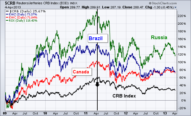
the mix. Chart 1 compares the trend in the CRB Index (bottom line) to Brazil (blue line), Canada (red line), and Russia
(green line) iShares since 2009. You can see the visual
correlations. All four markets rose together until the spring of
2011. The CRB Index peaked that spring (thanks to a rising dollar),
and has continued to weaken. Brazil, Canadian, and Russian stock
ETFs peaked at the same time and have continued to weaken along with
commodities. Russia's stock market is especially sensitive to trends
in energy, which is its biggest export market. Relative weakness in
the Chinese stock market (which is the world's biggest importer of
commodities) has also hurt demand for commodities and country stocks
that produce them.
The Directional Movement Indicators have equalized as trading turns flat for the Dow SPDR (DIA), but the overall trend remains up as the ETF tests its first support zone. Let's look at support first. DIA hit 144 on March 11th and then traded flat the last few weeks with several crosses of this level. DIA dipped to 144.05 in early trading on Friday, but rallied after the weak open and closed above 145. Support in the 144 area extends from the mid March consolidation. A move below the consolidation lows would break support and argue for a deeper correction, perhaps to the 138-140 area.
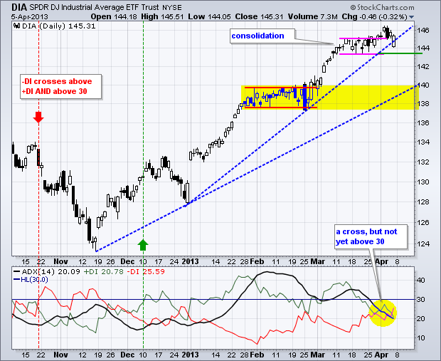
Click this image for a live chart.
The indicator window shows the Average Directional Index (ADX) along with Plus Directional Movement (+DI) and Minus Directional Movement (-DI). +DI (green) crossed above âDI (red) on December 5th and exceeded +30 to kick off the current uptrend. I am using 30 to confirm crossovers and reduce whipsaws. Notice how +DI has moved above/below 30 since December, but âDI has yet to exceed this level. Most recently, the indicators converged in the low 20s as directional movement flattened and âDI crossed above +DI this week. Even so, the bulls still have the edge because +DI was the last one to exceed 30. âDI would have to break above 30 to confirm this crossover and reverse this edge. You can read more about these indicators in
our ChartSchool.Made in Manhattan!
--Arthur Hill CMT
We have a few wonderful indicators we can use to judge the overall health of the market. The problem for the technician is when to say, "I'm Out!"
Lets compare the $TSX to the $SPX using these two charts to analyze the broader picture. Here are the links. $TSX, $SPX
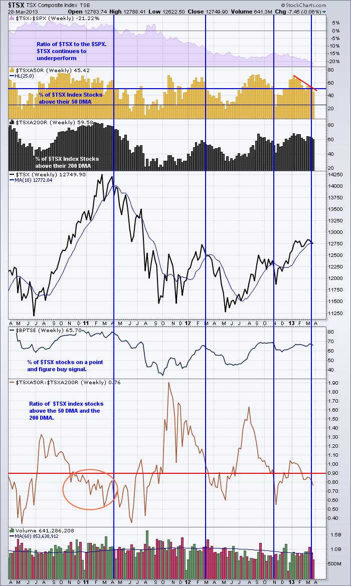
The blue vertical lines are placed when the index fell below the 10 week or approximately the 50 DMA line. The $TSX looks like it is ready to breakdown here, with the exception of the stocks above the 200 DMA. That still looks strong as does the Bullish percent. But both are at levels where markets have broken down before.
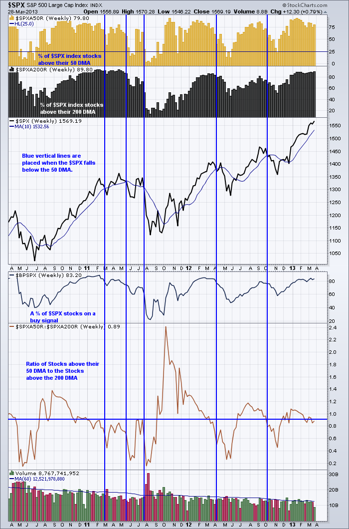
The $SPX appears stronger. Period. The only signs of weakness are the stocks above the 50 DMA appear to be making lower highs. The Ratio of Stocks above the 50 and the 200 DMA seems to be weakening to a level where things normally break down from.
Looking back up at the stocks above the 200 DMA (black) area, you probably don't want to wait until that number starts falling. But a drop below 80% would be ending a trend I think. The % of stocks still above their 50 DMA is strong. The level was almost 10 % lower midweek so there is some weakness.
Good Trading,
Greg Schnell, CMT
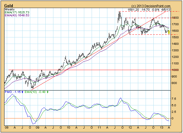
While gold is still maintaining a long-term consolidation, gold mining stocks have signalled still lower prices to come.
A quick look at the weekly gold chart shows that the metal is holding above a line of support that goes back over a year.
In
contrast, the XAU (gold mining stocks) has formed a bearish head and
shoulders pattern, which executed when price dropped below the neckline
earlier this year. We can see that the breakdown was followed by a brief
snapback before the decline continued. At this point the minimum
downside target would be the support line drawn from the October 2008
low.
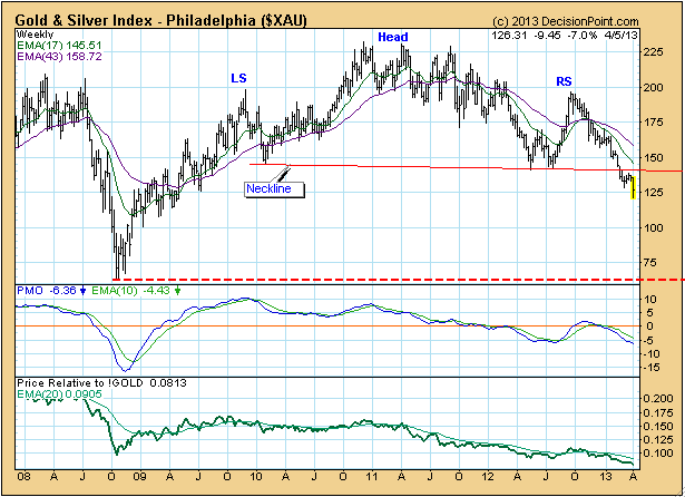
It
would be useful to note how dissimilar the two price lines are. One
would think that the stocks would be closely related to the metal, but
the charts will quickly clear up that misconception. (Prices are
intraday.)
Conclusion:
While for the time being gold has bounced off long-term support, the
XAU has signalled that there are still lower prices ahead for gold
mining stocks.
This is my favorite time of the quarter. Being a "technifundamentalist", I like finding companies that look solid both technically and fundamentally and concentrate my trading efforts there. For me, it all begins with volume. If a company reports earnings and receives a ho-hum response in terms of volume, I'm not interested. High volume is still a necessity during any "accumulation phase". Therefore, consider narrowing your trading choices down to stocks that report earnings and produce extremely heavy volume that accompanies a surge higher. A maribozu candle (one that opens on the low and finishes on the high) is perhaps the best indicator of uncontrollable buying interest, or accumulation. It doesn't mean I'd chase the stock, but it's one that could easily be kept track of at StockCharts using a ChartList. Wait for a pull back to price support, gap support or a key moving average and seize the opportunity.
Here's a very simple illustration on how to first find stocks that produce heavy volume:
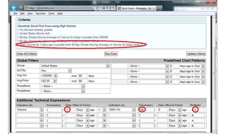
Notice that my primary concern on this scan is volume - lots of it. I don't even consider a stock unless it produces daily volume 3 times its average level over the past 90 days. I also filter out less liquid stocks by requiring that the 90 day average be at least 200,000 shares. I run this scan every day during earnings season to identify stocks that are both technical and fundamental winners. Then comes the patience and discipline, allowing a trade to set up. On this particular scan, I'm looking at stocks that met my criteria 7 days prior. That gives me an opportunity to see how they've traded since the big volume day.
I've identified one stock that reported earnings recently that fits the bill and I'm including it as my Chart of the Day for Monday, April 8th. You can CLICK HERE for more details.
April has not thus far been very kind to the economic bulls. The various world and US PMI reports have been "less-than-anticipated", while employment is showing weaker-than-expected figures via the weekly jobless claims, ADP private payroll and non-farm payrolls. This economic deceleration is simply part and parcel of the lagged effects of the payroll tax and the sequester. Moreover, this weakness has pushed down 10-year yields down to 1.69% from its recent highs of 2.06%, a rather large percentage move to be sure, and not far off the lows at 1.394%. Ultimately, 10-year note yields are headed to new lows below this level; and this "should", and we stress "should" be the "final move" that will provide for a generational low in yields.
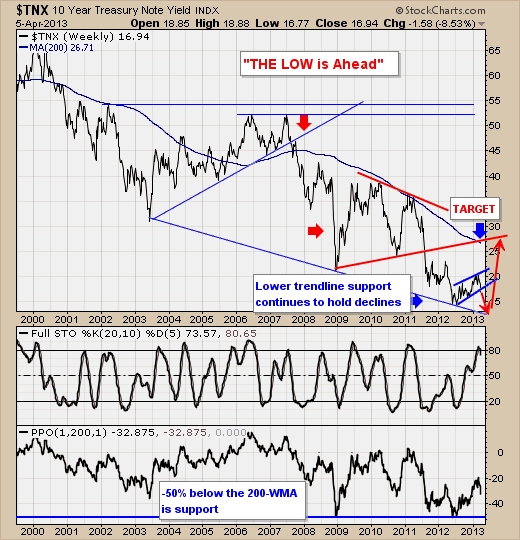
Technically speaking, the downtrend in 10-year yields remains in place, with the 20-week stochastic having turned lower from overbought levels. This rollover supports a decline yields into lower trendline support, which at this point has three very clear touches...thereby solidifying its importance as major support. Too, we should note that 10-year yields tend to bottom out at -50% below the 200-week moving average, which given its current reading of -32%...leaves roughly -18% of a decline before major support is found. This figures to be at 1.38%...slight new lows. However, we do believe that once these new lows do print - then an a minimum upside mean reversion target of 2.65% lies in the future.
So, as we enter the "sell in May and go away period", then perhaps one of the "biggest" trades on the technical landscape will see 10-year note yields finally rise on the order that everyone has expected over the past several years...but only after new lows print. And, it is an inevitability that prices will trade back to, and then above the 200-week moving average (only rarely in the past 12-years); and our bet it that the move off the lows will begin in 2013.
Good luck and good trading,
Richard