Hello Fellow ChartWatchers!
I'm very happy to announce that we've just added a new overlay to our system - the Chandelier Exit. This overlay is a favorite of our good friend Dr. Alexander Elder. He discusses it extensively in his books. It is a trailing stop overlay meaning that it tries to determine a good price level for exiting an existing position. In that regard, it is similar to Welles Wilder's Parabolic SAR overlay. Here's what it looks like in action:
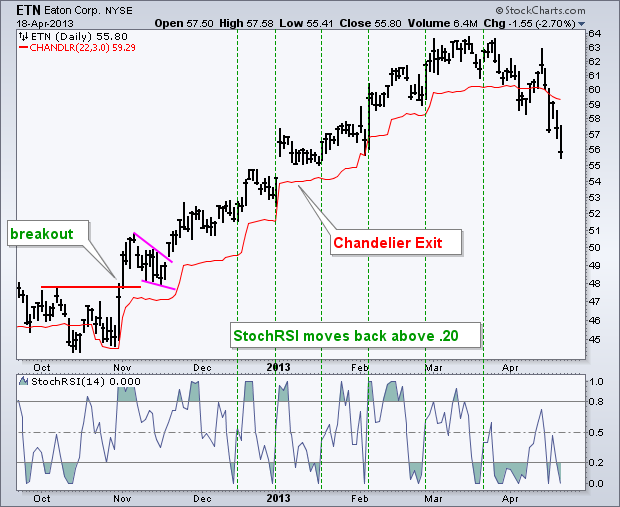
Notice that the red line on this chart could have been used effectively as a trailing stop-loss during the uptrend.
For more details on Chandelier Exits including how they are calculated and used, please see our new ChartSchool article on them.
- Chip
Of all the commodity markets, copper is viewed as the most closely
aligned with trends in the global economy. Copper and other
commodities have been lagging behind global stocks over the past year
(largely owing to a stronger dollar and weakness in Chinese stocks).
This week's plunge in copper, however, finally caught the world's
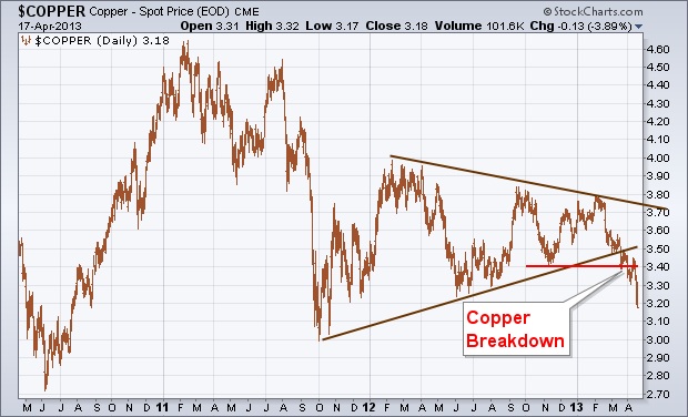
attention, and not in a good way. Chart 1 shows the price of spot copper
plunging this week to the lowest level since October 2011. It had
already fallen below the lower line of a long-term "symmetrical
triangle" which signaled that its trend was weakening. One of the
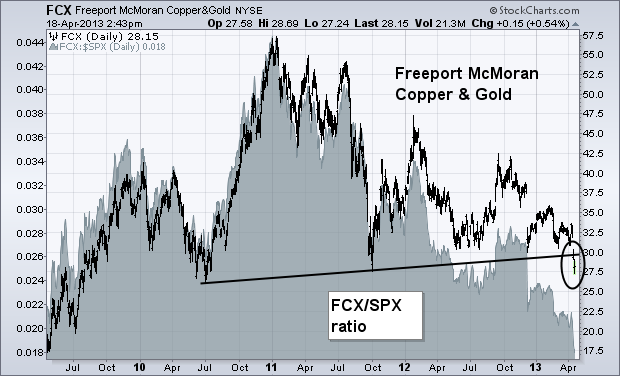
worst performing stocks is tied to copper. Chart 2 shows Freeport McMoran Copper & Gold (FCX)
tumbling to a two-year low this week. Its relative strength line
(gray area) had been falling for the past year. [FCX is primarily a
copper stock]. The copper breakdown calls into question the strength
of the global economy which, in turn, is causing nervous profit-taking
in global stock markets.
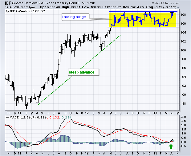
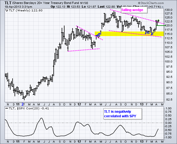
The 7-10 YR Treasury Bond ETF (IEF) is challenging resistance and a breakout would have negative consequences for stocks. Stocks and Treasury bonds are negatively correlated because they march to the beat of different drummers. Treasury bonds move higher because of deflationary pressures, signs of economic weakness or both. We could be getting a little of both recently. Gold, oil and copper fell sharply in April and this is more deflationary than inflationary. Economic reports have been soft over the last few weeks and first quarter earnings have largely disappointed. After earnings season, our next big batch of economic reports will hit in early May.
Click this image for a live chart
The first chart shows the 7-10 year T-Bond ETF (IEF) moving to the top of a trading range that extends back to June 2012. The ETF moved sharply higher from February 2011 to June 2012 and then traced out a flat trading range. Technically, a flat range after an advance is a bullish continuation pattern and a breakout here would signal a continuation higher, which would be negative for stocks. The indicator window shows MACD turning up, breaking its signal line and moving into positive territory. Momentum is bullish. The second chart shows the 20+ Year T-Bond ETF (TLT) breaking above the upper trend line of a falling wedge. This surge and breakout signal a continuation of the bigger uptrend. It would take a quick move below 120 to negate this breakout.
Click this image for a live chart
Good Trading!
--Arthur Hill CMT
One of the hardest trades to make is the one you don't put on. Just sit. The martial arts practice Defence and Offence.
The 40 WMA (Weekly Moving Average) is roughly equivalent to the 200 DMA (Daily). Lets call it the Black belt for today. Many technicians employ a simple strategy of the price action being above or below the 40 WMA. If it is above they are bullish and below they are bearish.Depending on your investment strategy depends on how short or how long the timeline is for your long term MA.
John Murphy reviewed 2008 and remarked that the $SPX never spent 1 day above the 200 DMA all of 2008. Just sitting on your hands while it was below would have saved many accounts from the beating that ensued. So many investors could have been out of the market just using that strategy for the down turn. Here is what makes that difficult for Canadian investors. Every time the $TSX broke below the 40 WMA in the last 3 years, it surged back above, tested a higher level and then continued lower. So it's not as easy as it sounds. Here is the link to the $TSX chart. $TSX. If we use the slope of the red line it can be a guide. It is either pointed up or down while the market tests the 40 WMA. This is not infallible either but it helps. Sometimes using Elliott wave theory can try to place us on the right part of the wave structure. It looks to me like we have had a 5 wave move down off the 2011 highs, to an ABC correction which we just completed if my marks are right. An equivalent move from the 5 wave down would have us finish this corrective wave at about 9500. That would be optimistic. The bearish views of EWI (Elliott Wave International) would suggest much lower than that.Let's just say I am not an elliottician. The bottom line is the pattern looks lower right now.
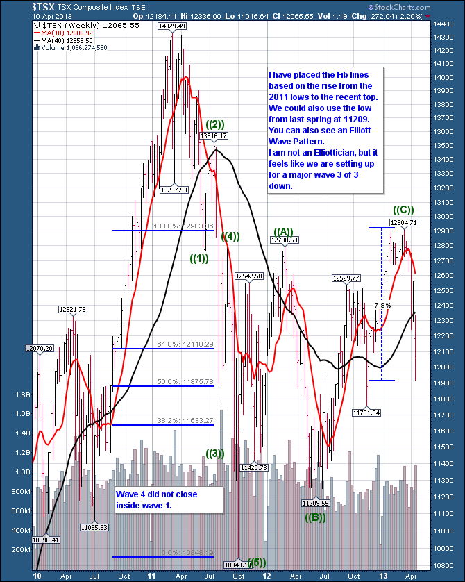
Today we sit at that junction. We moved the major Canadian Index below the black belt or the 40 WMA. Now what? There are many moving parts to this chart. It feels like a thriller, and it should. The moves are straight out of 'Skyfall'. The $TSX is already 7.8% off it's highs from peak to trough. We've already had 200 and 300 point moves down in the last 3 weeks. While investing in a firestorm is very tricky, the $TSX is a market riddled with cross currents. Our major trading partner is the USA. 80% of our trade is with America. But our index is filled with commodities and has traded closer to the growth markets rather than America. So assuming the USA is doing well, tells you to stay long. Most of the growth markets are testing the 200 DMA or just the opposite of America's charts.
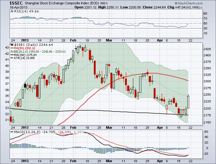
An example would be growth markets like Shanghai daily. ($SSEC).
and India daily.($BSE)
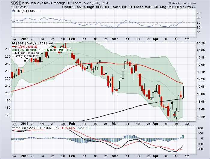
Both had 2% up days this week which may be indicative of at least a slowing of the downward trend if not a reversal. India moved below and is retesting the 50 DMA from the bottom. The multiple big candles suggest this move is not done. Notice that all three charts flirted with the 200 DMA this week. The $TSX made its high 6 weeks ago, roughly timing with the first test of the 50 DMA from the underside on the other two charts in March.
What we need to see now is a surge above the 50 DMA. For Canada, that is a long way above. I think watching these global indices will tell us if the frightful move to the downside in commodities is finished and we are going to reverse right here, or if we are entering into the strongest part of the major wave down. If we are entering the strongest part of the major wave down, sitting on my hands might just be the best trade I can put on. Or trade with a black belt. Defence is as important as offence. Many are enamoured with going short. It is not a game for the buy and hold either. The overnight bounces off major lows have been 150 points higher. That is hard to hold short positions through. The charts make it look easy but short time intervals are way more profitable than trying to catch the top and the bottom of the big move down. That is what I have found anyway. We are at a tricky part of the charts. Smaller positions can also help mitigate the risk.
Good Trading,
Greg Schnell, CMT
In
the last few weeks gold has experienced a major breakdown, and, of
course, there are many opinions as to what will happen next. Let's take a
broad look at the technicals, so that we have some context for making
decisions.
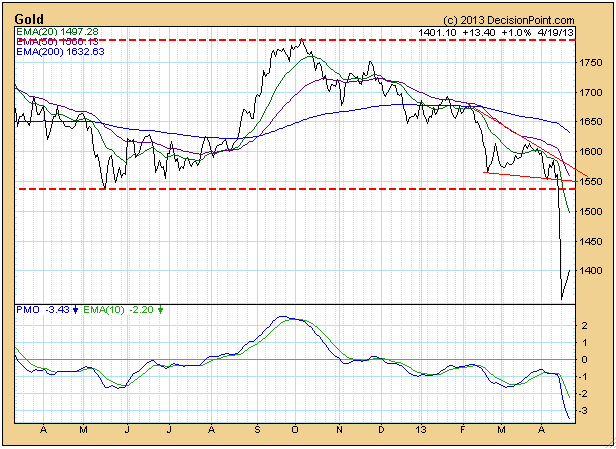
The
daily chart shows the critical break below long-term support at about
1540. The bounce off the low is unlikely to be the beginning of a new
rally, rather we think it is a short-term consolidation, like a reverse
flag or pennant.
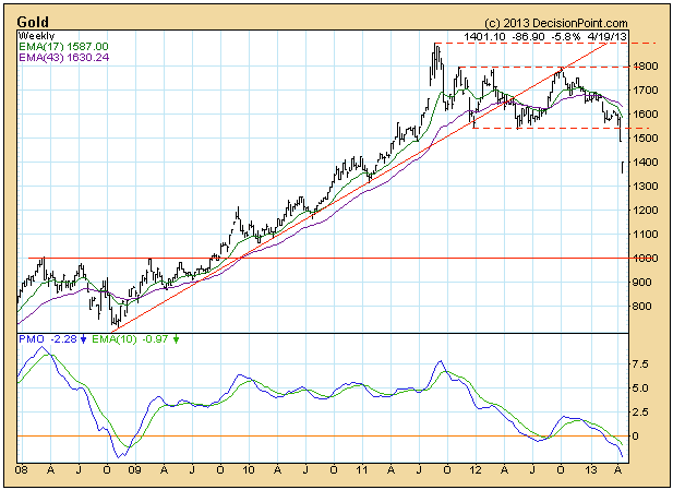
The
weekly chart gives the best view of the trading range that has kept
prices contained for over a year and a half. We thought that this was a
price consolidation that would eventually lead to higher prices, so the
failure of support was disappointing and has very negative long-term
significance.
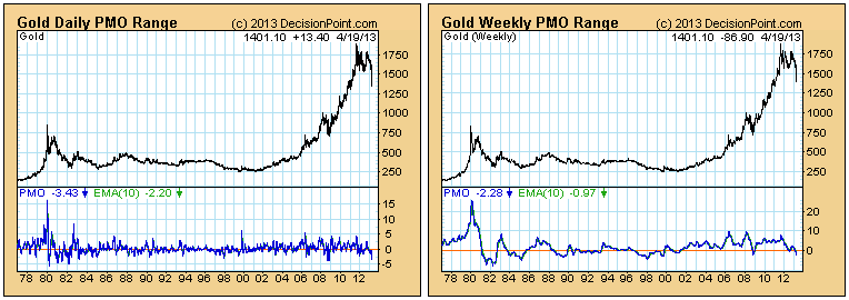
On
the charts above you will notice that both the daily and weekly PMOs
(Price Momentum Oscillators) are at the oversold side of the range shown
on the charts, but a longer-term view below shows that neither PMO is
challenging historical lows.
The
monthly chart below gives the best perspective for gold's long-term
prospects. While the top is broader than usual, we believe that we are
seeing a collapsing parabolic. The "parabolic" is the gradually
steepening curve as prices rose from the 2001 lows to the 2011 top.
Typically, parabolics collapse back into their original basing range.
For gold this range (based upon the price history visible on the weekly
chart just above) is between about 250 and 500. I agree that doesn't
sound reasonable, but it does fit normal expectations for a parabolic
collapse.
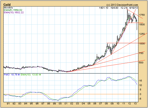
In
our opinion, the most obvious support level at this point is at about
1000. Support could easily be found higher than that, but for now let's
stick with the obvious when estimating where a solid bottom could be
found.
Conclusion:
Long term, the trend for gold is down, and the condition, based upon
the monthly PMO, is very overbought; therefore, we have to assume that
outcomes will be negative until some improvement is seen.
At its highest level last week (Thursday afternoon), the VIX was up 50% from its prior Friday close. That's a HUGE spike in volatility.
Volatility, as measured by the CBOE Volatility Index (VIX), provides us a gauge of fear in the stock market. The VIX measures the market's expectation of stock market volatility over the next month. It represents a weighted blend of prices for a range of options on the S&P 500 index. As the market begins to price in higher volatility, premiums on S&P 500 options rise. Theoretically, as S&P 500 prices show increased volatility, option premiums rise. Therefore, the VIX becomes a bit of a lagging indicator. I like to use it as a confirming indicator, however, as it tends to trend higher in bear markets and lower during bull markets. Many popular technical analysis tools designed to help traders with indexes and stocks simply don't work when analyzing the VIX. Why? Because volatility rises and falls very quickly based on investor mentality. The use of moving averages is rendered almost useless. The key for me is whether the VIX confirms the trend taking place on the S&P 500. Think about it. If the pricing of the VIX is based on the behavior of options that track the S&P 500, then it makes sense that the VIX should follow the S&P 500. It actually follows it INVERSELY. When the S&P 500 drops, fear in the market rises. That sends the VIX higher, reflecting this expected increase in volatility. Therefore each new low in the S&P 500 should be accompanied by a higher VIX - in theory. And a new high in the S&P 500 should be accompanied by a lower VIX - again, in theory.
The two don't always move together, however, and that's where we can glean some possible clues to help us from an S&P 500 directional standpoint.
Take a look at recent action in the VIX and the accompanying price action in the S&P 500:
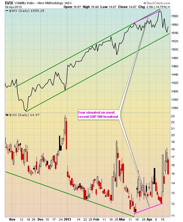
As expected, the VIX continued to fall with every movement higher in the S&P 500. This makes perfect sense because volatility tends to dry up during a period of rising equity prices and this creates a narrowing of price movement. That's the general rule, although the late-1990s proved to be one exception. But as you look at the VIX chart above, note that the last rise in the S&P 500 was accompanied by an INCREASE in expected volatility (VIX). Increases in expected volatility normally are associated with declining equity prices, so was it a precursor of a drop in the S&P 500? Well, hindsight is 20/20, but we do know there is a clear relationship between the movement in the S&P 500 and the behavior in the VIX so, if nothing else, it should have at least raised a few eyebrows.
I indicated above how the moving averages tend to prove virtually useless when trying to determine which way the VIX is heading. As an illustration, check this chart out:
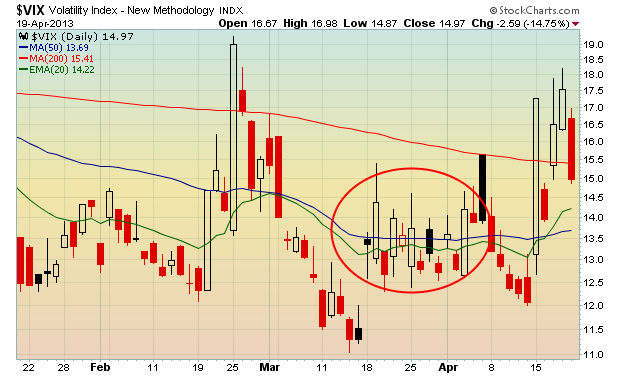
I've highlighted (red circle) the late-March and early-April period as it shows how many false signals you can receive in a very short time frame. Instead, focus on the overall TREND in the VIX - that's what I use to determine whether the VIX is confirming price behavior in the S&P 500 or suggesting that a change in direction may occur.
The interesting part right now is that there's been significant rotation into defensive areas of the stock market. For the month of April alone, utilities, healthcare and consumer staples have all gained more than 3%, while energy, materials, industrials and technology have all lost more than 3%. That's more than a 6 percentage point swing in just three weeks between these two very different groups of stocks. Clearly, traders are nervous as they're willing to commit to equities, but only the defensive groups. Defensive sector outperformance should be interpreted as increased fear by market participants. But the longer-term signal in the VIX doesn't confirm that increased level of fear.
For Monday, April 22nd, I'm including a long-term chart of the VIX as my Chart of the Day to illustrate one reason why I believe the bulls may return in full force sooner rather than later.
CLICK HERE for more information.
Happy Trading!
Tom Bowley
Chief Market Strategist
Invested Central
Our attention has turned to the crude oil market, where a rather large "head & shoulders" top pattern is in development. The focus is upon how prices challenge and hold the 300-week moving average, and if not...whether neckline support is violated. A breakdown of these levels would lead to a virtual free-fall in prices towards the $51 target level.
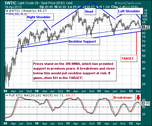
Of course we are ones to wonder what the world economy and the world's stock markets would look like under such a scenario. If past is prelude, then we should expect a rather nasty correction...and it very well may be quick and sharp. Aware is prepared.
Good luck and good trading,
Richard