Hello Fellow ChartWatchers!
As I mentioned last time, we've recently started adding key economic datasets to our database so that you can chart them with our SharpCharts charting tool. This week, we added the weekly Unemployment Indexes including the Initial Jobless Claims number. The symbol for that index is $$UNEMPCIN.
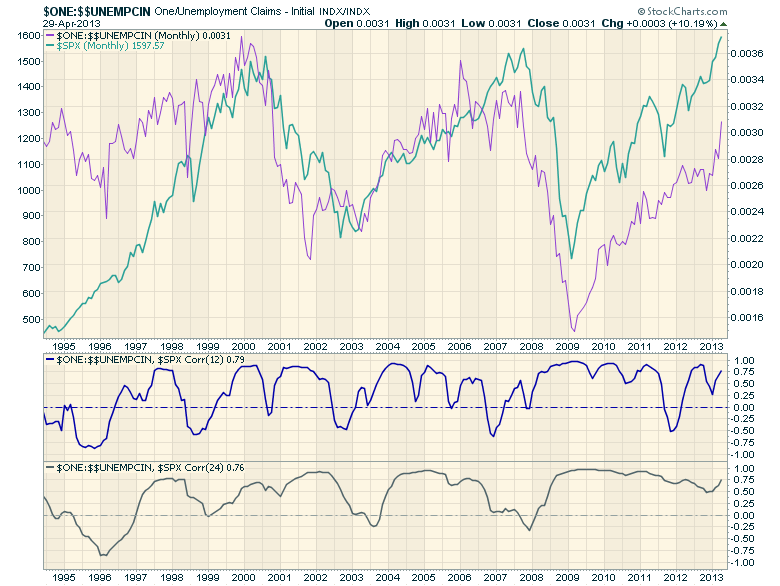
$$UNEMPCIN behaves inversely to the stock market - when the market is doing well, initial jobless claims are falling and vice versa. We can see this directly by charting the inverse index - $ONE:$$UNEMPCIN and overlaying that with the S&P 500. Check out the following chart to see what I mean:
(Click here for a live version of this chart.)
This chart is a monthly line chart. I'm using months instead of weeks to smooth out some of the noisyness of the data.
Now, in addition to the two overlaps price plot lines, I've also added the 12-month Correlation indicator and the 24-month Correlation indicator. As you can see, both of those lines spend most of their time above the zero line in the middle of that plots. That confirms what we can intuitively see - that the red and blue lines move more-or-less in unison (i.e., they are positively correlated).
What's interesting is that points in time where the correlation lines dip below zero. That happens when the red and blue lines start moving in opposite directions. Note that on the 24-month correlation line, those dips correspond with major changes in market direction. Those same signals are on the 12-month Correlation indicator as well, but they aren't quite as easy to pick out. Still, whenever the 12-month Correlation of these two lines dips below zero, it might be time to look for the market to change direction.
- Chip
TECHNOLOGY SPDR RESUMES UPTRENDby John Murphy | The Market Message Thursday, April 25th I wrote about the technololgy sector being one of
the markets weakest groups this year. That may finally be changing for
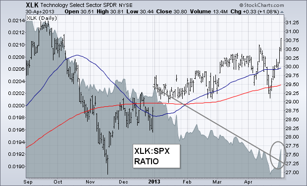
the better. The chart below shows the Technology Sector SPDR (XLK)
exceeding its early April high to reach the highest level in six
months. The XLK/SPX relative strength ratio (gray area) has also
turned up. That's the first sign of upside leadership coming from the
technology this year. Thursday's message suggested that an upturn in
Apple (the sector's biggest stock) from an oversold condition would be a
big help to the sector. It also showed Microsoft (the second biggest
stock) breaking out to the upside. Over the past week, both stocks
have gained 9% and 7% respectively. Another big teck stock that has
turned up is Intel. So have some other semiconductor stocks.
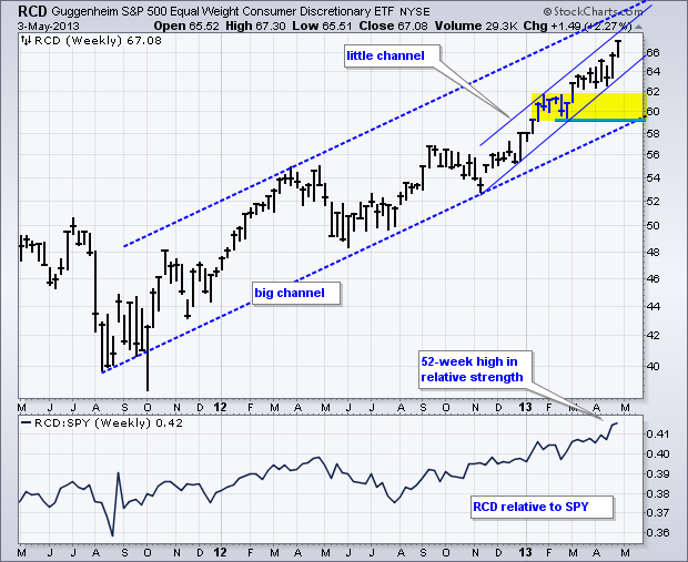
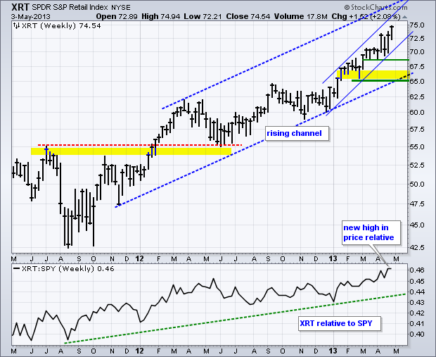
The Equal-weight Consumer Discretionary ETF (RCD) and the Retail SPDR (XRT) hit 52-week highs in price and relative strength this week. New highs and relative strength in these two groups is very positive for the market overall. As its name suggests, the consumer discretionary sector is the most economically sensitive sector. Retailers feature prominently in this sector and retail spending accounts for some 2/3 of GDP. If performance of these two ETFs is indicative of consumer spending, then the economy and broader market are in good shape. Neither shows absolute or relative weakness for the moment.
Click this image for a live chart.
The first chart shows RCD within a large rising channel over the last 18 months. The ETF is now in the upper half of this channel and the upper trend line extends into the low 70s over the next few months. Support is marked in the 59-60 area. There is also a smaller rising channel taking shape since November. The ETF is nearing the upper trend line of this channel and getting short-term overbought. The second chart shows the Retail SPDR (XRT) with similar characteristics.
Click this image for a live chart.
A MEANINGFUL 3 WEEK PATTERN IN $COPPERby Greg Schnell | The Canadian Technician On a huge macro scale, we are trying to break out of a consolidation range. 13 year. Breaking out on Dow, SP500, Nasdaq, $RUT. Unfortunately, the rest of the globe has not been confirming.
But the 2 days since the Fed announcement since they removed the upside limit on intervention has really changed the shape of the market.
This was a major week for the markets.
Here was a view from April 24. Notice by right clicking on the Perf Chart you can bring up the cycle tool and slide the yellow line, left to right!!!!!! (That 's a new feature!)
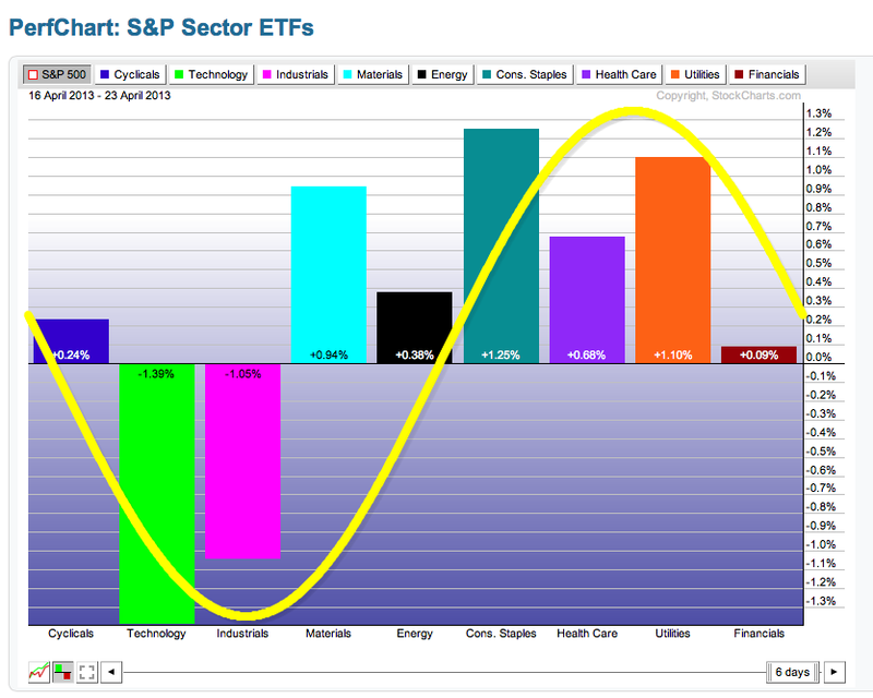
Compare that to now.
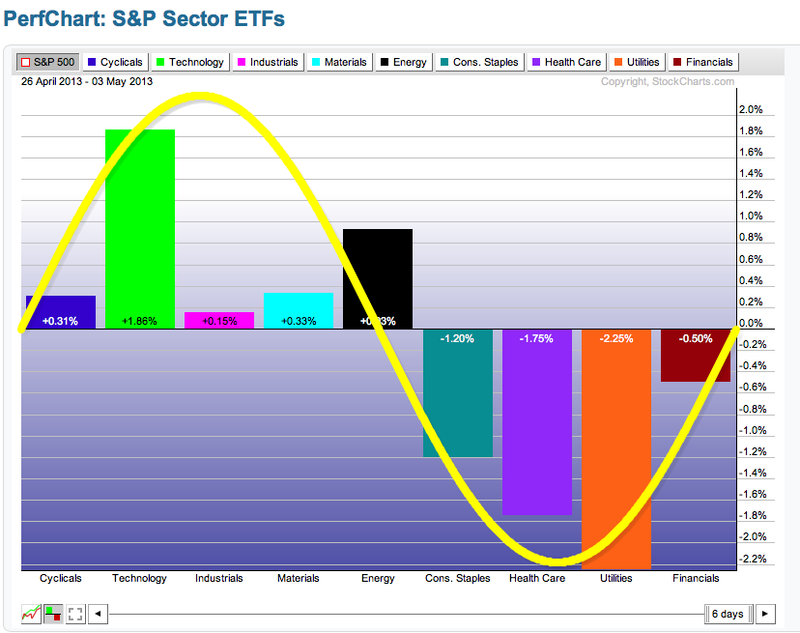
The $UTIL relative strength line plummeted. That is actually a good thing. The transition to tech leadership this week was particularly acute.
The transports were doing well, now the techs are starting to move. Next should be the industrials and raw materials. So I visited the $COPPER chart.
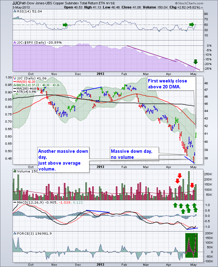
The 7% move in Copper yesterday was working real hard and I believe a trend change.
Unlike the $INDU market Copper kept climbing from open to close. The $INDU market opened high, climbed slightly and gave back into the close.
There are 7 big green volume candles on the daily JJC. Live Chart
We need to look at the bigger picture in Copper. $COPPER
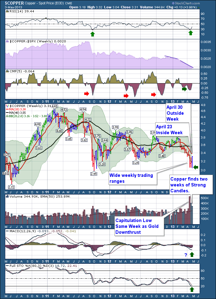
So one week does not make an all clear and the problems are wider spread than America, so its still cautionary. But in 7 trading days things have clearly reversed.
It's pretty important timing in the market as normally a summer swoon sets in. This week and the change of behaviour to the growth side of the cycle is very encouraging for me.
We also made a confirming move above the $SPX 1597,$TRAN, $RUT, $INDU, $TYX. We are still in a dicey spot on the charts. But when you are looking for technical signals, we got a bag of confirmations this week. Short term we might have run a bit too far, too fast. Big picture, we got some great signs this week. $COPPER's change was huge in my mind.
Good Trading,
Greg Schnell, CMT
PRECIOUS METALS SENTIMENTby Carl Swenlin | DecisionPoint.com
With
the recent volatility in gold and silver prices, it would be nice to
get an idea of what kind of sentiment is being generated. Measures of
sentiment tell us if there is too much optimism or pessimism in a
particular market. There are a number of sentiment trackers for stocks,
but very few are readily available for precious metals. One that we
track is the premium or discount on shares of Central Fund of Canada
(CEF).
Central
Fund of Canada (CEF) is a closed-end mutual fund that owns gold and
silver exclusively -- the metals, not stocks -- at a ratio of about 48
oz. of silver to 1 oz. of gold. Closed-end funds trade based upon the
bid and ask, without regard to their net asset value (NAV). Because of
this, they can trade at a price that is at a
premium or
discount to their NAV. By tracking the premium or discount we can get an idea of bullish or bearish sentiment regarding precious metals.
The
following chart shows CEF history going back to 1986, and the bottom
panel shows the amount of premium (green) or discount (red) at which CEF
shares were selling. It is amazing to see that there have been
discounts of lower than -20% and premiums approaching +30%. I suspect
that a good deal of this extreme behavior can be accounted for by the
fact that some of the buyers and sellers simply did not know how
closed-end funds work.
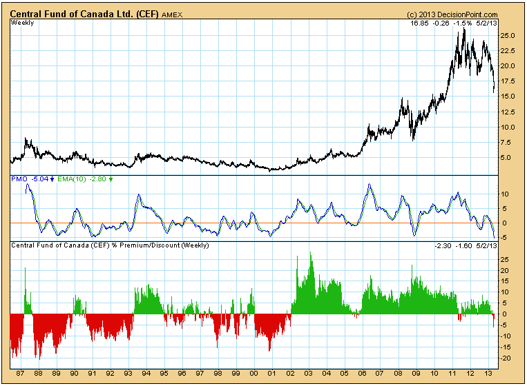
It
is interesting to note that in the last two years, sentiment swings
have held a much more reasonable range. The extended topping action
probably had something to do with that. More to the point is that recent
bearish sentiment has been fairly low, considering the sharp decline in
precious metals prices. This
does not tell us if prices are going to continue lower, but it does
show us that bearishness has not reached the kind of extremes that would
prompt us to start looking for a price bottom.
EARNINGS REALLY DO MATTERby Tom Bowley | InvestEd Central Every quarter, my goal is to identify the absolute best stocks that I can find from both a technical and fundamental standpoint. I am a firm believer that stocks beating expectations, raising guidance, trading extraordinarily high amounts of volume and printing bullish candlesticks have much better odds of trading higher than stocks that don't fit this category. For me, once the stocks are identified, it becomes a game of patience and discipline, identifying high reward to risk entry points. Great earnings do NOT necessarily mean you simply run out and buy a stock. For readers of my early April article, I provided a link to Nike, Inc. (NKE), which was my Chart of the Day for Monday, April 8th. NKE had posted strongly quarterly results, gapped higher, then pulled back to retest key gap support - an excellent entry point.
Take a look at the chart:
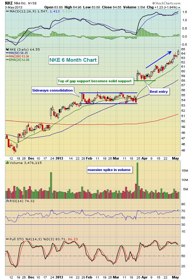
The gap up is where market makers opened NKE after they reported their strong earnings. Most gaps are filled and the reason is simple. When everyone is on one side of the trade, guess who's on the other side? Market makers. We know they're generally going to make their money at the expense of the retail trader. So once the initial buying takes place, stocks tend to reverse - at least temporarily - as market makers are on the short side. Gaps get filled and price support levels are reached, then market makers work off their short position and stocks are more able to move freely once again. In the case of EXTREMELY heavy buying interest, many times market makers are overwhelmed with demand and after the nice gap up, prices continue rising. From a bullish perspective, maribozu candles (opens on or near the low, closes on or near the high) with massive volume are powerful indications of accumulation after a strong earnings report. You can see what happened to NKE after it quickly fell back to test opening gap support. It's been straight up ever since, far outperforming the S&P 500.
One industry group that's been seeing very strong results of late and just made a significant price breakout is the Dow Jones US Gambling Index ($DJUSCA). Take a look at the technical strength below:
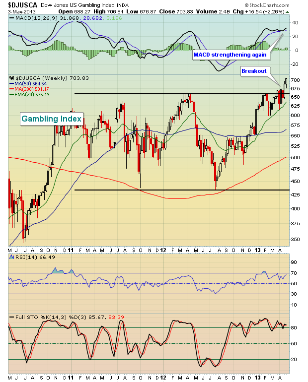
One component of this index just blew out earnings estimates a little over a week ago, received a very strong technical response, but has since pulled back to a key technical support area - very similar to the technical pattern on NKE a month ago. I'm featuring this component stock as my Chart of the Day for Monday, May 6, 2013. CLICK HERE for more details.
OIL SERVICE ABOUT TO PLAY "CATCH-UP"by Richard Rhodes | The Rhodes Report The current S&P 500 rally to new all-time highs may very well be the beginning of a "bubble-like" move to much higher levels in the weeks and months ahead. However, make no mistake, there is a great deal of risk in being long many stocks at this juncture, but there are sectors/industries that haven't participated...and very well may be ready to do so given the trading patterns of the past two weeks.One such sector and/or industry is the energy sector (XLE), and in particular the oil service group (OIH).
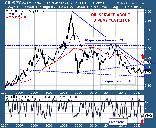
Technically speaking, when we look at the relative OIH/SPY ratio, we find it at levels extant during 2012 and 2008, and we find the overall pattern a bullish multi-year wedge. Moreover, the longer-term 40-week stochastic is at oversold levels, which in the past have allowed for OIH to rally relative to SPY. Currently, prices stand at .27, but we look for a move towards the .42 level that in the past has proven to be major resistance.
Hence, if one needs or wants to be long in the current market environment, then OIH and its component stocks are the place to be.
Good luck and good trading,
Richard