Hello Fellow ChartWatchers!
After a couple of big down days, the market had 3 nice up days in the middle of the week to retest the 16450 level on the Dow before closing mixed on Thursday just before the Good Friday holiday. After my article, you can see what Arthur, Greg and Tom think of these developments. (John and Erin are on vacation this week due to the long weekend.) But before that, I need to tell you about two very important happenings here at StockCharts:
Our 15-Year Anniversary Special is Underway!
Yep, you read that right. We are officially 15-year old now! Seems like only yesterday we started this crazy journey. Anyway, we're having a bunch of big specials to celebrate. Click here for all the details. Do NOT delay however - this special only lasts 15 days...
The "Ranger" Brings More Interactivity to SharpCharts
I'm thrilled to announce that we've just added a new, very interactive, control to our SharpCharts charting tool that we are informally calling the "Ranger." It allows you to quickly and easily set the start and end dates for your chart just by clicking and dragging your mouse!
To enable the Ranger control, create a SharpCharts and then find the "Range" dropdown located below the chart. Change the "Range" dropdown so that it says "Select Start/End." At this point, you should see a "Start" box, an "End" box and a new slider control. That slider control is the "Ranger." Here's a snapshot of what that area looks like with the Ranger on the right side:

So the Ranger control consists of three elements:
- The Date Scale - A changable set of months/years that make up the middle of the control. This shows you the range of dates that it is possible to use for your chart. If you use all of the dates currently shown on the scale, additional time will appear automatically.
- The Slider - The wider box in the middle of the date scale is a slider that represents the current date range for your chart. The left edge of the slider corresponds to the left edge of your chart and the right edge corresponds to the right edge of your chart. Just like with our PerfChart tool, you can click and drag on the left or right edge of the slider to change its size or you can click and drag the middle to move the slider through time. As soon as you stop dragging, the chart will refresh with your new start and end dates!
- The Arrows - Clicking on either arrow will move the slider forward or backward by 1 time period. You can also do that by pressing the left or right arrow key on your keyboard. (You may need to click on the Ranger one time with your mouse before the arrow keys will work.)
Ranger is one of those things that is harder to explain than it is to use. Take a second and try it out for yourself. Click here and try moving the slider around some. You should pretty quickly get the hang of it.
Notice that as you move the slider with your mouse, the "Start" and "End" dates are instantly updated. When you release the slider, the chart then follows suit.
To expand the range of the slider - and thus to create a longer-term chart - drag the left edge of the slider all the way to the left edge of the date scale. As soon as you get close to the left edge, more dates will appear on the date scale. When you release your mouse button, Ranger will update its scale to give you even more dates to choose from. (Note: Because free users only get 3-years of chart data, the Ranger won't expand very much unless you are logged in as a member.)
One last thing - while dragging the slider around with your mouse is lots of fun, personally I think the most exciting thing about the Ranger is the way the arrow buttons/keys work - especially on a daily chart. This allows you to move through a chart day-by-day and see how the patterns and indicator values develop over time. That's huge. Try it for yourself and see.
Here are a couple of additional notes about using the Ranger that you need to be aware of:
- It cannot work in conjunction with the "Inspect" feature for technical reasons. If you start to use Ranger, "Inspect" will automatically be disabled. Just turn it back on when you are done setting the chart's range.
- Intraday time periods can only be set in daily increments. In other words, you cannot have a chart start or end in the middle of a day.
- You can still type dates inside the "Start" and "End" boxes just like you always have. Use of the "Ranger" slider is optional.
- You can still use the calendar controls to set "Start" and "End" dates if you prefer those instead.
- Once you have set Start and End dates that you like for your chart, remember to click the "Update" button to "Finalize" those values - especially if you are going to save the chart into a ChartList.
So we hope you enjoy this new control and find it useful. Please feel free to send us feedback on it if you have some time.
- Chip
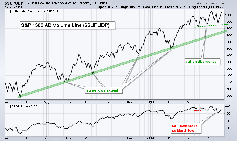
The AD Volume Line held strong during the April pullback and formed a small bullish divergence over the last few weeks. The AD Volume Line is a cumulative measure of AD Volume Percent, which is advancing volume less declining volume divided by total volume. In this example, we are looking at the S&P 1500 AD Volume Line ($SUPUDP). I like to use the AD Volume Line instead of total volume because it represents net buying pressure. Advancing volume represents buying pressure and declining volume represents selling pressure. AD Volume Percent, therefore, is net buying pressure. The AD Volume Line rises when buying pressure is stronger and falls when selling pressure is stronger.
Click this image for a live chart
The chart above shows the AD Volume Line moving lower the first two weeks of April and holding above the March low. Meanwhile, notice that the S&P 1500 did not hold its March low. The higher low in the AD Volume Line amounts to a bullish divergence and indicates that net buying pressure remains strong. The AD Volume Line surged towards its early April high last week and remains in a clear uptrend. I view this as positive for the broader market, especially large-cap stocks because large-caps dominate the most active lists on the NYSE and Nasdaq.
Good weekend and good trading!
Arthur Hill CMT
The QQQ is the tracking ETF for the Nasdaq 100. It has lots of messages this week. Other indicators also exist for the Nasdaq 100. The $NDXA50R is a sweet indicator. Its even better paired with its mate the $NDXA200R. When the are used together they produce the gold/black plot pane below in Chart 1. The gold area represents the number of stocks above the 50 DMA in %. The Black represents the number of stocks above the 200 DMA on the left scale in %. So the dark gold is where the black is shadowing behind the gold histograms. Here is how I like to use it.
When the Gold is nice and high you are in a bull market. What is harder to see here, is the scales adjust for the 200 DMA and the bottom of the range for black is 55.We can see recently that the % of Nasdaq 100 stocks above the 200 DMA dipped to about 58 using the left scale. That is the first time it has been weak in a while. I will cover off more about how that helps us on the next chart. But first, I left the $NDXA50R:$NDXA200R ratio shown farther down in brown on this chart. When it reaches extreme lows, it can be a timely buy signal. You can see it would have helped in June and February as well.
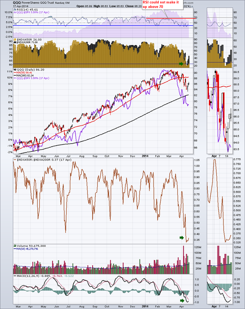
Two other things to notice on Chart 1. The acceleration of volume recently and the very low MACD. The volume is turning up the average for over 3 months. Low MACD's are usually indicative of a trend change, especially when the symbol has had a high MACD for months.
Here on Chart 2 is a long term weekly view of the $NDXA50R and the $NDXA200R.
- Greg
Last week's gains may have been more about options expiration and an oversold bounce than anything else. I have my eyes set squarely on the NASDAQ right now, waiting either for a resumption of the five year bull market or a breakdown of its current head & shoulders topping pattern that could spell LOTS of trouble ahead. I believe we're going to see the latter. Take a look at the chart:
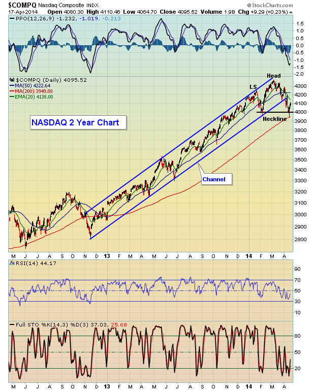
That was a powerful channel that NASDAQ prices remained in for 17 months. Since the breakdown, however, the NASDAQ printed equal lows - February and April - to form a neckline. The current bounce is a potential right shoulder forming to test the declining 20 day EMA and/or become a backtest of the broken trendline. A failure at either and a subsequent break below neckline support at 3997 would likely result in much deeper selling. The head & shoulders pattern would "measure" to the 3650 area. That really wouldn't be too shocking if you consider that the NASDAQ rose more than 50% from November 2012 to March 2014.
The flight to safety in 2014 is rather obvious to see. Since the S&P 500 hit its second peak at 1848 in mid-January, it's managed to tack on close to 1%, closing at 1864 on Friday. Over that time frame, utilities have gained 12%. Energy is up more than 8%. Consumer staples and basic materials are each up approximately 4%. The good news is that the S&P 500 is up year-to-date. The bad news is that all the wrong sectors are leading the charge. It's this rotation to defensive stocks that leads me to believe the current rally will be short-lived. Over the past several weeks, we're seeing more and more impulsive selling take control of the market and volatility has soared. The NASDAQ 100 Volatility Index ($VXN) spiked to test an intermediate-term resistance level as reflected in the chart below. Should the NASDAQ lose the neckline support identified
above AND the VXN close back above 23, we're likely to have a panicked market on our hands. Unfortunately, we remember all too well what that means for our portfolios, so take necessary precautions if we head down that path. Check out the VXN:
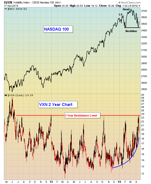
Note that the expected volatility began to rise BEFORE the NASDAQ 100 topped. That expected volatility was a warning sign and now we have a topping pattern in the form of a head & shoulders formation. The combination of a high volume, bearish breakdown of this pattern, accompanied by soaring volatility expectations would suggest at least the possibility of a very quick and significant selloff at some point in the not-too-distant future.
I believe it's better be to safe than sorry, and that's exactly the message the market is sending right now in terms of sector rotation. My Monday Chart of the Day will focus on an ETF from the ProShares product line that concentrates on large companies paying and raising dividends - in other words, a more conservative and diversified income strategy that's been working well in the current market environment. For more details, CLICK HERE.
Happy Trading!
Tom Bowley
Chief Market Strategist
Invested Central


 Investors beware or at least be aware. Over the past two years, I've had a number of significant relationships, but that's changed now – in part because I was reminded of Charles Darwin's famous quote "It is not the strongest of the species that survives, nor the most intelligent that survives. It is the one that is most adaptable to change." Academics like to write lots of...
