Three Ratios Showing Risk-On .... Small-caps Lead New High Expansion .... Finding and Scanning for New Highs .... How to Use a New High List .... Notes from the MTA Meeting ... A Relative Breakdown for EEM .... //// ....
Three Ratios Showing Risk-On
While there is no guarantee that the wicked rotations of the last two days will extend, it is worth noting some key leaders since Wednesday morning. First and foremost, risk is on with small-caps outperforming large-caps, stocks outperforming bonds and industrial metals outperforming precious metals. The chart below shows the Russell 2000 iShares (IWM) outperforming the S&P 500 SPDR (SPY) as the IWM:SPY ratio surged the last five days. The middle window shows SPY outperforming the 20+ YR T-Bond ETF (TLT) since the late June low (Brexit). The lower window shows the Base Metals ETF (DBB) outperforming the Precious Metals ETF (DBP) since June as well, but serious outperformance did not begin until September.
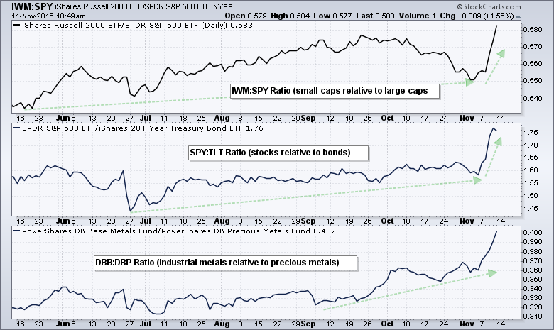
Outside of risk-on, I do not want to read too much into the meaning of these ratios, but I will take a stab. Small-caps are more domestically oriented than large-caps and this suggests a preference for US-centric equities. Stocks are riskier assets than bonds and relative strength in stocks points to a strong risk appetite in the financial markets. It could also mean that interest rates are normalizing and inflationary pressures could increase. Relative strength in industrial metals points to an uptick in economic growth (demand), while relative weakness in precious metals points to less demand for safe-haven assets. I highlighted a bear flag in GDX on Monday and it triggered with a breakdown on Thursday.
Small-caps Leading New High Expansion
I showed High-Low Percent for the S&P 500 and the sector SPDRs on Thursday and will turn to High-Low Percent for the major indexes today. The numbers on the right show the High-Low Percent values. For the broad market, a move above +10% in S&P 1500 High-Low Percent shows strong enough upside participation to be bullish and this signal remains bullish until a move below -10%, which is bearish. S&P 1500 High-Low Percent ($SUPHLP) turned bullish on March 31st and remained bullish the last seven months. It surged to its highest level of the year on Thursday (19.47%) and this affirms the bull market environment.
 The other windows show High-Low Percent for the S&P 500, S&P MidCap 400 and S&P Small-Cap 600. Notice that S&P 600 HiLo% ($SMLHLP) exceeded 20% and hit the highest level of the three. This means small-caps are leading the charge. Mid-caps are second (18.25%) and large-caps are third (17%).
Finding and Scanning for New Highs
How can we find stocks hitting new highs? First, you can check out the Predefined Scans page. The column headings show new highs for the NYSE, Nasdaq, AMEX and more. Click on any of the numbers to see the stocks that made new highs.

The screen shot below shows the list of NYSE stocks hitting new highs. You can sort a column by clicking the column heading. The column on the far left has five charting icons (SharpChart (your default), SharpChart (our default) Gallery Chart, P&F chart and Seasonality Chart).

Chartists can also scan for new highs using the (corrected) code below:
[group is SP500] or [group is SP400] or [group is SP600]
and [[today's close > yesterday's daily max(252,close)]
or [yesterday's daily close > 2 days ago daily max(252,close)]
or [2 days ago daily close > 3 days ago daily max(252,close)]
or [3 days ago daily close > 4 days ago daily max(252,close)]
or [4 days ago daily close > 5 days ago daily max(252,close)] ]
This code will show stocks that hit a 252-day closing high over the last five trading days. Today's scan returned 328 stocks (out of 1500). This means that 21.8% of stocks in the S&P 1500 hit 252-day closing high over the last five trading days. This is a strong stock market.
How to Use a New High List
Stocks making new highs are clearly leading the stock market. Chartists interested in relative strength or momentum strategies should definitely be interested such a list. Even chartists interested in mean-reversion strategies or corrective patterns can use this list. First, save the store the results to an existing ChartList or create a new ChartList.

Second, monitor the stocks in this ChartList for pullbacks or bullish continuation patterns over the next few weeks. The image below shows four charts with recent breakouts and new highs. A pullback to the 32-33 area for FLIR might provide an opportunity. Broken resistance turns first support around 50 for FMC. FTI has support in the 32 area and FL has a fresh breakout at 70.

Notes from the MTA Meeting
Earlier this week I attended the Amsterdam chapter meeting for the Market Technicians Association (MTA). Katie Stockton CMT gave an excellent presentation and here are a few of the highlights.
- The intermediate trend is the most important trend lately. (I totally agree that the two to six month trend has become the most important trend to watch now).
- Chartists looking to compare emerging markets to foreign developed markets can plot the EEM:EFA ratio. This shows the Emerging Markets ETF (EEM) relative to the Europe, Australia and Far East ETF (EFA). Emerging markets are outperforming when this ratio rises and underperforming when this ratio falls. The chart below shows the EEM:EFA ratio breaking down this week as EEM underperforms.

- Volume is not an important part of her analysis process. Katie only uses volume when there are big spikes because these can signal a selling climax or buying climax. (I agree. I do not think volume adds much value to the analysis process. Price action is more than enough).

- Investors can view their portfolios using Relative Rotation Graphs (RRGs) and the S&P 500 as the benchmark. The RRG makes it easy to see which stocks are leading the portfolio and which are lagging. The leaders are obviously driving the gains in the portfolio and the laggards are weighing it down. The example below shows a ten stock portfolio relative to the S&P 500.

******************************************************
Measuring Risk On-Risk Off - Using charts to quantify stock, economic and credit risk.
PPO Trading Strategy - How to use 3 PPOs to develop a trend-reversion trading strategy.
Long-term Trend Indicators - Using the PPO, EMA Slope and CCI to determine the trend.
ETF Master ChartPack - 300+ ETFs organized in a Master ChartList and in individual groups.
Follow me on Twitter @arthurhill - Keep up with my 140 character commentaries.
****************************************
Thanks for tuning in and have a good day!
--Arthur Hill CMT
Plan your Trade and Trade your Plan
*****************************************