.... Small-caps Extend to New Highs
.... Broad Selling in the Nasdaq 100
.... XBI and IBB Edge Higher
.... COPX and JJC Correct within Uptrends
.... TLT Turns Up within Uptrend
.... Charts to Watch: DAL, CB, LEN, RMD, SBAC ....
Small-caps Extend to New Highs
The S&P SmallCap iShares (IJR) and the Russell 2000 iShares (IWM) edged higher on Monday and exceeded their July highs to record fresh 52-week highs. This extends the string of 52-week highs, which began with the November surge. Note that IWM and IJR recorded new 52-week highs in December, February, April, July and September. Even though small-caps are lagging large-caps over this period, the price charts for IJR and IWM show clear uptrends and this is what really counts.
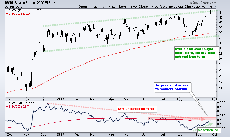
The chart above shows IWM within a rising channel and at the top of this channel. I would not call this upper line a "hard" resistance level, but the ETF is short-term overbought after a 7.5% run in five weeks. We do not need a momentum oscillator or channel line to figure this out. The indicator window shows the price relative (IWM:SPY ratio) falling from December to August and then turning up the last five weeks. Small-caps are still lagging long-term, but leading short-term. In fact, the price relative is at its moment-of-truth because a break above the summer highs would reverse the long-term downtrend in relative weakness.
The next chart shows IJR with the mean-reversion strategy using RSI(5) and the Chandelier Exit (22,1). You can read all about the strategy in this System Trader article. I chose to use Chandelier (22,1) because it produces a tighter stop. Chartists looking for a wider stop can try Chandelier (22,2) or Chandelier (22,3). Plot all three on one chart to compare the differences and similarities.

Broad Selling in the Nasdaq 100
The Nasdaq 100 and tech stocks bore the brunt of selling pressure on Monday. It was not just Apple and its suppliers because all six tech-related industry group ETFs (FDN,SKYY,SOXX,HACK,IGN,IGV) were down and the percentage of $NDX stocks above the 20-day EMA is the lowest of the major indexes. The chart below shows %Above 20-day EMA for the S&P 500, S&P Small-Cap 600, S&P Mid-Cap 400 and Nasdaq 100. Fifty percent of Nasdaq 100 stocks are below their 20-day EMAs, which means half fell over the one to two weeks. In contract, 80.5% of small-caps and 70.75% of mid-caps are above their 20-day EMAs.

This chart also highlights a technique for spotting short-term oversold conditions within a bigger uptrend. Breadth becomes short-term oversold when %Above 20-day EMA dips below 30%. A bullish signal triggers when this indicator moves back above 50%. I will be move to "alert" mode when/if the indicator dips below 30% for the Nasdaq 100. In other words, such a move would trigger a short-term bullish setup and I would then look for a short-term bullish catalyst.
XBI and IBB Edge Higher
The Biotech SPDR (XBI) and the Nasdaq Biotech iShares (IBB) were notable exceptions to Nasdaq weakness. Note that most of the top holdings in these two ETFs are in the Nasdaq 100. XBI formed a falling flag into mid September and broke out last week. Even though the ETF fell back into the flag pattern, the bias is still bullish and further gains are expected until it fails. The flag lows mark first support and a break here would argue for a pullback within the bigger uptrend. The second chart shows IBB with a pennant or small falling wedge. Watch 335 for an upside breakout here.


COPX and JJC Correct within Uptrends
A decline within a bigger uptrend is considered a correction and this makes it an opportunity to partake in the uptrend at a discount (lower price). Not all corrections end or reverse where we expect and some corrections evolve into bigger downtrends. Nevertheless, my trading preference is to look for corrections and capitalize on the uptrend extending (not reversing). In other words, I want to find stocks and ETFs that pulled back and have a good chance of hitting new highs in the near future (a few weeks to a few months). That's the theory at least.
The first chart shows the Copper ETN (JJC) hitting 52-week highs in July-August and falling back in September. We can use Fibonacci retracements, broken resistance, support zones and RSI to estimate where a correction will end (reverse). This is NOT an exact science, but it appears that JJC is near its first reversal zone around 33. Note that the decline retraced 38.2%, there is support from the August low and RSI is in the oversold zone. The red Raff Regression Channel defines the downswing with first resistance at 33.80. Watch for a breakout here to reverse the short-term downswing.

The second chart shows the Copper Miners ETF (COPX) retracing just over 38.2% of the prior advance and RSI becoming oversold. The August low marks support in the 23.5 area. The red Raff Regression Channel defines the current downswing with resistance marked at 25.50. Note that COPX is quite volatile and risky.

The next chart shows the Metals & Mining SPDR (XME) with a small falling wedge in September. The trend since mid July is up and I am marking support in the 30.6-31 area. Even though RSI has yet to enter the oversold zone, the falling wedge is typical for a correction within an uptrend. XME firmed up on Monday and a bounce here would provide the first signal. A wedge breakout would end this pullback and argue for a continuation of the overall uptrend.
TLT Turns Up within Uptrend
The 20+ YR T-Bond ETF (TLT) is also a case-in-point for playing pullbacks within uptrends. The trend since March is clearly up and a rising channel is currently in play. TLT fell sharply in mid September, but found support near the lower trend line and in the 50-61.8% retracement zone. The ETF broke first resistance with Monday's surge and reversed the downswing. It looks like the bigger uptrend is taking over and this targets a move above 129, which implies a move lower for the 10-yr T-Yield ($TNX). Strength in TLT is typically negative for gold, negative for banks and positive for utilities (bond proxies).

Charts to Watch: DAL, CB, LEN, RMD, SBAC


******************************************************
ETF Master ChartPack - 300+ ETFs organized in a Master ChartList and in individual groups.
Follow me on Twitter @arthurhill - Keep up with my 140 character commentaries.
****************************************
Thanks for tuning in and have a good day!
--Arthur Hill CMT
Plan your Trade and Trade your Plan
*****************************************