- Breadth Indicators Fall Short.
- S&P 500 Backs off the 40 Week.
- When to Tread Carefully.
- Offensive Sectors Weigh.
- Sector with Lowest Correlation to $SPX.
- Utes Lead the Market.
- Bond ETFs Consolidate within Uptrends.
- ChartList Notes, Additions and Deletions.
 ... Breadth Indicators Fall Short
... The advance from late December to early February was extraordinary, but not enough to turn the weight of the evidence bullish. I use nine breadth indicators and basic trend analysis to weigh the evidence. Currently, four of the nine breadth indicators are bullish, which means five of the nine are bearish. In addition, the S&P 500 is below the 200-day SMA, below its last reaction high and the 50-day SMA is below the 200-day SMA.
The nine breadth indicators consist of three for each index (S&P 500, S&P Mid-Cap 400 and S&P Small-Cap 600). The 10-day EMA of AD Percent triggered bullish when all three moved above +30% on January 10th. The S&P 500 %Above 200-day EMA (!GT200SPX) triggered bullish this week when it exceeded 60% for the first time since early October. Note that the Mid-Cap %Above 200-day EMA (!GT200MID) and Small-Cap %Above 200-day EMA (!GT200SML) remain below 50% and are not close to bullish signals.
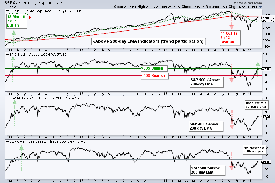
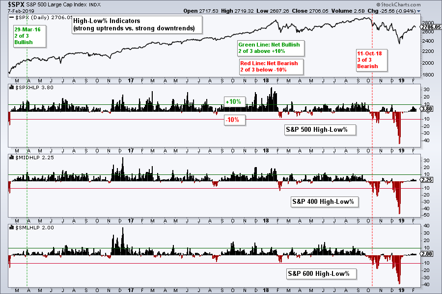
The next chart shows the High-Low Percent indicators turning bearish on October 11th when all three moved below -10%. These indicators need to exceed +10% to turn bullish again and all three fell short. New highs represent strong uptrends and there are simply not enough strong uptrends within the indexes to support a bull market environment.
S&P 500 Backs off the 40 Week
The weekly chart puts the current bounce and the bigger trend into perspective. The S&P 500 broke down in October, consolidated for a few weeks and broke down again in December. After becoming very oversold in late December, the index surged some 12% with a move back to 2700. Does this look like a trend changing event? Not to me. The index is still below the prior highs and still below the 40-week SMA, which is equivalent to the 200-day SMA.
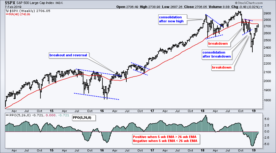
The indicator window shows the PPO (5,26,0). This indicator is positive when the 5-week EMA is above the 26-week EMA and negative when the 5-week EMA is below the 26-week EMA. The signals are NOT PERFECT, but it does give us an idea of the overall trend. The PPO has been negative since mid October and this points to a downtrend on the weekly chart.
When to Tread Carefully
There is always uncertainty in the markets and there are always "key" levels to watch. In early January, many technicians, myself included, were expecting resistance in the 2600 area. This, of course, did not materialize as the S&P 500 blew through 2600 on its way to 2740. The 2740 area is the next "key" area to watch because of the 200-day SMA and the 61.8% retracement. This area is also just below the prior highs and in the prior consolidation zone.
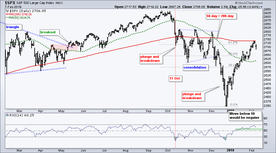
If we add the size of the current move (~15% in six weeks) and the long-term downtrend to the equation, the S&P 500 looks vulnerable to a corrective period or a resumption of the bigger downtrend. At the very least, the chances for further gains in the coming weeks are diminished and I am treading carefully.
Offensive Sectors Weigh
Momentum traders often use the Rate-of-Change indicator to find leading stocks, industry groups and sectors. The timeframe varies from three to twelve months and I like to use six months. The chart below shows the six month Rate-of-Change for the 11 sector SPDRs and SPY using a PerfChart. Notice that SPY and the five offensive sectors are negative over this period. Chartists looking for momentum leaders would surely pass on these sectors.
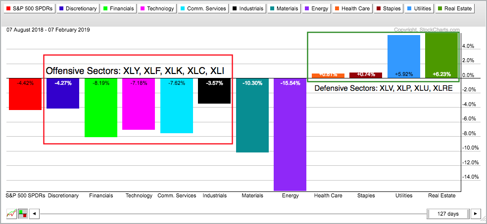
The right side of the chart shows the four defensive sectors and they are positive over this period. The Utilities SPDR (XLU) and the Real Estate SPDR (XLRE) are the leaders and the only sectors with decent gains over the last six months. Bottom line: This PerfChart does not reflect a bull market environment.
Sector with Lowest Correlation to SPX
The next chart shows SPY, XLU and the Correlation Coefficient (SPY,XLU) in the first three windows. I set the Correlation Coefficient to two periods and added a 52-week SMA (pink). The Correlation Coefficient is +1 when XLU and SPY move in the same direction (red/green shading), and -1 when SPY and XLU move in opposite directions (blue shading). The 52-week SMA is used to smooth out these fluctuations and get a yearly average. Notice that XLU average correlation is .12 and this is the lowest of the eleven sectors. This means XLU is the least correlated to movements in the S&P 500 and may offer an alternative.
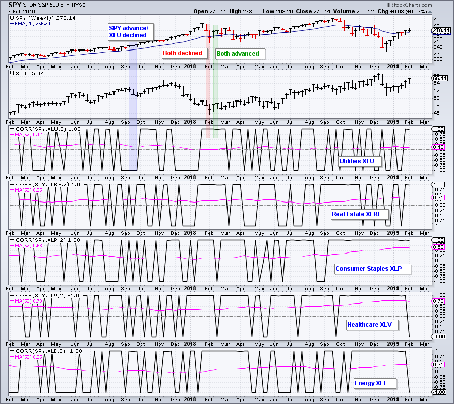
The bottom three windows show the average Correlation Coefficients for the Real Estate SPDR (XLRE), Consumer Staples SPDR (XLP), Health Care SPDR (XLV) and Energy SPDR (XLE). XLRE and XLE have the second lowest correlations. Note that XLP and XLV have fairly strong positive correlations with the S&P 500.
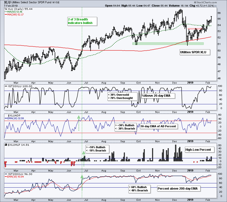
Utes Lead the Market
Correlation cannot be used to pick stocks or ETFs. It is simply an extra that can be used in conjunction with basic chart analysis, kind of like cocoa powder on a cappuccino. In last week's commentary, I noted that the charts for XLV, XLRE and XLP were too choppy and did not show consistent uptrends. XLU, on the other hand, was less choppy and showed a fairly consistent uptrend.
This next chart shows XLU with four breadth indicators. The XLU %Above 20-day EMA (!GT20XLU) is a short-term indicator used to identify overbought and oversold conditions. The other three are longer term breadth indicators. The evidence turns net bullish when at least two of these are on bullish signals and net bearish when two of the three are on bearish signals. As the green vertical line shows, two of the three triggered bullish in late June and the indicators remain net bullish. On the price chart, XLU held its September low in December and broke out in late January.
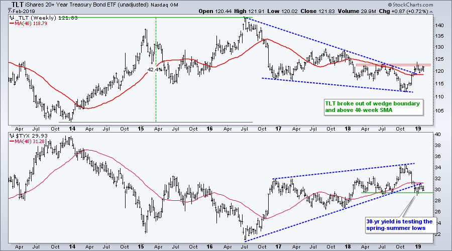
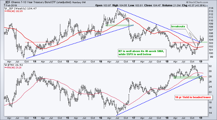
Bond ETFs Consolidate within Uptrends
Bonds are in bull mode overall and short-term bullish continuation patterns are taking shape. The first chart shows the unadjusted 20+ YR T-Bond ETF (_TLT) breaking above the wedge line and the 40-week SMA in December and holding this breakout with a stall the last seven weeks. The lower window shows the 30-yr T-Yield ($TYX) consolidating below the wedge break.
The next chart shows the unadjusted 7-10 YR T-Bond ETF (IEF) breaking out in November-December and holding above the last breakout zone. Similarly, the 10-yr T-Yield ($TNX) broke support and is holding below this support break.
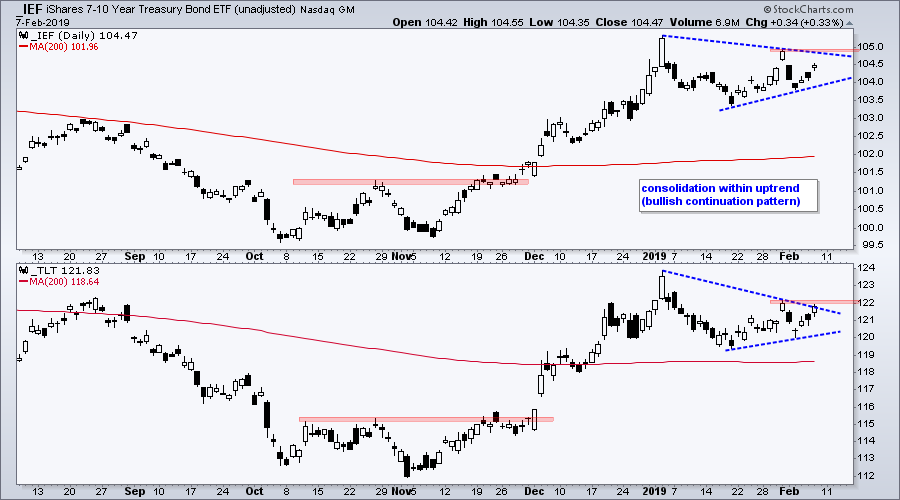
The third chart focuses on the consolidation pattern in 2019. Both formed triangle patterns and these represent a rest after the surge from early November to early January. As such, they are bullish continuation patterns and an upside breakout would signal a continuation higher.
ChartList Notes, Deletions and Additions
I removed the Sugar ETN (SGG) from the Art's Charts ChartList because I do not like the price action of the nearby futures contract (^SBK19). I am also removing the South Africa iShares (EZA) because of weak performance and Alarm (ALRM) because of upcoming earnings.
In general, several of the international ETFs look vulnerable to pullbacks or even failed breakouts (EPOL, EWZ, RSX, EWS). The US stock market also looks vulnerable at this stage and weakness in the US could have ripple effects.
I am adding three stocks to the ChartList today. Merck (MRK) sports a triangle breakout within an uptrend. Consolidated Edison (ED) is in a strong sector, ultimately held the 200-day and broke out in late January. Zscaler (ZS) is in the cyber-security group and the stock recorded a 52-week high this week.
Questions, Comments or Feedback?
I do not take symbol request and I cannot promise to response to all correspondence, but I will read it and take into under consideration. I greatly appreciate all feedback because it helps me improve the commentary and provides ideas for the future.

Plan Your Trade and Trade Your Plan.
- Arthur Hill, CMT
Senior Technical Analyst, StockCharts.com
Book: Define the Trend and Trade the Trend
Twitter: Follow @ArthurHill