Last week, I began by laying the foundation for my analysis by quantifying true measures of support and resistance via Peak Expansion and Peak Energy. I touched on the fact that sectors and sector rotation were another key area of focus in identifying opportunity. One segment is looking for positive signals in unloved sectors, whilst balancing that for the professional arena by looking for negative signals in loved sectors, I pay particular attention on ETFs that have an equal weighting. They reflect a pure measurement of the market or sector, and remove the vagaries of real performance and the inability to historically track what weightings the Fund Manager was exposed to.
There are many equal weight ETFs, the last count lying at 114, with various levels of liquidity and volume. The one I pay the most attention to is the Alps Equal Sector Weight (EQL). This is the most transparent view of the entire market and, therefore, is an essential barometer to its health and, most importantly, what represents the key supports and resistances.
There are differences in the dynamics between Peak Expansion, which analyzes range, and Peak Energy, which looks at volume. Primarily, the Peak Energy levels change far less frequently. This means that levels can track back many years and may seem irrelevant under normal market conditions, as they can be very far away from the current price. Peak Expansion, by nature is far more dynamic and therefore consistently provides a closer reference.
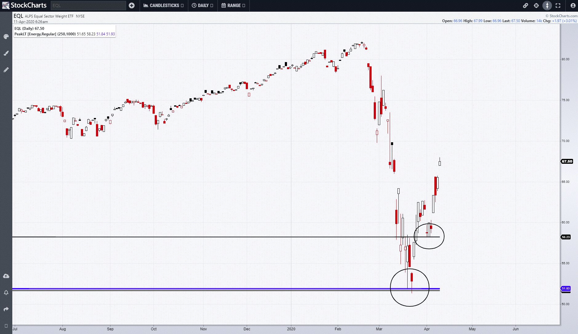
The chart below is a daily of EQL with the Peak Energy weekly (black) and monthly (blue) points or zones of interest. Having briefly held the first weekly support, it then moved down to an extremely powerful zone of support that represented two monthly points in combination with one weekly. Such combinations are rare, but can never be ignored. The combination signaled the low in the market; subsequent to that (2nd circle), it held that weekly level on consecutive days before accelerating upwards once more.
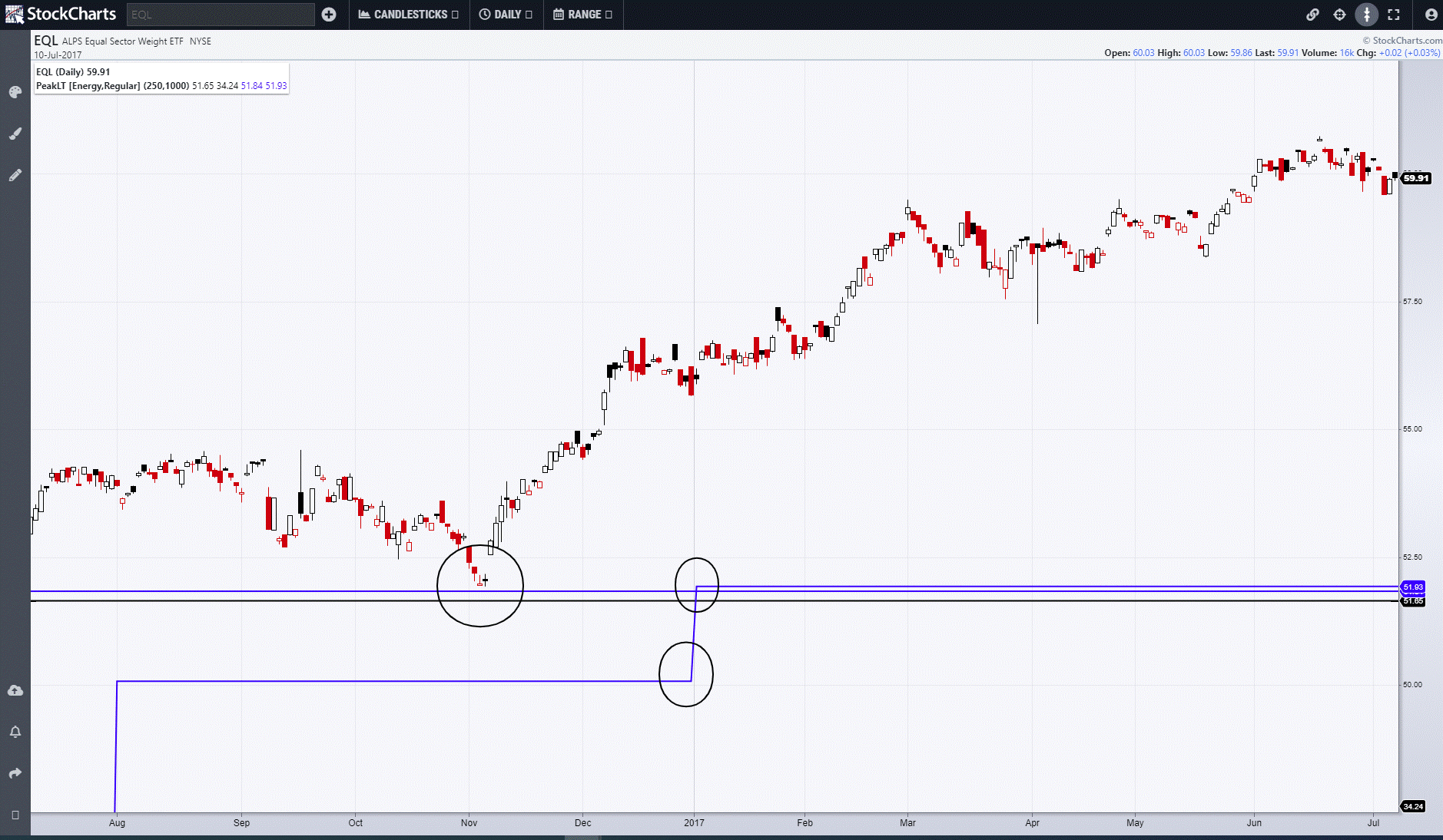
Moving back through the history of the chart enables one to see how long a level has remained constant. The longer the period, the more powerful it is. Chart 2 shows how the weekly and monthly levels date back to June 2015. For a weekly level to remain unchanged for so long highlights its strength.

The third chart shows how price respected that zone in late 2016 before being joined and strengthened with the arrival of the final monthly point at the beginning of 2017.
The next blog will look at another of the core components in the Fourth Dimension armoury by delving into some of the key properties and uses of Range Deviation Pivots. In the meantime, I can be contacted at shaun.downey@aol.com to answer any questions.
Shaun Downey