Try to summarize 2021 in one word.
"Rotational."
"Uncertain."
"Volatile."
Perhaps all of the above?
This year has been all about leadership rotation, with growth names, value stocks and even defensive sectors all spending some time as the strongest performers in a given month. This has been a year of uncertain times and competing narratives, from the Fed's attempts to address elevated inflation levels, to the projected economic boost of increased infrastructure spending, to the chronic unknowns of the COVID-19 pandemic. And, after 2019 and a relatively low volatility environment, followed by 2020 with its all-time high levels for the VIX, 2021 was somewhere in the middle.
So how do we make sense of this year from a technical perspective?
Here are my top five charts of 2021, which I believe tell the story of this year. And I feel that they tell of a challenging year, given all the uncertainties, but also provide plenty of lessons on how to manage a portfolio when the future is truly unknown.
First, we have what I call the Market Trend Model.
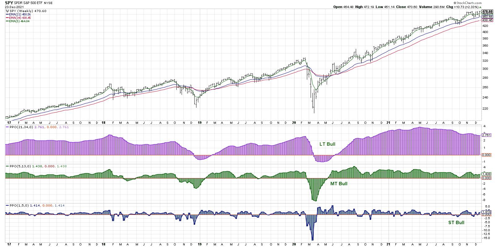
Years ago, I tried to create a systematic trend-following model that would mirror how I was viewing the overall market trend on three time frames: short-term (a couple days to a couple weeks), medium-term (a couple months to a couple years) and long-term (many years). My Market Trend Model uses exponential moving averages to determine the trend on each of these time frames, and I have found that a regular review of this chart during my Morning Coffee Routine allows me to keep a proper focus on the overall trend in the equity markets.
The long-term model turned bullish in June 2020 and remained bullish through all of 2021. Given the persistent strength in stocks and repeated new all-time highs for the S&P 500 and Nasdaq 100, this makes good sense.
On the medium-term time frame, the model turned positive in May 2020 and also remained bullish through the course of 2021. I actually tweaked the medium-term portion of the model earlier this year, as my previous version turned negative in May 2021 and remained bearish as the S&P pressed on to new highs into the fall.
This was a fantastic lesson on developing a process and staying consistent during your day-to-day to use of the approach -- but don't be afraid to adjust your inputs if you find that market conditions have changed!
The medium-term model is what I use as a basic risk-on/off gauge for equities. Should I be thinking more about potential reward or potential risk in my portfolio? The consistent bullish reading here tells me the remain constructive and to keep looking for long opportunities given the overall strength in the market trend.
Lesson #1: Don't fight the trend!
My second chart for 2021 is the daily S&P 500 chart, using daily price bars along with RSI and support/resistance levels.

The daily S&P chart demonstrated the limited pullbacks that we experienced in 2021. During an average year in the equity markets, it's reasonable to expect at least one good corrective move of over 10% down. We just didn't see that in 2021!
While the consistent uptrend from the weekly chart was certainly one key theme for equities, this chart shows how that upside was paired with limited downside as well. A basic approach of buying every time the S&P touched its 50-day moving average would have proven to be a fairly successful strategy!
It's also worth noting here that we saw four bearish momentum divergences in 2021. The deepest drawdown after a bearish signal was only 5-6%. So, while the bearish divergence in November and December appears quite negative on the surface, the reality has been much less negative through the course of the year.
Lesson #2: New highs and higher lows are the sign of a healthy bull market phase.
Next, let's review one of my favorite market breadth indicators, the Bullish Percent Index.
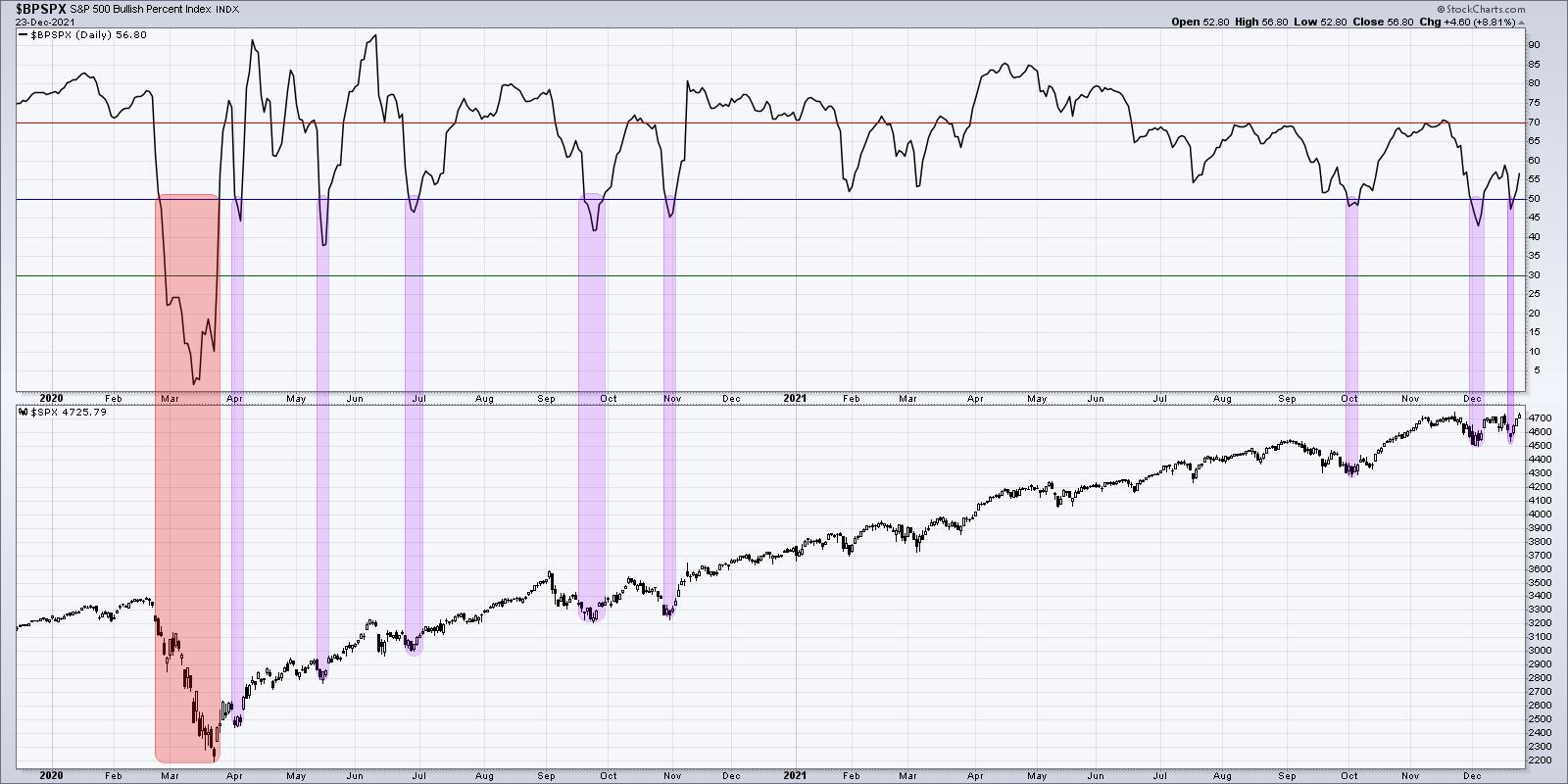
The Bullish Percent Index is derived by reviewing the point and figure charts of all 500 members of the S&P 500 index. Was the most recent signal on each chart a buy signal or a sell signal?
This index gives the percentage of the 500 charts which are currently on a buy signal, and is another way of measuring overall market participation. The index has dipped below the 50% level nine times since the beginning of 2020. In eight of those instances, the indicator turned back above 50% within a week or so of first dipping below 50%. In each of those cases, the S&P 500 rallied soon after and usually pushed to new highs. The ninth occurrence was in Feb 2020, where the index moved well below 50% and remained below this level for almost six weeks.
Years down the road, when I think about the year 2021, I may call this "The Year of Buyable Dips". Pretty much every pullback was an opportunity to jump in and ride the next leg higher. In 2022 and beyond, I will be keeping a close eye on this chart and comparing subsequent signals to this year's "buy on the dips" mentality.
Lesson #3: A strong uptrend will often provide plenty of opportunities to buy in on short-term weakness. Use a breadth indicator to identify these potential entry points.
Now let's review a series of risk-on vs. risk-off measures using market breadth and sector rotation. This chart has become so important to me over the years that I often just refer to it as "The Chart".
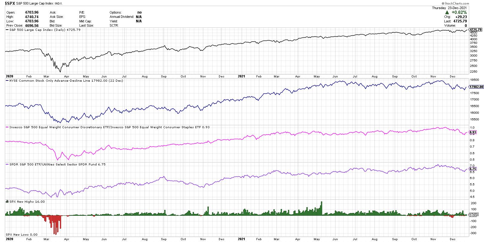
From the top, we have the S&P 500 on a closing basis, the cumulative advance-decline line of the New York Stock Exchange, the ratio of Consumer Discretionary to Consumer Staples, the relative performance of the SPY versus the Utilities sector, and the new 52-week high and lows for the S&P 500 members.
The advance-decline line is all about participation. If the S&P 500 index is moving higher, what about all the stocks that make up these indexes? Toward the end of a bullish phase, you will often see the major indices move higher, but measures of breadth like this one will start to slope lower. This suggests a weakening of market internals and less upside momentum behind the price movements.
You'll notice on the chart that this breadth indicator peaked in June and, from there, it's been more sideways than bullish. This shows how many individual stocks, particularly in cyclical sectors, have not been participating in the most recent moves higher.
Next we have what I call the "offense vs. defense ratio" which compares the equal-weighted Consumer Discretionary and Consumer Staples ETFs. I'm using the equal-weighted ETFs instead of the more common cap-weighted versions to limit the impact of the mega-cap Consumer Discretionary stocks: AMZN, TSLA and HD.
This ratio made a new into December, which was one of the main inputs that encouraged me to remain overall constructive on stocks through the November high. Over the last six weeks, however, this ratio has turned lower as stocks like PG, KO, PEP and others have made new all-time highs. This suggests a move to more defensive positioning going into the new year.
The next line (purple) shows the relative performance of the S&P 500 ETF vs. the Utilities sector (XLU). I have found that investors usually only own Utilities if they are looking to ride out market uncertainty by owning something with low volatility and high income. Overall, this ratio has moved higher through the course of 2021, which illustrates the underperformance of a key defensive sector. Similar to the consumer ratio above, this has also taken a negative turn in December and could be a key chart to watch going into January.
Finally, we're looking at the new highs and lows for the S&P 500. A healthy bull market phase is marked by an expansion in new highs. The market is doing well if it's not just the major indexes making new highs, but a broad group of stocks showing strength as well. While this indicator was fairly strong in October and November, I've seen less and less stocks making new 52-week highs in December. A bullish trend in early 2022 would really need to be confirmed by an increase in new 52-week highs.
Overall, The Chart shows the overall strength of breadth measures through much of 2021, but also shows the strength of the FAANG trade over the summer. As sectors like Energy and Financials topped out in May, the market moved higher despite the lack of participation.
Lesson #4: Investors have not broadly rotated to defensive positioning yet, but they will!
For our fifth and final chart, we have the Ten-Year Treasury Yield, along with the relative performance of Financials vs. Technology.
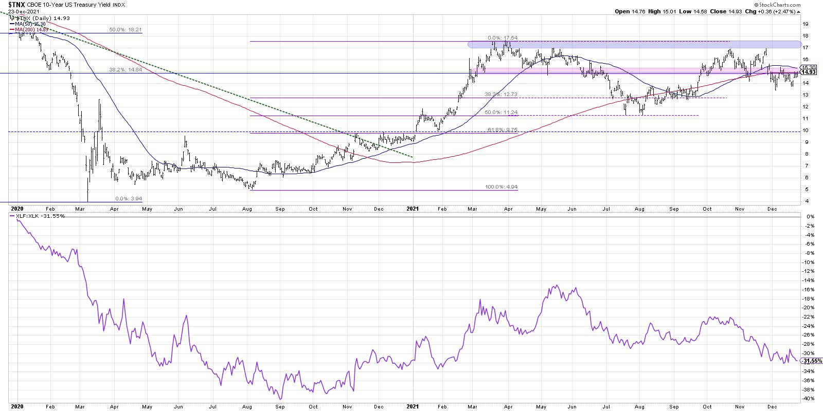
What strikes me on this chart is that the Ten-Year yield is almost exactly where it was in February! Now, it has not been a sideways trend over the last ten months, as this key interest rate has fluctuated up to 1.75%, down to 1.15% and back again. But the key to this chart is what it tells us about market leadership.
From January to May, it was all about the cyclical sectors driving the markets higher. Sectors like Energy and Financials emerged in Q4 2020 and pounded higher in the first quarter. May to August saw interest rates move lower, which means a headwind to those value-oriented sectors and more of a tailwind to growth sectors like Technology. The ratio moved higher into October as rates moved back higher and value sectors shined. The last eight weeks have been marked by lower interest rates and stronger charts in Technology. Growth sectors have once again regained the leadership role.
I was asked recently the question I posed at the beginning of this article. I answered "rotational" and I feel this fifth chart tells the story quite clearly.
If you want to understand the leadership theme in equities, and figure on which side of the growth/value debate you should be positioned, I would watch the chart of the Ten-Year. Given the Fed's well-documented plans to raise rates in 2022, I would expect this chart to move higher, which would mean it's much more likely we'll see a sector like Financials outperforming Technology. And this chart should help you understand the timing of that move.
Lesson #5: Interest rates matter. Big time.
How would you describe your experience as an investor in 2021? And what can you do today to help you upgrade your investment process and find success in 2022?
To help you answer those questions, check out the video version of this article, which includes a more complete illustration of the lessons from each of my Top Five Charts of 2021!
RR#6,
Dave
P.S. Ready to upgrade your investment process? Check out my free course on behavioral investing!
David Keller, CMT
Chief Market Strategist
StockCharts.com
Disclaimer: This blog is for educational purposes only and should not be construed as financial advice. The ideas and strategies should never be used without first assessing your own personal and financial situation, or without consulting a financial professional.
The author does not have a position in mentioned securities at the time of publication. Any opinions expressed herein are solely those of the author, and do not in any way represent the views or opinions of any other person or entity.