TAKEAWAYS
- Comparing equal-weighted and cap-weighted sectors on a Relative Rotation Graph can offer interesting insights
- When the trajectory of the tails and their position on the chart differ significantly, further investigation is warranted
- At the moment, two sectors are showing such divergences
All on the Same Track... or?
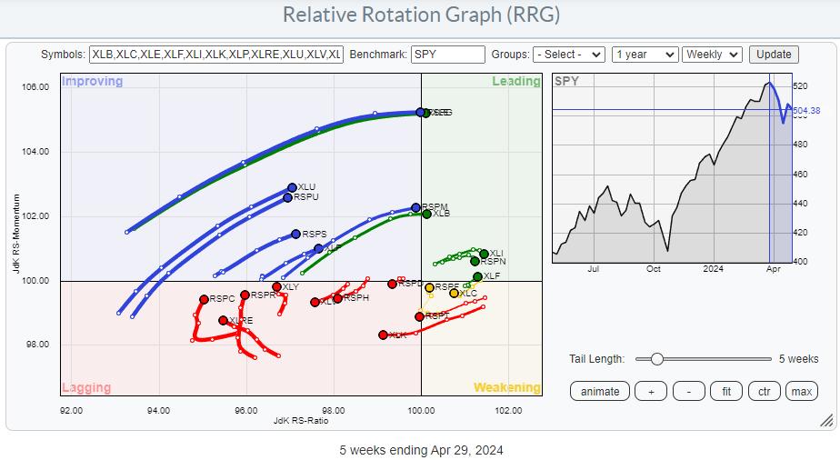
The difference between equal-weighted sectors and cap-weighted sectors is obvious. Namely, the cap-weighted variant is much heavier and is impacted by the changes in some heavy-weight, often mega-cap, stocks. Nevertheless, when you plot these sectors on Relative Rotation Graphs, you will often find that their tails generally move in the same direction and/or follow the same path.
When that does not happen, when the tails of the two versions of the same sector are on different paths or in completely different positions on the RRG, it's time to investigate.
The RRG above shows the two universes, cap-weighted and equal-weighted, plotted on the same RRG and against SPY as the benchmark. Looking closely, you will find most sector pairs on the same trajectory. If you have a SC account, you can click on the graph, open the RRG in your own account, and do a closer inspection.
*You can save RRGs as bookmarks in your browser. By doing that, you can create your own custom RRGs and save them for later retrieval. Scroll to the bottom of the page, click "permalink," and then copy and save this link as a bookmark in your browser.
Zooming In
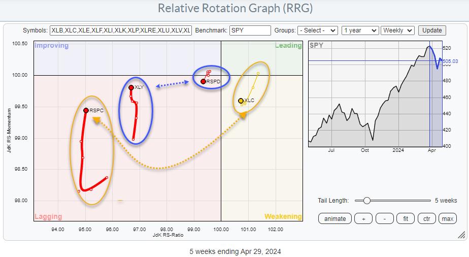 To get a better handle and a clearer picture, I have removed the sectors where both tails are on similar trajectories and positions and only left the tails on the graph where they differ. As a result, two sectors remain: Consumer Discretionary and Communication Services.
Consumer Discretionary
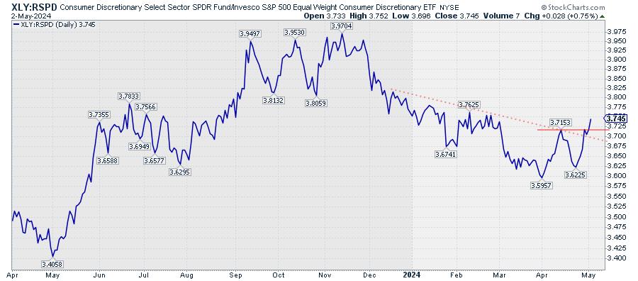
Both tails are inside the lagging quadrant. However, that is as far as the comparison goes. XLY is moving higher on the RS-Momentum scale, indicating an improvement in relative momentum, while RSPD is moving lower and is on a negative RRG-Heading. Also, the tail on XLY is substantially longer than on RSPD, indicating the power behind the move.
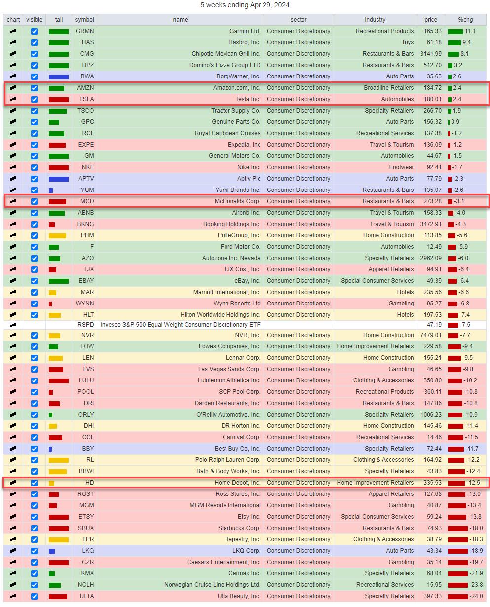
Looking at the composition of the sector, it's obvious which stocks inside Consumer Discretionary are causing the difference.
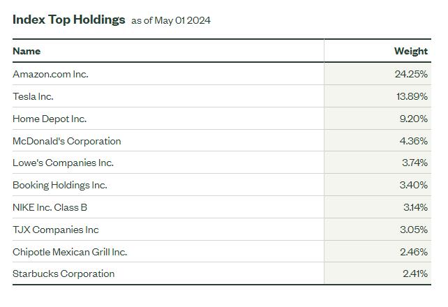
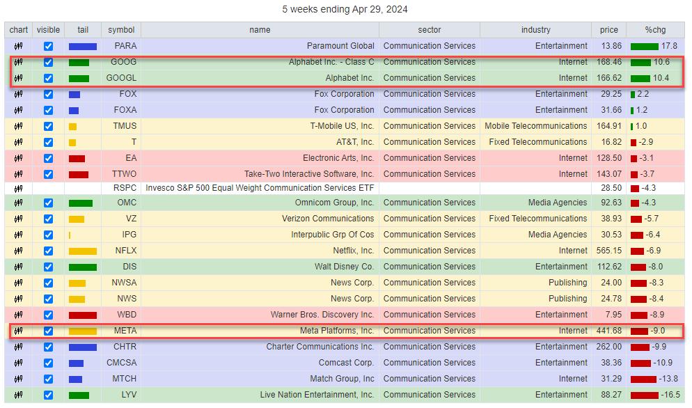
AMZN, TSLA, HD, and MCD comprise 50% of the index, while AMZN and TSLA are already 38%.
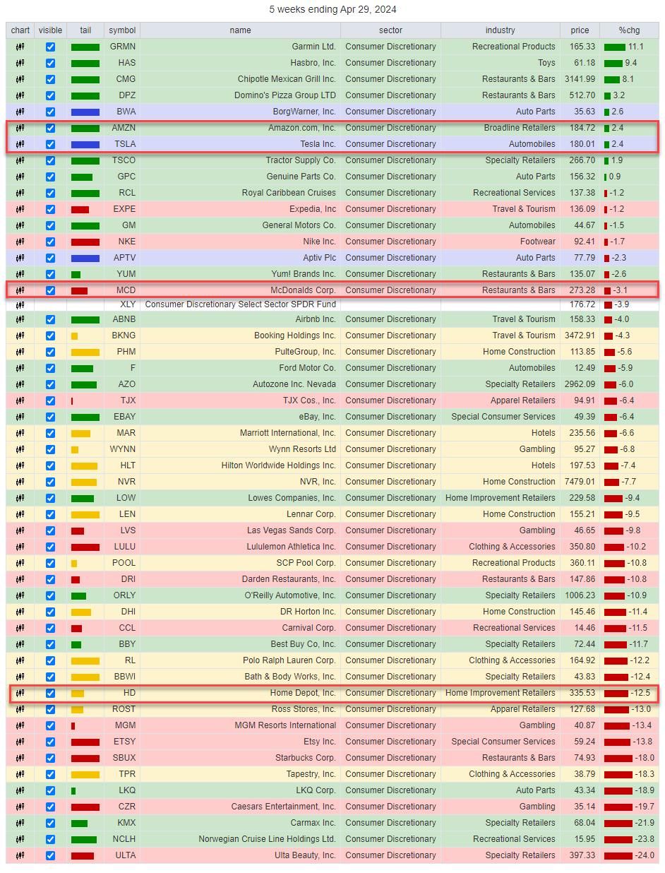
Looking at the performance over the last five weeks (tail length on the RRG), we can see how the sector's performance has shifted to the large names. The table above shows the top 50 stocks in the discretionary sector. AMZN and TSLA are in the upper end of the range, and MCD is just above XLY, which is at position 17 out of 50. This implies that most stocks are performing worse than that sector index.'
Roughly the bottom half is at double-digit declines. While AMZN and TSLA are "only" up 2.4%, they drag the sector index up to around 1/3 of the entire universe, even with HD showing a 12.5% decline over that period.
Now, look at the same table. Instead of using XLY as the benchmark, we are now using RSPD as the benchmark.
RSPD is showing up at position 27 / 50, right where you'd expect an equal weight benchmark -- in the middle of the universe, balancing out all the performances.
The bottom line is that XLY has been picking up recently only because of TSLA, AMZN, and MCD. But, under the hood, most discretionary stocks are going through a horrible correction.
From a trading perspective, such observations can offer great pair trading ideas.
Communication Services
The tails for XLC and RSPC are also far apart on the RRG. XLC is still inside the weakening quadrant and has just started to show the first signs of curling back up. RSPC is deep inside the lagging quadrant at a really low reading on the RS-Ratio scale overall, and is picking up relative momentum, but no relative trend (RS-Ratio) yet.
Over the five-week period, XLC lost 2.8%, while RSPC lost 4.3%. The composition for this sector is even more top-heavy than Consumer Discretionary.
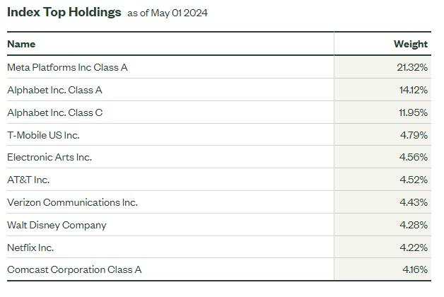
META is listed as the top holding in XLC at 21%. But when we add up the weights for Alphabet A and B, it comes out to 26%. So together, the top two stocks in XLC are a whopping 47% of the sector.
Looking at the same table for XLC, we find Alphabet at the top of the list over the last five weeks. Meta is in the lower part at -9%. The sector (XLC) comes in at -2.8%, which means that META is UNDERperforming (-9% + 2.8% =) -6.2%. But Alphabet Class A is OUTperforming (10.4% + 2.8% = ) 13.2% and Alphabet Class C is OUTperforming (10.6% + 2.8% = ) 13.4%. This is a way stronger upward pull for the index than the drag caused by META.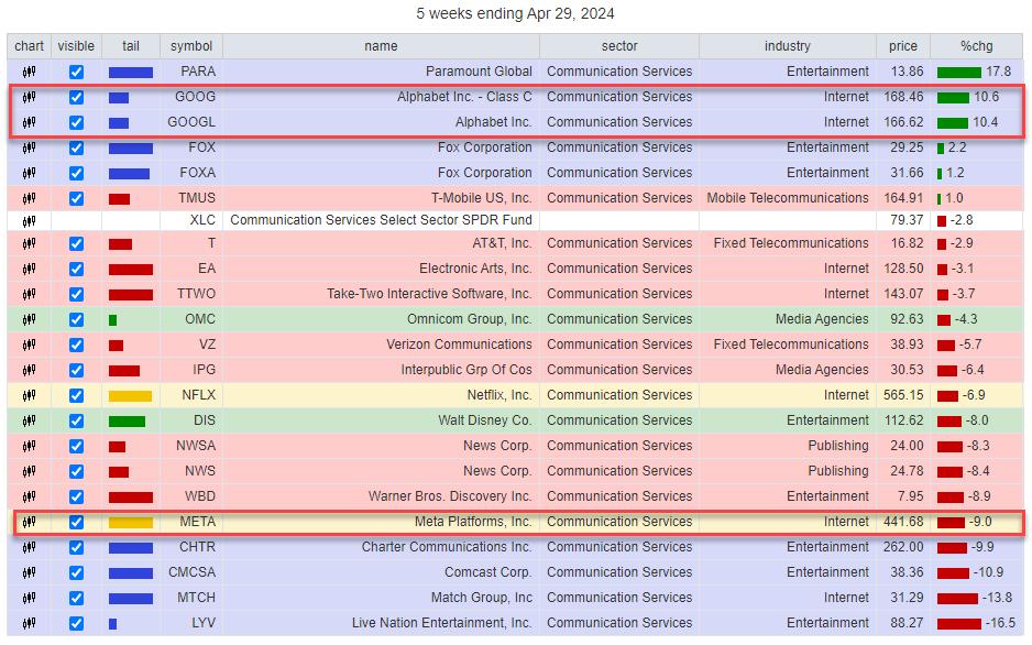
Changing the benchmark to the EW version of Communication Services shows this table.
Again, we see the equal-weight benchmark (RSPC) dropping to near the middle of the list, balancing out the return more evenly.
All in all, this provides a similar pair trading opportunity.
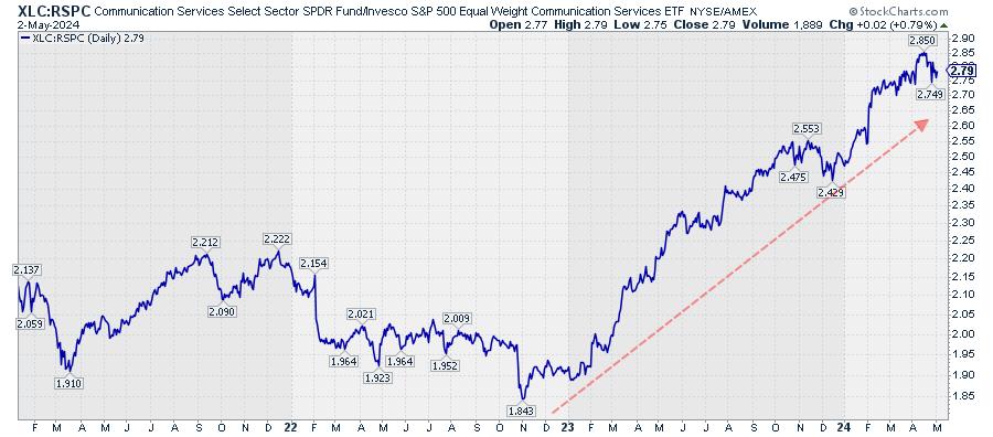
This relative trend is much more mature than the XLY:RSPD pair, but, as long as the rhythm of higher highs and higher lows continues, buying the dips in this relative line offers opportunities.
Most of the time, the cap-weighted and equal-weighted versions of a sector will move more or less in tandem. But when they don't, they're worth investigating, as they may offer interesting trading opportunities.
#StayAlert and have a great weekend, --Julius
Julius de Kempenaer
Senior Technical Analyst, StockCharts.com
Creator, Relative Rotation Graphs
Founder, RRG Research
Host of: Sector Spotlight
Please find my handles for social media channels under the Bio below.
Feedback, comments or questions are welcome at Juliusdk@stockcharts.com. I cannot promise to respond to each and every message, but I will certainly read them and, where reasonably possible, use the feedback and comments or answer questions.
To discuss RRG with me on S.C.A.N., tag me using the handle Julius_RRG.
RRG, Relative Rotation Graphs, JdK RS-Ratio, and JdK RS-Momentum are registered trademarks of RRG Research.