StockCharts now has four different "time independent" forms of charting. I thought I'd take some time this week to introduce you to all four.
A "Time Independent" chart is a chart that doesn't have a consistent horizontal axis. On a typical price chart - a standard Bar Chart for example - each time period on the chart occupies one vertical column of space, even if the stock doesn't trade during that time period. So, one week of time occupies the same amount of horizontal space regardless of the ticker symbol you are charting. On a "Time Independent" chart, each time period may or MAY NOT result in vertical columns of space being added to the chart - it depends on the price action during that period of time.
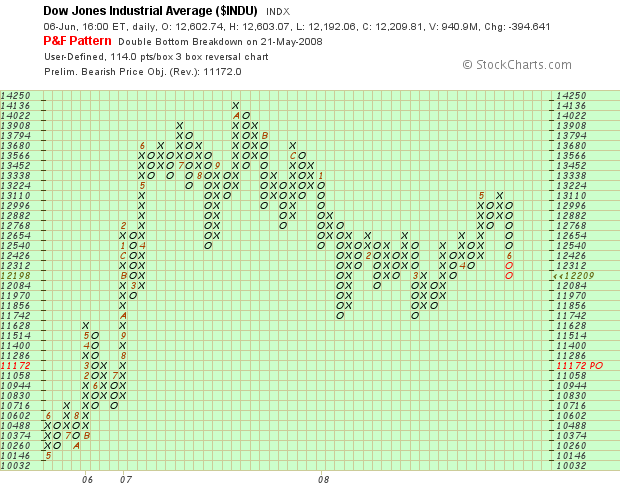
You are probably familiar with Point and Figure charts - the ones with the X's and the O's. We've had P&F charts on StockCharts almost from day one. They are the most common example of Time Independent charting on our site. On a P&F chart, new X's or O's only appear if the price "fills" the next box in the current column. New columns appear only if the price reverses direction by a large enough margin. (Click here for the gory details.)
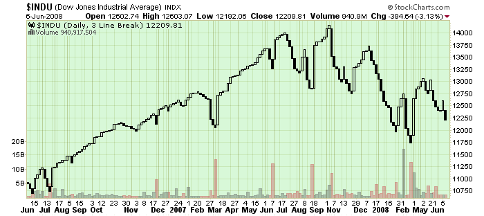
In addition to Point & Figure charts, StockCharts.com now supports Three-Line Break charts, Kagi Charts, and Renko Charts - the four most popular time independent charting styles out there. Here's what all of those charts look like:
Point & Figure Chart
Three-Line Break Chart
Kagi Chart
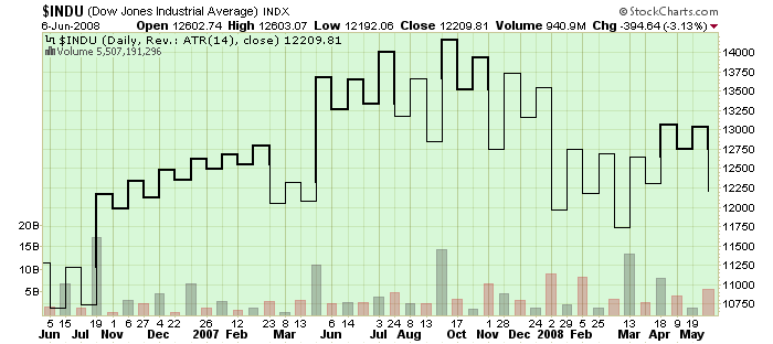
Renko Chart
(Click on each chart to see how it was constructed.)
As you can see, each kind of charting has its advantages and disadvantages. For example, the P&F Chart clearly shows the recent Double Bottom Breakdown that occurred at the end of May. The Three-Line Break chart shows the Head & Shoulder top that appeared on the chart at the end of last year. The Kagi chart makes it easier to spot support/resistance levels such as the one around 12750 that was recently broken. Finally, the Renko chart clearly shows when the Dow was trending up and down.
You can read more about P&F Charts, Kagi Charts and Renko Charts in our ChartSchool's Chart Analysis area now. (We'll have a Three-Line Break article up soon.)
The key reason to use Time Independent charts like these is that they filter out all of the "insignificant" price moves and give you a better view of the "big picture." Make sure to add these important tools to your charting arsenal.
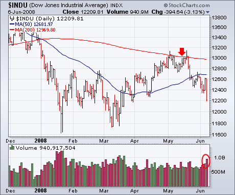
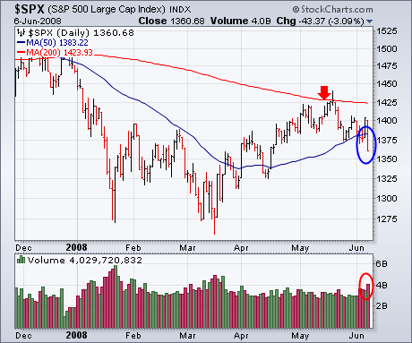
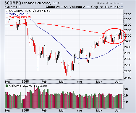
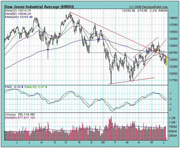
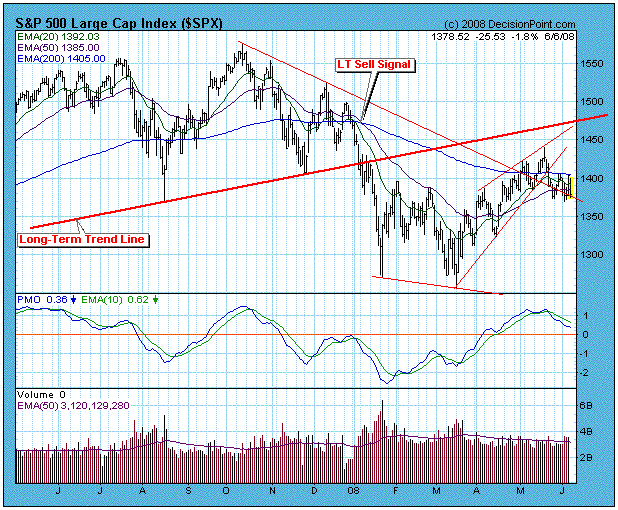
BEARISH FORCES RETAKE THE MARKETby John Murphy | The Market Message There have been two consistent themes that myself and Arthur Hill have been stressing in recent Market Messages. One has been that the rally from mid-March is a bear market rally. The other has been that the rally has probably ended. That dual reality was brought into sharper focus on Friday when a combination of intermarket forces sealed the fate of bullish hopes. A huge jump in the unemployment number, a big drop in the U.S. Dollar, and a record surge in oil prices sunk the stock market in a big way. Charts 1 and 2 show the Dow Industrials and the S&P 500 hitting two-month lows on heavy volume. That's after failing at their 200-day moving averages in mid-May. Rather than repeating ourselves, I refer you to last Monday's Message headlined: "It still looks like the bear market rally is ending -- Short-Term ROC lines have turned negative -- Long-Term ROC shows market still in bear market -- VIX jumps 10% -- Nasdaq fails at 200-day average for second time". All of those bearish factors are still in play. Chart 3 shows the Nasdaq ending the week back below its 200-day line after a brief pop over that major resistance line on Thursday.
\
SMACK DOWN AT RESISTANCEby Arthur Hill | Art's Charts
Even though techs and small-caps have been showing relative strength the
last several weeks, the Nasdaq and the Russell 2000 are running into stiff
resistance of their own. Their charts show similar setups that point to a
medium-term peak.
First, let's look at the reasons for resistance. Both indices declined
sharply from October to March and then rallied from mid March to early June.
These rallies retraced 50-62% of the October-March declines and carried both
indices back to their 200-day moving averages. In addition, broken support
around 2550 turns into resistance for the Nasdaq. The yellow areas reflect
these resistance zones on both charts.

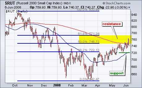
Friday's sharp decline reinforces these resistance zones and increases the
chances of a trend reversal. Both indices have been moving higher since mid
March and remain in 10-12 week uptrends. The late May lows and 50-day moving
averages mark support for these uptrends. A break below these support levels
would forge a lower low and reverse the uptrends.
There is also a videoversion of the this analysis available at TDTrader.com - Click Here.
THREE MARKET VIEWSby Carl Swenlin | DecisionPoint.com
There are three market indexes that capture the most attention: The Dow Jones Industrial Average (DJIA), the S&P 500 Index (SPX), and the Nasdaq 100 Index (NDX). Together they represent about 80% of the total U.S. market capitalization. While they are normally more or less in sync with one another, this is not always the case, and now is one of those times where they don't look a lot alike.
Currently, the DJIA is the weakest of the two. It is on a long-term sell signal (the 50-EMA is below the 200-EMA), as well as an intermediate-term sell signal generated by our primary timing model. Looking at the chart we can see that the price index had broken above horizontal resistance and an important declining tops line that defined the bear market. Unfortunately, this breakout was a fakeout, and prices dropped below the support, leaving the DJIA in an unambiguous bear market configuration. The DJIA has only 30 stocks, but it has the most psychological impact on the public.
The broadest of the three markets is the SPX. Consisting of 500 stocks, it is the least likely to be distorted by individual stocks or sectors. The SPX is also on a long-term sell signal, but the intermediate-term signal is a buy. It has managed to break above the declining tops line, but is struggling the resistance of the 200-EMA and, as I write this, it is making a strong effort to break down again.
The NDX presents the most positive picture of the three. It switched back to a long-term buy signal about three weeks ago, and it has a nice profit on an intermediate-term buy signal. While I will treat the NDX strength at face value, I will also acknowledge that it is the odd-ball.
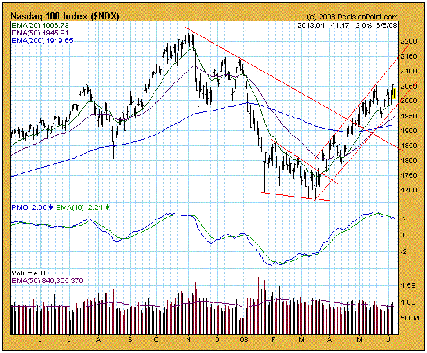
Bottom Line: Rather than being in agreement, the three major indexes we follow present different pictures. The DJIA and SPX present similar pictures, but one is negative and the other is still slightly positive. The NDX, on the other hand, is strongly positive. Will it lead the rest of the market higher? I have my doubts.
The problem the market faces at this time is that the rally from the March lows is in the process of being corrected, a process that will probably take several more weeks. The DJIA has already succumbed and turned negative, and the SPX is not far behind. And while the NDX has rallied faster than the broad market, it will probably move faster in reverse, turning negative in the end.
Let's focus first on one of the strongest indices, the NASDAQ. Technology stocks have been performing quite well and there's been a challenge for the tech-heavy NASDAQ to pierce price resistance at 2541. Thursday's close of 2549 was enticing, but volume was just moderate and the Friday jobs report was in the on-deck circle. I wasn't buying into it, actually removing a QLD play Thursday afternoon rather than play stock market roulette on Friday morning. It's always better to preserve capital, lock in profits and be safe rather than sorry, especially when mired in an intermediate-term downtrend with price action trying to negotiate resistance. The jobs report Friday was shocking as the unemployment rate jumped from 5.0% to 5.5% rather unexpectedly. The bears grabbed control of the action at the opening bell and would not let go. Below in Chart 1, you can clearly see the current trading range for the NASDAQ:
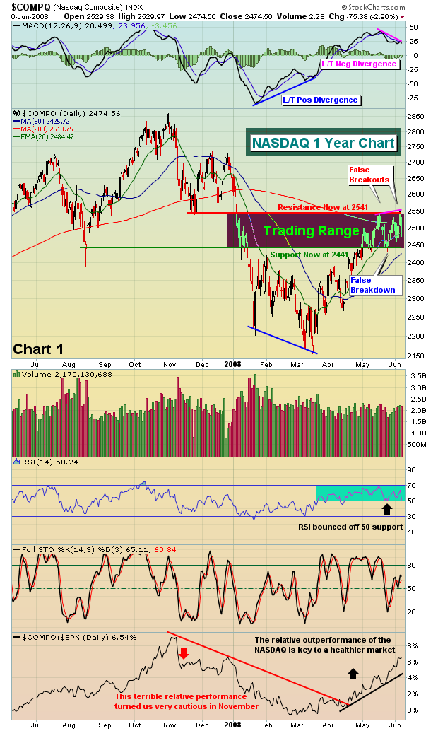
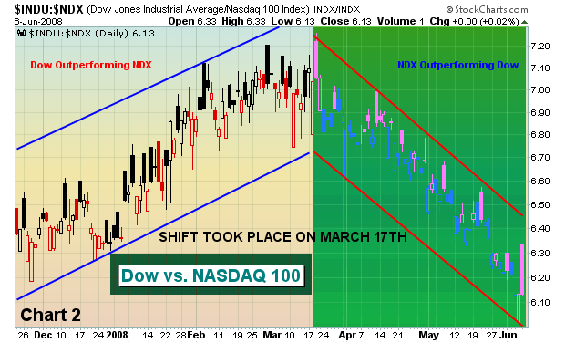
Notice on the latest price high on the NASDAQ that a long-term negative divergence has formed on the MACD. This suggests to me that we'll see a pullback continue to test the 50 day SMA and the bottom of the recent trading range. Look for 2425-2441 as a target on the current move down. If that support area is lost, the market could have much further to drop. Continue to play the trading range, but beware of changing conditions. The market has recently enjoyed outperformance by the NASDAQ 100, or NDX. Chart 2 is a "flight to safety" chart that compares price action between the Dow Jones and the NDX. When equity prices are under pressure and downtrending, the "flight to safety" ratio generally moves higher as money rotates from the high-growth, high PE NDX stocks to the more stable and secure blue chip companies. However, a strengthening equity market normally results in a decreasing "flight to safety" ratio. Should the current downtrend in this ratio be broken, it would be yet another sign of further weakness to come in the equity markets.
Next up is the S&P 500. I had identified 1370 as fairly strong short-term price support. That support level was lost on Friday's close, as was the 50 day SMA. The S&P 500 joined the Dow in losing their respective 50 day SMAs. Below is the current chart on the S&P 500:
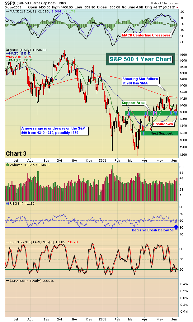
Losing price support on the S&P 500 was ominous enough. However, watching the MACD cross the centerline on the S&P 500 has put us in a very cautious mode. Think capital preservation.
Happy trading!
Join Tom and the Invested Central team at www.investedcentral.com. Invested Central provides daily market guidance, intraday stock alerts, annotated stock setups, LIVE member chat sessions, and much, much more.
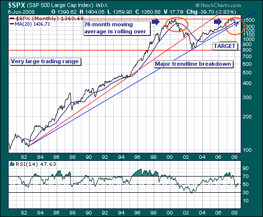
LOOKING TOWARDS THE HORIZONby Richard Rhodes | The Rhodes Report When markets become as volatile as they have in the past week; it is best to stand back and take a look at the longer-term time horizon. We like to use the S&P 500 as our proxy; and as week look at the monthly chart - we find the S&P having broken down through several critical long-term support levels. This suggests the probability has increased substantially that a bear market has indeed begun - with further significant damage to be wrought in the months ahead.
Quite simply, the 1980-2002 bull market trendline was violated; the importance of which can't be underestimated. The last time a trendline of this magnitude was violated, the S&P fell roughly -27% from the breakdown level. If that were to occur once again - then it would argue for a lower target of 985 from its current 1360 level. This has significant implications towards tactical trading to be sure. Moreover, confirming this major breakdown, the 20-month moving average was violated and is now turning lower - a circumstance last seen at the end of 2001. We all know the subsequent damage done thereafter.
Therefore, taking the long-term perspective and perhaps positing that last Thursday's rally was in essence the end of the countertrend rally off the March lows, while Friday's plunge the beginning of the next leg lower - one should certainly consider becoming more defensive and/or putting on short positions.