Hello Fellow ChartWatchers!
The markets continue to rise impressively with the Dow closing higher for 13 of the last 16 days. Arthur, John and the rest of the ChartWatchers team discuss that in more detail in just a bit. I wanted to take some time to talk about six very important things that most people don't know about our website.
1.) You Can Get Notified As Soon As New Articles Are Posted -
Everytime a new article is posted on StockCharts (even this one!), we send out several notifications about via both Twitter and our RSS Feeds. (Most articles also appear in the "What's New" section of the Home Page.) If you want to say up-to-date with StockCharts, I strongly encourage you to either join our Twitter feed or you can point your News Reader program to our RSS Feed.
2.) Long Term Members Can Save Money Each Year They Renew -
Last year, we implemented a Loyalty Rewards Program that provides an ever increasing discount for our long-term subscribers. For each year that you've been a member of StockCharts, we'll reduce your renewal cost by 1%. The only "trick" here is that you need to remember to enter your loyalty coupon code into the renewal form before you renew. For whatever reason, many people are not taking advantage of this deal - don't be one of them! Before you renew, get your coupon code by clicking on the loyalty badge that is next to your name on the Members page. Click here for more details.
(And please don't ask us to apply your discount after-the-fact. It's just not possible. You must enter it into the renewal form before you submit your renewal order.)
3.) Arthur Hill Has Been Improving Our ChartSchool Area -
Arthur has added lots of new articles to ChartSchool recently including ones on the Detrended Price Oscillator, Bollinger's %B, Cycle Line Analysis, the Raff Regression Channel and much more. Be sure to revisit ChartSchool when you get a chance to learn even more about Technical Analysis.
4.) We've Posted Over 2100 High Quality Blog Articles Over the Past 13 Months -
Some people associate the word "blog" with low-quality, controversial sites that spread rumor and innuendo. Don't mistake our blogs for those others. The "Blogs" area at StockCharts.com only contains articles written by the StockCharts staff and a few select guest authors. The articles are only about technical analysis and getting the most out of our website. If you aren't reading our Blog articles, you are really missing out on getting the most from our website. And most of our Blog articles are free!
Here are some great recent articles you may have missed:
What are ZigZag Retracements? from our MailBag blog
Pulte hits retracement resistance from our "Don't Ignore This Chart" blog
Now You Can Add Sector and Industries to your ChartLists from our "What's New" blog
Be sure to read our Blogs every day.
5.) The Flash Version of ChartNotes is Almost Complete -
So far the feedback on our new Flash version of our ChartNotes annotation tool has been very positive. We have added a couple more features like mouse-wheel and printing support and we think it is almost ready to replace the Java version. For most people, it is faster and has fewer technical issues when they try to run it. Let us know if there are any more kinks that we need to fix before it is officially released.
6.) Our Milestones Page Show You Our Long-Term History of Continuing Improvements -
Don't forget to visit our Milestones page from time-to-time. It shows you all of the significant improvements we've made to the site since we started way back in 1999.
- Chip Anderson
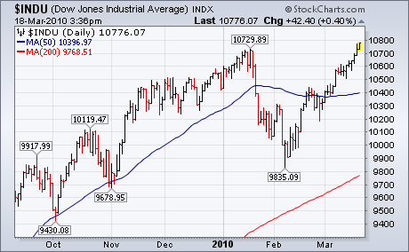
DOW THEORY UPTREND IS CONFIRMEDby John Murphy | The Market Message Dow Theory holds that the Dow Transports and Industrials must both hit
new highs to confirm an ongoing bull market. The ability of the Dow
Industrials to exceed their January high has done just that. That
doesn't tell us how far the bull market will run, or for how long. It
just confirms that a bull market still exists. The Dow has been a
laggard for several months and is one of the last indexes to hit a new
high. [The NYSE Composite also hit a new high last week]. A lot of this
week's Dow strength can be attributed to upside breakouts in some key
components.
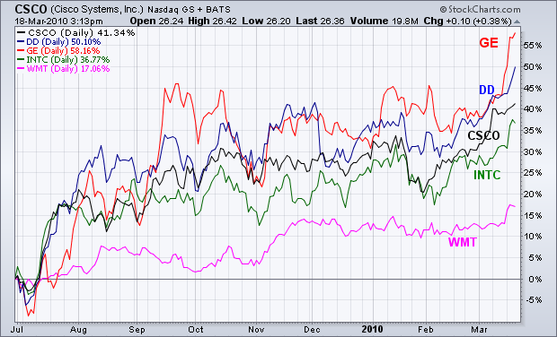
DOW LEADERS... The Dow's ability to finally hit a new high is
largely based on the strong price of the five stocks shown below. All
have rallied to 52-week highs over the last week. In order of relative
strength, they include General Electric, DuPont, Cisco, Intel, and Wal Mart.
Although Wal Mart has been a laggard for sometime, all five stocks are
doing better than the Dow during the first three months of the new year.
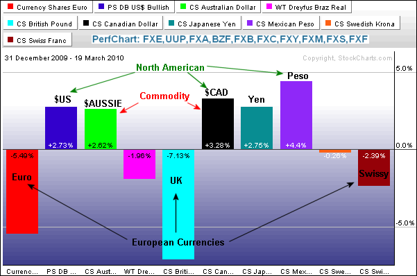
The Perfchart below shows the performance trends for
10 currency ETFs in 2010. The North American and commodity currencies are strong, while the European currencies are weak. First, notice that the DB Dollar Bullish ETF (UUP), Mexican Peso ETF (FXM) and the Canadian Dollar ETF (FXC) are up. Strength in all three North American currencies bodes well for a recovery throughout the continent. In particular, Mexico and Canada benefit from a recovery in their big neighbor. The Peso is the strongest of the 10 currency ETFs this year (ole!). The Canadian Dollar and Australian Dollar ETF (FXA) represent two of the so-called âcommodity currenciesâ because both countries are rich in natural resources. In contrast to the North American and the Commodity Currencies, the Euro ETF (FXE), British Pound ETF (FXB) and Swiss Franc ETF (FCF) are weak this year. The Euro and Pound each have their own set of problems, but these are compounded by their proximity to each other. These are the currency trends so far in 2010 and they show no signs of changing.
Click this image for a live PerfChart.
A TIP ON TIPS by Carl Swenlin | DecisionPoint.com
TIPS are bonds that provide inflation protection. While Erin covered
this subject in yesterday's blog, I wanted to cover it with a little
more depth and from a somewhat different perspective. Our default
"first look" charts are usually set for one year, but I personally like
to step back to a three-year chart to help put recent price action in a
longer-term context.
I think the most prominent feature on the chart is the crash in
October 2008. Before that you can see the strong advance, coinciding
with people's belief that prices on everything would rise forever.
Prices leveled in 2008 as the inflation belief began to be undermined.
The crash in TIPS occurred when both real estate and stocks were
crashing and fear of deflation took hold. TIPS began to advance again
out of the depths of the crash.
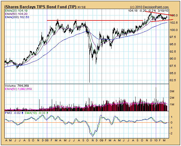
Since the November 2009 top, TIPS have moved sideways into a triangle
formation. This is also called a continuation pattern, meaning that
prices are technically expected to continue higher once the
consolidation phase has completed. Prices have been turned back from
overhead resistance for a third time, and I think this could be the
final pullback before an upside breakout occurs. Supporting this
opinion is the fact that (1) the 50-EMA is above the 200-EMA (bull
market for TIPS), (2) we have a PMO crossover buy signal in relatively
oversold territory, and (3) the 20-EMA is close to crossing up through
the 50-EMA, which will generate a Trend Model buy signal.
Candlesticks and candlestick patterns are the foundation to trading in my view. I use them on every charting timeframe, whether it's a one minute, hourly, daily, weekly or monthly chart. If you're a daytrader or swing trader, trading without the knowledge of reversing candlesticks is doing yourself a great disservice. While not every uptrend or downtrend ends with a reversing candlestick, most reversing candlesticks do end a trend if a prior trend is in place. The reversal may just be a temporary end to the trend, so you have to view these candlesticks in tandem with other technical indicators such as price support/resistance, trendlines, key moving averages, MACD divergences to determine the potential degree of any reversal. Combining these candlesticks with other technical indicators can be especially rewarding. Take a look at the following chart of Aspen Insurance Holdings (AHL):
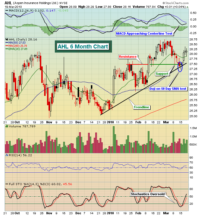
AHL was our Chart of the Day for Tuesday, March 16th. I've circled the doji which would be an interesting candlestick all by itself. But when you combine it with a 50 day test, trendline test and price support test, it becomes even more meaningful. Also trading AHL, which at the time had RSI in the 40s and stochastics in the single digits, was a much better alternative than chasing stocks that had already advanced significantly and were sporting RSIs and stochastics in the 70s and 90s, respectively. AHL was also a fairly conservative trading prospect. Note that the 6 month trading range on AHL only spanned 3 points or so. So while it probably wasn't go to be a huge winner in terms of a percentage gain, neither was it likely to be a big loser. Given the extremely overbought market conditions last week, AHL represented a decent trading opportunity for the more conservative trader. A significant benefit to trading off of a reversing candlestick is that it provides you a pre-determined stop level. In the case of AHL, any move below $27.20 (the low the day the reversing candle printed) would have been a sign to exit. This is crucial as a trader because now you can clearly identify your risk. Roughly, there was $.30 per share risk in this trade. If you wanted to limit your risk to no more than $150, then you know to purchase no more than 500 shares (500 shares X $.30 = $150).
I realize not all traders are conservative, however, and many want to "swing for the fences" on occasion (or maybe more than "on occasion"). I search for those as well. You can check out two such candidates - KongZhong Corp (KONG) and Ford Motor (F) that were included as Charts of the Day on Thursday and Friday of this past week. F is included as a more aggressive stock in this example because it was included as a short candidate following Thursday's reversing candlestick. Note the 3.2% drop in F on Friday. CLICK HERE to view the videos we produced on our Thursday and Friday Charts of the Day on both KONG and F to gain a better understanding of the power of reversing candles.
By the way, every ETF that tracks the major indices printed reversing candlesticks on Friday. Given the recent uptrending market, this is something that shouldn't go unnoticed. The equity only put call ratio (EOPCR) indicator (my favorite sentiment indicator discussed in previous articles - check the archives) that marked the short-term bottom in early February was flashing a sell signal throughout last week as well. This is certainly indicative of a short-term top.
Whether you're an active daytrader, professional trader, portfolio manager or simply someone looking for a bit of supplemental income, candlesticks should be an integral part of your screening technique.
Happy trading!
IS THE S&P ON SOUND-FOOTING, OR NOT?by Richard Rhodes | The Rhodes Report The recent S&P rally to new reactionary highs has shown to be on rather slim-footing given that volume patterns are rather tepid. We don't disagree in the least, but the fact of the matter is that the advance/decline figures have been rather "good" of late and showing impressive strength in the face of this volume contraction. We've always been led to believe that volume equals conviction, but the current rally has only convinced in terms of points and percentages...not in volume.
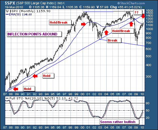
So we must question whether the S&P is on sound-footing or not? Our initial reaction would be "no"; but when we look at the longer-term monthly S&P chart, we can't dismiss the fact that the S&P has broken out above its 50-month exponential moving average by a slim 1% to 2% margin. In the past, the 50-month has been an inflection point that gives confidence as to the next market move - be it higher or lower. The current breakout coupled with the still rising full stochastic means we lean "long" at this point. This is a very difficult statement to make given we've fought the rally as being of the counter-trend variety.
Still, the potential exists for this nascent breakout to fail, and for prices to falter and extend below the 1146 level once again. This would lead to a resumption of the bearish trend. However, if prices extend from current levels - then we won't be surprised to see a test of the 1400 to 1500 highs in the next several years. Yes, we hear the knashing and wailing and we can point to a litany of economic issues that illustrates the markets should move lower; and they very well may do so. But the technical breakout stands for now; not on firm footing - but a footing that must be respected.