| |
|
|
|
|
| |

|
ChartWatchers
the StockCharts.com Newsletter
|
|
|
|
|
|
|
|
Hello Fellow ChartWatchers,
Today I'm please to announce the grand opening of our Advanced Scan Library. We've collected some of the best scans available and posted them in this new ChartSchool area for everyone to see. We have a big collections of Sample Scans that will teach you how to use our Advanced Scanning tools. A difference section contains all of our Predefined Scan criteria on one page for you to review. We also have a collection of Published Scans that have appeared in other publications. Finally, we have some User-Contributed Scans that our members have sent in over the years.
All of the scans are in Advanced Scan Workbench format, ready to be copied and pasted into the Advanced Scan Workbench by members of our Extra service. Hopefully they will be helpful to you - especially if you are trying to learn more about creating your own scans.
Here's an example from the Published Scans section to give you a better sense of what the Scan Library contains:
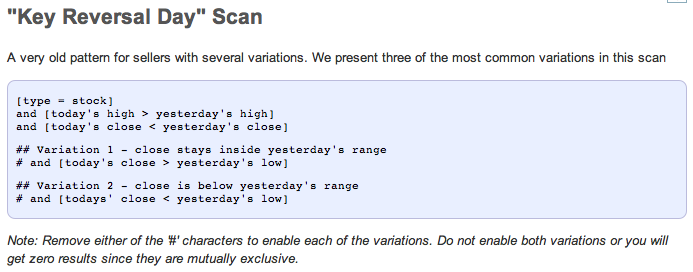
(Click on that example to see the live scan criteria in the library which you can then cut and paste into the Advanced Scan workbench.)
The great news is that the Scan Library will continue to expand and evolve over time - especially the Published Scans section and the User-Contributed Scans section. Do you have a non-trivial scan you'd like to see us add to the Library? Send it to scanning@stockcharts.com and we'll consider it for inclusion.
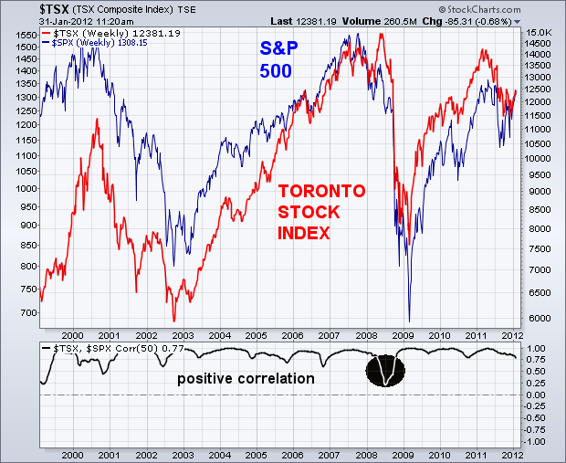
- Chip CLOSELY CORRELATED WITH US MARKETby John Murphy | The Market Message My market message from Thurs, Jan 26th, argued for the inclusion of Canada in a foreign stock portfolio. I'm going to expand on Canada's unique role in the global intermarket picture in this message. In my view, Canada is unique for at least three reasons. First, it's very highly correlated to the U.S. stock market. That shouldn't be a surprise because Canada is the biggest trading partner with the U.S. It also means, however, that the two markets need to be charted together to ensure that they're sending the same messages. Another reason why Canada is important is because it's highly correlated to the Canadian Dollar. And the Canadian Dollar is closely tied to the trend of commodity markets. That's because Canada is one of the world's biggest exporters of natural resources. The Canadian markets, therefore, tell us a lot about the direction of global stocks, commodities, and currencies. Chart 1 compares the Toronto Stock Index (red line) to the S&P 500 (blue line) since 2000, and is simply intended to show the close correlation between the two markets. Over most of that time, the correlation coefficient (below chart) fluctuated between .75 and 1.00. One exception was during the first half of 2008 when Canadian stocks kept rising while the U.S. market plunged (see circle). That was due to the fact that commodity prices kept rallying into the middle of 2008 before peaking. Canadian stocks peaked with commodities.
With a string of positive economic reports lifting stocks this week, the S&P 500 ETF (SPY) closed higher for the fifth consecutive week. Friday was a big reporting day with Factory Orders showing strength, IWM Services indicating expansion and the employment rate coming down. These positive reports should not come as a surprise because stocks, which are a leading indicator, are up sharply since early October. The chart below shows SPY challenging its 2011 highs around 135, a level that marked resistance from April to July. SPY failed at this level last summer and declined rather sharply in late July and early August. Flash forward to 2012 and SPY is once again at resistance and overbought after a sharp advance the last four months. The ETF is up over 25% from its early October low and up over 15% from its late November low. At the risk of over speculating, resistance and these overbought conditions could give way to a corrective period in the coming weeks. Should a sideways consolidation develop between 125 and 135, an inverse head-and-shoulders patterns evolve. Notice that the June lows marks potential support for the right shoulder around 125.
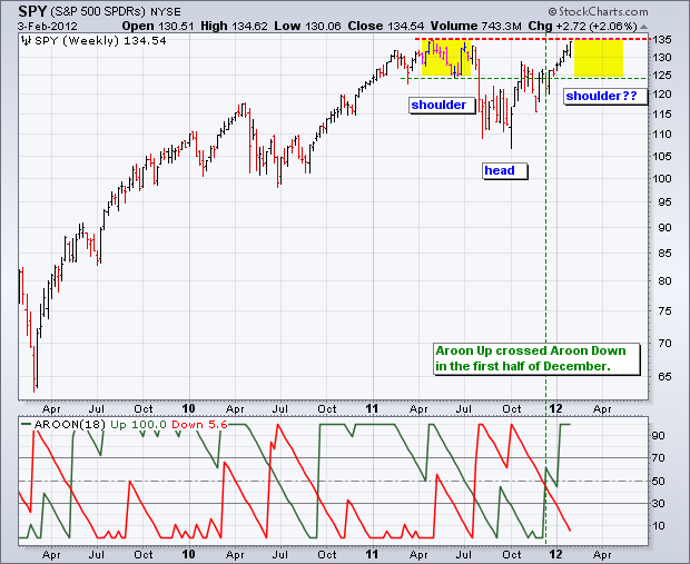
Click this image for a live chart.
(THIS WEEK'S DECISION POINT ARTICLE WAS WRITTEN BY GUEST WRITER ERIN SWENLIN HEIM)
As many of you are aware, I've been doing my duty as a citizen of this great country by serving on a jury. It has been interesting, to say the least. The trial is still not over, but I hope to be back full time sometime next week.
After my fellow jurors found out I was a stock market analyst, I began getting questions like, âWhat is the market going to do?â, âCan you tell me what stock I should buy?â, âWhat is up with Greece?â, etc.
For those of you who have had the pleasure, you know that jurors have a LOT of time on their hands. It seems you âhurry up and waitâ constantly, so I was able to answer questions (except the one on Greece, because I have NO idea what the answer is there).
I began explaining my job as best I could without getting too technical. First and foremost I told them that 1) I cannot predict anything, I have no crystal ball because if I did, Iâd be rich and likely not here sitting on this jury; and 2) I am not a registered investment advisor, so donât take anything I say as investment advice.
I told them that my job is to get as much information about market conditions and trends as I can so I can evaluate whether I want to take action or not. Then I write about it on our website. I explained that you didnât want to âbetâ against the trend or conditions that tell you to expect a certain outcome. You have to determine what is happening in all three time frames, short-term, intermediate-term and long-term and let each time frame help guide you along. All three time frames may say something different, but ultimately, the long-term trend affects the outlook for the long-term and the intermediate-term; and they both affect the outlook for the short-term. Additionally, I consider our technical indicators. They give me more insight into what the condition of the market is whether overbought or oversold.
I equated it to black jack (not that investing is the same as gambling, although for the uninformed investor I suppose it is). You will generally do better than the âhouseâ or the market if you know the best way to play your hand given the condition of the dealerâs hand and the card trend (how many small or high cards have already been played). You wonât always win, but you have a better chance.
So, what is the trend and condition of the market right now? Looking at the chart below, the top part of the chart shows that the S&P 500 has been trending up since the market low in October. The three bottom panes of the chart show us that right now in all three time frames, the market is overbought. The majority of stocks are currently trading above their 20-, 50- and 200-EMAs.
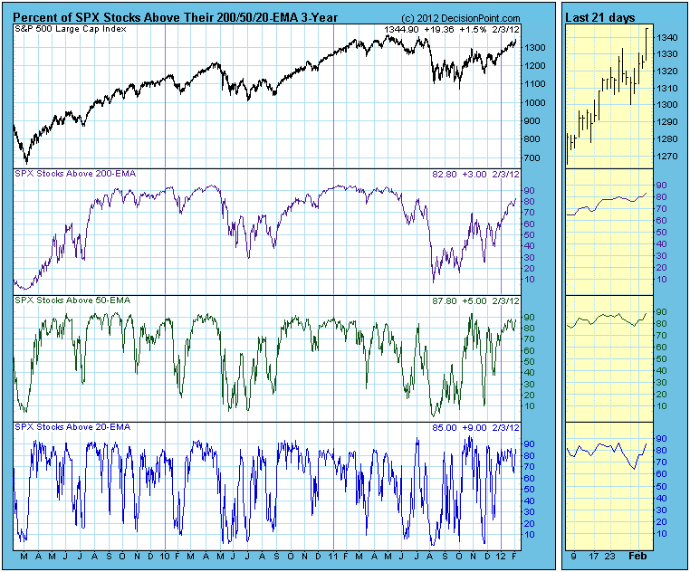
How should we play this hand? I like my odds. It appears I have a good hand because the trend is with me. However, the condition of the market is overbought and could work against me. It is time to probably play conservatively. I donât think I want to âdouble-downâ on my bet and "invest more" money, Iâll count on the trend and that the dealer will not beat my hand; I should see a return on the bet I already have on the table.
Unfortunately like blackjack, there is some âluckâ involved. In the market, I equate luck to those outside influences on the market that I donât have control over and can't usually predict. Things that can throw the market an unexpected curve ball. An example: news headlines from Europe and Greece. Right now, certain news from Greece and Europe can cause the market to shoot up or tumble lower on just one headline! A stray economic report or utterance by Mr. Bernake and all my prudent investments can greatly suffer or profit without any basis in technical analysis.
Bottom Line: I told my jury friends to keep it simple, donât get bogged down in the chatter and noise. Get educated on technical analysis, learn as much about current market conditions and trends as possible so your investment decisions are based on analysis not chance. Donât let the âhouseâ take advantage of you!
THE JANUARY EFFECTby Tom Bowley | InvestEd Central Two weeks ago, I wrote that equities were very overbought and quite complacent. While we didn't see any selling of substance, the market did struggle to move up - that is, until Friday's Nonfarm Payrolls hit the wires. What a blowout number it was!
Let's revisit that EOPCR chart to get a fresh update:
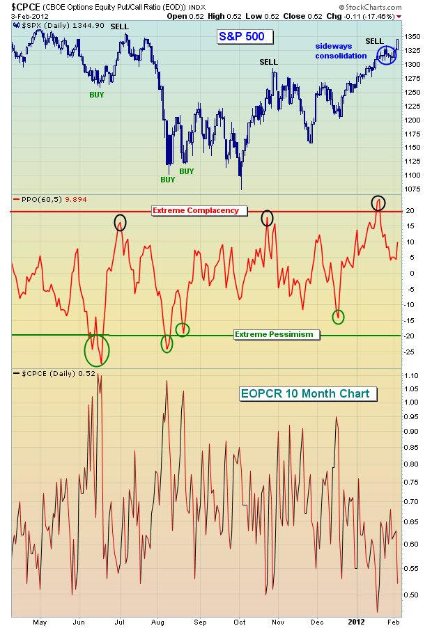
Relative complacency doesn't have quite the track record in marking tops as relative pessimism does in marking bottoms. Nonetheless, it's still a solid indicator and one that everyone should track frequently.
There are lots of positive signals that have emerged during the rally off the mid-December lows. First, I'm ecstatic over the recent absolute and relative performance of financial stocks. If you study history, there's one common denominator that supports nearly every sustainable market rally - a financial sector that AT LEAST performs as well as the S&P 500. And if financials perform better on a relative basis, all the better. Take a look at the Dow Jones US Financial Index ($DJUSFN):

When a sector has performed as badly as the financials have for so long, there are going to be a number of hurdles along the way as the sector recovers. But the good news is that the group is not backing away from a challenge. Instead, it's clearing one hurdle at a time. If that continues, the foundation is set for a continuing rally, with the occasional selloff from overbought territory.
I'm a student of history and one of the most intriguing relationships in the market - from an historical perspective - is the tight positive correlation between January performance on the S&P 500 and the balance of the year. There's an old saying on Wall Street "as goes January, so goes the year". I have to say the numbers support this argument in a VERY convincing way. Since 1950, the top 25% of Januarys have averaged gaining 6.93%. During the balance of those years, only ONE year produced a negative return. The other 14 years produced positive returns over the balance of the year, and 13 of THOSE years moved higher by at least 10% over the final 11 months of the year. What was the AVERAGE balance of year return for this top quartile of Januarys? 17.60%. That's a nice number.
Januarys that fell into the next best 25% (or 2nd quartile) produced balance of year returns of 9.73% - not too shabby as well. Of the 16 years that made up this 2nd quartile of Januarys, 13 produced gains from January 31st through December 31st. So when we consider the top 50% of Januarys, 27 out of 31 moved higher over the balance of the year (after January 31st). That's a very high percentage (27 of 31, or 87%).
If you're wondering about the lower half of Januarys, you should know that out of those 31 Januarys, 19 saw the S&P 500 finish the year higher than it was at January 31st. Remember, the top quartile of Januarys produced an AVERAGE of 17.60% in the balance of the year. The bottom half produced an average balance of year return of 1.59%. That's a far cry from 17.60%.
So the obvious question is - where did January 2012 rank? Well, it was the 13th best January on the S&P 500 since 1950, gaining 4.36%. January 2012 ranks in that top quartile.
I've produced a table showing every year's January and balance of year return since 1950. I've also created an historical boot camp (it's FREE) to educate the investing community about several historical tendencies that every trader and investor MUST know. CLICK HERE for more information. STARTING OFF WITH A BANGby Richard Rhodes | The Rhodes Report The 2012 trading year has begun with a "bang" to be sure. In terms of the S&P 500, we find that 16 of the 23 trading sessions have traded to the upside, with no losing session down more than -8 points or -0.6%. This is rather "one-sided", and it gives rise to thoughts that a correction must be forthcoming. Really, how could a rather sharp correction not take place given the European fiscal and debt crisis and the slowing the Chinese economy. There are so many negatives in front of everyone, there can't be any way the market should trade higher. However, one must try and understand the power of "money printing liquidity" provided by nearly all of the world's central banks.
We'll be the first to admit - we've been rather wrong-headed about this rally. There have been ample signs that this is nothing more than a counter-trend rally in a bear market, but then again there are technical signs it shall go further and farther than most believe. The question, is where do the probabilities lie in regards to this, and we look upon them in this blurb from the monthly perspective.
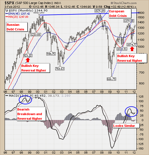
Quite simply, the risk-reward is to the upside given the October-2011 trade formed a bullish monthly key reversal to the upside - a signal that new highs were a higher probability than previously thought. Certainly given the European fiasco, one would have thought prices would trade lower; but when they did - it was only for a very short period. This is reminiscent of the pattern seen during the Russian debt crisis in 1998, when prices traded lower in October-1998 - only to trade over +40% higher in the ensuing 18-months. Frankly, the current technical pattern seem eerily similar from a corrective and MACD point-of-view - which would lead one to surmise that new highs in the S&P are forthcoming - in all probability into the 1600 area. But having said this, even if new highs develop, we would this as a bear market rally in much the same manner as those were in the 1970's trading range that broke to new highs only to falter massively in the months thereafter.
This is change in tenor for us; and one that we've held out for as long as we could. We are a "bear" with a bull hat on for the moment. The fact of the matter is that the S&P has broken above, and extended above all the necessary moving averages - which puts the risk-reward to the upside. There are other markets as well breaking out on a monthly basis such as Brazil, India and other Latin American countries - although China is not yet done so, or is even close for that matter. We've been bearish, and we've been rather wrong. Our outlook going forward will be for a weakening rally, with Energy, Healthcare and Gold/Silver shares leading the way. Moreover, we see an increasing potential for a "melt-up" to develop as rotation takes place out of bonds and into stocks. The low volumes associated with the markets at present certainly provide for this context.
So, the craziness continues...and we are left in humble stead to play "catch-up" until its time throw everything away again.
|
|
|
|
|
|
|
|
|
|
|
|
|
|
|