Hello Fellow ChartWatchers!
Last weekend's ChartCon conference in Seattle was amazing. Myself and the other newsletter authors met so many terrific people during the event and the feedback that we are getting from the attendees is extremely positive. Thanks again to everyone that attended!
We made several big announcements at ChartCon, but the biggest had to be the announcement of our new PRO service. PRO is a new service for members that want to break through the limitations of our Extra and ExtraRT services. 15-second refresh rate too slow for you? PRO refreshes every 5-seconds. 1500-pixel charts too small? PRO goes up to 2500-pixels. Five user-defined alerts not enough? PRO users can have 50. Click here for a complete list of PRO's features and how they compare to our other services.
(Just so you know, PRO is not intended for everyone. If Basic or Extra works well for you then please don't feel compelled to upgrade. Only upgrade to PRO if you really need one or more of PRO's features.)
While PRO has a lot of features to talk about, right now I want to focus in on what I think it its most powerful feature: User-Defined Indexes.
A User-Defined Index is a dataset that you create and maintain. You enter the data - either by hand or via an spreadsheet upload - and then you can chart it and analyze it using our SharpCharts tool.
So, what can you do with a User-Defined Index? Here's a partial list of ideas:
- Create and chart your own Bullish Percent Index
- Create and chart any other sentiment information you can think of (# of CNBC commercials per day anyone?)
- Upload and chart economic data from the St. Louis Federal Reserve
- Upload and chart any of the datasets from websites like Wikiposit.org
- Calculate your own technical indicator using Excel formulas and chart the results
- Eliminate "bad" datapoints from our regular data and chart your corrected version
- and much, much, much, much more...
Are you starting to get excited? Before we get too much farther however, I do need to mention that there are some limitations for User-Defined Indexes:
- Right now, only PRO users can create and use them. That may change in a year or so after we've made sure that our systems can handle their performance impact.
UPDATE: PRO, ExtraRT and Extra members can now create various kinds of User-Defined Indexes.
- Initially, PRO users can only use one single User-Defined index. (They can re-use it as often as they want however.) We plan on allowing PRO users to create several additional indexes at some point in the next couple of months.
UPDATE: PRO Users can create up to 10 User-Defined Indexes. ExtraRT and Extra members can only create one.
- PRO users can access their data via the special @MYINDEX ticker symbol. In the future, we will allow PRO users to specify their own ticker symbol and description for their indexes.
UPDATE: PRO Users can give their indexes any ticker symbol they want (as long as it starts with "@"). ExtraRT and Extra members can only have one index named "@MYINDEX."
- User-Defined indexes can only store daily, weekly, monthly, quarterly or yearly data. They cannot store intraday data.
- Currently, user-defined indexes cannot be shared with others. We hope to be able to remove that restriction for PRO users in the next couple of months. For now however, they cannot be emailed, tweeted, bookmarked, or even added to a Public ChartList. Any data that you add to your user-defined index will only be visible to you.
UPDATE: PRO members can choose to make any of their User-Defined Indexes shareable so that they can be seen by others. They can also keep their indexes private if they do not want other people to see their data. ExtraRT and Extra members cannot share their index data with others.
OK, enough with all the legal-sounding limitations. Let's see these things in action!
Charting the Quarterly Rate of Change for the US GDP
The St. Louis Federal Reserve maintains a treasure trove of free economic and financial data on its "FRED" website. Click here to see for yourself. Included on that site is the quarterly data for the US GDP going back to 1947. To download that data, go to the FRED website and click on "Real GDP" in the middle of the page, then click on the "Download Data" link that appears on the left side of the page. Finally, select "Text, Comma Separated" as the "File Format" and click the "Download Data" button to store the CSV file of that data on your computer's hard disk.
Next, assuming you are a PRO member, you'd go to the Member's homepage and click on the "User Defined Indexes" link at the bottom of the "PRO Control Center" part of the page. If you already had some data in your index, you'd need to clear it out by clicking the "Delete All Data" link. (This assumes that you have a copy of your old index data stored on your hard disk.) Then you'd click the "Upload Spreadsheet Data" button, select the CSV file you just downloaded from FRED, and click "Upload". Finally, if the upload was successful you can click on the "View Chart" link to see @MYINDEX in all of it's glory!
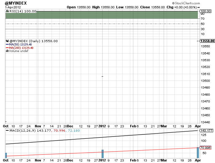
Hmmm... That doesn't look too impressive does it? See if you can spot the problem before reading the next paragraph.
The problem is that this is a daily chart however the GDP data from FRED is quarterly data. (If you spotted that on your own then good for you!) Let's change the chart settings to Quarterly (another PRO-only feature by the way) and remove all of the default indicators and overlays since we won't be needing them. We'll also change the chart's Type to "Area", the color to green, and lower the Opacity a smidge to make things look better. And voila!
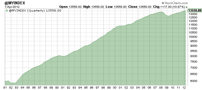
There's a GDP chart going back to 1980! Terrific! But wait a second. FRED gave us data going all the way back to 1947. To see all of that data, we need to change the "Bar" setting in the "Range" area of the chart from 5 to 1. That will allow SharpCharts to squeeze that extra data onto the left side of our chart. (We also need to turn off log scaling.) Here's the result:
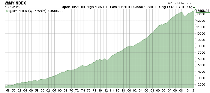
Wow, a chart going back to 1947 - that's also a new PRO feature. Basic and Extra charts can only go back to 1980.
So now, let's add the Rate of Change (ROC) indicator to this chart to see the quarter-to-quarter fluxuations in the GDP. We'll choose "Rate of Change (ROC)" from the Indicator dropdown below the chart and we'll use "2" as the parameter so that we get the quarter-to-quarter change. Finally, we can choose "Behind Price" for the position so that it is overlaid on top of the GDP plot. Here's the final result:
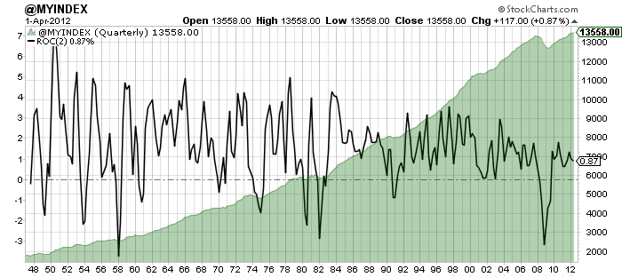
Pretty cool huh? (Check out the dates where the ROC line dips below its dashed zero line.) We could use any other technical indicators or overlays that we want to in order to further analyze this data. We could annotate it, store it in a ChartList, and even compare it to $INDU, $SPX or any other ticker symbol. Powerful stuff!
Finally, keep in mind that I can do the same thing with ANY time-series data that I can somehow get into a CSV file - i.e., anything that I can get into Excel. I don't know about you, but my mind is still boggling over that.
For more on all the new features we've been introducing over the past week, be sure to read the recent articles in the "Chip Anderson" area of our Blogs section. I'll be posting more examples of things you can do with User-Defined Indexes in that area in the coming days so check back often.
- Chip
P.S. If you are interested in upgrading to PRO (or seeing how much that would cost), click on the "Your Account" link in the upper right corner of any of our webpages.
Large-caps continue to lead the market as the S&P 100 ($OEX) recorded a 52-week high this week. Thus far, the S&P 100 is the only major index to reach this milestone. The Nasdaq, Russell 2000, S&P 500 and Dow Industrials remain shy of their spring highs. This means the S&P 100 is leading the market and large-caps are showing relative strength. Even though $OEX may be short-term overbought, this fresh 52-week high confirms that this key index remains in an uptrend.
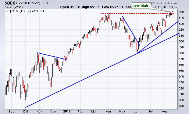
Click this image for a live chart.
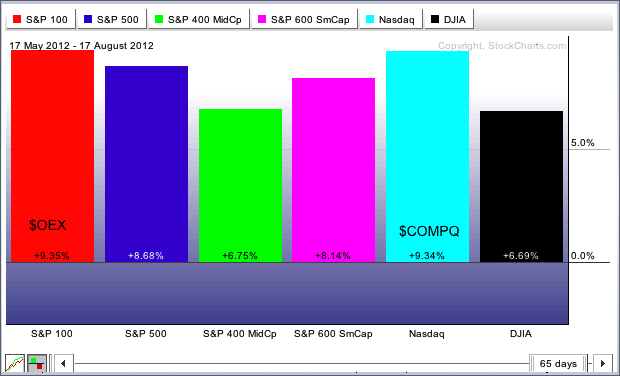
The PerfChart shows the three month percentage change for six major indices: the S&P 100, S&P 500, S&P MidCap 400, S&P SmallCap 600, Nasdaq and Dow Industrials. $OEX shows the biggest gain over this timeframe (+9.35%), but the Nasdaq is not far behind with a 9.34% gain. Techs and large-caps are clearly the leaders. $MID, which represents mid-caps, shows the smallest gain, which means it is underperforming. $INDU is also underperforming with the second smallest gain.
Good trading,
Arthur Hill CMT
When a stock is above its 200-EMA, it is considered bullish, and in the broadest sense the stock can be considered to be in a long-term rising trend. A good way to determine the amount of support behind a rally is to analyze the percentage of stocks above their 200-EMA.
Decision Point keeps track of this percentage for the S&P 500 Index, and it indicates that there are fewer stocks pushing the SPX to the current highs than there were at the April highs. Also, we can see that the percentage in April was lower than it was at the 2011 highs.
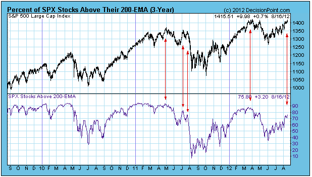
Taking 2011 by itself, we can see the rapidly erroding percentage at the July 2011 tops just before the sharp decline in July and August.
Of course, we must note that as of this writing both price and the indicator are making new highs since the June bottom, so it is possible for the appearance of weakness to be remedied if the rally continues.
Conclusion: The percentage of stocks above their 200-EMA shows fewer stocks participating in the advance than there were at the 2011 top and the March 2012 top. This is not a healthy condition, and will probably result in a correction fairly soon; however, the market needs to stop going up before it can go down.
First, let me say that it was AWESOME meeting so many of you at Chartcon 2012 in Seattle last week. It was also great to finally meet several of the co-authors of ChartWatchers. I've been to a LOT of trading conferences and this one surpassed all of the others on so many levels. If you weren't able to make it, please mark your calendar for August 2013 in the event that Chip decides to host the ChartCon 2013. ChartCon 2012 was truly outstanding.
My background is in public accounting and while my first choice is always to believe the technicals, it's difficult to stray from solid fundamentals. Accordingly, each quarter I search through hundreds of earnings reports and charts to find that rare combination of "out of the park" earnings results and just the right amount of uncontrollable buying interest. Generally speaking, here's my formula:
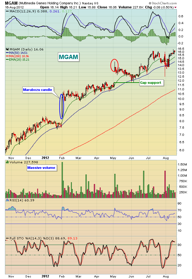
Beat on revenues, beat on EPS, raise guidance and print a marubozu candle (or at least a very strong candle) on MASSIVE volume.
Ok, so you might be asking what is a "marubozu" candle? A bullish marubozu candle shows buying interest the entire trading day. There are either no tails (shadows) or very small tails on the candle. It opens with a gap up and the buying interest never slows, trending higher all session long and finishing at or very near its high of the day. Normally, gaps get filled. As everyone jumps on board at the opening bell, market makers provide liquidity and complete the other side of the trade. This explains why so many gaps fill. Market makers generally make their money one way or the other. But a marubozu candle in essence paints a picture of unrelenting demand - even after a HUGE gap up. Even the market makers can't slow demand.
In the last two quarters, I've been able to find a couple stocks where demand swamps supply and I'll highlight them both below:
First, check out Multimedia Games (MGAM):
Next, take a look at Mellanox Technologies (MLNX):
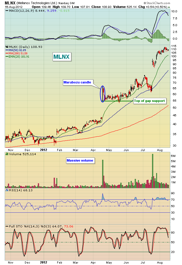
There are differences in how the two traded shortly after their blowout earnings reports, but ultimately both stocks soared much, much higher. Identifying these stocks when "game-changing" candles print can make a big difference in your trading success.
Unfortunately, marubozu candles are not particularly common. But I do still look for gaps to the upside after solid earnings where momentum continues on the long side after the gap higher. I have one such stock that appears poised to me to move much higher over the next quarter. For more details, CLICK HERE.