Hello Fellow ChartWatchers!
Happy 2013! I'd thought we'd start the year off with a bang by announcing a major new section of our website - the StockCharts Videos Archive. We've been working hard creating new educational videos that can help anyone understand how to use our charting tools better. Many of the new videos are hosted by Arthur Hill, our senior technical analyst. We also have video excerpts from our recent ChartCon conferences. And best of all, these are all free!
Click here to see our new Videos Archive page
Enjoy!
- Chip
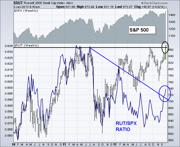
One of the most impressive technical developments of Wednesday's stock surge was the ability of the Russell 2000 Small Cap Index (RUT)
to reach a record high. [The S&P 500 Midcap Index did the same]. The chart shows the RUT closing above previous highs reached during
2011 and 2012. Although not shown here, the RUT also cleared its 2007
peak. The blue line is a ratio of the RUT divided by the
S&P 500. The ratio peaked in spring 2011 which began the
correction/consolidation period that's existed since then. The ratio
reached a new three-month high yesterday and broke its 18-month
resistance line (blue circle). Given the tendency for small cap
stocks to act as leaders for large caps on the upside, yesterday's
bullish breakout is an encouraging sign for the rest of the market.
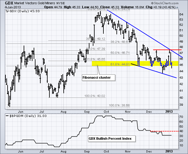
It was a volatile week for gold and gold miners, but the Gold Miners ETF (GDX) remains at an interesting juncture that warrants attention. After surging above 47 to start the New Year, the Fed minutes on Wednesday put some doubts on the future of quantitative easing. Keep in mind that the Fed announced its latest quantitative easing program in mid September and suggested then that it would be open ended. Even though the Fed minutes got the blame for this week's plunge back below 46, I am not so sure of this connection because gold and the Gold Miners ETF (GDX) have been moving lower since October, which was just after the Fed announced its latest round of quantitative easing. Gold may be marching to the beat of a different fundamental drummer.
Click this image for a live chart.
Whatever the case, the trends for the Gold Miners ETF (GDX) and the Gold Miners Bullish Percent Index ($BPGDM) are clearly down as GDX fell back to potential support with a sharp decline the last 2-3 days. Note that support is just âpotentialâ because the trend is down. Resistance levels are expected to hold during downtrends and support levels are expected to fold. The 45 area is âinterestingâ because GDX formed a falling wedge the last few months and is trading in a Fibonacci cluster. Falling wedges are typical for corrections and this Fibonacci cluster could mark a reversal zone. The last two peaks established resistance in the 47.60 area and a break above these peaks is needed to reverse the downtrend. Until such a trend reversal, this downtrend could extend to next support in the 39-40 area. The indicator window shows the Gold Miners Bullish Percent Index trending lower since October as well. A break above 40% is needed to reverse the downtrend in this breadth indicator.
Best wishes for 2013!
Arthur Hill CMT
Gold has become pretty unloved. That in itself is usually bullish. This week we look at why it might be time to renew your interest in Gold and the miners.
First of all, Lets look at the Gold Miners. Here is a link to the live chart. Gold Miners Index.
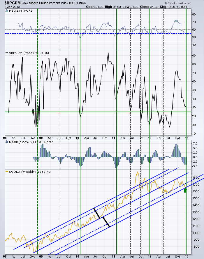
Lets start at the $BPGDM. First of all, the Bullish percent index is very close to the level it normally reverses at which is denoted by the green line. The index has 29 stocks in it, so each stock is more than 3% influence. It would only require 2 stocks to change the index below the line. So, getting into bullish territory.
In examining the chart information for more detail, I found a couple of interesting points. Lets start with the RSI.
There have been 4 times in the past 5 years where the index has dropped below the current level of 40. All of them produced nice trading rallies. It is clear that down at 40 is a pretty good area to look for a buying opportunity.
Next, the MACD histogram shows a deep push on momentum. This is the momentum of the Gold Miners index, not Gold. We have only had the selling momentum reach this level 7 times. This is one of the worst if you look at the area of the histogram over the last few months. It looks really bad. So that could be bad or good. However, the histogram recently seems to have bottomed out and made a higher low this week. That is important. I have drawn vertical lines where the histogram starts to improve. You can compare it to Gold's price at the bottom panel. Pretty nice location to start buying. The April to July 2012 period was harder to call as the histogram didn't go very deep.
Next is seasonality. I marked the vertical lines green if the rally started near the first of the year. Look at how strong those rally points were. I dotted the one in 2008 because of the trauma that was ensuing that particular year. While it did not happen in January, it did start near the beginning of the year. The seasonality factor looks to be huge. 4 for 4 in rallies for the beginning of the year. 3 rallies started around July.
Continuing down is the final panel where I have $GOLD plotted in Gold color. I have annotated the chart with some blue trend lines. The solid lines are equidistant from the middle as shown by the black lines. The dotted lines are best fit based on the trends in the price. This could be due to a log scale chart which would normally be used for a multi year chart with so much price movement. What I see from here is that GOLD is at an area that is near the lower extreme of distance from the trend. The blow off top of 2011 was a clear exaggerated move outside the trend. Could we see that to the downside still? Anything is possible. But this chart shows a lot of good reasons for a trade right here.
Lets look at a chart of $GOLD on the daily. Here is a link. $GOLD
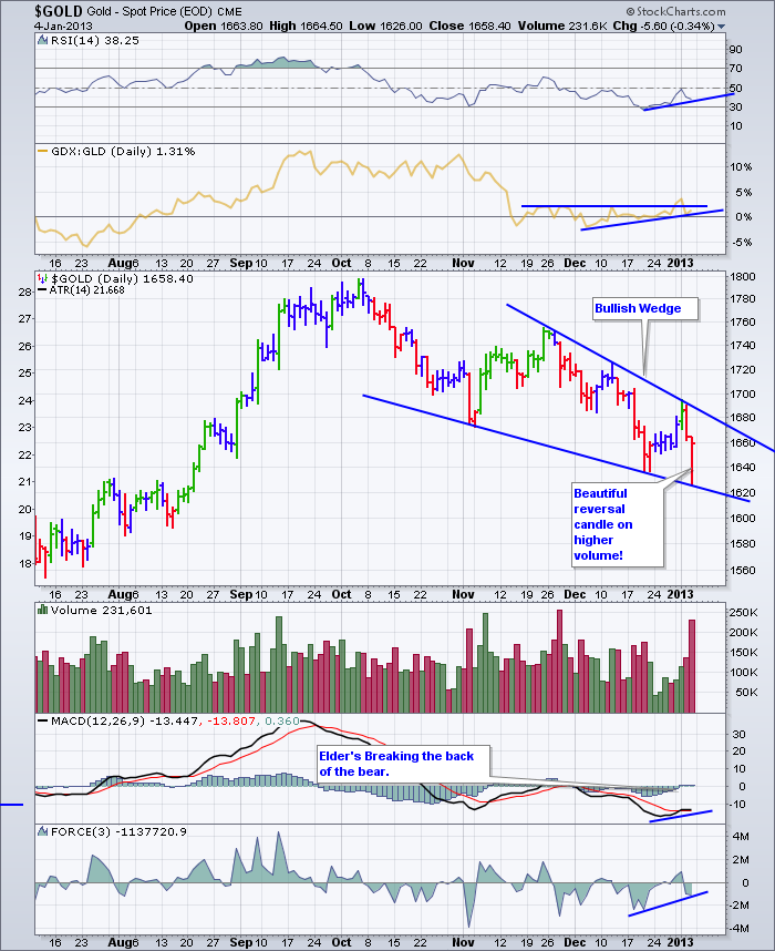
Recently, the RSI has been improving. The GDX:GLD ratio is rising which is very good to see. The downward sloping bullish wedge is also a positive signal to help spot a reversal. Friday's reversal candle was textbook on higher volume as a lot of stops were tested on the weekly chart below. The MACD appears to be trying to make a higher low while price is making a lower low. The force down was not as significant on this push so that too is bullish. I have shortened the time to 6 months so the price action is clear, but the shelf back in August is at a very important level. This level has marked support and resistance for 15 months. You can see that on the weekly below.
Here is a Weekly of $GOLD. $GOLD Weekly
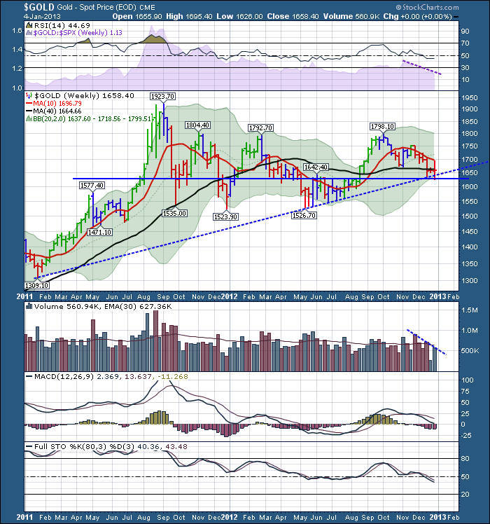
On this weekly chart, the RSI is holding 40 which is excellent. The purple shaded area represents relative strength compared to the $SPX and is declining so that is not a good sign.
$Gold looked to find support at the horizontal line of $1625. This line has been a support resistance zone for the last 15 months. The $GOLD price also tested stops below the 2 year uptrend line this week. This is a very nice place for the chart to reverse, especially with seasonality.
The MACD is making higher highs in October compared to March 2012 even though the price was the same. That is a bullish divergence.
One thing that looks weak on this chart is the full sto's falling below 50. They really need to find a floor right here or that would mark a significant negative trend reversal.
This looks like a very interesting place to enter a gold related trade to the upside. Like all great entry points, they have significant potential to fail if no new major investors join the falling trade. For the gold followers, it has been a very difficult trade and they would sure like to see some upside reprieve.
In conclusion, I like the seasonality and the bullish candle. We'll see how 2013 treats the gold trade.
Good Trading,
Greg Schnell, CMT
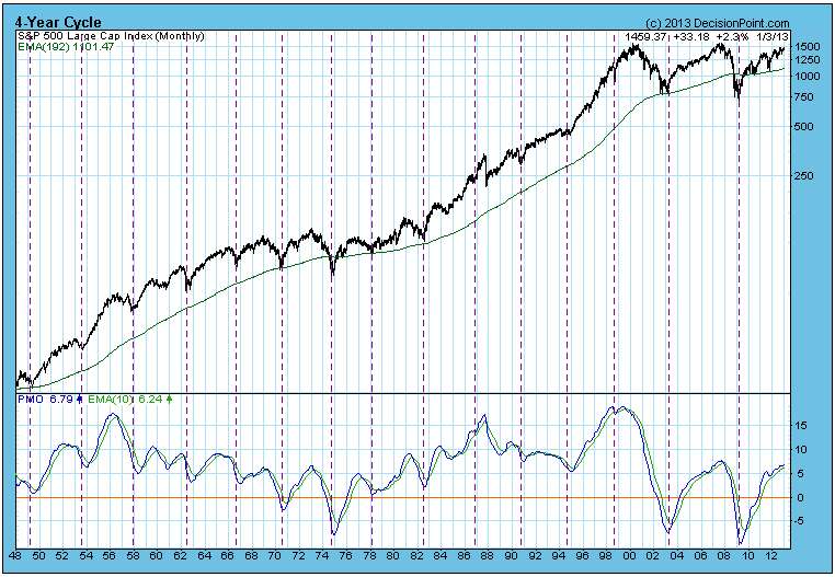
Calculating from the Four-Year Cycle low in 2009, the next cycle low is due in two months, but unless
there is a major crash, that projection will not be realized. In fact,
we can't even say that there has been a cycle crest yet, although, given
the proximity of current prices to the tops in 2000 and 2007, it is
likely that a long-term top will be put in soon.
Obviously,
the Four-Year Cycle does not repeat at exact intervals -- the last one
lasted almost six years from trough to trough -- and it appears that the
current cycle is going to be extra long. A "normal" downside for the
cycle is about 18 months, so an educated guess as to when the price low
might hit is about mid-to-late-2014.
To
summarize, the ten-year trading range of the S&P 500 Index suggests
that a major price top should be arriving sometime in the first half of
2013, maybe within three months. After that the Four-Year Cycle low
(price low) projection would be for the last half of 2014, unless the
decline is exceptionally accelerated.
Happy New Year!!! Here's to good health and good fortune in 2013!
Now is the time when market pundits give their predictions for the stock market for the upcoming year. While it might be entertaining to try to figure out where the S&P 500 might finish in 2013, one of the best predictors of yearly stock market performance lies within January performance. You wouldn't think that how the market performs in January could have a strong influence on what will happen the next 11 months, but history says it makes a HUGE difference.
Let's take a look at this "January Effect". The basic premise of the January Effect is that "as goes January, so goes the rest of the year". The numbers bear this out.
First, consider that the average annual return of the S&P 500 since 1950 is 8.71%. Of the 63 years on the S&P 500 since 1950, 35 years have produced annual gains ABOVE 8.71% and 28 years have produced results that are below that 8.71% threshold. Of the 35 "better than average" years, January was higher in 31 of those years. By contrast, during the 28 "worse than average" years, the S&P 500 climbed only 8 of those years. That's a pretty strong correlation between January strength and annual strength.
Now let's look at it from a slightly different angle. Does January strength portend strength the balance of the year? In the above paragraph, I broke down the results by "better than average" and "worse than average" annual performance of the S&P 500. In this second approach, I will break down January performance into four quadrants - the top 25% of Januarys, the second 25% of Januarys, etc.
In Quadrant 1, the best 16 Januarys in terms of S&P 500 performance produced January gains ranging from 4.10% (1999) to 13.18% (1987). These MONSTER Januarys averaged rising 6.92%. Of these 16 years, the balance of the year produced gains in 15 of the 16 years. In 13 of these 16 years, the S&P 500 rose more than 10% during the balance of the year (not including the January gain). The average "balance of the year" returns were 17.07%. So think about that for a second. The years that produce the best Januarys go on to post ADDITIONAL gains that average 17.07% per year. The average annual return during these strong January years is an astounding 23.99%. Not too shabby.
In Quadrant 2, the next best 16 Januarys in terms of S&P 500 performance produced January gains ranging from 1.73% to 4.05%. These 16 years also showed continuing strength over the balance of these years, averaging 9.73% gains over the balance of the year. 13 of these 16 years saw gains during the last 11 months of the year. The average gain during the balance of the year is 9.73%, significantly below the 17.07% of Quadrant 1, but still very solid action. The average annual return for Quadrant 2 is 12.62%, again a far cry from Quadrant 1's 23.99%, but still 4 percentage points above the S&P 500's average annual gain of 8.71%.
Quadrants 1 and 2 demonstrate the overall positive impact that strong Januarys have on how the S&P 500 trades during the balance of the year. Januarys that fall in the top half of all Januarys have produced POSITIVE balance of year returns in 28 of 32 years.
As you might imagine, this is where the bullish part of the discussion ends.
Quadrant 3 January performance averages -0.45% and ranges from -2.53% to 1.56%. The average balance of the year returns for this group of Januarys is 0.09% with nearly half of these years producing losses from January 31 to December 31. The average annual return on the S&P 500 for Quadrant 3 years is -0.36%
Quadrant 4 covers the worst 25% of Januarys since 1950. This covers January returns that range from -8.57% to -2.74%. The average annual returns of the S&P 500 for Quadrant 4 years is -2.10%. Of the 11 worst S&P 500 years since 1950, 5 of them are situated in Quadrant 4 and 5 more are included in Quadrant 3. There is obviously a tight correlation between awful stock market years and poor January performance.
So while it's entertaining in early January to talk about where the S&P 500 might finish 2013, I'd suggest you wait until January 31st. You'll have a much better idea then. January 2013 got off to a great start - now we'll see if the bulls can extend the gains over the balance of the month.
Happy trading!
Thomas J. Bowley
Chief Market Strategist
Invested Central
http://www.investedcentral.com/January 2013 has rolled in, with the "fiscal cliff" solved for the moment; and now there are concerns "QE-4" will end sooner rather than later...and perhaps below 2013 ends. Collectively, the passing of the fiscal cliff and the new QE-4 concerns pushed 10-year note yields higher; however, given "QE-4" has begun, and the growing concerns over raising the US debt ceiling - all should contribute to pushing 10-year yields lower...in all probability to new lows below 1.394%. This is our opinion; and it is our opinion this should be the "final move", and prep the landscape for a generational low in yields.
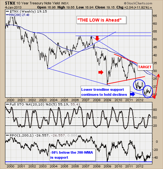
Technically speaking, the downtrend in 10-year yields remains in place, with the 20-week stochastic having turned lower from less-than-overbought levels. This failure should allow yields to move into lower trendline support, which at this point has three clear touches...thereby solidifying its importance as major support. Too, we should note that 10-year yields tend to bottom out at -50% below the 200-week moving average, which once new lows do print - should provide an upside mean reversion target in the future.
So, as we enter 2013 - perhaps one of the "biggest" trades on the technical landscape will see 10-year note yields finally rise on the order that everyone has expected over the past several years. It is an inevitability that prices will trade back above the 200-week moving average (a rare occurrence in the past 12-years); and our bet it that the move will begin somewhere towards the of 1Q or 2Q 2013. Be prepared.
Good luck and good trading,
Richard