| THIS WEEK'S ARTICLES |
| John Murphy's Market Message |
| FALLING DOLLAR HELPING COMMODITY-RELATED MATERIAL STOCKS—FOREIGN STOCKS RISING FASTER THAN THE U.S. |
| by John Murphy |
Last week's message showed how a falling dollar was boosting the price of gold and its miners. The falling dollar may also be lending support to material stocks tied to various commodities which can also benefit from a weaker dollar.
FALLING DOLLAR BOOSTS MATERIAL STOCKS
The green area on the top of Chart 1 shows the U.S. Dollar Index peaking near the end of the third quarter and continuing to weaken. The solid line in the middle box shows the relative strength ratio of the Materials Select Sector SPDR (XLB:$SPX) turning up during the fourth quarter and showing new market leadership as the dollar weakened. The third box in Chart 1 shows XLB touching the highest level in six months. While gold stocks have provided leadership, industrial metals and their stocks have also rallied.
The daily bars in Chart 2 show the Dow Jones US Nonferrous Metals Index ($DJUSNF) rising to the highest level in seven months. The index measures the trend of stocks tied to copper. The solid line in Chart 2 shows the price of copper rising as well. Stocks tied the aluminum and steel are also rising. The weaker dollar may also be providing support to energy shares.
Foreign stocks also appear to be benefiting from a weaker dollar and rising foreign currencies.
 Chart 1 Chart 1
 Chart 2 Chart 2
RISING FOREIGN CURRENCIES BOOST FOREIGN STOCKS
Foreign stocks are now rising faster than U.S. stocks which is a side effect of a falling dollar and rising foreign currencies. Chart 3 shows the iShares MSCI EAFE ETF or EFA (blue bars) and the euro (green bars) rising together since their October bottom. The euro is being shown because it's the largest foreign currency measured against the U.S. Dollar Index. All major foreign currencies are also rising. The EFA measures the trend of foreign developed stock markets. Emerging market stocks are also showing new leadership.
EM STOCKS AND CURRENCIES ARE ALSO RISING
Chart 4 shows the iShares MSCI Emerging Markets or EEM (red bars) in strong rally mode and trading at the highest level in seven months. The green line shows the WisdomTree Emerging Currency Strategy Fund (CEW) rising along with emerging market stocks. The main message there is that rising emerging currencies (tied to a falling dollar) are playing a major role in pushing emerging market stocks higher. Both foreign stock indexes have also exceeded their 200-day moving averages (MAs).
 Chart 3 Chart 3
 Chart 4 Chart 4
S&P 500 INDEX REACHES 200-DAY MOVING AVERAGE
While foreign stock indexes have exceeded their 200-day MAs, U.S. stocks have yet to do so. Chart 5 shows the S&P 500 index ($SPX) moving up this week to test that long-term resistance line (red arrow). [The Nasdaq market is much further below its 200-day MA]. The $SPX also has to deal with overhead resistance formed during the fourth quarter which foreign developed and emerging markets have already exceeded. Thursday's CPI report showing consumer inflation declining for the sixth month in a row has encouraged some buying in U.S. bonds and stocks. How the Fed reacts to cooling inflation pressure still, however, remains a major factor in market behavior.
 Chart 5 Chart 5
|
| READ ONLINE → |
|
|
|
|
|
| The Mindful Investor |
| The Four Scenarios for the S&P 500 |
| by David Keller |
Position for the most probable scenario, but plan for alternative scenarios.
Why is this a sentence that should be printed out and taped to your monitor, now if not sooner? Because, as investors we often become very tied to a particular narrative.
The Fed is wrapping up its tightening cycle and then it's off to the races!
This recession is going to be way worse than anyone expects.
Earnings are going to solid this quarter, and the market will pound higher.
There's no way we break above the August high.
There's no way we go below the October low.
Market history is filled with events that wise and experienced investors never thought would happen. So how do we combat this reality of the financial markets?
Well first, we need to consider different scenarios. If you're bullish here, think through the bearish argument. If you're all bearish with a portfolio full of short positions, list out the reasons why the market could go higher and think through those possibilities.
A novice investor becomes married to an investment thesis, goes all in with their positioning, and assumes they'll be right. An experienced investor thinks through alternative scenarios, positions their portfolio to profit from the most likely scenario, but also develops a good game plan in case their alternate hypothesis become reality.
Let's review the current chart of the S&P 500 index.
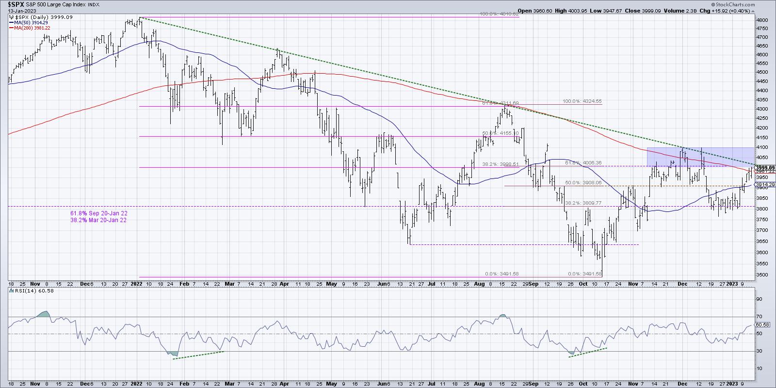
This is one of those times where we can draw a trendline that almost perfectly tracks the downtrend channel displayed by the SPX over the last 12 months. And the first question in any scenario is, "Do we break above trendline resistance?"
After that, we need to consider key levels of support and resistance. What would it take for the S&P to break above 4100? What about the August 2022 high around 4300? On the downside, we have 3800 level which was tested in December, along with the June and October lows at 3650 and 3500.
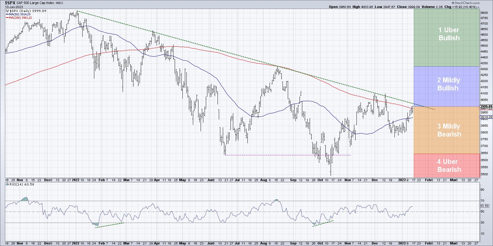
Here is a chart summarizing four scenarios, followed by a description of each of the four potential outcomes. Which do you see as the most likely, and why?
1. The Uber-Bullish Scenario
This week, I talked with Jeff Hirsch about the Presidential cycle so brilliantly laid out in this year's Stock Trader's Almanac. He shared that the pre-election year is usually quite strong in the first half and tends to have a much less bullish average second-half performance.
So, in this first scenario, the S&P blows right through trendline resistance and leaves the 200-day moving average in the dust. Not only that, it powers right through 4100 and also breaks out above 4300, which is the August 2022 high.
What would have to happen for this series of events to play out? Well, the Fed would need to near the end of the tightening cycle. Inflation data would need to show further evidence of an economic slowdown. And interest rates would most likely need to remain lower to give growth stocks an opportunity to rally much further than they have so far.
2. The Mildly Bullish Scenario
In this somewhat less euphoric option, the S&P 500 still breaks above the trendline and moving average resistance, but doesn't make much headway beyond 4100. Perhaps we retest the August high at 4300, but, by then, the optimism that we have experienced since the October low begins to dissipate.
If the bearish macro headwinds remain in spite of stock market strength, this could be the scenario that plays out. There's enough upside momentum to push stocks a bit higher, but not enough to make it an obvious raging bull market environment.
Quite simply, the prospects of expected macro headwinds minimize the upside for risk assets.
3. The Mildly Bearish Scenario
Now we're thinking through a scenario where the market fails to eclipse key resistance, fails to overcome the thick green trendline and fails again to break out above the 200-day moving average.
Perhaps the Fed tightening cycle continues a little longer than expected, or maybe we get some bullish economic indication showing that the economy is not slowing enough, or it could be that this earnings season takes a dark turn as companies project major league headwinds for their businesses in 2023.
For whatever reason, the rally from the October low ends up being just another bear market rally, and the downtrend that began in January 2022 is not yet complete. But in this mildly bearish scenario, we don't get below the June 2022 low around 3650, and instead we continue this "backing and filling" process that has played out since last May.
4. The Uber-Bearish Scenario
This brings us to the real down, the outcome where things just get really bad really quickly. The market fails to breakout, but then the downtrend is re-initiated and the S&P and Nasdaq retest their 2022 lows. Either or both of these benchmarks probably make a new low for the cycle, and stocks that have seen solid performance in the last 2-3 months stall out and rotate back to a pattern of distribution.
The dreaded "R" word (RECESSION!) came up in my discussion with Tony Dwyer this week, who pointed out that his long-term analysis of yield curve inversions and recessionary periods suggests that the bear market phase is just not over yet. So this fourth scenario means the worst-case outcomes indeed play out, the Fed continues a tightening cycle into mid-2023, and inflation remains a central theme for risk assets.
In this probabilistic analysis, the point is not just to vote on which scenario is most likely (although please head over to my YouTube channel and let me know what you think!) but more about forcing yourself to think through these different outcomes. To have proper risk management, you need to be able to think through potential risks and visualize how they may play out. Only then will you be truly prepared for whatever lies ahead.
Position for the most probable scenario, but plan for alternative scenarios!
More of a video person? You can experience this article in video format over at my YouTube channel.
RR#6,
Dave
P.S. Ready to upgrade your investment process? Check out my YouTube channel!
David Keller, CMT
Chief Market Strategist
StockCharts.com
Disclaimer: This blog is for educational purposes only and should not be construed as financial advice. The ideas and strategies should never be used without first assessing your own personal and financial situation, or without consulting a financial professional.
The author does not have a position in mentioned securities at the time of publication. Any opinions expressed herein are solely those of the author and do not in any way represent the views or opinions of any other person or entity.
|
| READ ONLINE → |
|
|
|
| RRG Charts |
| Return of the REITs? |
| by Julius de Kempenaer |
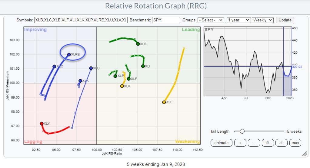
On the Relative Rotation Graph for US sectors, the tail for XLRE, the Real Estate Select Sector Fund, is inside the improving quadrant and heading towards leading at a positive RRG-Heading.
This is one of the few tails with a positive RRG-Heading, between 0-90 degrees. The other ones are Utilities, recently discussed in this article, Communication Services, and Information Technology. Interestingly enough, they are all inside the improving quadrant.
None of the tails inside leading or weakening are on a positive RRG-Heading. This suggests that some shift in sector rotation and leadership is underway.
For this article, I will focus on the developments in and around XLRE.
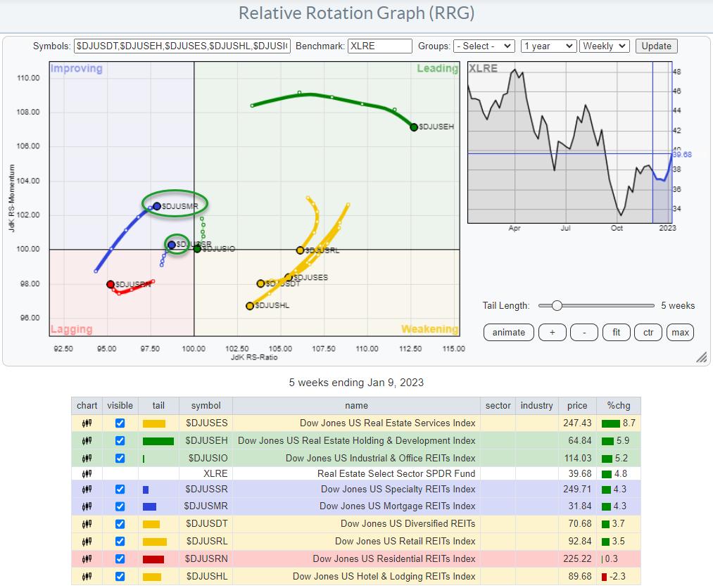
This RRG shows the XLRE sector broken down into industry groups, their rotation around XLRE as the benchmark. It is interesting to see the considerable dispersion between these groups compared to their sector index. When plotted against $SPX, more groups are showing a stronger tail, which, of course, is not surprising given the overall improving strength of the sector as a whole.
The second RRG shows why XLRE has emerged inside the improving quadrant at a strong heading. The tails inside leading, $DJUSEH and $DJUSIO, and inside weakening, $DJUSES, $DJUSDT, $DJUSRL$DJUSHL, have led the charge so far, but they are now all starting to roll over and lose relative momentum.
The good news is that almost all of these tails, except for $DJUSIO, are still quite far from the 100-level on the JdK RS-Ratio axis, which gives them a good chance of curling back up before crossing over into lagging.
For the time being, the leadership inside this sector seems to be shifting to Specialty REITs and Mortgage REITs.
Specialty REITs
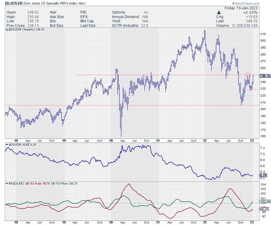
On the chart of the Specialty REITs, price is pushing against a heavy overhead resistance level, which goes back to 2019/2020 when it served as resistance. After breaking that level upwards, that same area started coming back as support in 2022, and now, again, it is coming into play as resistance.
The RRG-Lines are picking up strength, and with JdK RS-Momentum just crossing above 100 and RS-Ratio following momentum upward, the tail on the RRG is now inside improving and moving towards leading. A break above the recent peak in price will undoubtedly help further improve relative strength, but it will also trigger a new series of higher and higher lows.
Hence, I am keeping my eyes open for a break above 251 in $DJUSSR in the coming weeks to ignite a further rally in Specialty REITs.
Mortgage REITs
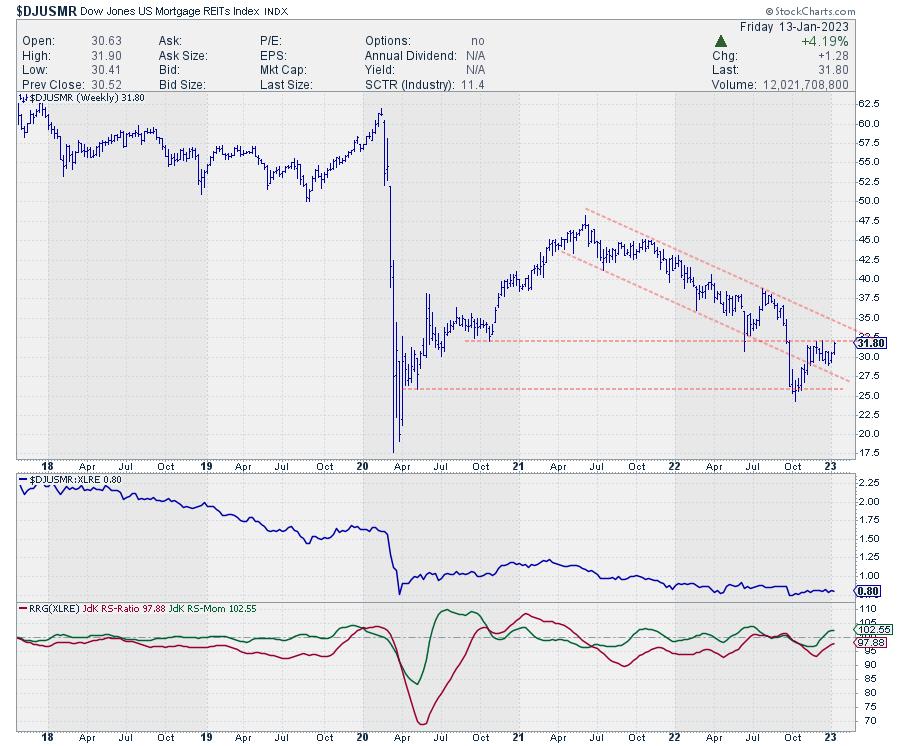
The Mortgage REITs index looks quite different, especially from a longer-term perspective. Where specialty REITs managed to rally strongly after the initial decline at the start of the pandemic in 2020, Mortgage REITs are nowhere near the prior pandemic levels.
On the chart above, you can see how Mortgage REITs have moved in a down-sloping channel since mid-2021 in a very regular series of lower highs and lower lows—and finally breaking lower out of that channel, accelerating to its recent low around 25. Out of that recent low, the current rally started to take shape.
The first positive takeaway was getting back into that falling channel. Breaking back into an old channel often leads to a test of the opposite side. In this case, the falling resistance line is currently somewhere just below 35.
Just like specialty REITs, its Mortgage equivalent is also pushing overhead resistance from a prior high. If this level can be taken out in coming weeks, that will, first of all, free the way toward that falling resistance near 35, but it will also trigger the start of a new series of higher highs and higher lows.
Once that new trend emerges, together with continued improvement in relative strength, Mortgage REITs are expected to be one of the leading groups within the Real Estate sector.
Have a great weekend, --Julius
|
| READ ONLINE → |
|
|
|
|
|
| Art's Charts |
| Relative Seasonality and a Monthly Equity Curve |
| by Arthur Hill |
 The stock market has a long-term bullish bias and the monthly return metrics reflect this positive bias. Chartists looking for a seasonal edge can compare benchmark metrics with the monthly performance numbers. Months that outperform the benchmarks have a positive bias, while months that seriously underperform have a negative bias. Four months stand out on the upside and four months stand out on the downside. The stock market has a long-term bullish bias and the monthly return metrics reflect this positive bias. Chartists looking for a seasonal edge can compare benchmark metrics with the monthly performance numbers. Months that outperform the benchmarks have a positive bias, while months that seriously underperform have a negative bias. Four months stand out on the upside and four months stand out on the downside.
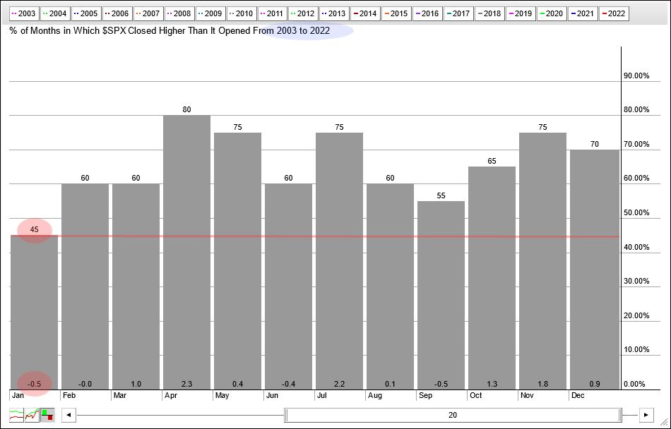
Seasonally, January is one of the weakest months of the year. The chart below shows monthly performance for each month over the last twenty years (2003 to 2022). The numbers at the top of the histogram bars show the percentage of months when the S&P 500 closed higher. The numbers at the bottom show the average of the gains/losses for the month.

Eleven of the twelve months closed higher 55% of the time or more. January is the only month that closed lower less than 50% of the time (45%). The average gain/loss for January is -.50%, which is also the lowest of the twelve months. January has clearly been the toughest month for the S&P 500 over the last twenty years.
I would like to extend the look-back to 2000 because that year marked a peak and the subsequent 2001-2002 bear market. There are 276 months of trading since January 2000. The S&P 500 closed higher 62% of those months and the average gain/loss was a gain of .45%. These performance metrics show a long-term positive bias.
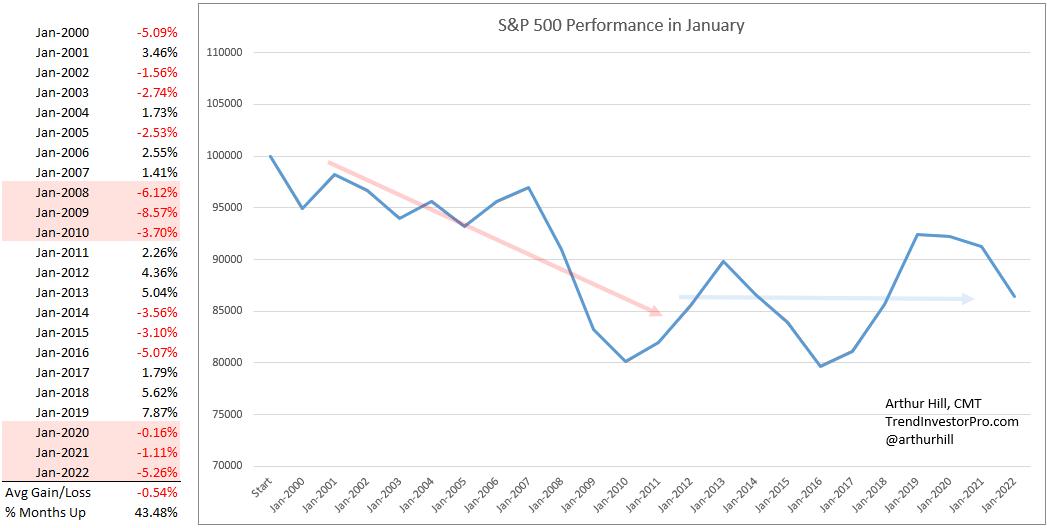
Now let's look at January again. The next image shows monthly performance for January since 2000. The monthly gains and losses are on the left with the average gain/loss at the bottom and the percentage of months closing higher. January closed higher just 43.5% of the time with an average loss of .54%. January underperformed the benchmark metrics and this suggests a negative bias for the month.

The chart on the right shows a hypothetical equity curve for January. Equity starts at 100,000 and increases or decreases with the monthly changes. January was exceptionally rough from 2000 to 2010 as the equity curve declined (red arrow). Performance turned mixed from 2011 to 2022 as the equity curve bounced up and down (blue line). Overall, there is not a definitive trend for the equity curve and this means the month could go either way.
This report continues for subscribers at TrendInvestorPro.com. We will look equity curves for the next five months and show a performance table for all twelve months. 2023 marked a move towards an even more systematic approach at TrendInvestorPro as we introduced a fully quantified mean-reversion trading strategy for ETFs. Click here for immediate access.
The Trend Composite, Momentum Composite, ATR Trailing Stop and eight other indicators are part of the TrendInvestorPro Indicator Edge Plugin for StockCharts ACP. Click here to learn more and take your analysis process to the next level.
---------------------------------------
|
| READ ONLINE → |
|
|
|
| Martin Pring's Market Roundup |
| A Tale of Two Indexes |
| by Martin Pring |

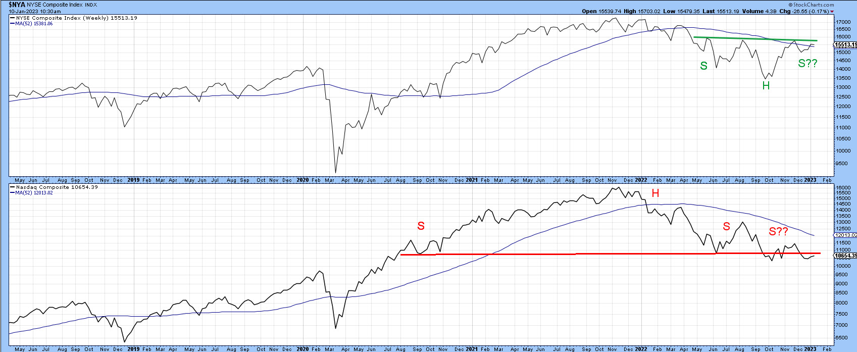
Most of the time, the major indexes move in tandem. Occasionally, they'll throw up positive and negative divergences that technical analysts can use to better identify important trend reversals. Today, we will look at two market averages whose 2022 price action has resulted in completely different potential chart patterns—one bullish and one bearish.
The two indexes are:
- The NYSE Composite ($NYA), which looks as if it is in the process of forming an inverse head-and-shoulders pattern.
- The Nasdaq Composite ($COMPQ), which may be in the terminal phase of completing a head-and-shoulders top.
Both indexes are plotted in chart 1. $NYA is marginally above its 52-week moving average (MA), and $COMPQ is some way below its MA. Either breakout could provide the signal for the next major move, which could be up or down.
 CHART 1: NYSE COMPOSITE AND NASDAQ COMPOSITE. The NYSE looks as if it's completing an inverse head-and-shoulders pattern whereas the Nasdaq Composite appears to be completing a head-and-shoulders pattern. Chart source: StockCharts. For illustrative purposes only. CHART 1: NYSE COMPOSITE AND NASDAQ COMPOSITE. The NYSE looks as if it's completing an inverse head-and-shoulders pattern whereas the Nasdaq Composite appears to be completing a head-and-shoulders pattern. Chart source: StockCharts. For illustrative purposes only.
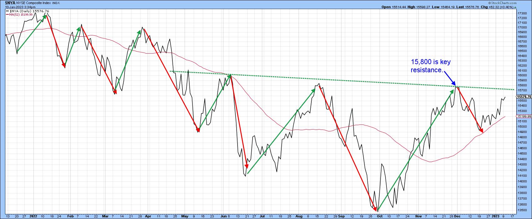
In chart 2 you can see that the $NYA is experiencing a series of declining short-/intermediate-term peaks and troughs. To reverse this progression, it would be necessary for the price to rally and hold above the late November high at 15,800. In doing so, a decisive close above that number would also complete the potential inverse head-and-shoulders formation. For now, though, the peak-trough progression remains intact and the reverse head-and-shoulders pattern continues to bear the label "potential".
 CHART 2: DECLINING PEAKS AND TROUGHS IN THE NYSE COMPOSITE. The 15,800 is an important resistance level. Keep an eye on this index to see if it closes above it and follows through. Chart source: StockCharts. For illustrative purposes only. CHART 2: DECLINING PEAKS AND TROUGHS IN THE NYSE COMPOSITE. The 15,800 is an important resistance level. Keep an eye on this index to see if it closes above it and follows through. Chart source: StockCharts. For illustrative purposes only.
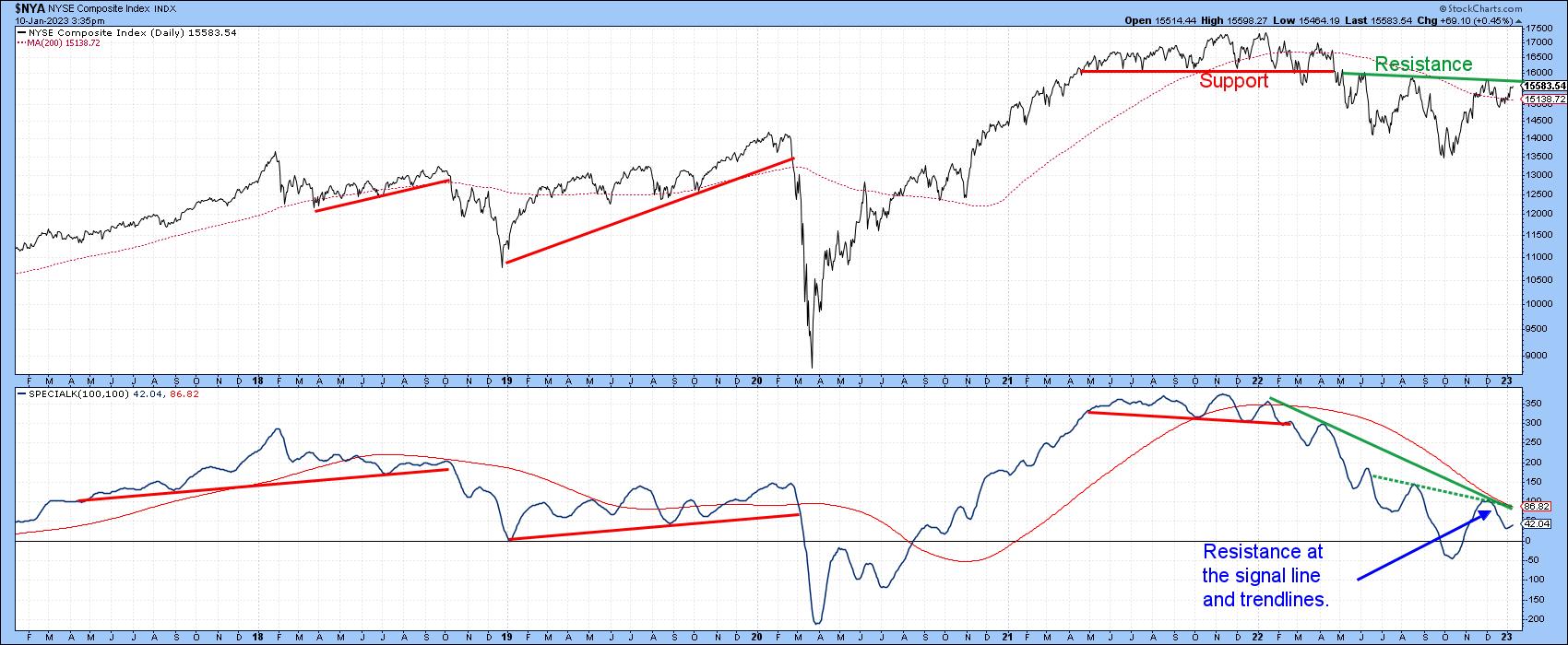
The bull and bear balance presented by $NYA is reflected in chart 3. Here, it is evident the 2021–2022 top, indicated by the red head-and-shoulders neckline, is equally matched by the green neckline of that potential 2022–2023 inverse head-and-shoulders at around the 15,800 level.
The bears are narrowly in charge at the moment because the index is below that resistance trendline. But it could easily reverse. The Special K remains in a downtrend but is close to the signal line and two green trendlines. Together, these three technical indicators represent very important resistance and, if surpassed, would enhance the importance of any decisive move that can hold above 15,800.
 CHART 3: BULL AND BEAR BALANCE. The necklines of a head-and-shoulders top and head-and-shoulders bottom are equally matched. The bears have a slight advantage but that could reverse. Keep an eye on the Special K indicator. Chart source: StockCharts. For illustrative purposes only. CHART 3: BULL AND BEAR BALANCE. The necklines of a head-and-shoulders top and head-and-shoulders bottom are equally matched. The bears have a slight advantage but that could reverse. Keep an eye on the Special K indicator. Chart source: StockCharts. For illustrative purposes only.
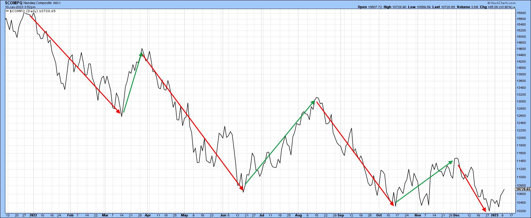
Chart 4 shows that $COMPQ is also experiencing a declining peak/trough progression and has just touched a marginal new closing low. It is therefore as close to re-affirming its downtrend as the $NYA is of signaling an upside reversal.
 CHART 4: WILL THE NASDAQ'S DOWNTREND CONTINUE? The Nasdaq Composite has just touched a new marginal closing low. How much lower can it go? Chart source: StockCharts. For illustrative purposes only. CHART 4: WILL THE NASDAQ'S DOWNTREND CONTINUE? The Nasdaq Composite has just touched a new marginal closing low. How much lower can it go? Chart source: StockCharts. For illustrative purposes only.
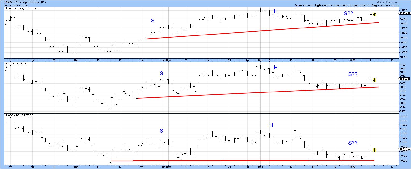
Chart 5 takes a closer look at the two indexes on a daily basis, along with the S&P 500 index ($SPX). It shows that, since November, the three series have, in one way or another, traced out small potential head-and-shoulder tops. I want to stress the word "potential" again, because, until any of these patterns are completed with a decisive close below the respective potential necklines, they're not a technical reality. The lines are currently around 15,000 for $COMPQ, 3,800 for $SPX, and 10,200 for $COMPQ. If these potential formations aren't completed, they would be classified as not "working", a technical event that, like a whipsaw, is usually followed by an above-average move, in this case to the upside.
 CHART 5: A HEAD-AND-SHOULDERS TRIFECTA. Watch for these three indexes to close below their necklines. If these technical formations aren't completed, there could be an above-average move to the upside. Chart source: StockCharts. For illustrative purposes only. CHART 5: A HEAD-AND-SHOULDERS TRIFECTA. Watch for these three indexes to close below their necklines. If these technical formations aren't completed, there could be an above-average move to the upside. Chart source: StockCharts. For illustrative purposes only.
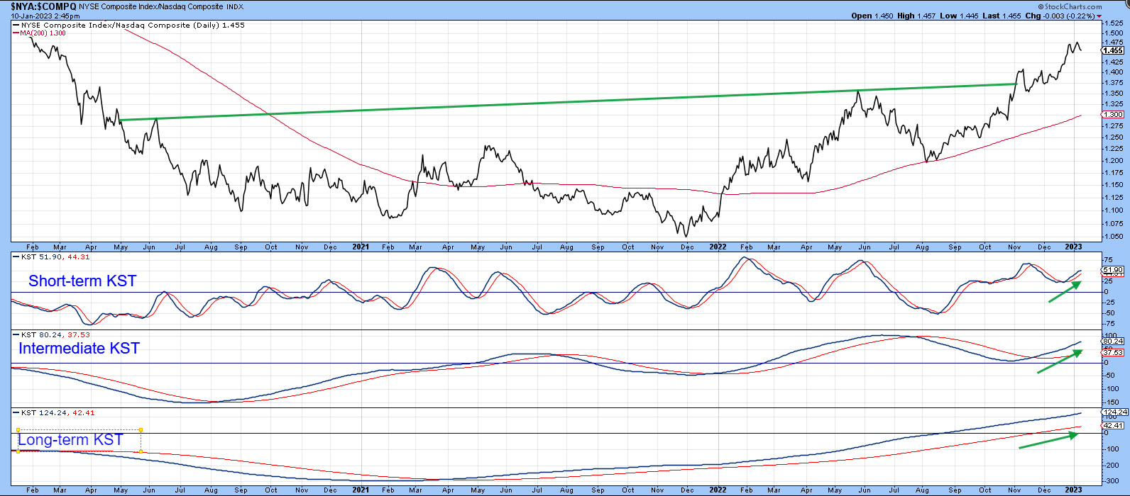
Regardless of the ultimate direction of any of these breakouts, chart 6 suggests that $NYA will continue to outperform because it has broken out from a base and is being supported by all three momentum series. The overstretched short-term Know Sure Thing (KST) indicator hints that a correction temporarily favoring $COMPQ could get underway. However, the bullish, but not overextended, long-term series argues that $NYA will be the victor in the longer run.
 CHART 6. NYSE COMPOSITE COULD BE THE VICTOR IN THE LONG RUN. The short-, intermediate-, and long-term KST indicators suggest a temporary correction in the Nasdaq but an upside move in the NYSE Composite. Chart source: StockCharts. For illustrative purposes only. CHART 6. NYSE COMPOSITE COULD BE THE VICTOR IN THE LONG RUN. The short-, intermediate-, and long-term KST indicators suggest a temporary correction in the Nasdaq but an upside move in the NYSE Composite. Chart source: StockCharts. For illustrative purposes only.
Stocks vs. Commodities
One indicator that could support a breakout in $NYA is the change in the relationship between stocks and commodities. At a normal bear market low, stocks, a forward-looking indicator of economic activity, tend to bottom ahead of commodities, which are more of a coincident indicator. That means the ratio between these two asset classes usually bottoms around the same time as stocks.
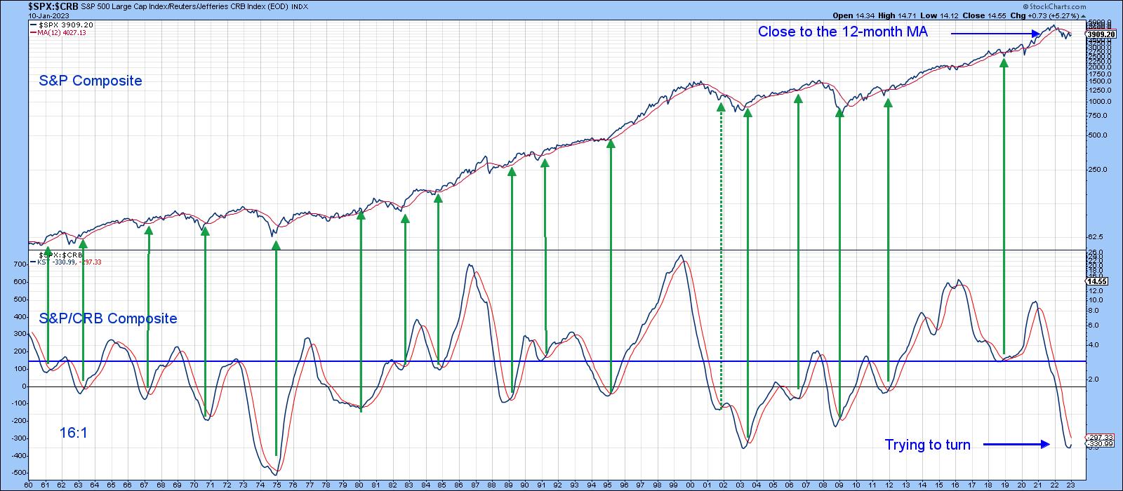
This ratio is exemplified in chart 7 by the long-term KST. In this instance, stocks are represented by the $SPX and commodities by $CRB. The green arrows approximate periods when the KST bottoms from a sub-zero position and crosses above its nine-month MA. Since 1960, there have been 17 signals, and only one was not followed by a worthwhile stock market rally. In the last month or two, the KST has started to hook up from a very oversold position, but it has yet to reach its MA. It's still bearish but could be close to a positive signal.
 CHART 7: RELATIONSHIP BETWEEN STOCKS AND COMMODITIES. The KST is looking like it's trying to hook upward from a very oversold area. A cross above its moving average would be a strong indication. Chart source: StockCharts. For illustrative purposes only. CHART 7: RELATIONSHIP BETWEEN STOCKS AND COMMODITIES. The KST is looking like it's trying to hook upward from a very oversold area. A cross above its moving average would be a strong indication. Chart source: StockCharts. For illustrative purposes only.
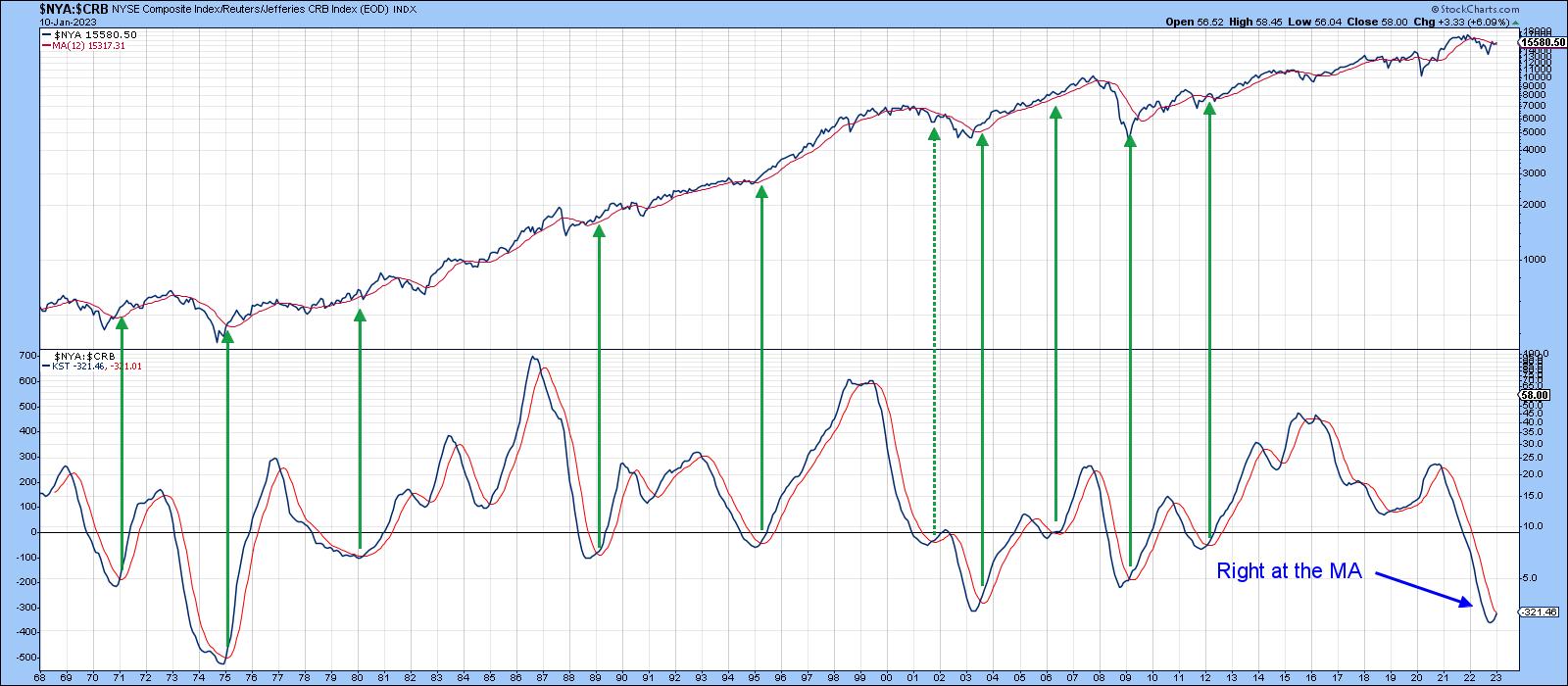
When you substitute $SPX with $NYA, as in chart 8, the KST is literally at the same level as its MA. That's because $NYA has been a superior performer. There's nothing that says a bull market is guaranteed to follow a positive crossover, but, if $NYA breaks above the 18,500 level at the end of the month, it would greatly enhance the probability of one developing. Until then, a cautious approach is appropriate.
 CHART 8: POSSIBLE BULL MARKET IN NYSE COMPOSITE? Maybe, but it all depends on if $NYA breaks above 18,500 by the end of January and if KST crosses above its MA. Chart source: StockCharts. For illustrative purposes only. CHART 8: POSSIBLE BULL MARKET IN NYSE COMPOSITE? Maybe, but it all depends on if $NYA breaks above 18,500 by the end of January and if KST crosses above its MA. Chart source: StockCharts. For illustrative purposes only.
Good luck and good charting,
Martin J. Pring
The views expressed in this article are those of the author and do not necessarily reflect the position or opinion of Pring Turner Capital Group of Walnut Creek or its affiliates.
|
| READ ONLINE → |
|
|
|
| ChartWatchers |
| Inflation Softens: Will Interest Rates Still Rise? |
| by Jayanthi Gopalakrishnan |

The December consumer price index (CPI) was welcome news for the stock market. Headline and core CPI numbers came in line with expectations. Headline CPI year-over-year is up 6.5% and core CPI is up 5.7%. Even though the softening inflation number was probably already priced into the market, the broader market indexes all closed higher. It's a move in the right direction and, if this trend continues, it's positive news for the stock market, going forward. But it's not a done deal.
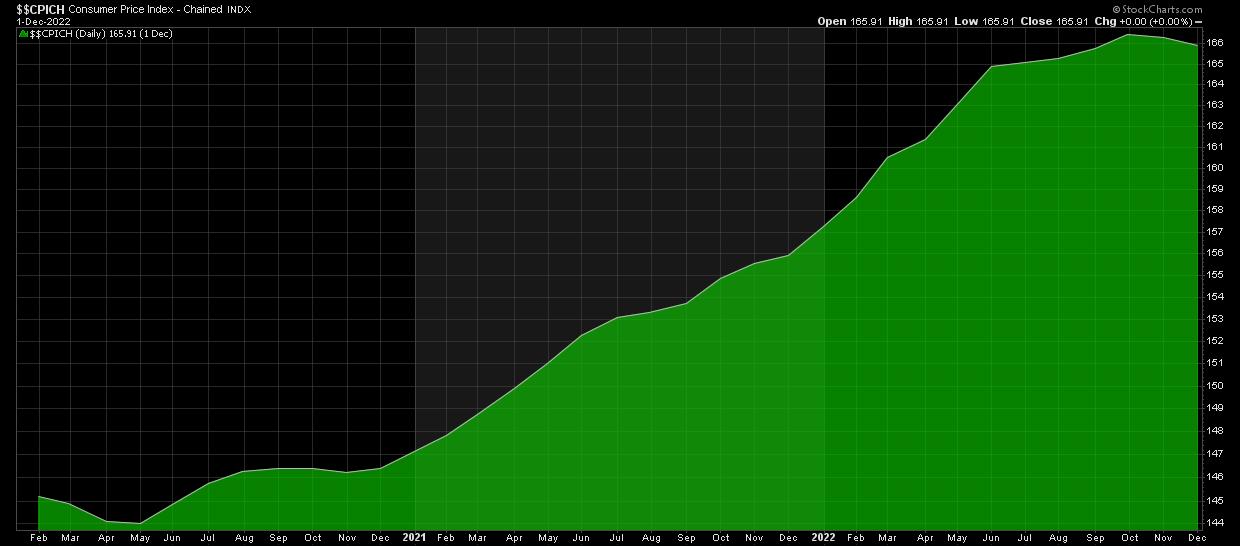
There needs to be a slowdown in rent and services, two areas that are still putting pressure on inflation. The labor market and wage growth need to cool down a lot more before inflation can come close to the 2% objective. If you pull up a chart of the headline CPI ($$CPICH), you'll notice that it's starting to trend lower (see chart 1). And that's an assuring sign that inflation is indeed cooling.
 CHART 1: CHAINED CONSUMER PRICE INDEX ($$CPICH). The upward trend in the headline CPI is starting to turn lower. Chart source: StockCharts.com. For illustrative purposes only. CHART 1: CHAINED CONSUMER PRICE INDEX ($$CPICH). The upward trend in the headline CPI is starting to turn lower. Chart source: StockCharts.com. For illustrative purposes only.
Are Investors Becoming More Complacent?
Another area to watch is volatility. The CBOE Volatility Index ($VIX) seems to be finding a new home below the 20 level. If it stays around this level or goes even lower to pre-pandemic levels, it could be a sign that investors are getting more complacent. But that would mean that investors would gravitate towards risk-on investments, Yet gold is trading higher. Does that mean investors are still uncertain and want to tread carefully? Perhaps, given that earnings season kicks off with four large banks—JP Morgan Chase (JPM), Wells Fargo Bank (WFC), Citigroup (C), and Bank of America (BAC).

Banks set the stage for the earnings season, since their results provide an overarching view of the state of the economy. That's enough to make investors a tad bit nervous.
Loans are a big driving force behind bank earnings. If you want a mortgage or a car loan, you have to go to your bank to get one. Higher interest rates help banks earn greater profits on loans. It'll be interesting to see how much the higher rates helped. You also get a look at trading activity that took place during the last quarter; given the volatility in the market last quarter, there's a chance that trading activity increased. Another important theme to listen for from the bank reports is the state of business and consumer credit. It's a great indicator for gaining insight into business and consumer activity, two big economic driving forces.
Recession or Soft Landing?
The Fed will make its next interest rate decision on February 1. Hopefully, Jay Powell and his team look at the December CPI number favorably. But it's just one data point. A further hike in interest rates is likely, at least for the next few meetings, but the rate at which interest rates are hiked may slow down. The CME FedWatch Tool shows over a 90% probability the Fed will raise interest rates by 25 basis points. That would be an indication that inflation is cooling, which could mean a soft landing. If the Fed decides to raise rates by 50 basis points, there could be some wild swings in the market. A lot depends on the labor market and services. When both these start to cool, it could be an indication that the Fed is in the home stretch of its interest rate hike.
The Stock Market is Optimistic
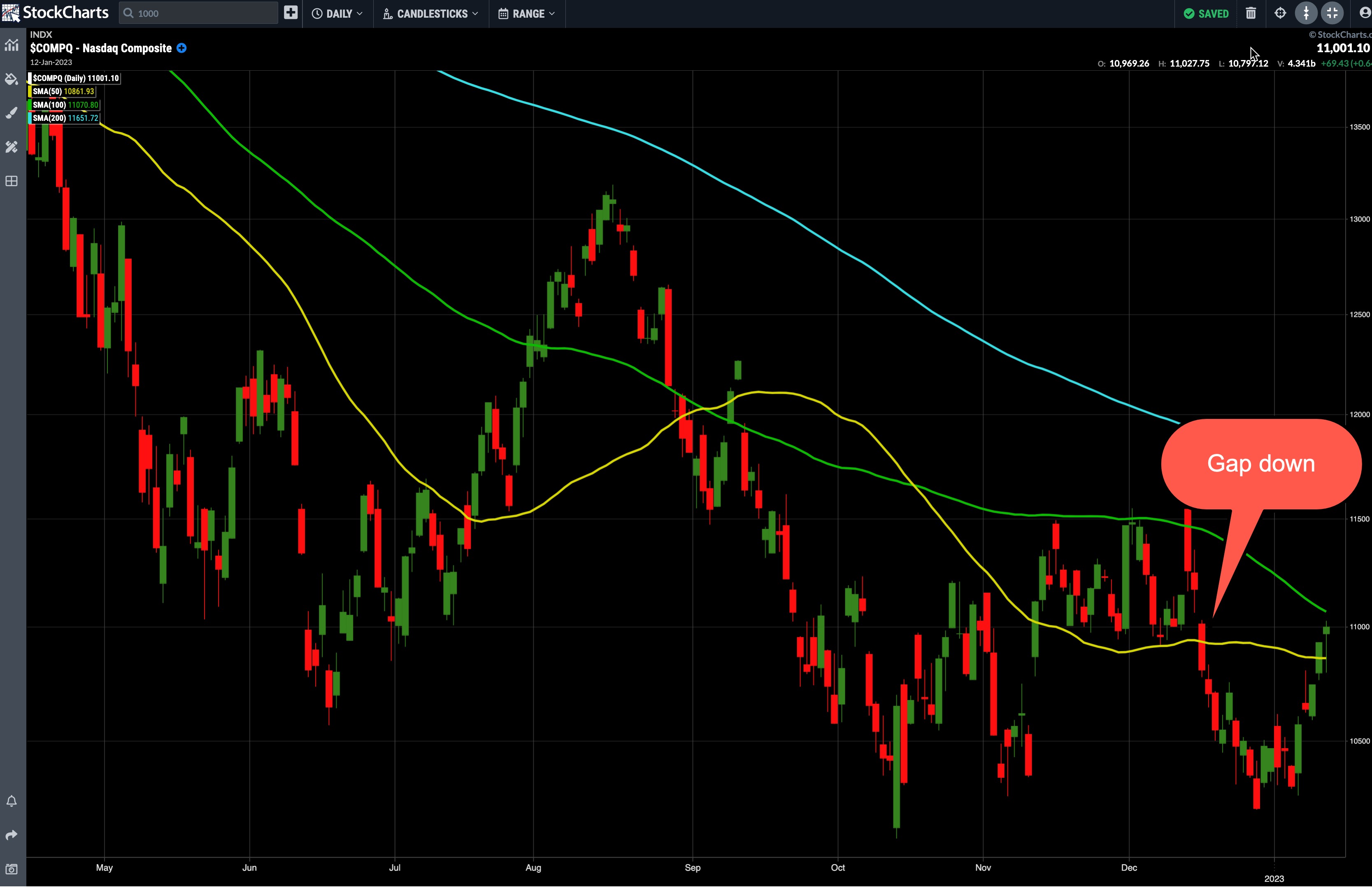
It was nice to see the Nasdaq Composite ($COMPQ) get a boost, closing just a hair above 11,000. Besides being a round number, this level holds some significance. If you look back on the daily chart of $COMPQ (see chart 2), on December 15, 2022, you'll see there's a gap down in value to the 11,000 level. If $COMPQ continues higher, the gap would be filled and the index could move up to the 11,500 level. The other side of the coin is that the 11,000 level could act as a resistance level and $COMPQ could fall back down toward the 10,200 level.

CHART 2: NASDAQ COMPOSITE AT CRITICAL LEVEL. Will it break above 11,000 and fill its December 15 gap down or will it bounce off the level and move lower? Something to keep an eye on in the coming days. Chart source: StockChartsACP. For illustrative purposes only.
Investors Are Still Cautious
Positive news is great, especially after a super volatile market at the end of 2022. But anything can happen during earnings season. So, tread carefully, keep an eye on your technical indicators, and make risk management a priority.
Jayanthi Gopalakrishnan
Director, Site Content
StockCharts.com
Disclaimer: This blog is for educational purposes only and should not be construed as financial advice. The ideas and strategies should never be used without first assessing your own personal and financial situation, or without consulting a financial professional.
|
| READ ONLINE → |
|
|
|
| The Canadian Technician |
| Stock Market Rallies: Is This Light Switch Turning On? |
| by Greg Schnell |
There are tons of charts to choose from to make a point about how bullish or bearish the market is. However, when you pick broad market charts, there is little to argue a point. Composite exchange charts (all the stocks in a group) reach a broad swath of the economy and help you see a wider view, rather than a narrower selection of the Nasdaq 100 ($NDX), the S&P 500 index ($SPX), the Dow Jones Industrial Average ($INDU), or a specific industry.
NYSE Line Chart
The charts below are from the NYSE. The NYSE Composite index ($NYA) represents the 'stock exchange' rather than a select group of the best charts.
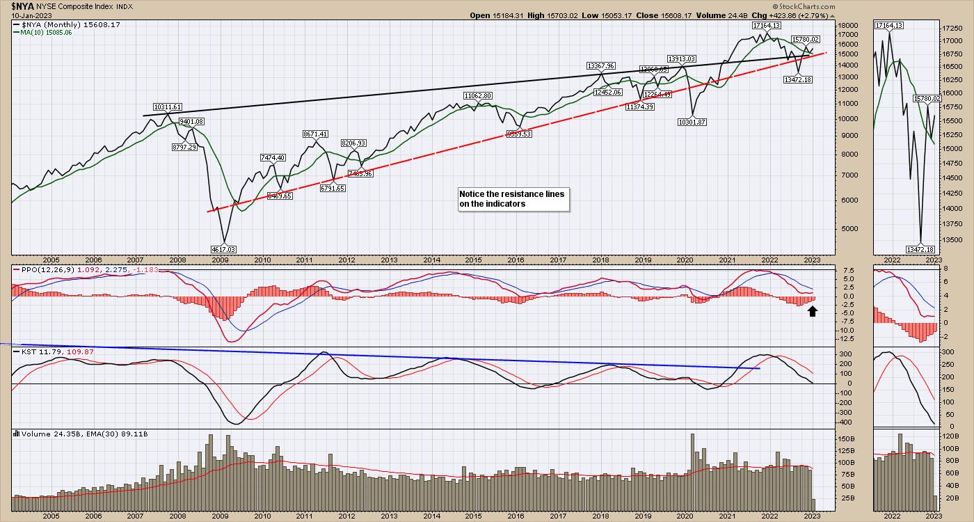
This week, $NYA sits at an important crossroads, one it hasn't visited in a long time. The junction of the top trend line since the 2007 high, the support trend line since 2010, and the 10-month moving average (MA) are all providing support under this chart after the 2020 frenzy of free government money. The chart exploded higher in 2020 through 2021 and slipped lower for most of 2022. $NYA bottomed in October 2022.

The percent price oscillator (PPO) is trying to turn up, just above zero. If the oscillator turns higher from here, it could be bullish. You don't want to see the PPO start to fail and drop below zero.
Another interesting clue is that in the 2008–2009 crisis, volume accelerated above the average until the market lows of October 2008 were in. The current volume seems comfortable below the MA, hinting that large investors may not be too worried if the market doesn't get through this threshold level.
NYSE Bar Chart
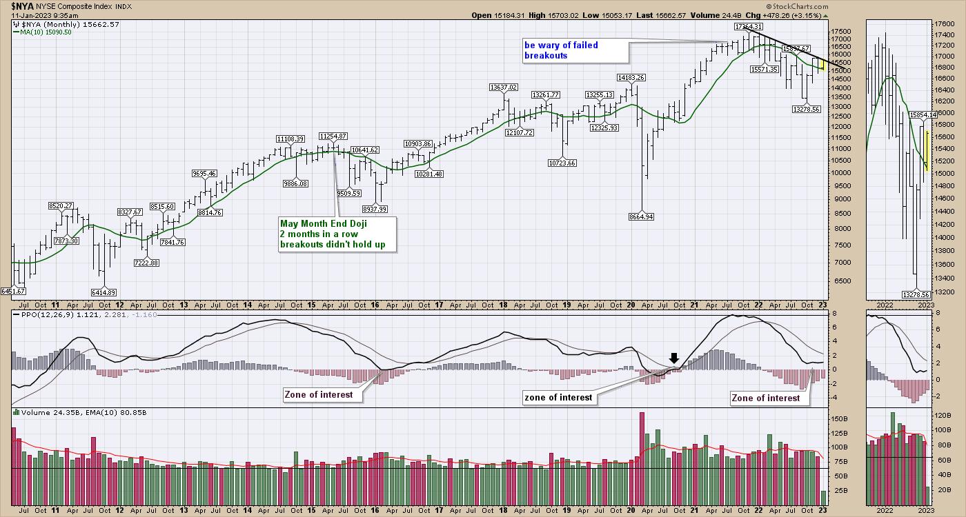
When you look at the monthly bar chart rather than a line chart, a few other clues come into play. A bar chart shows the price throughout the month, not just the closing price.
Price sits at the monthly trend line. So far, there have been four months of higher lows. $NYA also seems to be holding above its 10-month MA, which was a resistance level in mid-2022. The PPO is the same as the chart above, and indicates that this is a typical bounce point. The difference is that this bounce is taking place without the Fed's help.

NYSE Weekly Bar Chart
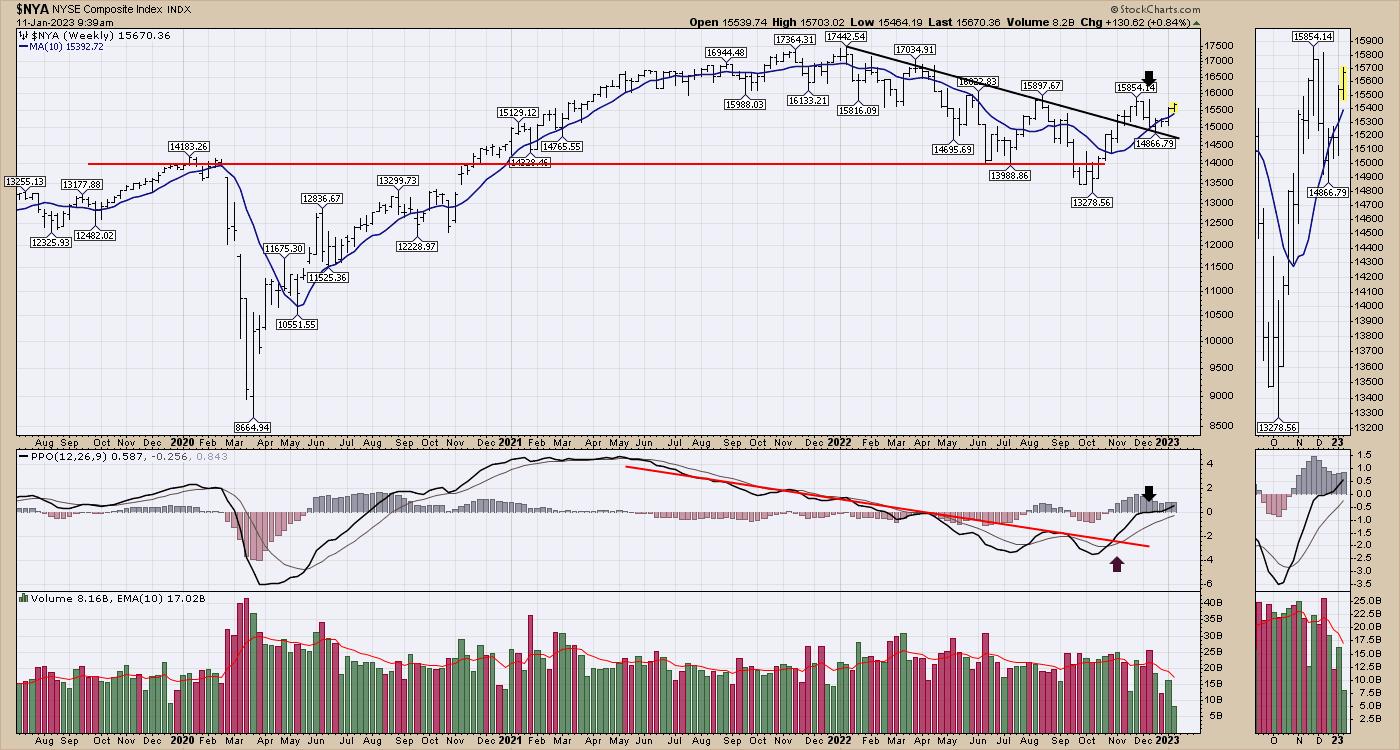
Moving to the weekly chart (see chart below) and a few more interesting things pop up.
The chart is holding above the 10-week MA (blue line). This was a support level all the way through 2020 and most of 2021. It's also trending up and has clearly broken any downtrend drawn on the MA. Price on a weekly chart looks much better and has broken a down trend line on the previous highs and has bounced off that line. The PPO is turning up very bullishly, right at zero.

As $NYA continues to rally, this looks more and more like the start of a bull market. I have a variety of charts telling me to be more positive on the outlook. It seems each week in the newsletter to clients, the stock market's bullish outlook is improving.
I also did a presentation about how we expect to manage the market turbulence in 2023 as we have a couple of interesting crossroads coming at us. That presentation can be found here. Investing Strategies From Osprey Strategic.

Grab a beverage and see if some of the ideas presented can help you preserve capital while enjoying the upside. Have a wonderful 2023!
|
| READ ONLINE → |
|
|
|
| Dancing with the Trend |
| 2022 Stock Market Review |
| by Greg Morris, Grant Morris |
2022 has ended, but the bear market and need for risk management remains!
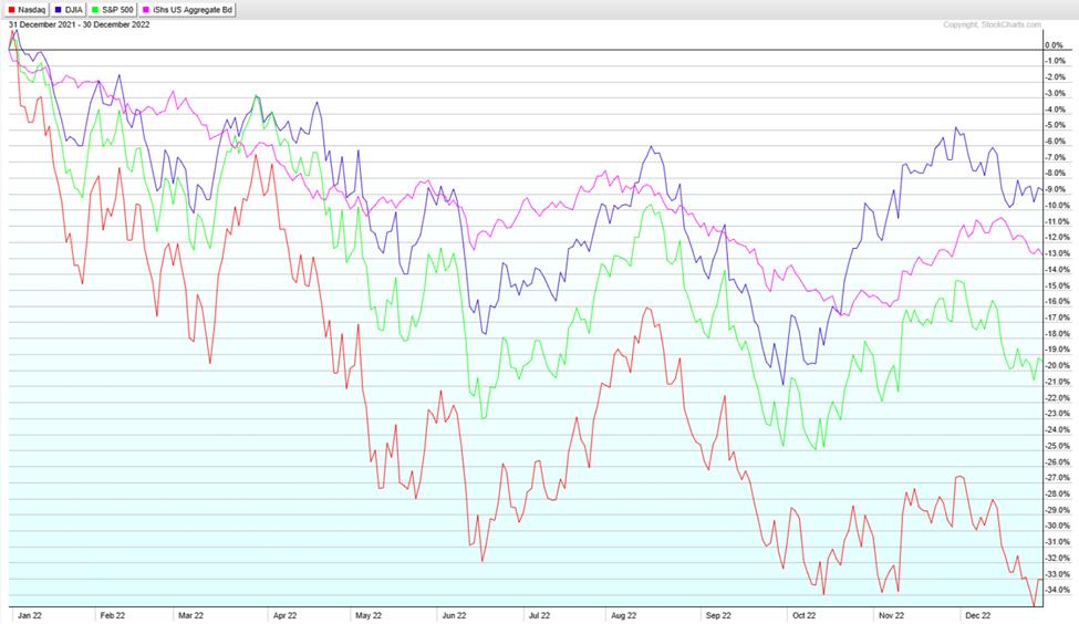
The year 2022 ended with the stock market delivering its largest yearly losses since 2008. The fourth quarter of 2022 saw new bear market lows in the S&P 500 index, Nasdaq Composite, and Bloomberg Agg Bond Index.
- The S&P 500 index finished the year down 19.44%, after being down nearly 25% at its lowest point in the year on October 12.
- The Nasdaq Composite finished the year down 33.1% with its lowest point being down almost 35% on December 28.
- The Dow Jones Industrial Average dropped in December to finish the year down 8.78%.
- The Bond index finished down 13% for its worst calendar year performance in many decades.
- A traditional allocation of 60% stocks and 40% bonds was down approximately 17%.

The main theme driving markets in 2022 was inflation; its causes, how long it would persist, and how the Fed would respond to it. The Fed moved in historic fashion to raise interest rates, making seven consecutive rate increases totaling 425bps, but inflation is still too high, and the Fed has stated more rate increases are needed and that rates would be held higher for longer to get inflation to their desired goal of 2%. The rapid monetary tightening aimed at bringing down inflation will ultimately succeed, but the cost will likely be a global recession in 2023. The story for 2023 will continue with inflation as the main theme but will soon be dominated by talk of a recession.
The drop in the stock market during 2022 improved equity valuations some, but the market is still overvalued by most estimates. The growing likelihood of a recession is a big risk to corporate earnings, as a recession would mean revenues decline, and profit margins compress from their current cyclical-high levels. Another leg down in the stock market (and possibly the bottom of the bear market) may come as companies reevaluate their earnings expectations to account for a global recession.
Given the high likelihood of a recession, active investors may feel sitting in cash is their best option right now, but without a disciplined approach for re-allocating capital when the investing environment improves, most investors will inevitably stay in cash far too long and miss out on the growth potential that comes after bear markets. We think the better approach is to invest using risk-managed strategies, which can participate in market upside when appropriate, while always maintaining downside protection if this bear market worsens.
Trend Plus Strategy
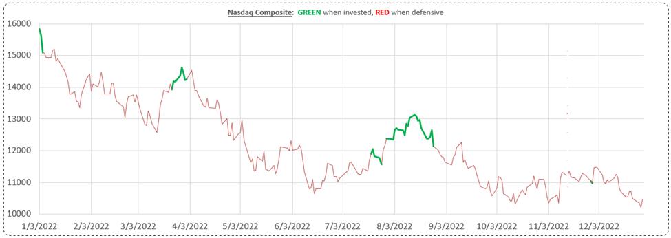
Our Trend Plus strategy was down 9.9% in 2022, ahead of the S&P 500 index, Nasdaq Composite, traditional 60/40 allocations, and even down less than the U.S. bond benchmark for the year. After the early January 2022 defensive move, the strategy attempted to participate in several of the counter-trend rallies that occurred during the year, but each bear market rally eventually failed and Trend Plus was stopped out to avoid riding the market to lower levels.
Risk management and downside protection are critical to generating long-term performance and we know we can come out ahead by minimizing drawdowns in the bad markets. The graph below shows the times at which Trend Plus was invested in the market (green) versus positioned defensively (red). Even though the model suffered a few whipsaw trades, the ability to avoid the large down moves in the market kept us ahead.

Sector Rotation
The Sector Rotation momentum strategy was down 13.7% in 2022, well ahead of the S&P 500 index, Nasdaq Composite, and traditional 60/40 allocations. Sector Rotation also only had a drawdown during the year of 15.5% (peak-to-trough move), while at one point the S&P 500 had lost a full quarter of its value (down 25% in October). Drawdowns are painful for investors and reducing the magnitude and duration of drawdown periods ultimately provides a smoother ride. The strategy didn't suffer any whipsaw trades since moving defensive in February. The defensive positions have had mixed performance with the U.S. dollar showing strength while gold lost ground for most of the year. But during the fourth quarter, gold established itself in an uptrend and was additive to strategy returns.
The strategy remains defensive with no equity exposure and will protect client accounts if a further selloff is experienced in the stock market.
TPSR (50% Trend Plus & 50% Sector Rotation)
The TPSR strategy was down 11.7% in 2022, well ahead of the broad market which was down more than 19% and traditional 60/40 portfolios which were down 17%. Having exposure to Trend Plus and Sector Rotation strategies has provided good results during a tough market environment, ultimately beating benchmark returns through superior risk management. This blended strategy has the ability to be reactive to changing market conditions and allocate quickly if a market rebound occurs, while still focusing on moves defensive to protect client capital if the bear market worsens.
Summary
We have stated many times in our investor updates that nobody can know if the bear market is over until the market attains new all-time highs. Allocating investors' capital based on guesses that the "bottom is in" is foolish and a recipe for disaster, although many take this approach. Our approach is different and, we think, a much better way to invest client assets. Our disciplined, rules-based, quantitative approach to investing is robust, has been time-tested, and has delivered outstanding results across many market environments, including protecting investors from significant drawdowns this past year.
We will attempt to participate in market rallies when they occur, but always with a focus on risk management and downside protection. Compounded returns over time are greater if smaller losses are taken during bear markets and that is what our strategies delivered in 2022.
We feel strongly that all investors should have an allocation to tactical strategies such as ours to improve their overall portfolio performance and make it through bear markets more successfully. Please contact us if you have any questions about our strategies or how MSCM can play an important part in your investment management plan.
Our strategy sheets are accessible through the buttons below, and on our website mscm.net.
TPSR
TREND PLUS
SECTOR ROTATION
TREND X
Dance with the Trend,
Grant & Greg Morris
|
| READ ONLINE → |
|
|
|
| MORE ARTICLES → |
|
 Chart 1
 Chart 2
 Chart 3
 Chart 4
 Chart 5



 The stock market has a long-term bullish bias and the monthly return metrics reflect this positive bias. Chartists looking for a seasonal edge can compare benchmark metrics with the monthly performance numbers. Months that outperform the benchmarks have a positive bias, while months that seriously underperform have a negative bias. Four months stand out on the upside and four months stand out on the downside.