| THIS WEEK'S ARTICLES |
| John Murphy's Market Message |
| HEALTHCARE SECTOR NEARS UPSIDE BREAKOUT |
| by John Murphy |
MONEY ROTATES INTO HEALTHCARE... One of the most encouraging developments over the last month has been the rotation into formerly lagging sectors like industrials, financials, and materials. That rotation also includes this week's upside breakout in the Dow Industrials to the highest level in more than a year. Small caps are close to doing the same (more on that shortly). An overbought condition in leading tech stocks may be contributing to that rotation. Today's message will focus on healthcare which is another lagging sector starting to look stronger. Interestingly, healthcare is the day's strongest sector while technology is one of the weakest.
Today's strongest sector is healthcare. Chart 1 shows the Health Care SPDR (XLV) on the verge of an upside breakout through its April high. A close above that level would signal a new uptrend in that sector. The XLV rally is being led by healthcare providers and pharmaceuticals. Three of the stock leaders are shown below.
 Chart 1 Chart 1
UNITEDHEALTH TURNS UP... Chart 2 shows UnitedHealth Group (UNH) climbing above its 200-day moving average and now testing a falling trendline drawn over its December/April highs. UNH is the week's strongest healthcare stock.
 Chart 2 Chart 2
JNJ AND ABT LEAD TODAY'S XLV RALLY... Two of today's strongest healthcare stocks that are in the pharmaceutical group are shown below. Chart 3 shows Johnson & Johnson (JNJ) surging to a new high for the year. The stock has also cleared its moving average lines in the process.
Chart 4 shows Abbott Labs surging to a challenge of its yearly highs. Its moving average lines are also in bullish alignment.
 Chart 3 Chart 3
 Chart 4 Chart 4
TECHS LOOK OVERBOUGHT... Up until recently, technology stocks have been the market's strongest sector. Some profit-taking, however, suggests that some short-term money is rotating into other parts of the market. The next chart may explain why. Chart 5 shows Technology SPDR (XLK) in a strong uptrend. The two arrows in the upper box, however, show the 14-day RSI line in very overbought territory. At the very least, that suggests that the XLK is due for a period of consolidation or some profit-taking. That wouldn't have a major effect in its major uptrend; but it may encourage investors to rotate some money into weaker parts of the market that offer better value like healthcare and small caps.
 Chart 5 Chart 5
SMALL CAPS TEST RESISTANCE...Small caps have also been doing much better of late. As a result, they may be nearing an upside breakout of their own. Chart 6 shows the Russell 2000 iShares (IWM) testing two previous peaks formed over the past year. An upside breakout would complete a bottoming formation and would go a long way to broaden out this year's market rally. Footnote: Stronger bank stocks are helping support the Russell 2000 Small Cap Index.
 Chart 6 Chart 6
|
| READ ONLINE → |
|
|
|
| The MEM Edge |
| Markets Flip as Earnings Season Heats Up |
| by Mary Ellen McGonagle |
Last week, the number of companies reporting earnings expanded, with heavyweight names Tesla (TSLA) and Netflix (NFLX) getting the most attention. Both companies sold off sharply on Thursday despite beating estimates. The selling spread to other Nasdaq stocks after two heavyweight Semiconductor companies signaled continued weakness in the chip market.
Stocks from beaten-down areas of the market were treated quite differently, however, with healthcare giants Johnson & Johnson (JNJ) and Abbott Labs (ABT) spiking higher after beating guidance and raising their full-year outlook. Bank stocks -- another area that's underperformed amid a crisis -- were the biggest winners, as they continued to rally on earnings even if they missed views.
The result was a week where the worst performing sectors year-to-date were last week's top performeres, while winning sectors were at the bottom.
Could it be that investors are paying attention to valuations as earnings reports roll in? Next week will certainly test this possibility, with four mega-cap companies due to report while a host of additional bank and healthcare companies release results. Microsoft (MSFT), Meta Platform (META), Alphabet (GOOGL), and Amazon (AMZN) are also seeing a rebalance in their Nasdaq 100 weighting on Monday, in addition to their reports later in the week.
 Daily Chart of Healthcare Sector Daily Chart of Healthcare Sector
Above is a daily chart of the Healthcare sector after last week's 3.5% rally pushed the group out of a 3-month base on heavy volume. With the sector poised to trade higher, I believe that pharmaceutical giant Novo Nordisk (NVO) deserves a close look after last week's move back above resistance at its 50-day moving average.
NVO sells two weight loss drugs while also working on additional treatments that are seeing positive results in trial studies. Today, Wall Street firm Morgan Stanley raised their forecast for annual sales of weight loss drugs to $77 billion, as patient demand for the medicines has outstripped supply amid a social media frenzy.
 Daily Chart of Novo Nordisk (NVO) Daily Chart of Novo Nordisk (NVO)
NVO's downtrend reversal occurred on above-average volume, while the MACD has just entered positive territory. Both positive characteristics join an already-positive RSI, as can be seen on the daily chart above.
Earnings season has always been a critical period for the markets, as not only is investor sentiment revealed based on responses to results, sector rotation such as last week's move into Healthcare can take place. If you'd like to be alerted to these critical shifts, use this link here to trial my twice weekly MEM Edge Report. We alerted subscribers to January's move into Semiconductors while highlighting Nvidia as a buy candidate. The stock has gained 158% since then!
Warm Regards,
Mary Ellen McGonagle, MEM Investment Research
|
| READ ONLINE → |
|
|
|
| Martin Pring's Market Roundup |
| Taking a Deep Dive Into Dr. Copper and What it Means |
| by Martin Pring |
Last week, I pointed out that several indicators were close to triggering a bull market for commodities. Some of those benchmarks have since been met, but none have yet moved decisively in that direction. Now, it's time to take a deep dive into the copper price, as this widely-used base metal has often served as a leading indicator for commodities in general.
Copper vs. Commodities in General
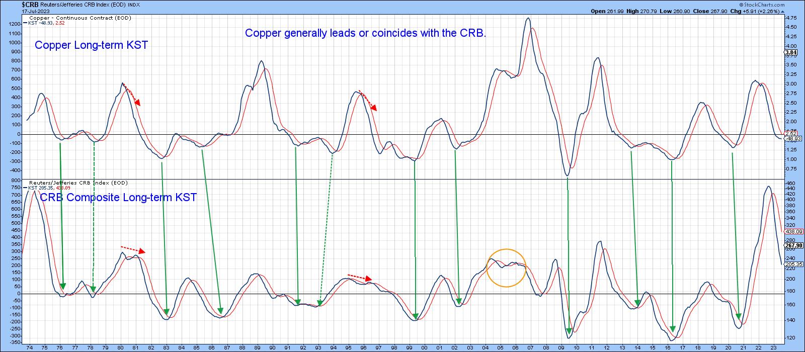
We can see that from Chart 1, which compares the long-term KST for the CRB Composite to one for the copper price. The arrows connect the lows and show that copper generally leads or coincides with momentum bottoms in the CRB. Copper momentum has recently begun to flatten, but has yet to confirm a reversal by crossing above its MA. It is, though, in a better position to experience an upside reversal than the CRB KST.
 Chart 1 Chart 1
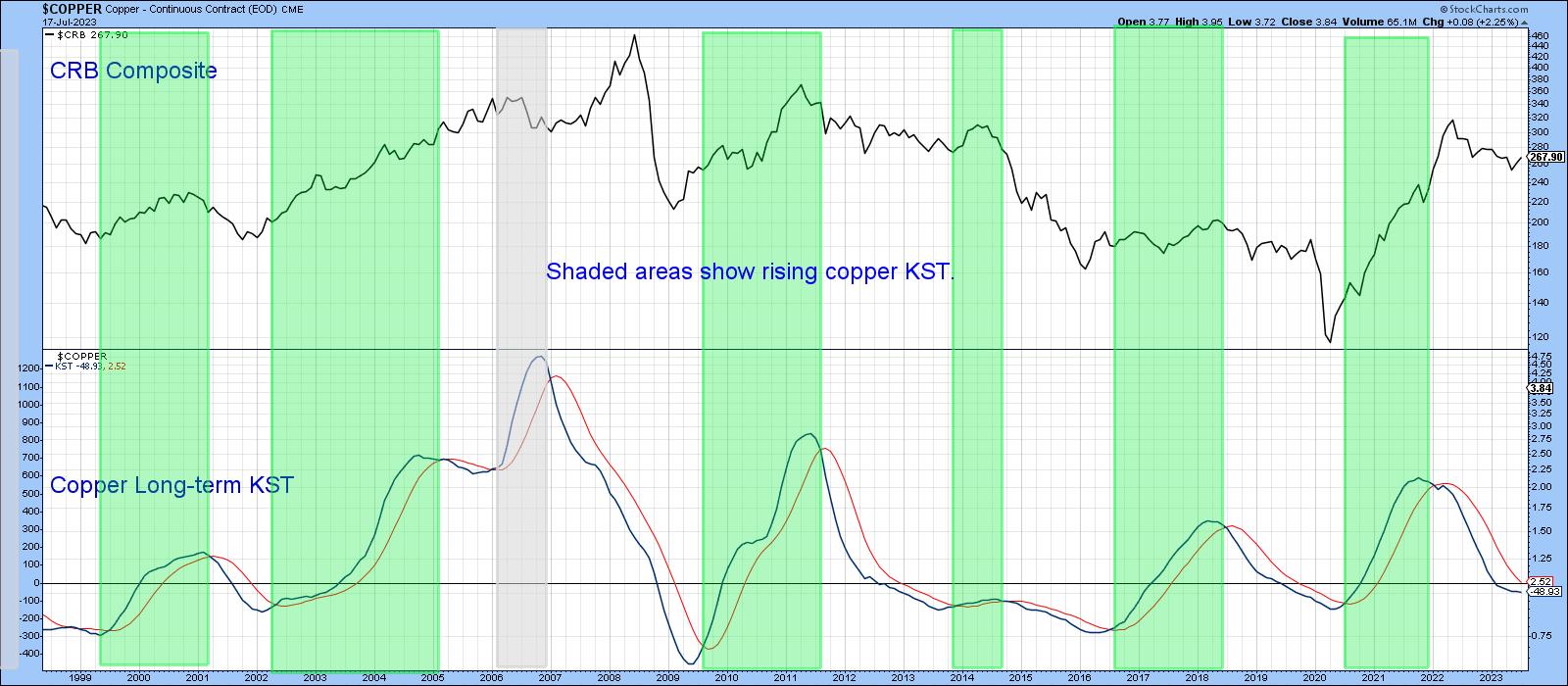
Chart 2, taken from last week's article, demonstrates that, when the KST for copper does cross its MA (which it is poised to do), that will be a bullish development for commodities in general.
 Chart 2 Chart 2
The Copper Price
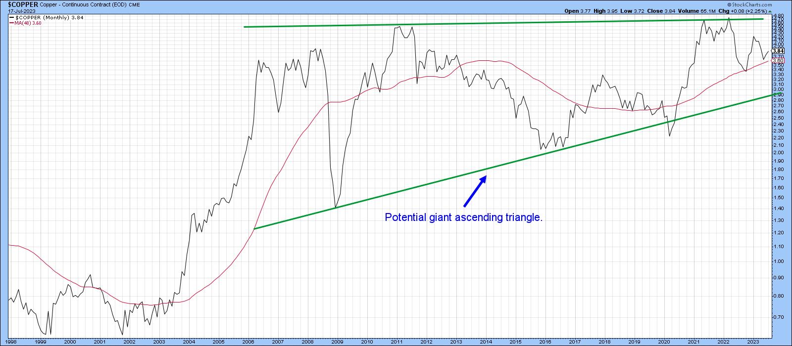
Chart 3 shows a monthly chart of copper together with a 48-month MA. If looks as if the price is in the terminal process of completing a giant ascending right-angled triangle. I need to stress that it has not yet been completed, since that would require a decisive monthly closing price that can hold above the upper trendline, say, between $5-$5.25. The point of displaying this potential formation, though, is to indicate the technical potential for substantially higher prices, if a breakout does materialize.
 Chart 4 Chart 4
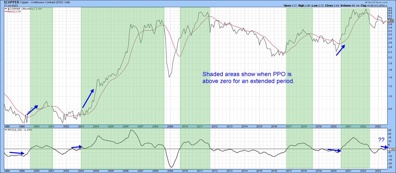
Chart 4 brings us back to earth, since the PPO has gone very quiet so far in 2023. The thick blue arrows indicate the three periods in the past when there was a similar tight balance between buyers and sellers, reflected by a subdued PPO. Each was followed by an explosive rally. That's not to say that the current battle is guaranteed to be resolved in a positive way. However, a PPO reading north of zero would certainly set the scene for one. Remember, any of the charts in this article can be updated by simply clicking on them.
 Chart 4 Chart 4
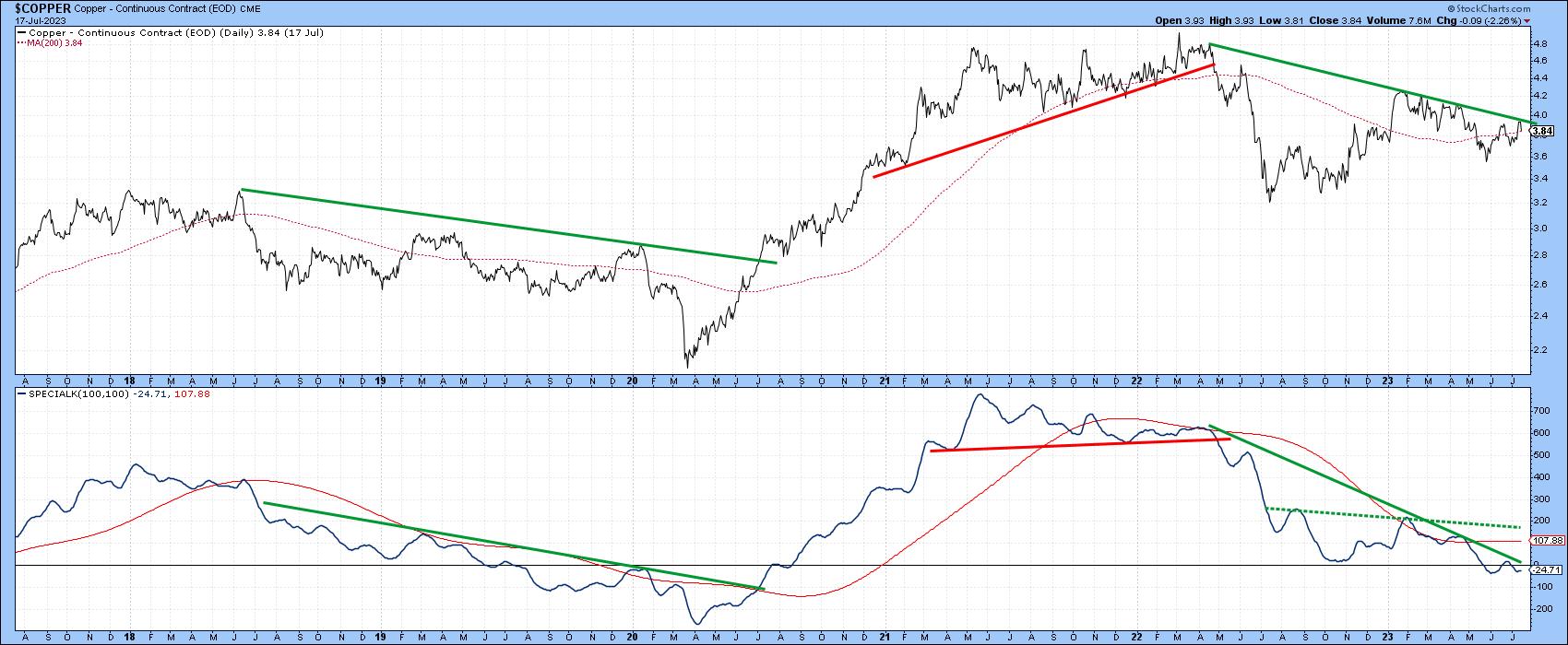
Chart 5 shows that the price could be very close to a major buy signal. That would come from a violation of the down trendlines for both the price and its Special K. Note how two previous trendline breaks for this momentum indicator were followed by an important reversal in the price itself. If you are not familiar with the Special K concept, you can read about it here.
 Chart 5 Chart 5
Copper and Related Shares
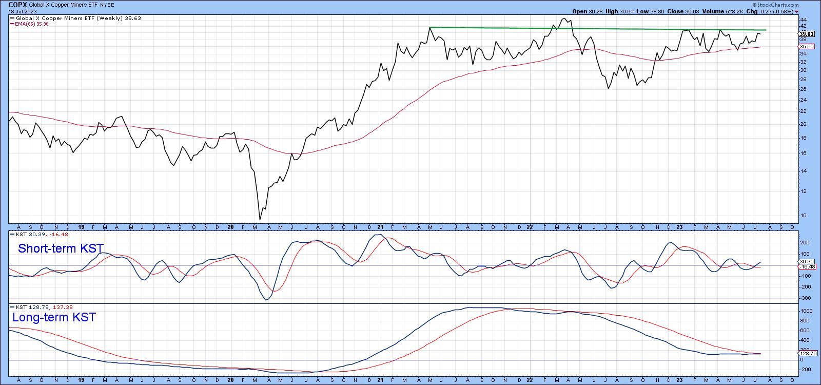
Most of the time, copper shares move closely with the copper price. Chart 6 features the Global X Copper Miners (COPX), where it is evident the price has been consolidating its 2020-21 gains for the last couple of years. If a genuine upside break materializes, that would represent a big boost in the fortunes of the metal itself. The bullish short-term KST suggests that a breakout may not be far away. If so, such action could involve the long-term KST crossing above its 26-week EMA. It's virtually there already.
 Chart 6 Chart 6
Copper and Emerging Markets
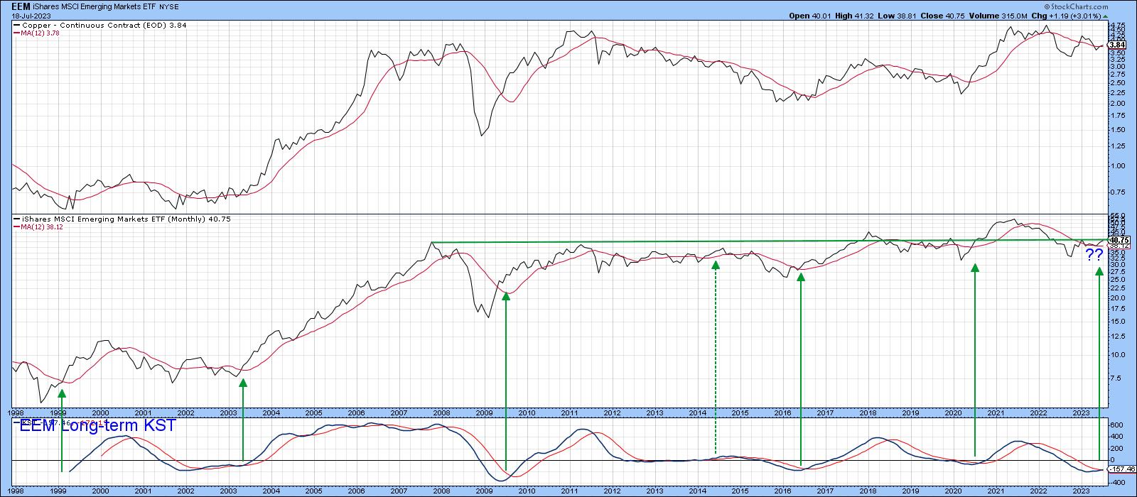
A substantial number of emerging markets are sensitive to swings in commodity prices. We have already seen that copper leads or coincides with commodity prices, so it would be reasonable to suspect that there is a relationship between emerging markets and copper, other than the obvious direct connection with copper mining itself. This relationship is featured in Chart 7, where the copper price has been plotted in the upper window and the iShares Emerging Markets ETF (EEM) appears in the middle one. There may be a couple of obvious divergences between them, such as the copper double top formed between 2006 and 2008. However, pretty well every large price swing was experienced by both parties. Neither, for instance, has experienced any net gain since 2008.
 Chart 7 Chart 7
A key point here is that the EEM is poised to experience a major upside breakout, as it is above its 12-month MA and is experiencing a positive long-term KST. The green arrows indicate that such signals have usually been followed by a rally. Given the history between Dr. Copper and the EEM, is it likely that the copper price will not be far behind in the event that the EEM breaks above its multi-decade resistance trendline.
Good luck and good charting,
Martin J. Pring
The views expressed in this article are those of the author and do not necessarily reflect the position or opinion of Pring Turner Capital Group of Walnut Creek or its affiliates.
|
| READ ONLINE → |
|
|
|
| ChartWatchers |
| Hidden Gems: A Simplified Method to Find the Best Stocks |
| by Jayanthi Gopalakrishnan |

When broad equity indexes move higher and higher and you don't actively add stocks or ETFs to your portfolio, it's natural for you to think that you may have missed the ride, as some of the stocks you really wanted may now be priced too high. This may tempt you to look for cheaper stocks, which can get tricky. There's nothing wrong with buying cheap stocks; you just need to adopt a smart approach.
In How to Trade In Stocks, one important point Jesse Livermore mentions is that, when you select securities to trade, you should "stay with the powerful healthy Industry Groups." This is very helpful advice, but how do you find bargain stocks within healthy industry groups? The best way—perform a top down analysis.
Start With the Leading Sectors
Each day presents a different story, so, when looking at the bigger picture, it's best to look at a longer-term time frame when identifying the strong sectors. Let's examine a hypothetical situation, although it's not far removed from what the stock market is going through in the second half of 2023.
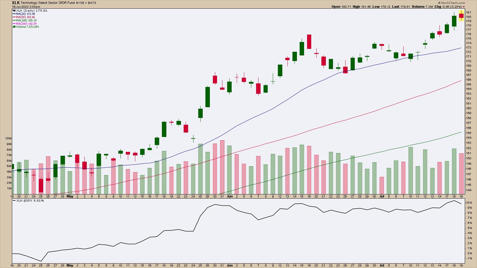
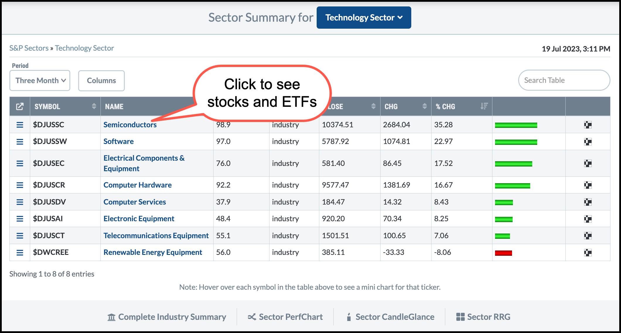
Looking at the StockCharts Sector Summary tool, you can see that, in the last three months, the Technology sector was the clear leader. The three-month daily chart of the Technology Select Sector SPDR Fund (XLK) below shows that the ETF started outperforming the S&P 500 index ($SPX) in April 2023.

CHART 1: TECHNOLOGY SELECT SECTOR SPDR FUND (XLK). The Technology sector was the top-performing sector in the last three months, which is reflected in the chart of XLK.Chart source: StockCharts.com (click chart for live version). For educational purposes.
XLK has traded above its 20-day simple moving average (SMA) since early May. The ETF bounced off the 20-day SMA a couple of times. As long as XLK continues rising, stocks within this sector should continue to perform well. But that doesn't necessarily mean every stock within the sector will perform well.
Again, the Sector Summary tool can help you narrow your stock search. Click on Technology Sector Fund in the name column. This will display:

CHART 2: SEMICONDUCTORS ARE THE LEADING SUBINDUSTRY. If you click on "Semiconductors" you'll see a list of stocks and ETFs that make up this sub-industry.Chart source: StockCharts.com. For educational purposes.
 How To Use the Sector Summary Tool How To Use the Sector Summary Tool
- From Your Dashboard or Charts & Tools, under Summary Pages, click on Sector Summary.
- Select time period for analysis from the Period dropdown menu (in this case, Three Month).
- Click on the name of the ETF. This displays a summary for the selected sector.
- Click on the leading industry name, which in this case is Semiconductors.
- Sort the stocks in the Semiconductor industry by any column. If you sort based on SCTR Universe (U), with large caps listed first, you can scroll down the list of stocks.
Zeroing In on Stocks or ETFs
Say NVIDIA Corp. (NVDA) is on top of the list. But its price may be a bit rich. So you look at the next stock, Marvell Technology Inc. (MRVL). The stock price is more attractive, but, when you hover your mouse over the stock symbol and view the thumbnail chart of MRVL, you may find it doesn't meet your criteria. So you move on to the next one. This is a quick way to look through the charts on the list and do a first pass.

The next hurdle is to figure out which stocks to trade. This is when you put on your analyst hat and dive deeper into the promising charts. Click on the company name or select an option from the menu on the left. If a chart looks interesting, add your favorite technical indicators and overlays and analyze away. This will narrow your focus to a few stocks, which you can add to one of your ChartLists.
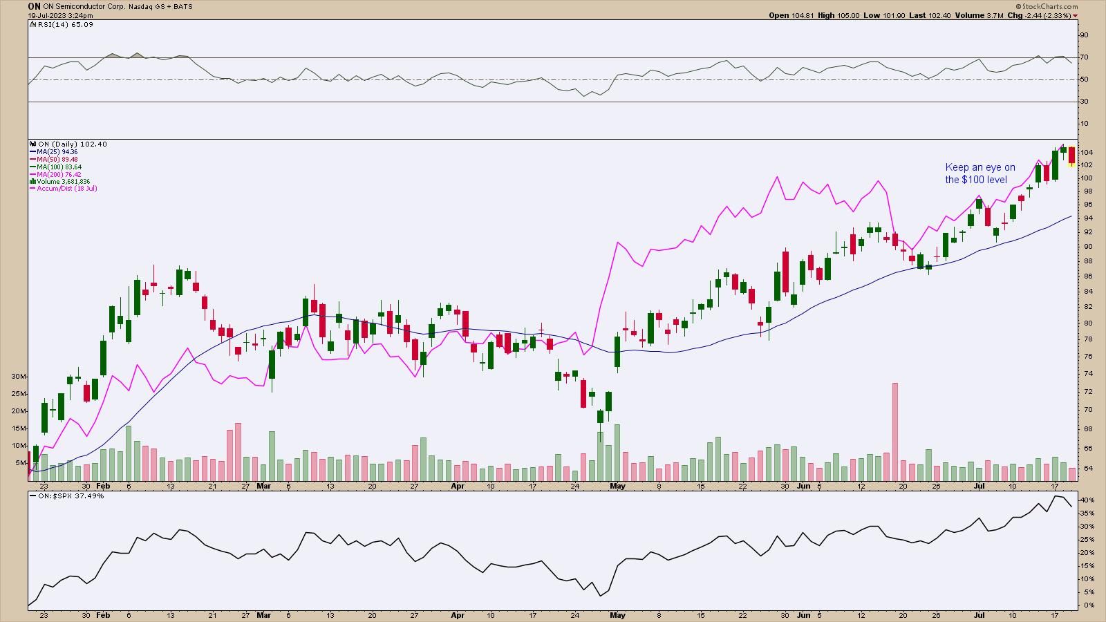
One of the charts that appealed to you is ON Semiconductor Corp. (ON). The daily chart shows the stock is trending higher (see below). Its Relative Strength Index (RSI) is below 70, and relative strength against the S&P 500 index ($SPX) is weakening. Overall, the stock is showing strength, but it looks like it may be pulling back.

CHART 3: IS ON SEMICONDUCTOR READY FOR A PULLBACK? A pullback will present a buying opportunity if the stock continues its uptrend after a pullback. The first support level would be the $100 level, which was an area where the stock paused a few days ago. If the stock fell lower, it could reach the 25-day moving average.Chart source: StockCharts.com (click chart for live version). For educational purposes.
How much lower could ON stock go before it turns around and continues its uptrend? If you look back at the chart, price has bounced off its 25-day SMA during the last significant pullbacks. If the stock pulls back to the 25-day SMA, it could present a buying opportunity. But the stock is a ways away from the 25-day MA. Before that, the stock may find support at the $100 level, since there was a pause with relatively wide-ranging price bars. If the stock pulls back to around $100, look for signs of a bounce back up on strong volume. If it doesn't reverse there, then look for the stock to go lower, toward its 25-day SMA.
Keep an eye on the RSI as well. If RSI remains between 50 and 70 during the pullback, there's a chance the stock could reverse and move back up.
It also helps to add an indicator that looks at the buying or selling pressure, such as the Accumulation/Distribution Line (ADL). In the daily chart of ON above, the ADL is overlaid on the price chart (pink line). During the upward move from May, the ADL showed strong buying pressure. As long as the buying pressure continues to dominate, the probability of an uptrend is high. In short, there's a good chance the stock may move even higher.
The Bottom Line
ON Semiconductor reached its all-time highs on Tuesday, so there's no upper resistance level. Keep an eye on support levels during a pullback. If there's enough momentum to push the stock higher, this could be a worthwhile stock to add to your portfolio.
Disclaimer: This blog is for educational purposes only and should not be construed as financial advice. The ideas and strategies should never be used without first assessing your own personal and financial situation, or without consulting a financial professional.
|
| READ ONLINE → |
|
|
|
|
|
| The Canadian Technician |
| Use These Indicators to Help with Exits |
| by Greg Schnell |
When investors get attracted to one industry, the move can be relentlessly good. Over the years, we have seen semiconductors, software, IT security, cloud, payment systems, and EVs all go on significant runs, to name a few examples.
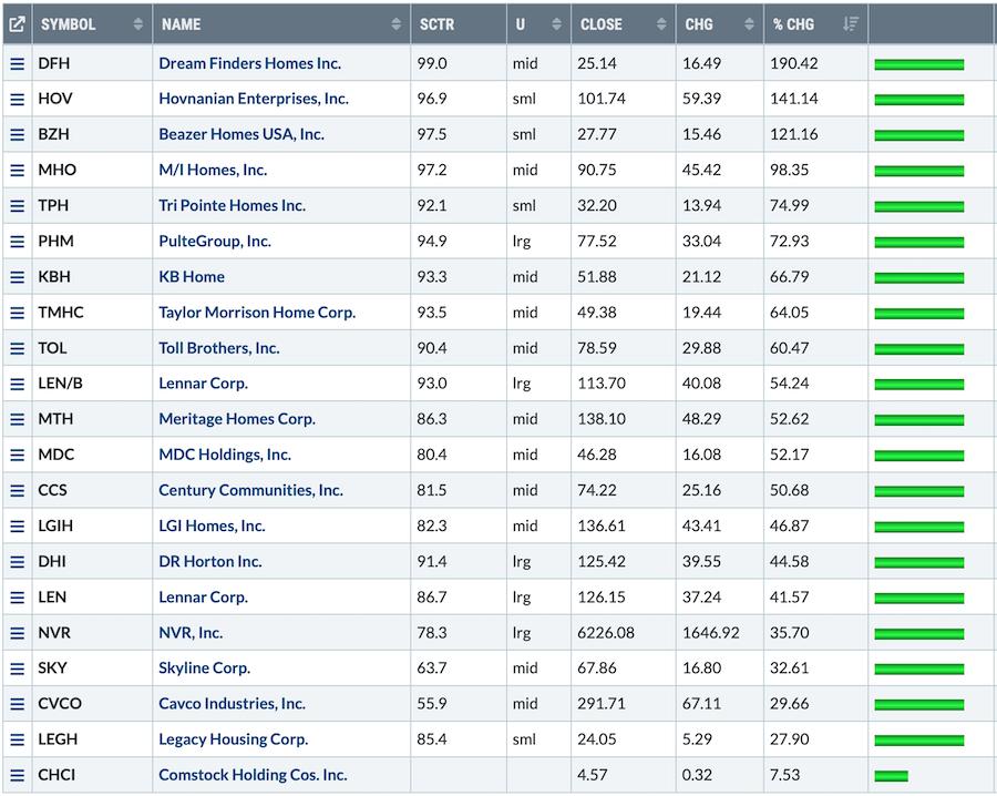
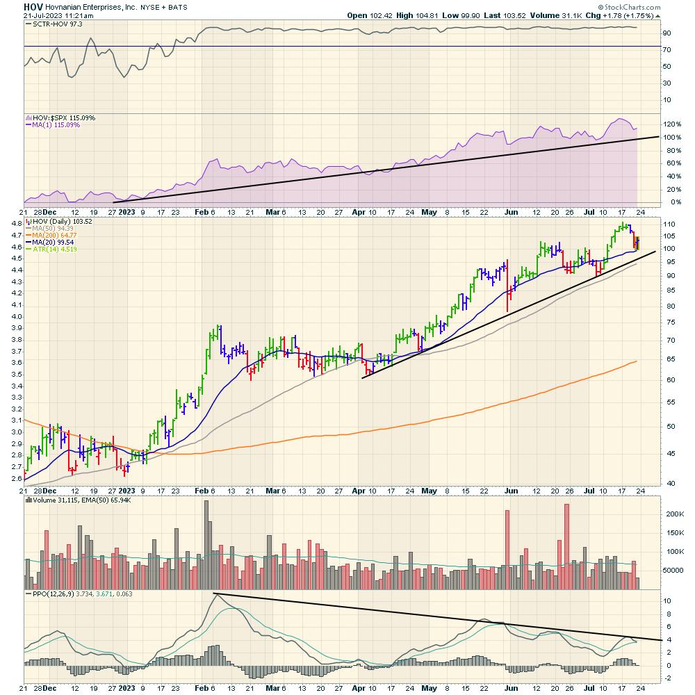
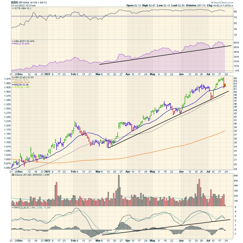
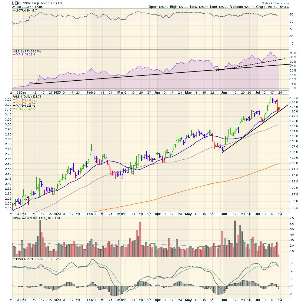
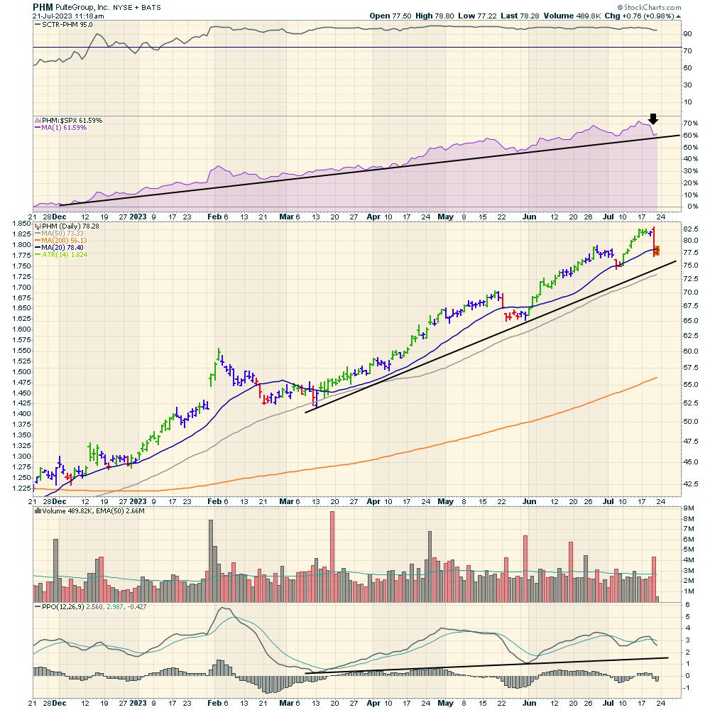
I doubted homebuilders as the mortgage rates continued to climb. But the reality is the demand for these shares has been insatiable. This table is the year-to-date move in the homebuilders, and it's remarkable! Check out the % change column!

Below, I have assembled charts of some of the homebuilders.
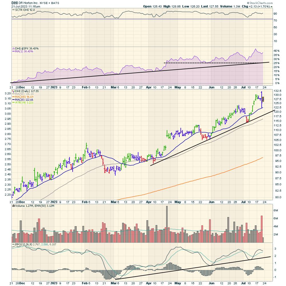
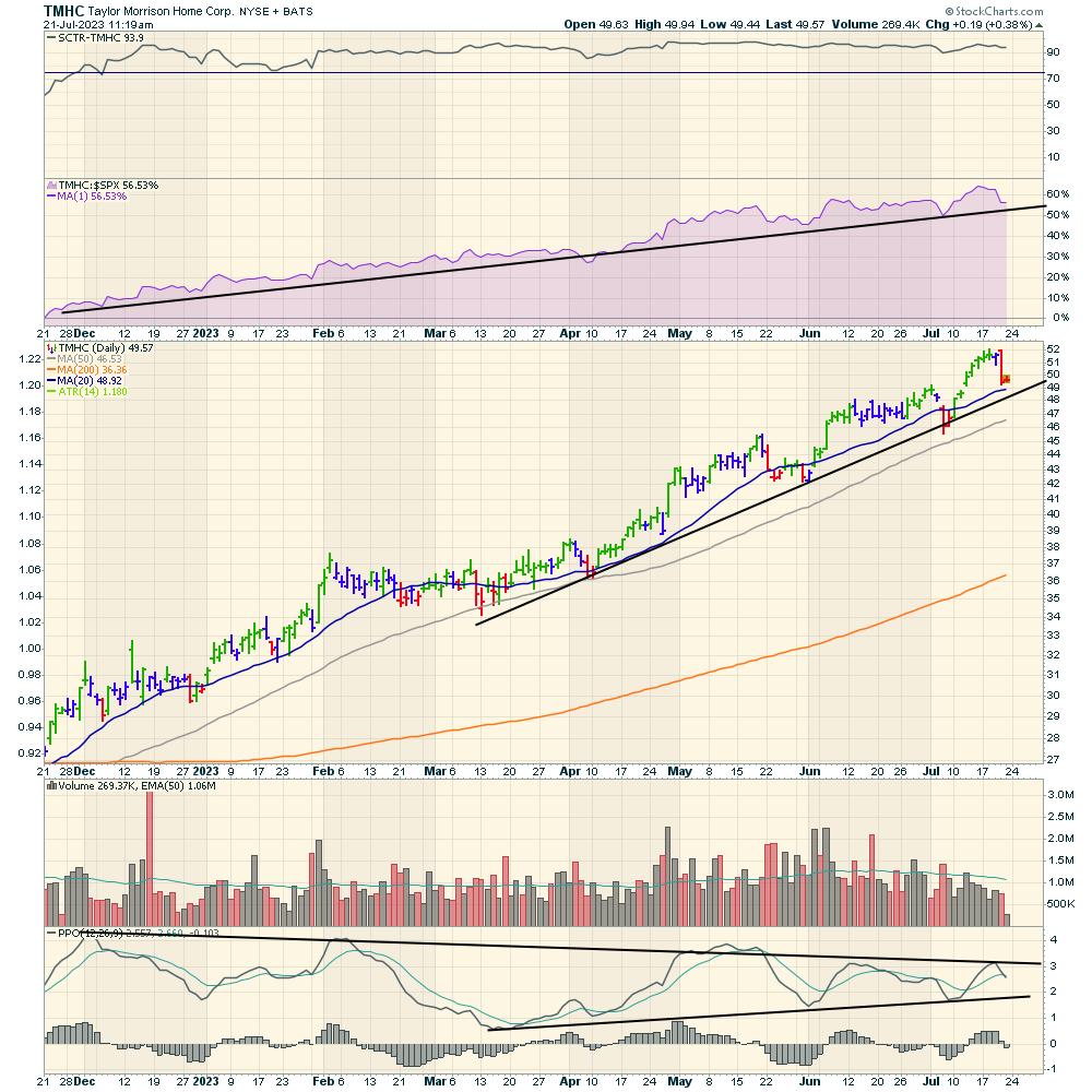
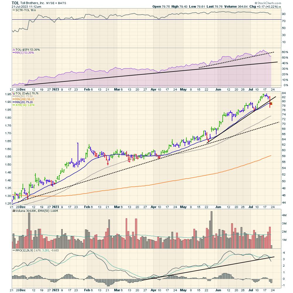
The SCTR (StockCharts Technical Ranking) proprietary StockCharts indicator can make outperformance really clear. I think it is worth commenting on how helpful this can be. The SCTR ranking on every one of these homebuilder stocks has been pinned at the top.
I like to draw a line on the SCTR at 75%. My logic for that line is that when stocks are above it, they are in the top quartile of positive price action compared to their peers.
Eventually the group will break down. How will we know? Eventually, they will no longer outperform. One of the longest periods of outperformance shown by the SCTR was on Tesla (TSLA) at 15 months, as an example. It is rare air when a stock holds up for more than three quarters.
On each chart, I'd like to highlight a few reasons to look at the SCTR, as well as other indicators.
1) The SCTR will drift below 75, but it is usually a late indicator for showing when the run in the stock is over. When the group starts to underperform, that is a very good clue that the stocks could start to perform in line with the $SPX, but, more likely, falls to underperformance. Eventually, momentum investors will sell the average performance and move to stronger stocks. This change of ownership can create weakness in the chart.
2) My purple area chart shows the relative strength (RS) compared to the $SPX. When a run is over, this indicator will start to break trend first. The trend line break is a clue that the outperformance is changing. As the indicator starts to break to three-month lows, it is more of a concern.As this happens, I like to have a strategy for taking profits. If all the stocks start to break the $SPX RS trend, it is worth trying to figure out if any of the big winners should continue to be held. The goal is to get out near the top, not round trip the gains by stubbornly holding on.
3) The moving averages are currently under the price action on all these charts. Eventually, the prices will start to drift below the moving averages. This is a more traditional approach of looking for price weakness.
4) The PPO on the daily chart will start to spend time below zero. I haven't put the weekly charts in this article, but when the weekly PPOs start to drift below zero, it's a better clue that the miraculous run is ending.
I've posted the charts with little commentary and let the trends on the charts speak for themselves. The stocks all pulled back this week, but is this the end of the run? All the charts are holding above important trend lines and bull market characteristics, but a few are starting to test some of the trend lines.
One of the homebuilder CEOs sold $50 million in stock in July. Do they see something we don't see yet? My suggestion would be to watch what investors do. It will be subtle, but it will eventually happen. I definitely don't want to waiting for earnings to slow. The stock will be off 50% by then.
These indicators help me keep the majority of my profits when trends change. I hope you'll find some of these clues helpful. If you click on the charts, you can see all the settings I use. If you come back to this article in a few weeks or months, you'll be able to see how the trend changes near the end.
DR Horton (DHI)
Beautiful uptrend from bottom left to top right. Still holding the up trend.

Hovnanian (HOV)
Long trend still holding.

KB Homes (KBH)
Long trend is still intact.

Lennar (LEN)
Lennar is still holding the long trend.

Pulte Group (PHM)
Long-term trend is still intact.

Taylor Morrison Home Corp (TMHC)
Beautiful long trend. The PPO is making lower highs on every rally, and so is losing some of the momentum.

Toll Brothers (TOL)
Short-term trends breaking, but longer-term trend is still intact.

You can click on these charts in a few weeks and see if conditions are changing.
One of the reasons we focus on the performance within an industry group is to help us see changes in market rotation. Within the Osprey Opportunities section of the Osprey Strategic website, we post charts within different themes to help our clients find excellent setups.
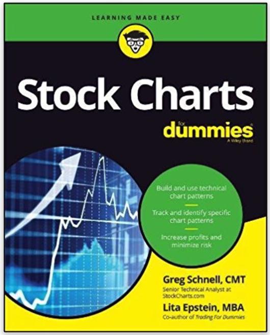
In the book StockCharts for Dummies, I focused on different methods to see relative strength. You might like this as a resource book that explains relative strength.

Below is a sample picture of the Osprey Opportunities page for our members. Each image links you into a chartlist of stocks with nice setups based on a theme or industry group.

If you like the work we do, I'd welcome the opportunity to show you what our members see. You can try out our offering at Osprey Strategic for just $7. We do broad market analysis, macro themes, individual industries, currencies, commodities, bonds, equities and a small but informative amount on Crypto.
Have a great weekend!
|
| READ ONLINE → |
|
|
|
| Trading Places with Tom Bowley |
| Opposite George Week Is Underway! |
| by Tom Bowley |
I always refer to monthly options expiration week as "Opposite George" week. It's a reference to the Seinfeld episode where George Costanza is, as always, down on his luck. Jerry and Elaine suggest that if everything he does in his life is wrong, then why not just do the opposite of every urge he has. That should then make his life so much better. George actually starts doing the opposite of his instincts and his life immediately turns. Anyhow, this same logic seems to apply to stock market performance heading into options expiration week. There's typically market maker incentive to send prices lower in certain areas of the market after a big advance, especially if these areas are heavily traded in options. Suddenly, stocks that have been rising have a lot of net in-the-money call premium (which market makers will be required to pay out) and can reverse as options expiration approaches. This weakness generally lasts into the week AFTER options-expiration Friday, but I'll save that discussion for another day.
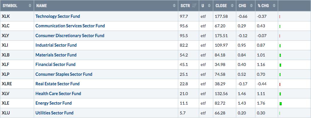
Check out today's sector performance as of 11am ET:

I sorted it in SCTR order, highest SCTR score to lowest SCTR score. Notice today's morning weakness is mostly concentrated in top-performing sectors, while strength is focused on the recently-weaker sectors. I discuss and write about this often and it's associated with monthly options expiration. While we've seen a bit of a change in this rotation over the past couple hours, don't be surprised if you see a return to Opposite George week in full force very soon.
We see the max pain effect on our major indices as well. The QQQ and SPY have both been moving up nicely, but currently have net in-the-money call premium of $1.86 billion and $2.47 billion, respectively. That's a lot of money on the table for market makers. The point at which market makers would pay the LEAST amount of net option premium, which I refer to as max pain, would be at 355 and 427 for the QQQ and SPY, respectively, resulting in possible declines of 7.61% and 5.75%, respectively. I'm not saying we'll see that kind of drop, but it's definitely possible that we'll soon see a reversal and at least head in that direction. It's just one reason to be very careful the balance of this week into early next week.
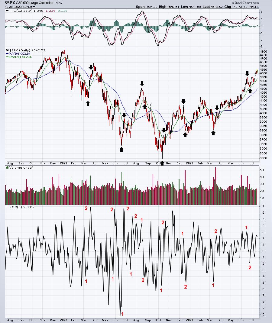
Here's a chart of the S&P 500, but check out several periods around options expiration and the reversals:

The black arrows mark short-term tops during options expiration week and then a week or so later. They also sometimes mark short-term bottoms during options expiration week and then a week or so later. The red 1's coincide with key market tops or bottoms during options expiration week, showing the 5-day rate of change (ROC). The 2's highlight that same 5-day ROC a week or so later. It's easy to see why I refer to options expiration week as "Opposite George" week.
If we keep moving higher, the odds of Opposite George week and a big reversal grow. Just keep this in mind.
Later today, at 5:30pm ET, I'll be hosting our monthly Max Pain webinar for July. It's a member-only event, but there are two ways to attend. First, you can start a 30-day trial to our full service at NO CHARGE by CLICKING HERE. Or, if you're only interested in our Max Pain service, we've made it truly affordable at just $27 per month. If you prefer this option, start your monthly service HERE. Either way, I hope to see you in a few hours!
Happy trading!
Tom
|
| READ ONLINE → |
|
|
|
| ChartWatchers |
| Gold Mining Stocks vs Gold: What's the Turnaround Trigger? |
| by Karl Montevirgen |

Popular investing articles tend to get it all wrong when it comes to gold. Most say that gold mining stocks are a way to get gold exposure. Well, they're sort of right, but over time, this advice might have taken you far...but in the wrong direction. See for yourself.

CHART 1: COMPARATIVE PERFORMANCE OF GDX AGAINST COMEX GOLD ($GOLD). Gold mining stocks have underperformed the price of gold for almost two decades.Chart source: StockCharts.com. For educational purposes.
If you had followed this advice and held gold mining stocks for the last 10+ years, well ... you can guess how badly it would've performed in your portfolio.
Why Have Gold Mining Stocks Performed So Poorly?
There are many reasons for this. But here's the "quick-and-dirty":
- Shares were diluted via frequent issuance to raise capital, and that didn't always pan out well for some miners.
- After gold peaked in 2011, miners' cost of production increased, right at a time when returns started sinking (as the price of gold started to decline).
- More stringent environmental regulations lengthen the time it takes to build new mining and production capacity. Money is tied up, and, in the meantime, interest payments, supply chain issues, bad weather, and political risks all combine to create a major vulnerability.
Okay, So What's the Upside Story?
Well, they say that the price of gold and the value of gold mining stocks are supposed to be correlated. Either it's not what it used to be, or there's some significant "mean reversion" upside that's poised to take place. If so, what's the bullish context here?
One of the key factors to consider is underinvestment, which has led to a decrease in exploration spending. If economic, macroeconomic, and geopolitical factors continue to weigh against confidence in the US dollar, then gold demand may exceed global production and supply. This means that gold mining stocks are undervalued, especially now.
What's the trigger? Some experts are saying that a break above the symbolic $2000 per ounce mark ($GOLD) would see a rise in bullish sentiment for gold miners. That would open the door for an upside mean reversion trade, so they say.
It's a nice fundamental story, but, if you're trying to fine-tune your market entry, it doesn't give you any specifics to nail down an entry point. This is where we need to look at the technicals.
GDX Revving Up a Little Escape Velocity

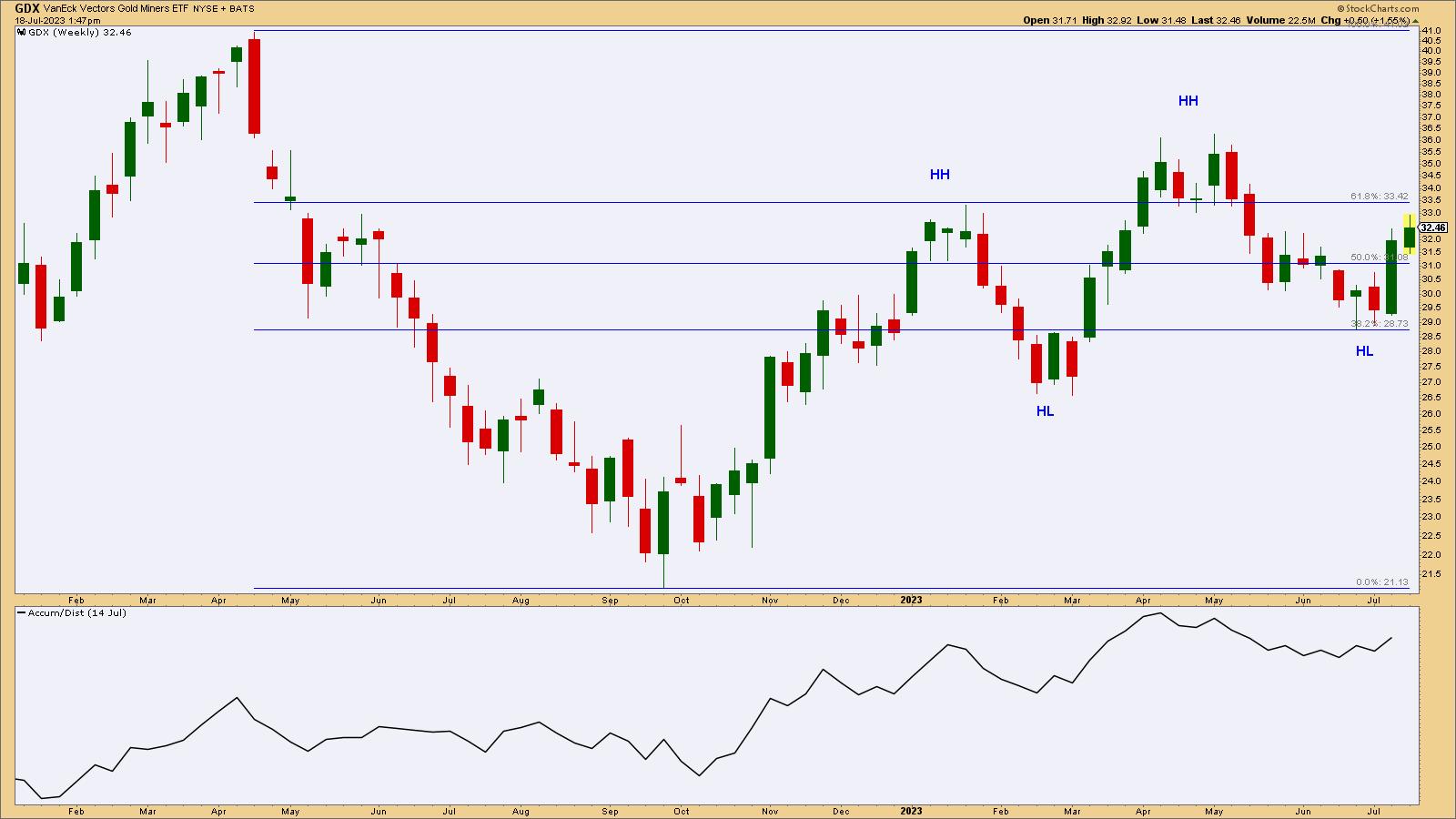
CHART 2: WEEKLY CHART OF GDX. GDX is in a clear uptrend. Will it break above its most recent HH level?Chart source: StockCharts.com (click on chart for live version). For educational purposes.
VanEck Vectors Gold Miners ETF (GDX) will be our gold mining industry proxy and our object of trade. Looking at the weekly picture, you can see that GDX is trending upward, with a series of clear higher highs (HH) and higher lows (HL) after bottoming in September 2022.
You can see from the Fibonacci Retracement levels how bears attempted to take control of GDX at each HH point, both coinciding with critical resistance at (and above) the Fib 61.8% retracement level. Though each rally attempt was met with bearish pressure, the bullish uptrend remained intact and is now about to challenge those levels again.
Simply put, for the current uptrend to continue, GDX must break through the most recent swing high at $36.25 while avoiding falling below the most recent swing low point at $28.75. The Accumulation Distribution Line, also trending upward, gives bulls a fairly encouraging picture of the buying pressure and money flow that may serve as some confirmation for GDX's more fundamental trigger ($GOLD exceeding $2,000) and tailwind (market sentiment surrounding the dollar and gold's demand/supply expectations given the drop in production expenditures).
Does GDX Have a Favorable Entry Point?
If you're bullish on gold miners and are looking for an entry point, there are two potential entry points to consider. Let's take a look at the daily chart:

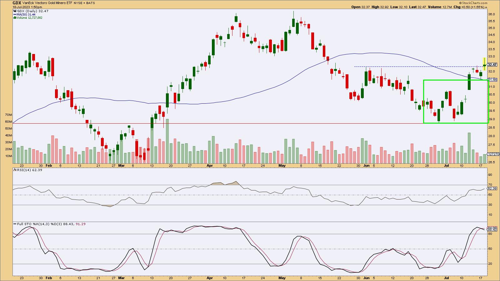
CHART 3: DAILY CHART OF GDX. The chart illustrates a favorable buying zone and critical support; a break below this level would invalidate the technical uptrend thesis.Chart source: StockCharts.com (click on chart for live version). For educational purposes.
First, take a look at the Relative Strength Index (RSI) and the Stochastic Oscillator. While the former signals there's still room for GDX to surge upward, the stochastic picture places GDX in a potential overbought territory (though such readings have been known to remain at either extreme there for an extended period). Either way, GDX may or may not be due for a pullback, though it exhibits the potential to do so.
An early and aggressive entry would have been the break above local resistance at $32.30 with a stop below the 50-day simple moving average (SMA) at $31.44. If GDX pulls back, you'll get stopped out, but the loss should be minimal.
A second entry point would be at or below the breakout level but above the swing low and highest HL (see weekly chart) of $28.75. Looking at the green rectangle, buying at these levels, especially during a pullback, makes for a favorable entry range. But remember that a break below this level would invalidate the uptrend thesis (see the weekly chart above). This means that $28.75 is the "uncle point" for a long trade.
As far as profit targets are concerned, it depends on whether you're aiming for a swing trade or a longer-term investment. The closest upside price target would be at the resistance level of $36.25, while the more distant target would be at the April 2022 high of $40.90.
The Bottom Line
To wrap it all up, most "pop finance" advice you'll find about buying gold mining stocks tends to oversimplify the issue. These stocks have struggled in the past 10 years due to over-issuing shares, higher mining and production costs, and new environmental regulations. However, people aren't investing as much in finding new gold. And with global issues making the dollar less reliable, the demand for gold might rise. This could make gold mining stocks worth more than their current price. GDX is slowly gaining steam. But will it rev up enough escape velocity to break away from its decade-long doldrums? We'll see.

Disclaimer: This blog is for educational purposes only and should not be construed as financial advice. The ideas and strategies should never be used without first assessing your own personal and financial situation, or without consulting a financial professional.
|
| READ ONLINE → |
|
|
|
| MORE ARTICLES → |
|
 Chart 1
 Chart 2
 Chart 3
 Chart 4
 Chart 5
 Chart 6


