| THIS WEEK'S ARTICLES |
| The Mindful Investor |
| Look Out Below! The Bear Case For Apple |
| by David Keller |
 The big news for Apple Inc. (AAPL) this week was a huge antitrust case from the US government. While the outcome of that particular situation is uncertain, one reality that has been quite certain is that AAPL is no longer pounding higher like its "magnificent" brethren. The big news for Apple Inc. (AAPL) this week was a huge antitrust case from the US government. While the outcome of that particular situation is uncertain, one reality that has been quite certain is that AAPL is no longer pounding higher like its "magnificent" brethren.
Today we'll show how the technical picture for Apple has gone from bullish to neutral to bearish, why multiple timeframes can be super valuable in separating the signal from the noise, and how we can identify potential downside objectives for stocks in breakdown mode.
I was taught, "When in doubt, zoom out." So, with that in mind, let's start with the weekly chart.
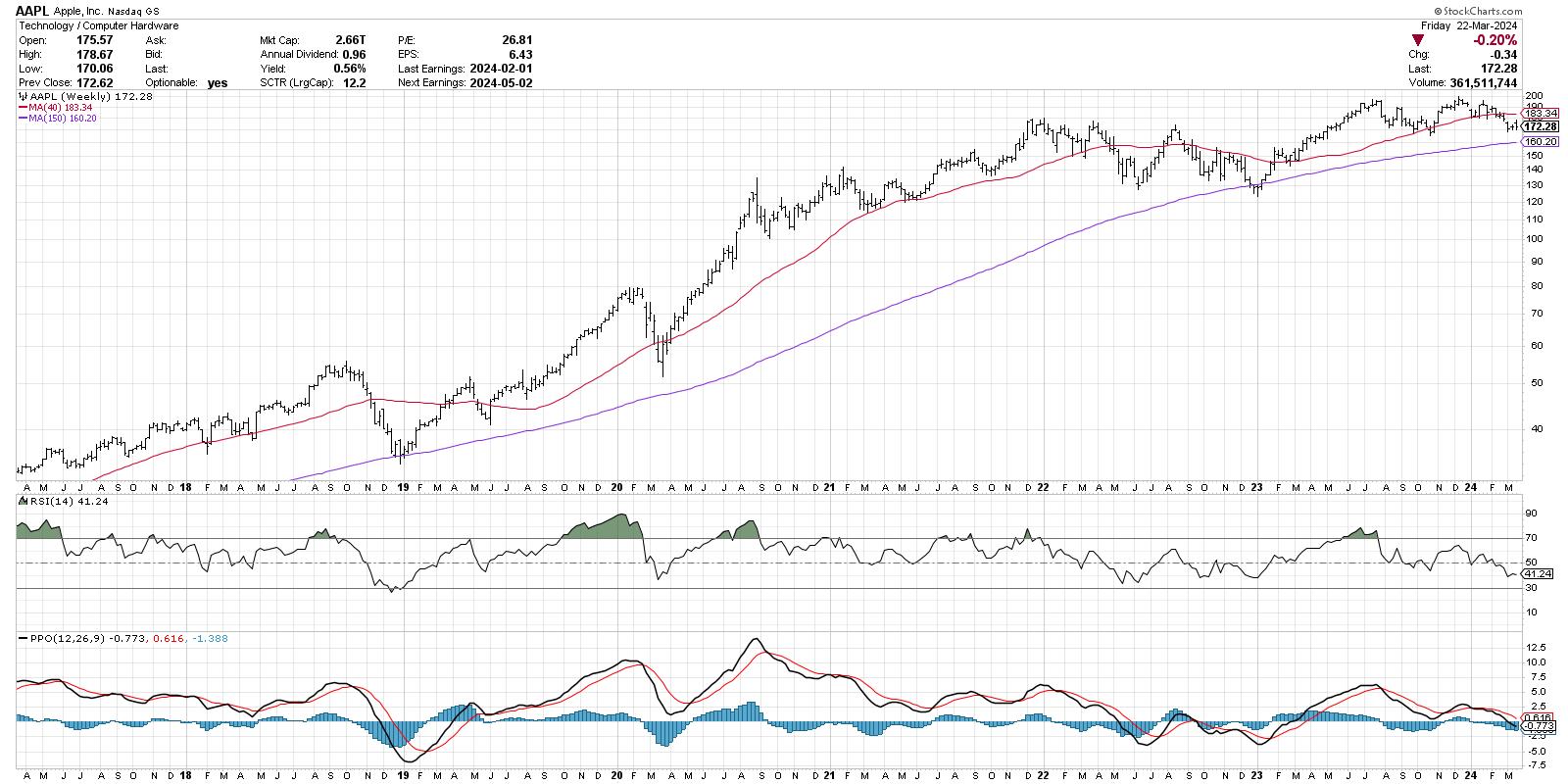
Three things stand out as I review the last seven years of Apple's price history. First, the long-term story is quite constructive, with the stock going from below $40 to almost $200 in less than five years. The 150-week moving average, one of my favorite long-term gauges of trend, has been sloping higher, and numerous tests of the 150-week moving average on the way up have held just fine.
Second, we observe a couple breaks of the 40-week moving average, which I use on the weekly chart because it lines up well with the 200-day moving average. The last time we had a confirmed break of the 40-week moving average was in Q2 2022, which ended up leading to an additional decline until the eventual low in December 2022.
Finally, the PPO indicator generated a sell signal in July 2023, when the PPO line broke down through the red signal line. This pattern tends to occur after a long bull phase, and suggests that the July peak was a meaningful one for AAPL.
The next chart we'll review uses my Market Trend Model, a proprietary model based on a set of weekly exponential moving averages. This model gives a trend signal for three time frames: short-term (a couple days to a couple weeks), medium-term (a couple months), and long-term (over a year).
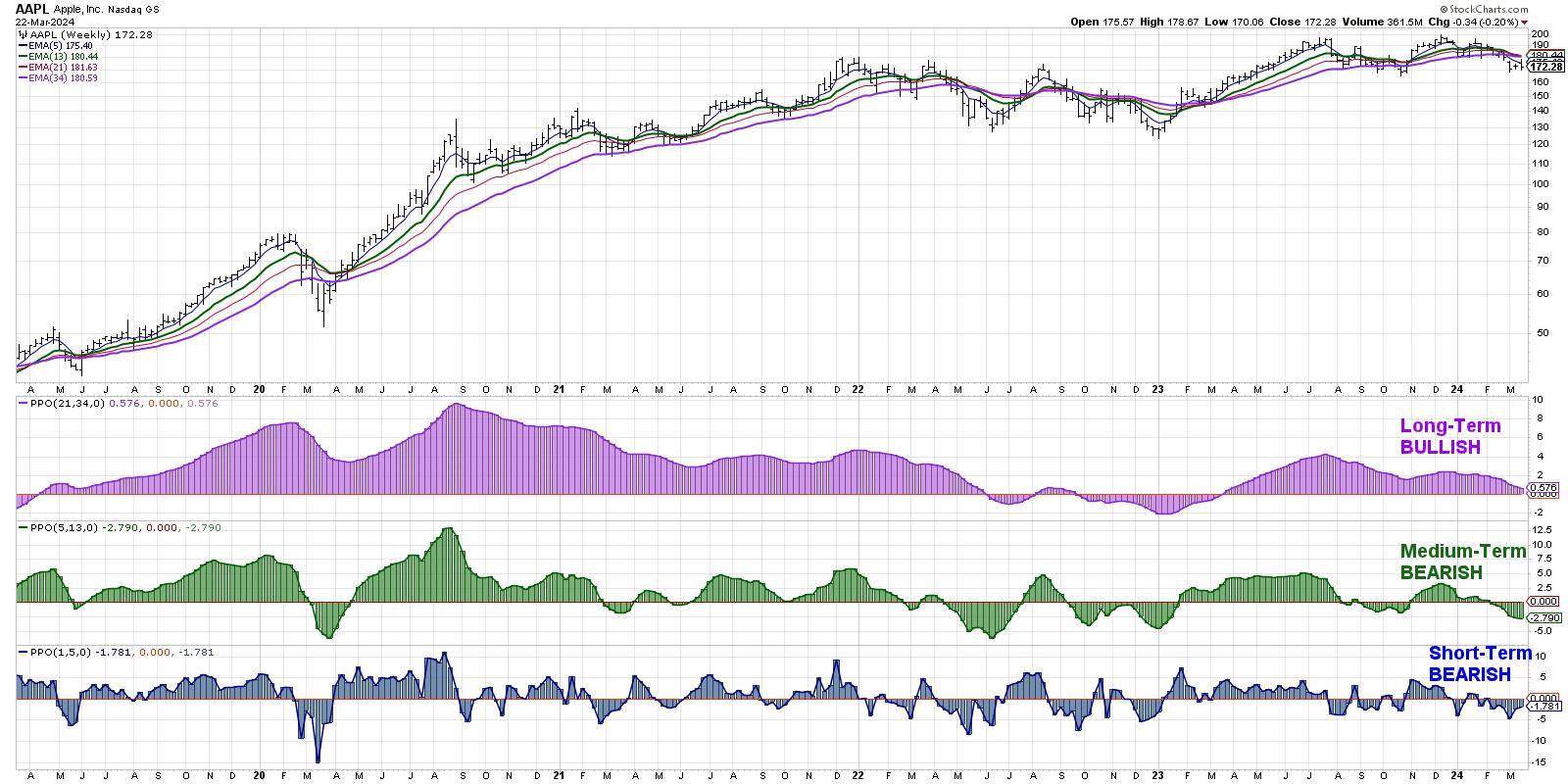
At this point, the model is reading short-term bearish, medium-term bearish, and long-term bullish. This lines up with our initial review of the weekly chart, in that the long-term story appears constructive, but the evidence has been mounting in recent months that the July 2023 high was a significant one for the stock. It's worth noting that the long-term model is very close to turning negative, which would be the first bearish signal since September 2022.
Now let's check the daily chart to see how last week's price action relates to the longer-term trends we've observed thus far.
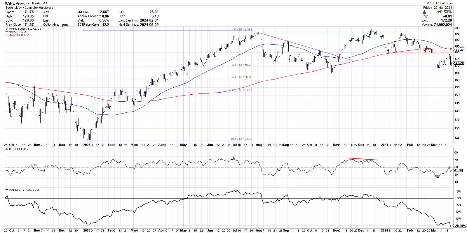
Here, we can see the double top pattern where the December 2023 high lined up almost perfectly with the July 2023 high. After a subsequent retest of this resistance level in January 2024, Apple dropped from a peak just below $200 to its recent swing low around $169.
Taking the January 2023 low and July 2023 high as a framework, we can use Fibonacci retracements to identify potential downside targets. The 38.2% level hits right around $169, which lines up with the September and October 2023 lows, as well as the recent price action for AAPL.
The red-dashed line represents a support level drawn from the January 2024 test of the 200-day moving average. There were four additional tests of this support level before AAPL finally broke below at the beginning of March. The last few weeks have seen Apple bounce between support around $169 and resistance around $180, giving us a fairly clear range with which to consider the next move for this key growth stock.
If AAPL would break below this confirmed support level around $169, that would represent a new 10-month low and open the door to further support around $160, and perhaps even the 61.8% retracement level around $152. If, however, investors become optimistic on Apple's prospects despite the recent antitrust claims, a break above $185 would mean a valid break above resistance as well as the crucial 200-day moving average. In that case, a retest of the all-time highs around $200 would seem a plausible scenario.
The most concerning feature of this chart, by far, would be the declining relative strength in the bottom panel. The downtrend in this series shows that while Apple has begun its short-term decline off all-time highs, the stock has underperformed the S&P 500. Owning names that underperform the S&P 500 is a sure way to underperform the S&P 500 in your portfolio!
While this week's news on Apple has caused many to revisit a bullish thesis on this long-time winning stock, a thorough review of the weekly and daily charts tells a potentially dire story that has been building for months. Mindful investors know that technicals tend to lead the fundamentals, and a weakening chart is usually a sign of an ominous future!
RR#6,
Dave
P.S. Ready to upgrade your investment process? Check out my free behavioral investing course!
David Keller, CMT
Chief Market Strategist
StockCharts.com
Disclaimer: This blog is for educational purposes only and should not be construed as financial advice. The ideas and strategies should never be used without first assessing your own personal and financial situation, or without consulting a financial professional.
The author does not have a position in mentioned securities at the time of publication. Any opinions expressed herein are solely those of the author and do not in any way represent the views or opinions of any other person or entity.
|
| READ ONLINE → |
|
|
|
| Larry Williams Focus On Stocks |
| MEMBERS ONLY |
| Larry's "Family Gathering" March 19, 2024 Recording |
| by Larry Williams |
|
It's March Madness in the stock market! In this video, Larry begins by presenting his Trading Days of the Month (TDOM) for the rest of March, as well as the days to hold back on trading. He also presents what he dubs his "Machu Picchu" trade...
|
| READ ONLINE → |
|
|
|
| Art's Charts |
| Rates Look Set to Rise as TLT Resumes its Downtrend |
| by Arthur Hill |
 The 20+ Yr Treasury Bond ETF (TLT) failed again at the falling 40-week SMA and looks poised to resume its bigger downtrend. Keep in mind that bonds and yields move in the opposite direction. A resumption of the downtrend in TLT translates into a resumption of the uptrend in the 10-yr Treasury Yield. The 20+ Yr Treasury Bond ETF (TLT) failed again at the falling 40-week SMA and looks poised to resume its bigger downtrend. Keep in mind that bonds and yields move in the opposite direction. A resumption of the downtrend in TLT translates into a resumption of the uptrend in the 10-yr Treasury Yield.
The chart below shows TLT hitting resistance-reversal zones twice: November 2021 and December 2023 (red shading). A key tenet of technical analysis is that broken support turns into future resistance and these resistance levels stem from broken supports. Notice how TLT broke down in early 2021 and then returned to broken support with the rising wedge (blue lines). See the end of this article for special offer from TrendInvestorPro.
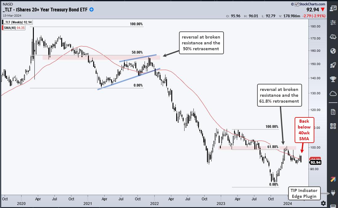
Another key tenet of technical analysis is that counter-trend advances retrace one to two thirds of the prior decline. In 2021, the counter-trend bounce retraced 50%. Think of this as two steps down and one step up. Downtrends prevail as long as the down legs are bigger than the counter-trend bounces. The rising wedge was a counter-trend advance. TLT broke down in early 2022 and fell into October 2023.
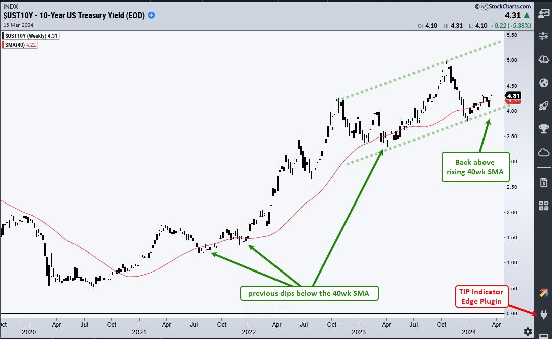
After hitting a new low in October 2023, TLT surged along with stocks in November and December. This surge also returned to broken support and broken support again turned into resistance (red shading). This advance also retraced around 61.8% of the prior decline. TLT is again failing at resistance as it fell back below its falling 40-week SMA this week. The next chart shows the 10-yr Treasury Yield turning back up and crossing above its 40-week SMA. A continuation higher targets a move towards 5.5%.
TrendInvestorPro offers two services - and a limited time offer for both. First, System Trader provides data-driven momentum strategies for Nasdaq 100 and S&P 500 stocks, and a mean-reversion strategy for Russell 1000 stocks. Second, Chart Trader reports and videos focus on stocks and ETFs with uptrends and tradeable patterns. Each week we cover the overall market environment and then feature highly curated trading ideas. Click here to learn more and get immediate access.
|
| READ ONLINE → |
|
|
|
| Martin Pring's Market Roundup |
| MEMBERS ONLY |
| Is China a Basket Case or a Screaming Buy? |
| by Martin Pring |
|
By now it's common knowledge that the Chinese property sector is in crisis, foreign investment has slowed, and youth unemployment is at record levels. Should be time to sell Chinese equities, right? After all, we don't know when the other shoe is going to drop...
|
| READ ONLINE → |
|
|
|
| RRG Charts |
| Energy: A Long-Term Turnaround in Relative Strength is Brewing |
| by Julius de Kempenaer |
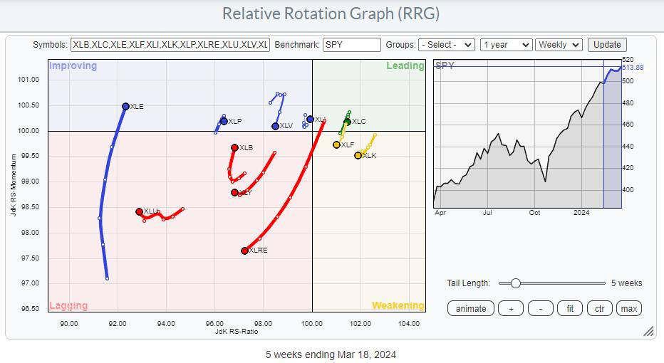
Energy Improving in Three Time Frames
Watching the sector rotation at the start of this week shows a continued improvement for the Energy sector (XLE). Even though XLE has the lowest reading on the JdK RS-Ratio scale, it has a long tail, and has just entered the improving quadrant.
This will happen after a very long rotation and at very low RS-Ratio levels, but, when I combine this rotation with the XLE tails on the daily and monthly RRGs, it becomes interesting.
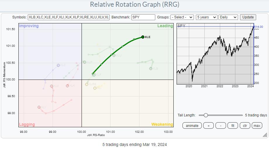
On the daily RRG, you can see the tail is well inside the leading quadrant and still pushing higher on strong momentum. The RRG-Heading has slowed slightly, but is still within 0-90 degrees.
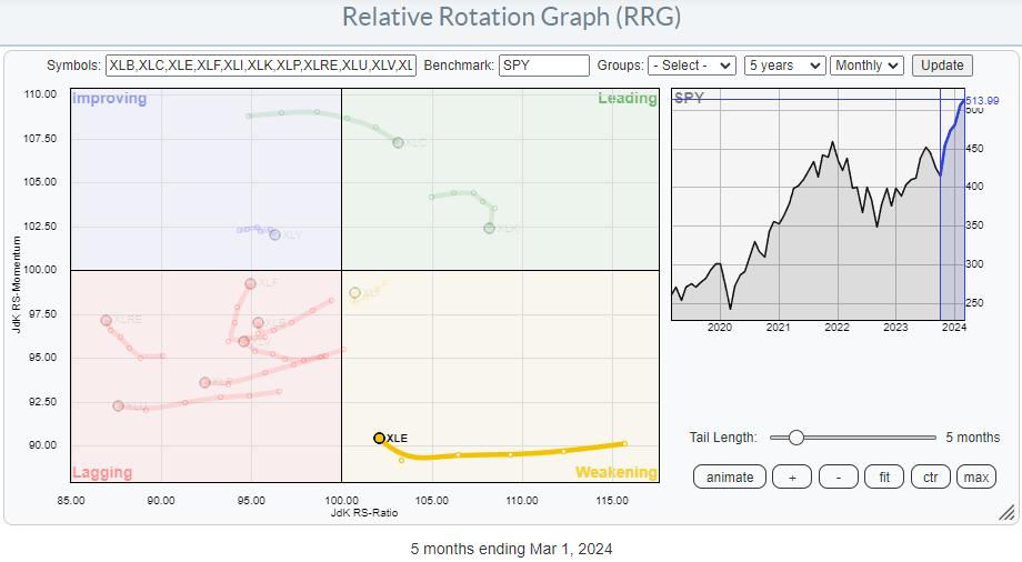
On the monthly RRG, the XLE tail is still inside the weakening quadrant and is starting to hook back up. This is interesting, as it signals the potential start of a new up-leg in the already existing relative uptrend.
All in all, this means we now have positive developments for the energy sector in all three timeframes.
Getting Close to Major Overhead Resistance Area
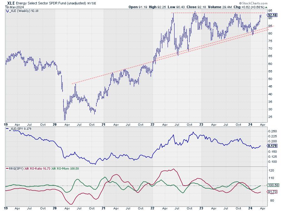
And the improvement is not only relative. On the price chart, XLE is now moving towards overhead resistance offered by four major highs since 2022, which were all set just below 95.
Be careful; with the big rallies that have taken place in major markets and sectors, it is easy to think that breaking that 95 barrier in XLE would mean a break to new all-time-highs. However, that is NOT the case for the energy sector, as you can see on the monthly chart below.
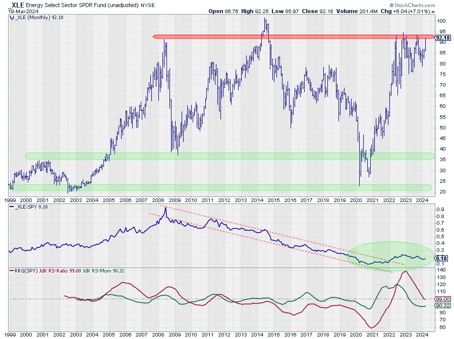
The 95 area is undeniably an important resistance level and, once broken, would certainly fuel (pun intended) a further rally towards the all-time-high level for XLE, which is at 101.52 in June 2014. That's almost ten years ago!
What is also interesting to see is that XLE tested support coming from lows dating back as far as 1999 and 2002 around 20, only four years ago in 2020. Out of that low, a 475% rally emerged, taking XLE from 26 to 95 -- more than any other sector in the same time period.
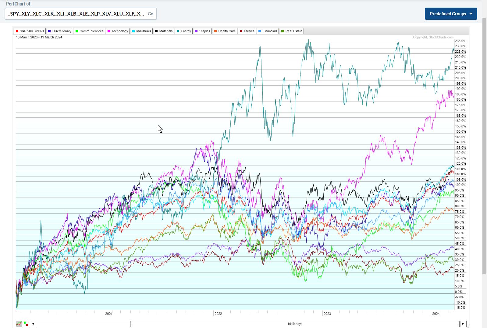
This PerfChart shows the performance for all sectors since the March 2020 low. The teal line at the top is XLE. Only XLK in purple comes close to the performance of XLE, and only because of the rally that started in October 2022.
Long-Term Turnaround in the Making
It is this huge outperformance that has kept the XLE tail on the monthly RRG on the right hand side of the graph for so long, and the recent relative improvement is causing this monthly tail to start curling up again.
As you know, the usual message in case of a hook back up inside the weakening quadrant is for starting a new up-leg within an already rising relative trend. Looking at the monthly chart of XLE in combination with the RRG-Lines and raw RS above, that is exactly what seems to be happening. And it is happening after an initial rally that ended a relative downtrend of XLE that started back in 2008.
When the raw RS value of Energy vs. SPY climbs above 0.25, an acceleration in relative strength and a much further rally in favor of Energy is likely.
--Julius
|
| READ ONLINE → |
|
|
|
| "Fill the Gap" with the CMT |
| The Bond Market is Signaling a Potential Short-Term Trading Opportunity |
| by Stewart Taylor |

In our last piece, we presented a long term/secular outlook for intermediate-term Treasuries, where we concluded that the structural break above the secular downtrend from the September 1981 high, coupled with the push above the November 2018 pivot @ 3.25%, has changed the long-term secular trend from lower (a bull market) to neutral. More work is needed to move the secular trend from neutral to bearish. In this piece, we'll assess how the weekly chart might interact with the monthly chart, and then begin to think about how investors can react to various scenarios as they are set up over the course of the next several weeks and months.
As a warning, my analysis of the shorter perspective time frame didn't leave me with an actionable trade or even a clear expectation for a probable outcome over the next few weeks. I think the market is ready to move away from the current congestion zone, and I suspect that the direction out of the zone will provide shorter-term traders with ample opportunity for entries. This analysis has allowed me to identify the important chart points/zones around which I will pay particular attention to behaviors and market structure, and to define appropriate trading plans.
10-Year Treasury Yield: Annual Perspective
The chart below is the yearly perspective of the 10-Year Treasury note (INDX).

Chart 1: Annual Chart of the 10-Year Treasury Yield
Note the break of the secular downtrend and the push above the 3.35% pivot. It's worth noting that the Moving Average Convergence/Divergence (MACD) oscillator has turned higher for the first time since 1985.
Keep in mind the following points:
- The basic definition of an uptrend is a market consistently defining higher highs and higher lows. For instance, a great example of a downtrend can be seen in the annual 10-year Treasury chart, where, over several decades, yields consistently made lower lows and lower highs, defining a very clear and obvious bull market (yields down/prices up).
- For bonds to begin defining a secular bear (bond prices down/yields up), it will require yield to set back from a high pivot, define a higher low pivot, and subsequently make a substantive new high. From that point, you can draw tentative annual and monthly trendlines, and channel projections. You can also make Fibonacci and point-and-figure price projections. Importantly, this structure would define a secular bear and place weekly and monthly momentum harmoniously with annual momentum. I expect this transition to occur over the next 12–18 months.
- The biggest question in my mind is whether last October's 4.98% high print marked the terminal point for the bearish structure that has built since the 0.40% low. I suspect that is indeed the case and that, by mid-year, yields will be falling. However, there is also a reasonable case for one final push higher into the stronger resistance zone at around 5.25%, before subsequently setting back and defining the higher low. Given this view, the evolution of the weekly chart over the next few months becomes particularly important.
10-Year Treasury Yield: Weekly Perspective
Below is a weekly chart of the 10-Year US Treasury Yield ($TNX).

Chart 2: Weekly Chart of the 10-Year Treasury Yields Note the following points of the chart:
- Bonds typically build reliable channels and trendlines, but the move from 0.40% is atypical in that a solid trendline or channel is difficult to find.
- Since the move from the low doesn't provide a solid trendline or channel, I am focused on the 2.52–3.25% (A-B) trend line. The decline from 4.98% since last October has repeatedly weakened it, and the bounce from the trendline has been very modest.
- The inability of the trendline to generate selling (higher yields/lower prices) suggests that the pressure isn't strong.
- It is likely that a decline below the 3.79% pivot would likely stretch back to the 3.25% pivot, with a higher likelihood of the area around 2.65% (retracing roughly 1/2 of the 0.40% to 4.98% move).
- The move from 3.79% has generally presented as a bull (lower yield/higher price) flag. Flags are usually corrective against the trend. Note that volume during the period has declined significantly (as would be expected), albeit from the extremely high volumes that developed during the move to last October's high.
- One of my favorite patterns is the "three drives to a high or low." While this chart may technically qualify (3.48% –> 4.33% –> 4.98%) the push to 3.48% only barely qualifies, as it's not proportional to the first two thrusts. This chart is potentially set up for a final drive higher to complete the sequence, perhaps into the strong resistance at the 5.25–5.35% area.
- I will also be monitoring the price for a secondary test of 4.98%. A completed secondary test would set up for a significant bull (yield down/price up) market.
The balance of the structural evidence on the weekly chart favors lower yields, but it's a close call and not particularly actionable from these levels.
Looking At Momentum
The multiple-screen momentum perspective below is a quick filtering method I use. Importantly, momentum is fractal (robust across time frames and markets). I prefer to derive the trend through the tape, so I only use the oscillators as a quick filter.
The chart below displays the annual, monthly, weekly, and daily charts of the 10-Year Treasury Yield. Note that on the chart, we move back to yield again.

Chart 3: Annual, Monthly, Weekly, and Daily Charts of the 10-Year Treasury Yield
An important point to remember: Rising yields = lower price.
- Yearly momentum has turned toward higher yield/lower price.
- Monthly momentum has turned toward lower yield/higher price. A slight negative divergence has formed, and the monthly is at odds with the yearly.
- Weekly momentum is mixed/neutral, but attempting to turn to higher yield/lower price. This struggle around the zero line suggests that behaviors over the next few weeks will likely define the direction of the next 25–50 basis point movement.
I am most interested in the weekly trend (in rates, the weekly perspective is the most important), so I generally defer to the trend of one higher degree. In this case, the monthly is on a lower yield/higher price signal and is just now moving into the MACD quadrant, where significant declines (in yields) are likely to take place; Odds are better that the weekly will also turn to lower yield/higher price to be in harmony. But, again, the evidence is mixed. Sometimes, you just need to let the price action evolve before drawing a solid conclusion.
A Weekly Perspective of TLT (Bond ETF)
 Chart 4: Weekly Chart of TLT Chart 4: Weekly Chart of TLT
Some important points re. volume:
- Since we're viewing the iShares 20+ Year Treasury Bond Fund (TLT), we're looking at price (a downtrend is a bear market) rather than working with yield. This is because the yield indices we are using have no reported volume. The caveat here is that, in my professional capacity, I prefer to use futures volume, as they better represent institutional-rate investors, while TLT has a distinctly retail focus.
- The evidence between futures and ETF volume is conflicting. TLT showed clear signs of short-term capitulation last October, but did not display a classic selling climax.
- Futures are more ambiguous, with no clear surge in volume, but price behaviors are more consistent with a selling climax.
- Since the October low, the volume in general has remained quite high, and the upward progress is relatively modest. The poor result for the effort expended suggests that the market continues to run into quality supply. The same price/volume relationship is also present in futures.
- Note the rapid fall in volume over the last three to four weeks as the market tilted higher. This is consistent with a bear flag or pennant.
- Finally, note the volume spike (arrow) as sellers leaned into the market a few weeks ago. There are still strong-handed sellers willing to hit bids into strength.
I think the balance of evidence suggests that the market made a selling climax in October. That climax will likely hold for most of this year, but may be retested.
10-Year Treasury Yield Daily

Chart 5: Daily Chart of 10-Year Treasury Yield
Note the following points:
- Seasonal Tendency. Yields tend to set significant intermediate highs early in the year before declining into mid-year. We are near the end of the bearish (yields up/prices down) annual period. This would suggest a push lower (yield down/price up).
- Yields have struggled to move away from the uptrend (A/B) but generally have built a bull (prices up/yields down) flag. Now, they are being squeezed between the internal resistance (gray lateral trendline) and the A-B channel bottom. From this perspective, bears (yields higher/prices lower) have an advantage.
- If the market breaks higher from this zone, where would resistance materialize? If yields breakout higher from this zone, there isn't much resistance between 3.50% and last year's @ 4.89% high. Above 4.89%, 5.25–5.35% is a reasonable target.
- If the market breaks lower from this zone, a solid support confluence exists in the 3.23–3.30% zone. But it is more likely the 0.50–0.618 retracement zone in the 2.15–2.70% zone would be in play. This would likely come as the result of an economic recession.
The Bottom Line
The next few weeks should represent a significant juncture in the daily and potentially the weekly chart. The market has generally been consolidating over the last several months, and the pattern breakout could be meaningful. For shorter-term traders, the direction out of the consolidation will likely define the direction of travel into the fall. In other words, it is a go-with.
- If yields break out higher, I will likely begin selling the breakouts of bear (prices down/yields higher) flags and will view short-term declines in yields as selling opportunities. If lower, I will likely be a buyer of bull flags and setups (yields down/prices higher) as they develop.
- If the market falls away from the trendline with velocity, the first solid support there is found in the 3.79% zone.
- I continue to see a not-trivial chance of one last push higher into the 5.25–5.50% zone, before beginning a major weekly and monthly perspective correction (yield down/price up) that eventually makes the higher low. And while I see an advantage to being generally bullish over the next few months (falling yields, rising prices), the analysis is tentative, with only a small near-term advantage to the trade. In my trading, I would consider it non-actionable without additional price/volume development or reasonable structure to trade against.
In deference to my macro work and business cycle work, I will be a better buyer of bullish inflections in the weekly chart over the next few months, as I fully expect a significant economic slowdown to develop into the end of the year.
Disclaimer: Shared content and posted charts are intended to be used for informational and educational purposes only. The CMT Association does not offer, and this information shall not be understood or construed as, financial advice or investment recommendations. The information provided is not a substitute for advice from an investment professional. The CMT Association does not accept liability for any financial loss or damage our audience may incur.
|
| READ ONLINE → |
|
|
|
| ChartWatchers |
| The Stock Market This Week: What This Surging Bull Means |
| by Jayanthi Gopalakrishnan |

It was an action-packed week in the stock market. The FOMC decided to keep interest rates unchanged, and also indicated there could be three rate cuts this year. This gave the stock market a positive boost, and the broader indices—S&P 500 ($SPX), Dow Jones Industrial Average ($INDU), and the Nasdaq Composite ($COMPQ)—notched record highs. Although the market ended the week mixed, all broader indices were up for the week.
The US economy is growing at a solid pace, the job market remains strong, and inflation is starting to slow, which is enough to keep investors optimistic that the economy will see a soft landing rather than a recession. While Fed Chairman Powell's speech after the FOMC decision was similar to previous speeches, the biggest takeaway this time is that Powell implied an easing in labor market tightness and stabilization in inflation. If the trend continues in this direction, the FOMC will likely cut interest rates three times later this year.
Powell emphasized that inflation could return if the Fed eases too much too soon. And if interest rate cuts are implemented too late, that could also be a harmful situation. Incoming data will continue to be assessed, since there needs to be greater confidence that things are moving in the right direction before bringing down interest rates.
Interestingly, the recent inflation data, which came in higher than expected, didn't change things much. The Fed is confident that inflation will come back to 2%. This was good news for the market, and especially for the Financial sector.
The weekly chart of the Financial Select Sector SPDR ETF (XLF) rose sharply after the Fed's meeting. Even though it pulled back on Friday, XLF was up for the week. A slight pullback is healthy for something that has seen a steep ascent. The chart below shows that XLF is well above its support level at around $37.75, which is when the ETF broke out above a consolidation pattern.
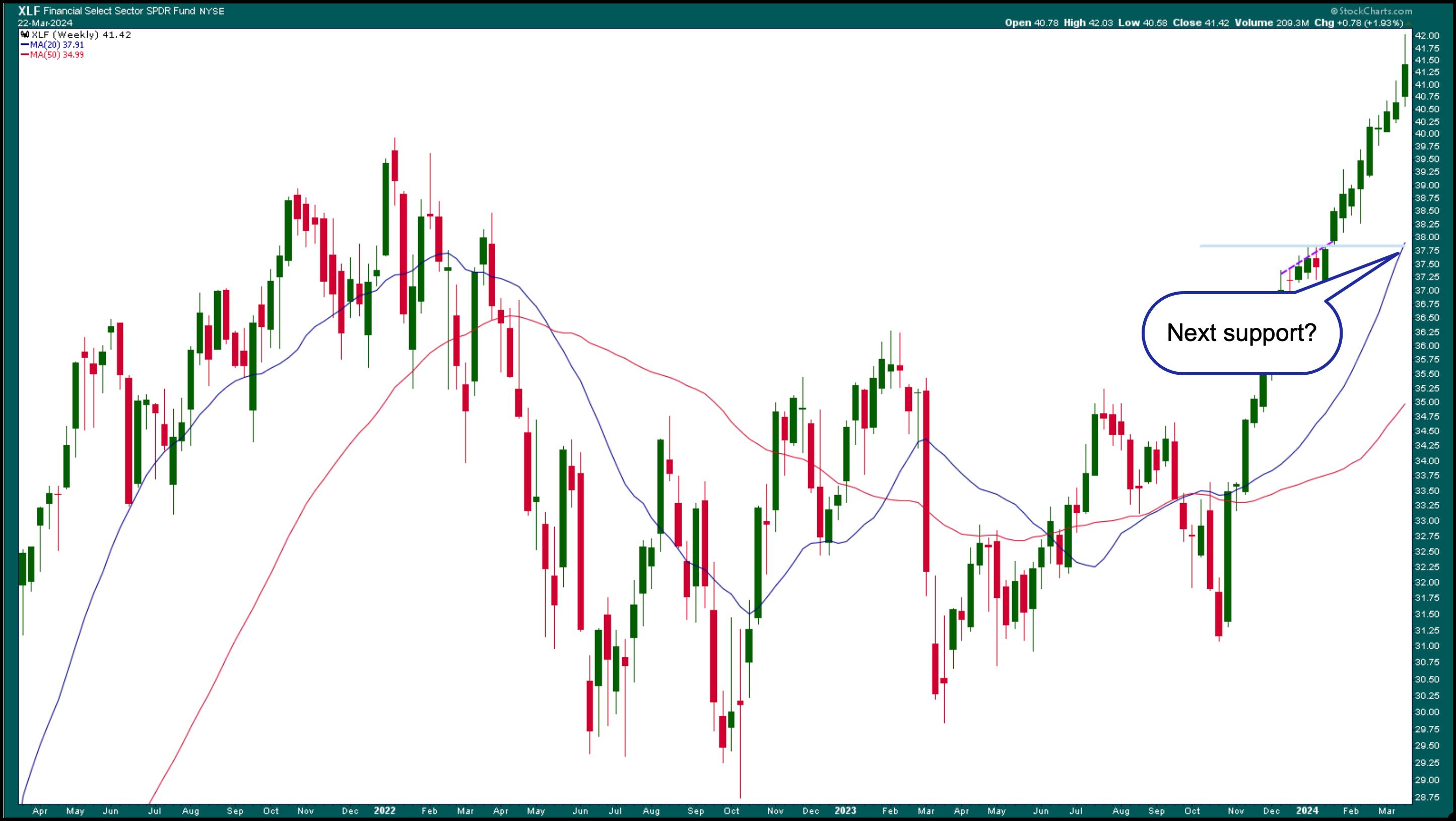
FIGURE 1. WEEKLY CHART OF FINANCIAL SELECT SECTOR SPDR ETF (XLF). The Financial sector has gained bullish traction and is trading well above its near-term support level.Chart source: StockCharts.com. For educational purposes.
It's worth adding XLF to your ChartList. If XLF pulls back further, followed by a reversal with a follow-through, then Financials could move higher, especially for the big banks. The regional banks still have some catching up—the SPDR S&P Regional Banking ETF KRE is down about 5.6% for the year. This could change once the Fed starts cutting interest rates. Small businesses will apply for loans, and demand for mortgage and auto loans could increase.
Viewing a PerfChart of the S&P 500, XLF, and KRE over one year reveals some interesting data points. Financials have marginally outperformed the S&P 500, and regional banks still have much catching up to do.
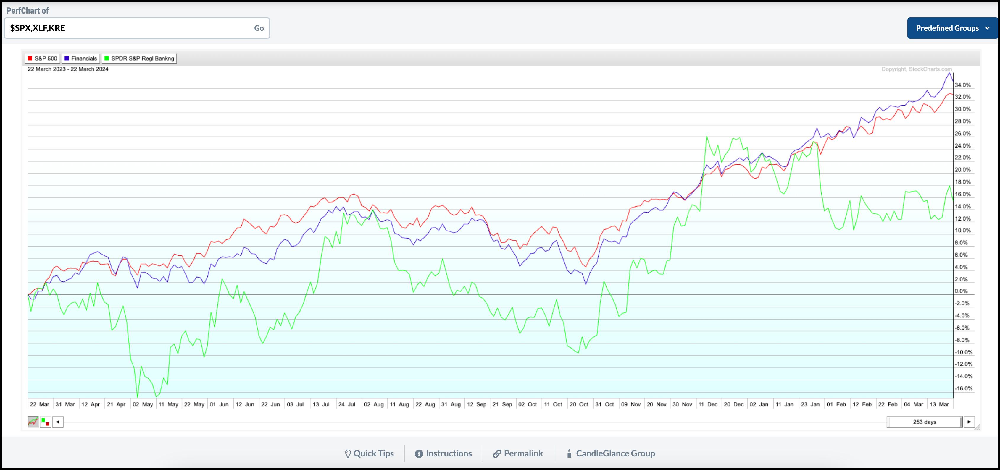
CHART 2. PERFCHART OF S&P 500, XLF, AND KRE. Financials have marginally outperformed the performance of the S&P 500 in the last year. Regional banks are at around 16% over one year.Chart source: StockCharts.com. For educational purposes.
How to View a PerfChart
- From Your Dashboard, click on the Charts & Tools tab.
- In the PerfCharts card, enter symbols $SPX, XLF, KRE
- Hit return.
The US Dollar and Gold
Besides the Fed, central banks worldwide also seemed to be more dovish. This was reflected in the US dollar action. On Friday, the US Dollar Index ($USD) gained strength as it approached its short-term resistance of 104.60.
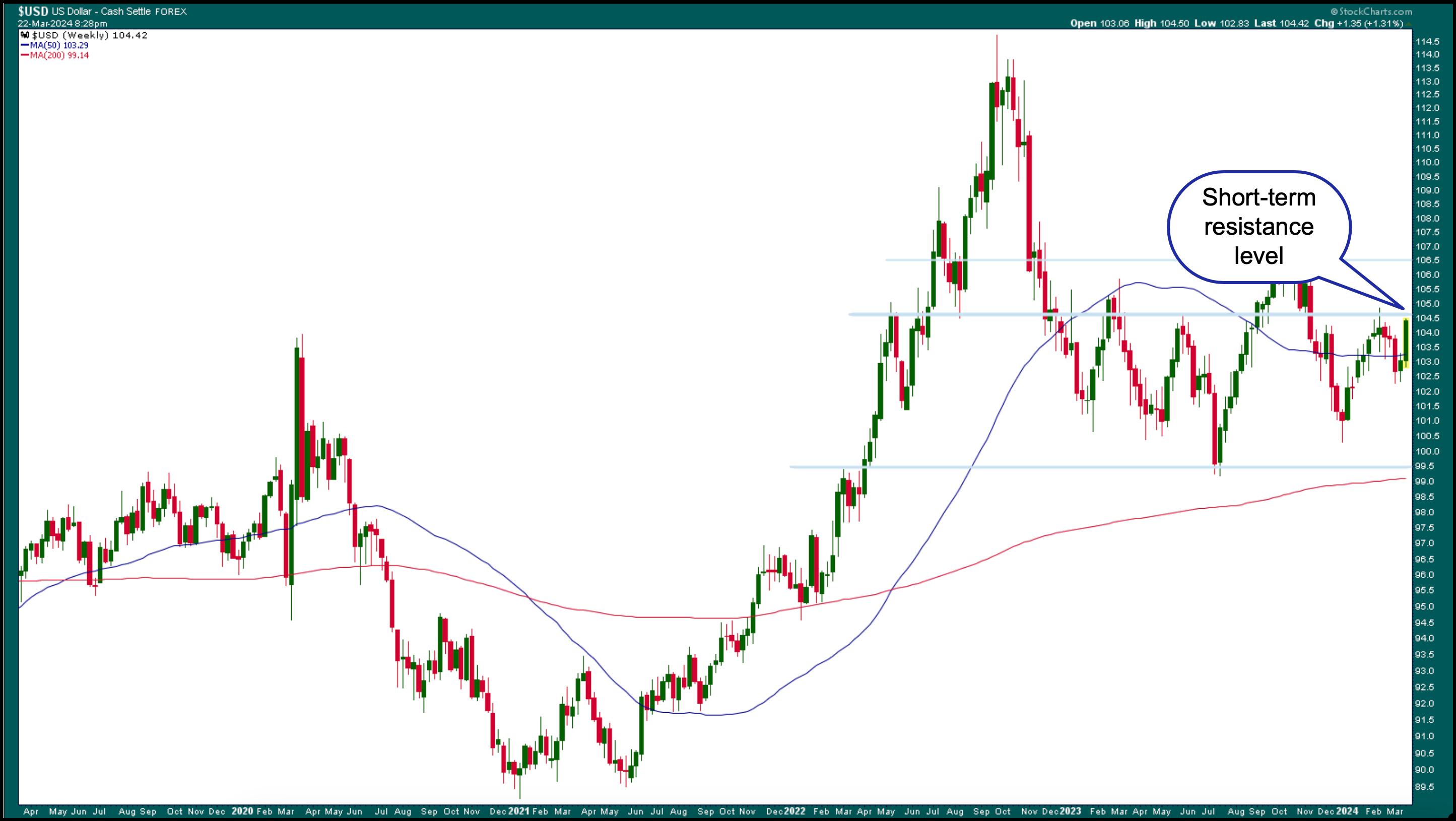
CHART 3. WEEKLY CHART OF THE US DOLLAR. The US dollar edged higher, coming close to its short-term resistance level.Chart source: StockCharts.com. For educational purposes.
A breakout above this level could take it to its next resistance level at around 106.50. If $USD breaks above this level, it could hit its 113–114 level. But the likelihood of the US dollar continuing to move higher could be low once the Fed starts to cut rates. That's when you'll need to watch the support level at 99.5 level.
Gold has also been trading higher. After moving sideways for the past few years, the price of the shiny metal broke out above its trading range and hit an all-time high of $2225.30 per ounce on Thursday (see monthly chart of gold futures below).
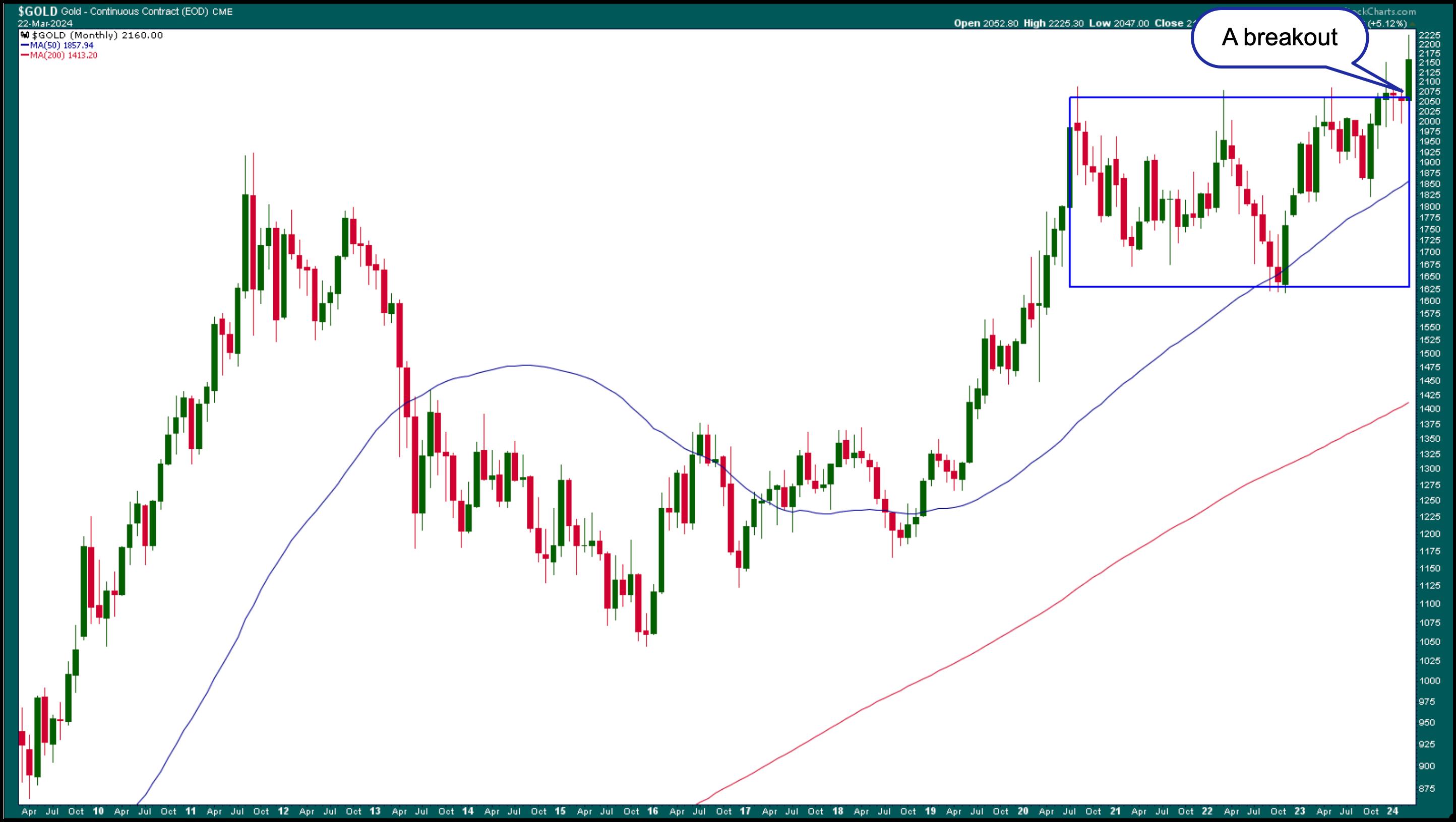
CHART 4. MONTHLY CHART OF GOLD FUTURES. Gold futures broke out of a sideways pattern and hit an all-time high.Chart source: StockCharts.com. For educational purposes.
Rising gold prices go against the idea of inflation stabilizing, which could be why gold prices pulled back to around $2164 on Friday. But it's still above its $2150 support level (see daily chart of $GOLD below). It remains to be seen if gold prices will fall below support. If they do, the next support level is well below prevailing levels. We're talking $2028 levels.
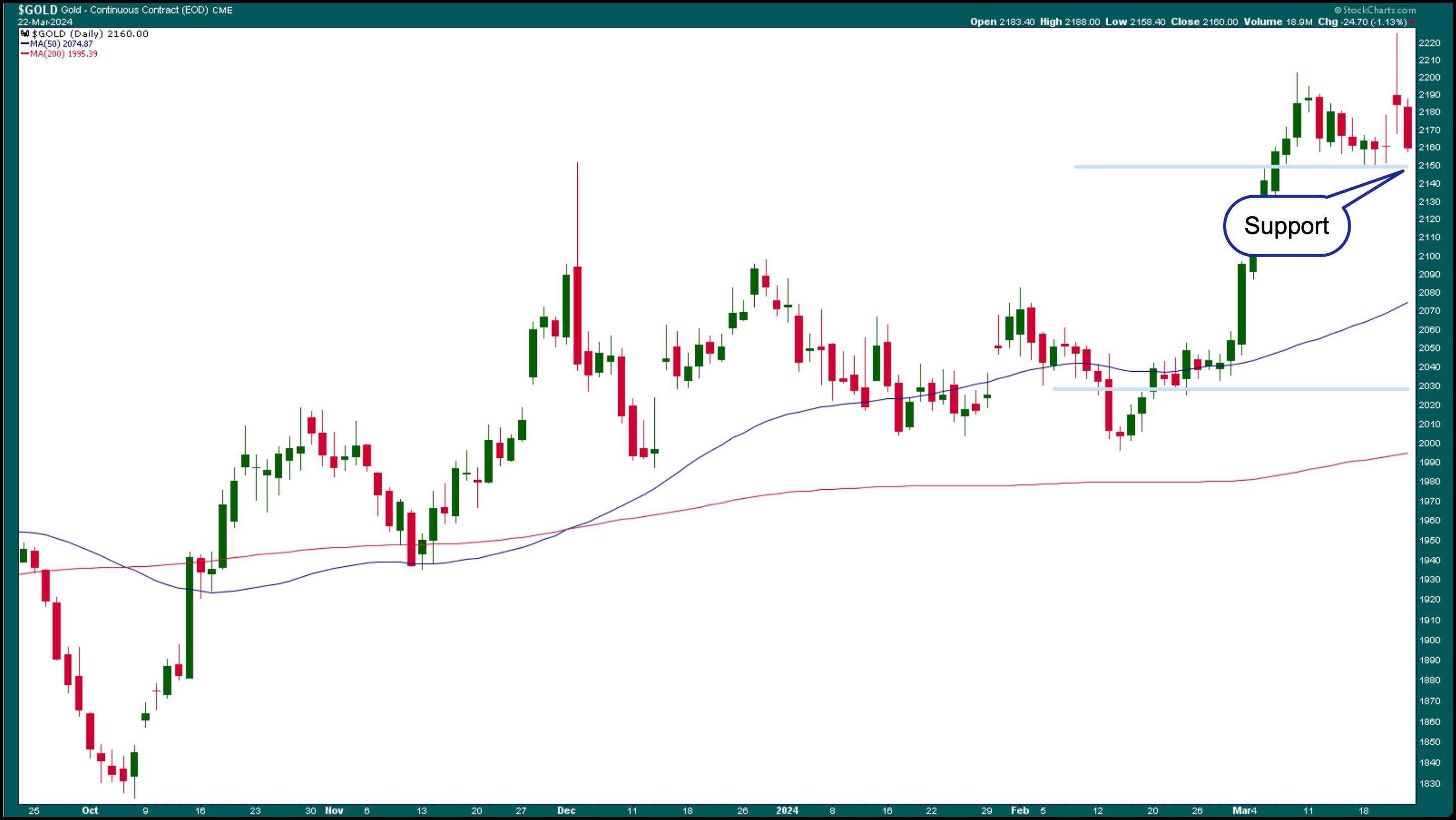
CHART 5. DAILY CHART OF GOLD FUTURES. Gold prices pulled back, but are still above near-term support.Chart source: StockCharts.com. For educational purposes.
In Other News
Bitcoin had a pretty volatile week. After hitting a high of 73,802.64, $BTCUSD retreated over 13% to close at 63890.87.
Cannabis stocks moved higher on the heels of partial legalization of cannabis in Germany that's expected to go into effect on April 1. Shares of Aurora Cannabis (ACB), Canopy Growth (CGC), Tilray (TLRY), and Cronos Group (CRON) all soared on Friday.
The Bottom Line

That said, equity markets are still strong, with the uptrend intact. The positive news is that the rally is spread out across a broader spectrum of the market instead of a concentration in a handful of tech stocks. The CBOE Volatility Index ($VIX) is trading slightly above 13, indicating that investors continue to be complacent.
Next week will be a short trading week, since the stock and bond markets are closed on Good Friday. There are some key economic data to watch for next week, but, given recent Fed remarks, they may not move the stock market much unless the data is drastically different than expected.
End-of-Week Wrap-Up
- S&P 500 closes down 0.14% at 5,234.18, Dow Jones Industrial Average down 0.77% at 39,475.90; Nasdaq Composite up 0.16% at 16,428.82
- $VIX up 1.16% at 13.07
- Best performing sector for the week: Communications Services
- Worst performing sector for the week: Real Estate
- Top 5 Large Cap SCTR stocks: MicroStrategy Inc. (MSTR); Super Micro Computer, Inc. (SMCI); Coinbase Global Inc. (COIN); Veritiv Holdings, LLC (VRT); Williams Sonoma (WSM)
On the Radar Next Week
- March Consumer Confidence
- February New Home Sales
- January S&P/Case-Shiller Home Price
- February PCE Price Index
- Fed Chair Powell speech
- Fed speeches by Waller, Bostic, and Cook
- March Chicago PMI
Disclaimer: This blog is for educational purposes only and should not be construed as financial advice. The ideas and strategies should never be used without first assessing your own personal and financial situation, or without consulting a financial professional.
|
| READ ONLINE → |
|
|
|
| Wyckoff Power Charting |
| Energy Heats Up |
| by Bruce Fraser |
 Crude Oil struck an intraday low on December 13th of 2023, the same day as Fed Chair Powell's notable press conference. This concluded a decline from approximately $95 (at the end of the 3rd quarter) to under $68 (near the end of the 4th quarter). After that Fed meeting and press conference the market priced in as many as five ¼ point Fed Funds interest rate cuts in 2024-25. This optimism has waned as crude oil began building a range-bound structure that appears to be an Accumulation base. Now this Accumulation appears nearly complete. Crude Oil struck an intraday low on December 13th of 2023, the same day as Fed Chair Powell's notable press conference. This concluded a decline from approximately $95 (at the end of the 3rd quarter) to under $68 (near the end of the 4th quarter). After that Fed meeting and press conference the market priced in as many as five ¼ point Fed Funds interest rate cuts in 2024-25. This optimism has waned as crude oil began building a range-bound structure that appears to be an Accumulation base. Now this Accumulation appears nearly complete.
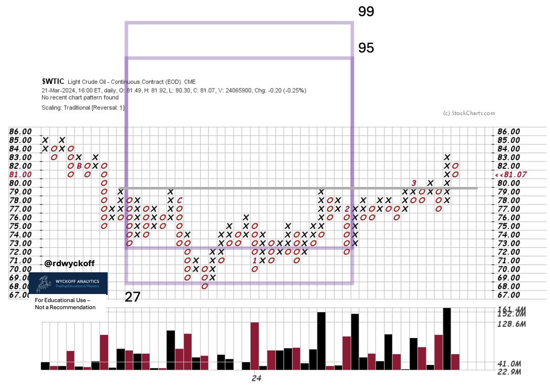
Crude Oil, Continuous Contract. PnF Swing Trade Case Study. 1 - Box Method
Wall Street's enthusiasm for future interest rate cuts is deteriorating with recent higher oil prices. Rising energy prices are a leading cause for inflation as measured by CPI, PPI, PCE and others.
Producer Prices (PPI) have recently been reported and were surprisingly double the forecast of economist's projections. Inflation is heating up again. The FOMC has headwinds that will temper their ability to dramatically reduce interest rates this year.
A swing trading Point and Figure study of the Accumulation provides an estimate of the upside potential for crude oil. This is a conservative PnF count which could be extended. If the objectives are fulfilled larger counts can be considered.
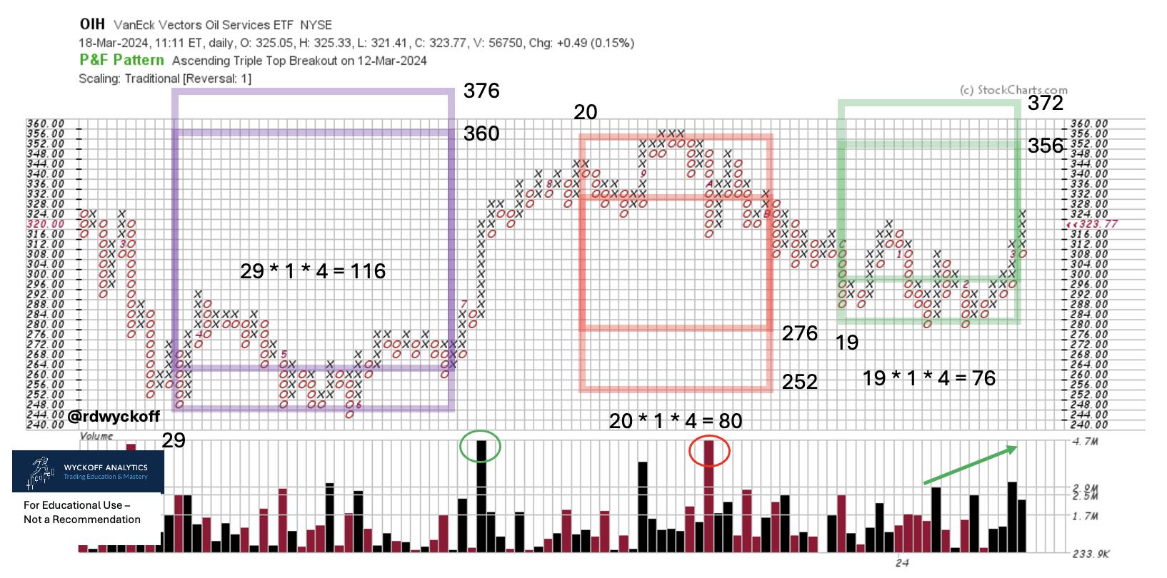
VanEck Oil Services Group ETF (OIH). Three PnF Swing Counts
There have been several swing trading opportunities in the oil services industry group. Here are three PnF counts. Two of them came within one box of fulfilling the minimum projections. The most recent count is still unfinished. Is it possible a larger ‘Campaign Count' using 3-box reversal method is developing?
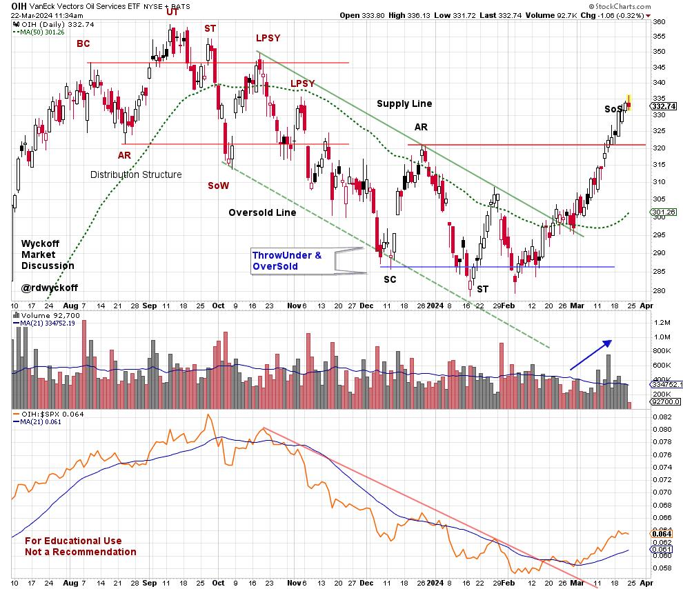
 Chart Notes: Chart Notes:
- Range-Bound since December.
- Local Climax from $315 to $335 which is just above the Resistance zone.
- Volatility remains elevated in the trading range. Less volatility on pullbacks would suggest absorption.
- Relative Strength basing after downtrend. Attributes of leadership emerging.
- Accumulation range could grow larger.
The vertical chart has the recent Distribution and Accumulation structures. They have classic Wyckoff attributes. The Sign of Strength (SoS) advance above the resistance line of the Accumulation may have the character of a local Buying Climax. This would be a place for OIH to pause before continuing higher. A correction back into the Accumulation trading range is very possible. The less correction of price the better. Any pullback would make the PnF count larger. The Relative Strength peaked in September of last year and has been in a well-defined downtrend since. This trend has been reversed upward and bodes well for price strength in the future.
Take time to evaluate the other industry groups in the Energy Sector as they have a family resemblance to the Oil Services Group.
Power Charting Final Episode
The 228th and final episode of Power Charting TV has been posted. To the many of you who have watched these videos, asked great questions and made suggestions... a huge Thank You! I have always visualized us being in the classroom setting together discussing all-things Wyckoff. The thrust and goal of these sessions has been to convey the concepts, techniques and nuances of the Wyckoff Method. As you all know, but please allow me to repeat, Wyckoff is a complete Method for trading markets. The goal of all Wyckoffians is to be on the Path to Trading Mastery. So many of you have shared your work and your progress is impressive. My plan is to post these written blogs on a more frequent basis, so stay tuned. Please sign up for email notification if you have not done so already.
There are excellent resources to support you on your mastery path. Join Roman and me for the weekly Wyckoff Market Discussion (Wednesday's at 3pm PT). Below is a link for a discount to WMD for my readers. Check out additional resources at Wyckoff Analytics (click this link to learn more). Consider taking Roman's ‘Wyckoff Trading Courses'.
All the Best,
Bruce
@rdwyckoff
Disclaimer: This blog is for educational purposes only and should not be construed as financial advice. The ideas and strategies should never be used without first assessing your own personal and financial situation, or without consulting a financial professional.
Join Roman Bogomazov and Me for the Weekly Wyckoff Market Discussions.
Special WMD Discount Coupon for Power Charting watchers. Be sure to add the coupon code (powercharting) at checkout:
https://www.wyckoffanalytics.com/wyckoff-market-discussion/
Power Charting Video
Power Charting Video: Gold Shines (March 8, 2024)
|
| READ ONLINE → |
|
|
|
| Don't Ignore This Chart! |
| Coinbase Stock Didn't Crash, But the Trade Still Raked in Cash |
| by Karl Montevirgen |

As a trader, calling market tops (or bottoms) is a difficult and potentially dangerous thing to do. Calling a market top on a fundamentally strong stock during a strong uptrend is probably a foolish thing to do. But for swing traders, exploiting such a trade can often be tempting, especially when the technicals are flashing red for an impending decline.
Last week, Coinbase's (COIN) technicals gave a strong signal that a pullback was imminent. The entire scenario was laid out in the article "Is Coinbase Stock About to Crater? Here's One Way to Exploit It". It turns out this setup worked, but only for the first target.
Here's an update on what happened, plus a few words on managing risk.

CHART 1. DAILY CHART OF COINBASE ON MARCH 12. All indicators pointed to a potential pullback in the stock's price.Chart source: StockCharts.com. For educational purposes.
On March 12, the following was apparent:
- The Relative Strength Index (RSI) read "overbought."
- The Chaikin Money Flow (CMF) showed an extreme bearish divergence; buying pressure gave way to selling pressure as it dropped below the zero line.
- The pin bar pattern showed strong rejection from the bottom, indicating substantial buying activity and the possibility of several stop losses right beneath the bar.
This trade aimed to exploit the stop loss area for a rapid, short-term dip, in which the first target would be the middle Bollinger Band (the second target would be at the former resistance line).
The outcome:

CHART 2. DAILY CHART OF COINBASE. First target hit, but should you hold for the second target?
The chart showing the outcome above was zoomed in to provide a closer view of what happened.
On the day of the trade entry, you could have estimated that the risk-to-return would be near 1-to-1 (more or less) for the first target, which wasn't a bad ratio.
With a short entry at $242.05, a stop loss at $271.65, and a target materializing at $219.95, the ratio turned out to be 1.33 risk to a unit of 1 (or a risk of $29.60 for a return of $22.10). The amount of your potential loss or gain would depend on your position size (i.e., the number of shares you traded).

The most recent candlestick on the right reflects a strong rally on the day of the FOMC interest rate announcement. With the Fed holding rates steady and reaffirming three more cuts this year, the broader market jumped; COIN went along with it.
And while the CMF shows an uptick in buying pressure as it moves above the zero line, note that the volume continues to dwindle. The "shorts'' who exited the trade did so with a decent, albeit small, short-term gain. Still, a few may have partially exited their positions, hoping to catch that second target. If so, market sentiment in reaction to the Fed's latest decision may or may not work in their favor in the coming days.
The Bottom Line
Overall, shorting a strong stock based on a technical reading can sometimes present a legitimate "mean reversion" opportunity, which some swing traders are likely to take advantage of. In this case, COIN did revert to the mean as measured by the Bollinger Bands. And when it comes to riskier short-term trades like this one, it's often best to aim for the lowest-hanging fruit, so to speak, to take what you can. After all, this is arguably what swing trading is all about.
Disclaimer: This blog is for educational purposes only and should not be construed as financial advice. The ideas and strategies should never be used without first assessing your own personal and financial situation, or without consulting a financial professional.
|
| READ ONLINE → |
|
|
|
| MORE ARTICLES → |
|
 The big news for Apple Inc. (AAPL) this week was a huge antitrust case from the US government. While the outcome of that particular situation is uncertain, one reality that has been quite certain is that AAPL is no longer pounding higher like its "magnificent" brethren.


 The 20+ Yr Treasury Bond ETF (TLT) failed again at the falling 40-week SMA and looks poised to resume its bigger downtrend. Keep in mind that bonds and yields move in the opposite direction. A resumption of the downtrend in TLT translates into a resumption of the uptrend in the 10-yr Treasury Yield.


 Crude Oil struck an intraday low on December 13th of 2023, the same day as Fed Chair Powell's notable press conference. This concluded a decline from approximately $95 (at the end of the 3rd quarter) to under $68 (near the end of the 4th quarter). After that Fed meeting and press conference the market priced in as many as five ¼ point Fed Funds interest rate cuts in 2024-25. This optimism has waned as crude oil began building a range-bound structure that appears to be an Accumulation base. Now this Accumulation appears nearly complete.


 Chart Notes: