| THIS WEEK'S ARTICLES |
| The Mindful Investor |
| The Bull Case for Buffett's Biggest Holding |
| by David Keller |
As investors flock to Omaha, Nebraska in their annual pilgrimage to learn from the great Warren Buffett, it seems an opportune time to reflect on the technical evidence for Berkshire's biggest holding, Apple (AAPL).
Today, we'll consider AAPL using "multiple time frame analysis", in which we analyze the same stock from three different time frames. This allows us to think about how the short-term fluctuations relate the medium-term trend, and how the medium-term trend fits into the longer-term secular trends at play.
First, let's consider the short-term time frame using the daily chart.
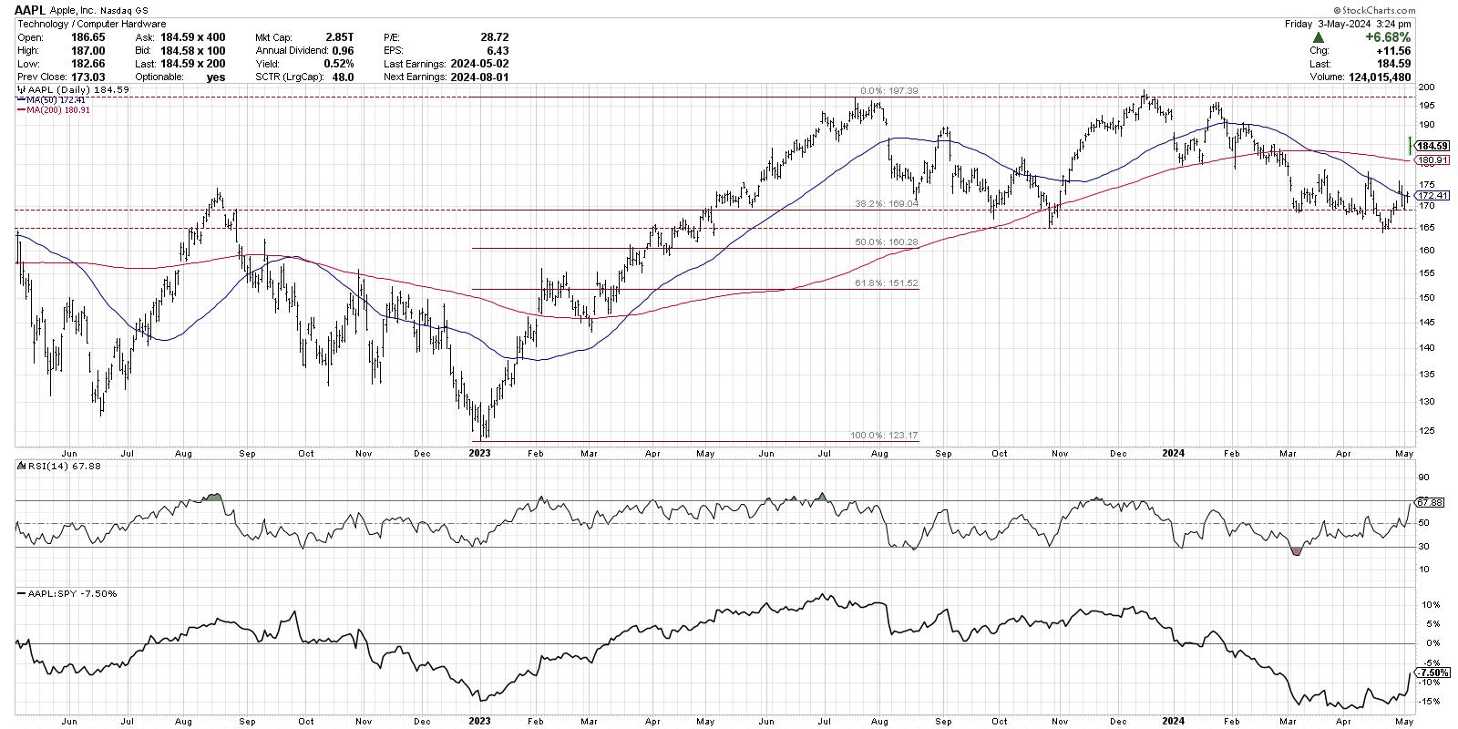
After an earnings release this week that disappointed investors on weaker iPhone sales, yet thrilled investors at the announcement of the largest buyback in Apple's history, the stock gapped higher on Friday above the 200-day moving average. After the last two months of lower highs and lower lows, combined with RSI levels very consistent with bearish phases, the stock finally appears to have reversed that downtrend with higher prices and improved momentum.
For now, remaining above the 200-day moving average after the gap higher on Friday remains the most important factor on the daily chart. It will be very telling in the days and weeks to come if additional buyers are willing to step in and pay even more for this long-term market outperformer!
For the medium-term time frame, let's consider the last ten months of price action, starting with the July 2023 high around $197. After achieving that peak, AAPL pulled back to a 38.2% retracement of the 2023 rally phase, finding support right around $169. Over the subsequent seven-to-eight months, Apple has been rangebound, bouncing between retests of the all-time high before returning down to test support in the $165-169 range.
This week's gap higher appears to confirm that support in that range has once again held strong, giving a clear floor to the price action for the last year. With improving momentum, in the form of the RSI pushing above 60 on this rally, the stock appears to be strengthening. But until we see a confirmed break above the previous high around $197, I'm inclined to label the medium-term time frame as "neutral."
Now let's consider the long-term trend using the weekly chart.
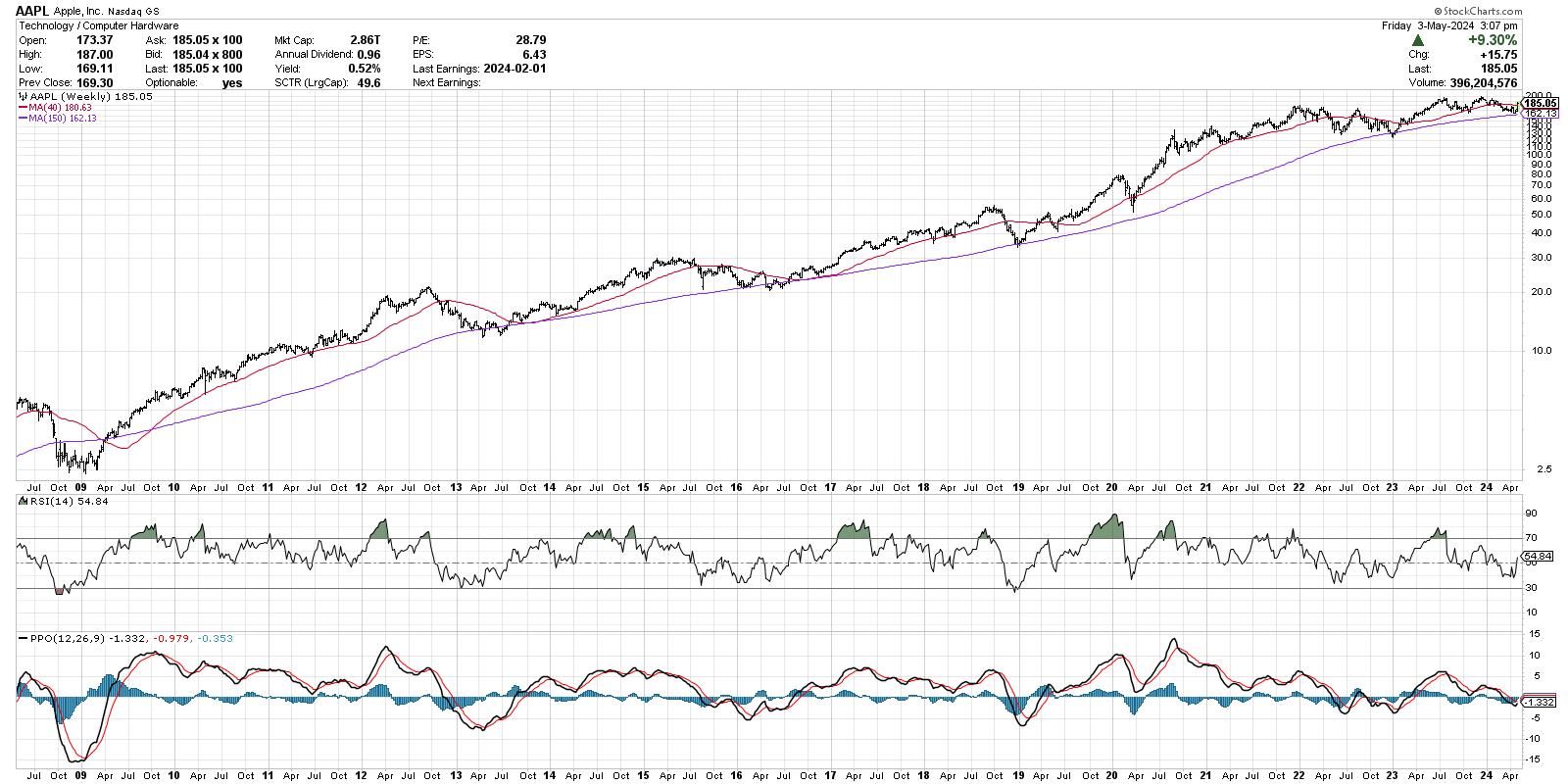
Quite simply, the long-term picture for AAPL is exceptionally strong. Since the 2009 market low, the stock has experienced numerous tests of an ascending 150-week moving average. And in 100% of those tests, the stock has rebounded higher, eventually making a new all-time high soon after.
Note the RSI levels on the weekly chart, showing that the momentum remains in the bullish range since late 2018. This suggests that the long-term momentum is positive, and that pullbacks to moving average support should be considered opportunities to capitalize on short-term market weakness.
Do you think Apple provides a decent opportunity in Q2, after pulling back to test long-term moving average support? Watch the video below, and then drop a comment there with your vote!
RR#6,
Dave
P.S. Ready to upgrade your investment process? Check out my free behavioral investing course!
David Keller, CMT
Chief Market Strategist
StockCharts.com
Disclaimer: This blog is for educational purposes only and should not be construed as financial advice. The ideas and strategies should never be used without first assessing your own personal and financial situation, or without consulting a financial professional.
The author does not have a position in mentioned securities at the time of publication. Any opinions expressed herein are solely those of the author and do not in any way represent the views or opinions of any other person or entity.
|
| READ ONLINE → |
|
|
|
| Larry Williams Focus On Stocks |
| MEMBERS ONLY |
| 35 Years of Crude Oil Forecasting the Future | Focus on Stocks: May 2024 |
| by Larry Williams |
|
All You Need to Know About Crude Oil and the Future Gold, black gold, is what Crude Oil has become. The entire world runs on energy. 98% of our cars and transportation, our lights, the device you are using to read this.....
|
| READ ONLINE → |
|
|
|
| Art's Charts |
| Is this a Dead-Cat Bounce or a Bounce with Legs? |
| by Arthur Hill |
Stocks fell sharply into late April and then rebounded over the last two weeks. SPY fell 5.34% from March 28th to April 19th and then rebounded with a 3.26% gain the last two weeks. Does this bounce have legs? Chartists can separate serious bounces from dead-cat bounces using breadth. Today's example will use the S&P 500 and the percentage of S&P 500 stocks their 20 day SMAs.
There are two steps. First, the indicator needs to become oversold (setup). Second, we need to see a significant increase (breakout) in upside participation (signal). An oversold reading signals a significant decline and provides the setup for a bounce. Aggressive traders can trade the oversold condition. A subsequent move above the breakout level signals adequate participation to sustain the advance. Now comes the subjective part. We must choose our oversold and breakout levels. I am choosing 10 and 70 percent for SPX %Above 20-day SMA.
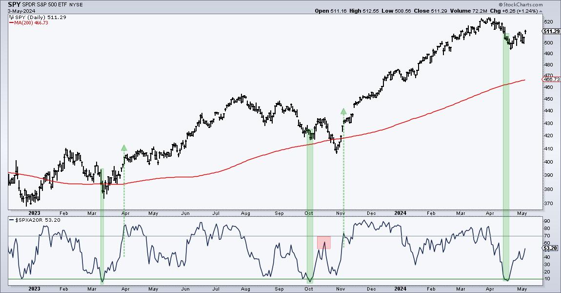
The green shading on the chart above shows when SPX %Above 20-day became oversold and the green arrow-lines mark the subsequent move above 70%. There were setup-signals in March-April and again in October-November. Both led to significant bounces. Notice the red shading where the indicator failed to clear 70% in mid October. This was a feeble bounce and SPY moved to a new low in late October. SPX %Above 20-day then surged above 70% in early November for a signal. Recently, the indicator became oversold here in mid April for a setup and moved back above 50% this week. An oversold bounce is indeed underway, but I need to see a move above 70% to show a participation breakout.
We are monitoring the rebound in the S&P 500 and Nasdaq 100 at TrendInvestorPro (ChartTrader). Our 10 indicator composite indicator became oversold in mid April, but we have yet to see the required breadth thrust to signal a strong increase in participation. ChartTrader reports and videos provide broad market timing signals and trading setups for leading stocks and ETFs. This week we featured setups in the T-Bond ETF (TLT), the Biotech SPDR (XBI) and four Tech ETFs (IGV, SOXX, CIBR, SKYY). Click here for immediate access.
//////////////////////////////////////////////////
|
| READ ONLINE → |
|
|
|
| ChartWatchers |
| Technology Stocks Back In the Lead: Are Inflation Fears Behind Us? |
| by Jayanthi Gopalakrishnan |

The weaker-than-expected jobs report gave the stock market some direction, a nice treat before the 150th Kentucky Derby. Job growth slowed, and the unemployment rate ticked up to 3.9%. If this trend continues, the market may price in more than one interest rate cut this year.
This week's price action gives the impression that the stock market is still uncertain and can't decide which way it wants to go. It's unclear whether Friday's move is enough to carry the market higher.
The broader equity market indexes moved higher on the news. The Dow Jones Industrial Average ($INDU) and S&P 500 ($SPX) reached their 50-day simple moving average (SMA) but didn't close above that level. The Nasdaq Composite ($COMPQ) managed to move above its 50-day SMA as several tech stocks moved higher; however, the index didn't show much upside conviction.
Tech Back in the Lead
View live chart here.
The daily chart of the Technology Select Sector SPDR ETF (XLK) below shows the breakout from the recent downtrend. It will be interesting to see if XLK can break through the resistance of its 50-day SMA.
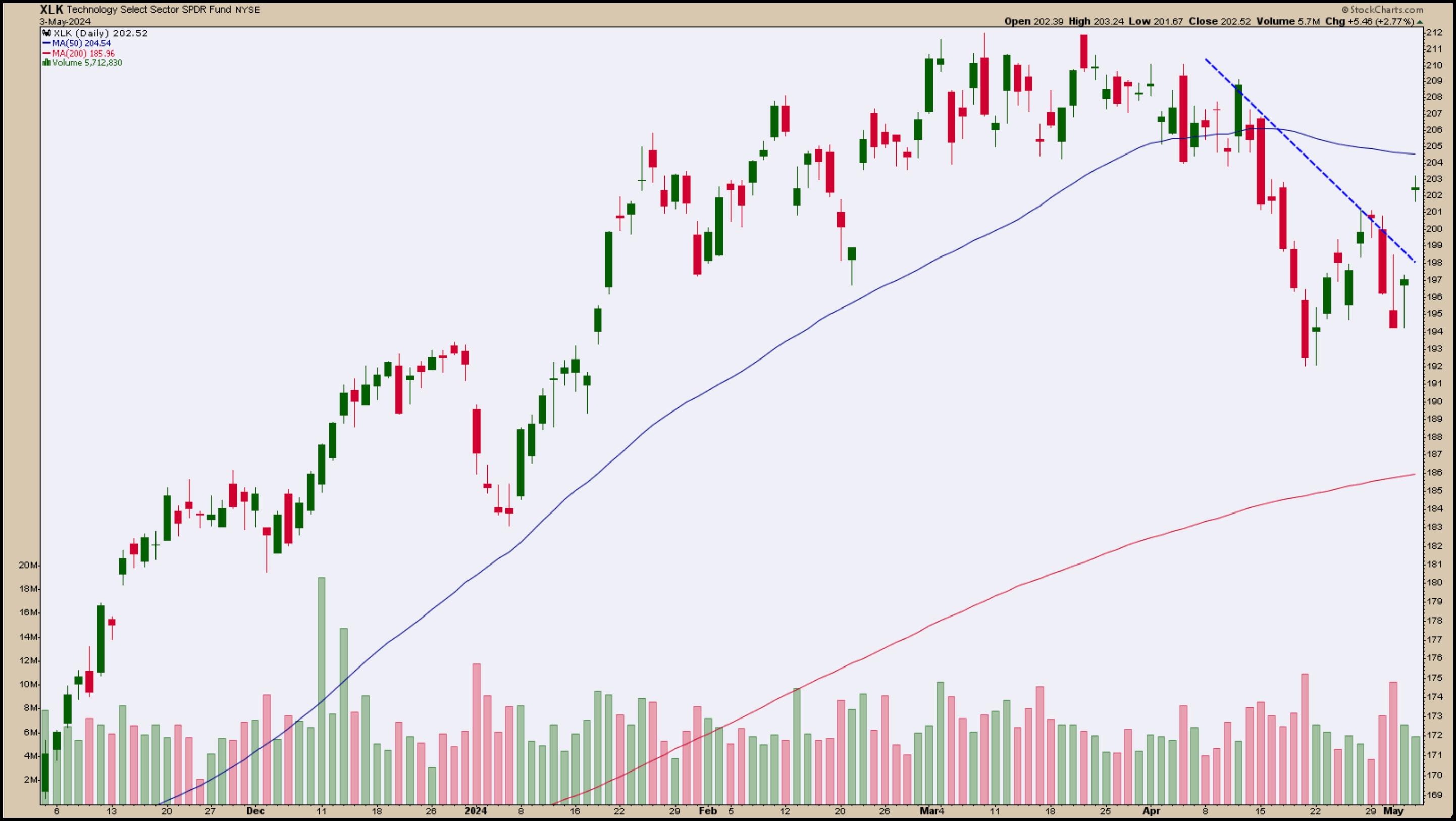
CHART 1. DAILY CHART OF XLK. The ETF broke its recent short-term downtrend, but a breakout above its 50-day SMA is critical.Chart source: StockCharts.com. For educational purposes.
The rotation back into the tech sector shows that investors are still gravitating toward technology stocks. Apple (AAPL) may have helped ignite interest when it reported better-than-expected earnings. Apple's stock price experienced a steep downfall, which may have now reversed.
Follow the live chart.
Apple's price shows strength after its significant gap up, following the earnings report (see chart below). The StockCharts Technical Ranking (SCTR) score (upper panel) is moving higher and is now shy of 50. Its Relative Strength Index (RSI) is also close to the 70 level. This would be a stock to add to your ChartList.
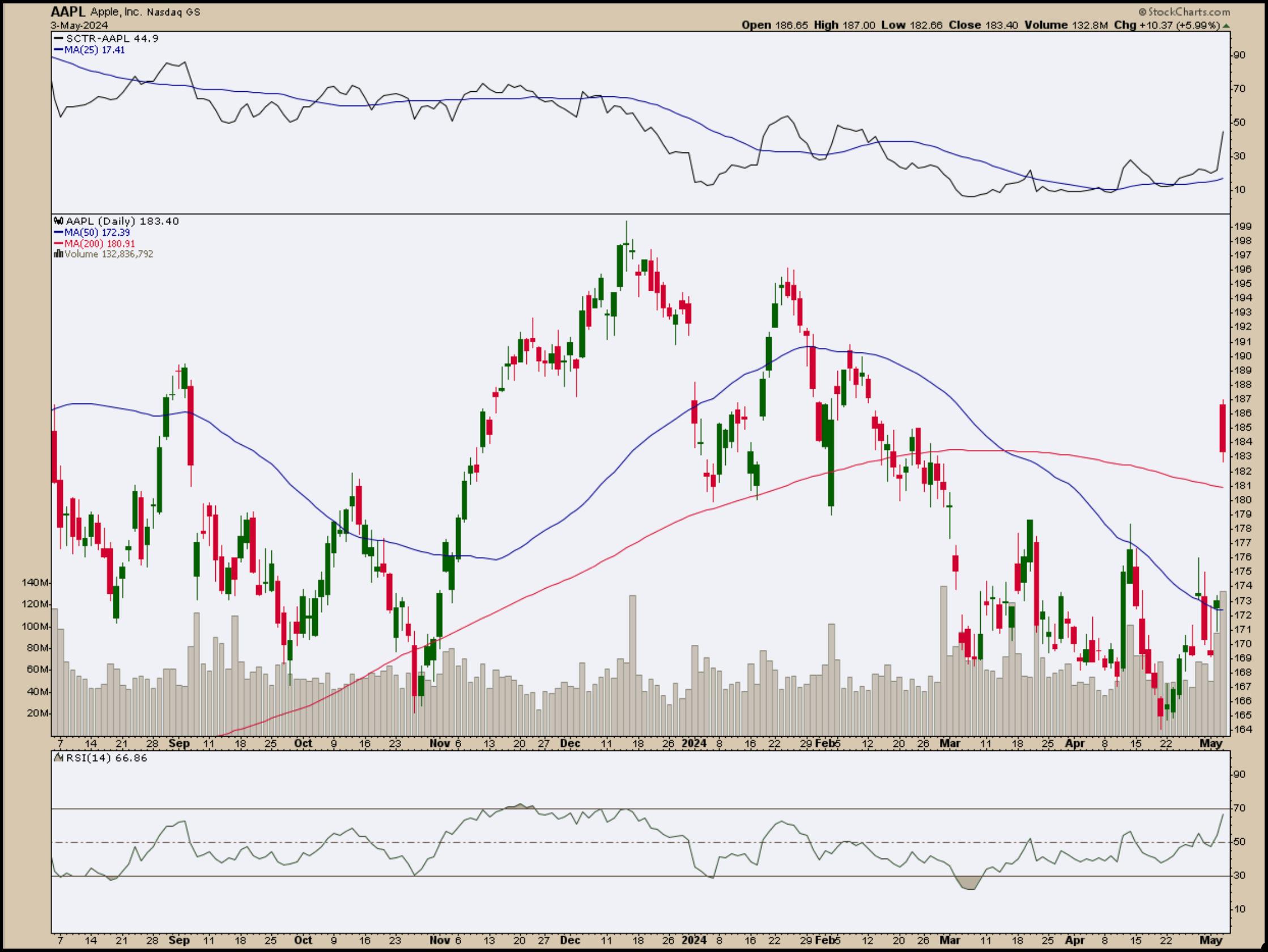
CHART 2. APPLE SOARS AFTER EARNINGS REPORT. Will the rise in Apple's stock price have enough momentum and follow through to push it higher?Chart source: StockCharts.com. For educational purposes.
Shares of Nvidia Corp. (NVDA), Microsoft (MSFT), Amazon (AMZN), and Meta (META) are trading higher. If you want to add more tech stocks to your portfolio, you may want to wait to see some follow-through to the upside before jumping in.
The Big Picture
The market pretty much made up the losses for the week, but the broader equity indexes haven't pushed through their resistance levels. They climbed higher in the early trading hours, but stalled and stayed relatively flat for most of the trading day. Anyone who was watching the markets will know it was like watching paint dry for most of the day. It is Friday, and investors may not want to add positions, especially since the market looked like it was in correction territory this week.
The Dow gapped up in the early trading hours, but hung out at its 50-day SMA. The S&P 500 broke out to the upside of what looks like a bear flag formation, but it also hung on to its 50-day SMA. The Nasdaq Composite is looking the most bullish of the three indexes, as it broke above its 50-day SMA but hung out there.
Follow the live chart.
Even bond prices were stagnant. The daily chart of the iShares 20+ Year Treasury Bond ETF (TLT) shows that bond prices rose, but didn't move much for most of the trading day.
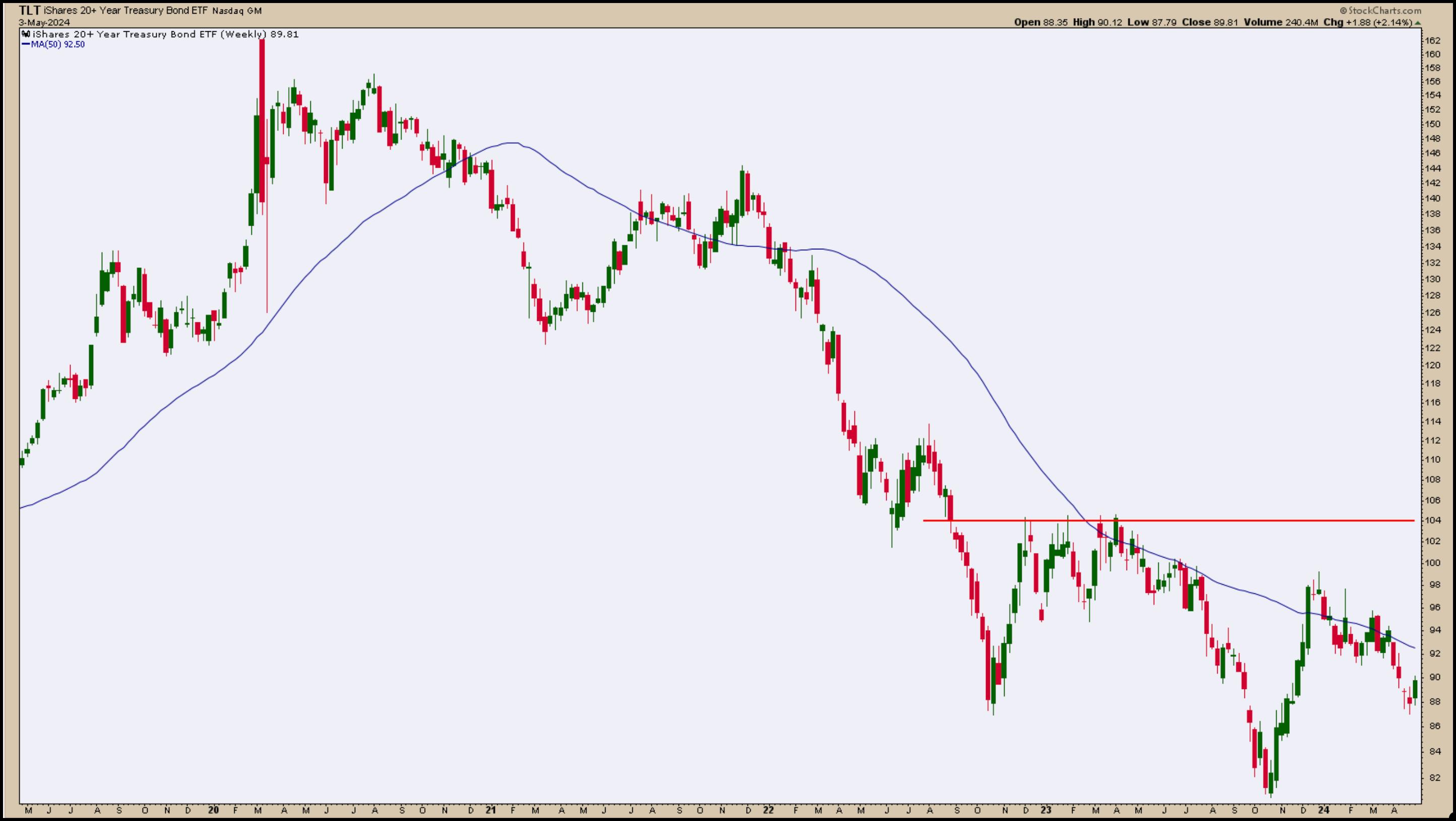
CHART 3. DAILY CHART OF TLT. Bonds prices rose on Friday, but still have a long way to go before showing signs of an uptrend.Chart source: StockCharts.com. For educational purposes.
The good news: The CBOE Volatility Index ($VIX) is back below 15 levels, an indication that investors aren't necessarily fearful and the market didn't fade at the close.
There's not much economic data next week. There are a few earnings to pay attention to, but a big chunk is in the rear-view mirror. The market could continue its indecisive behavior next week. We'll have to wait and see. It may be a good time to put your stock market thoughts aside and shift your focus to watching the Derby.
End-of-Week Wrap-Up

- S&P 500 closes up 1.26% at 5127.78, Dow Jones Industrial Average up 1.18% at 38,675.88; Nasdaq Composite up 1.99% at 16,156.33
- $VIX down 7.97% at 13.51
- Best performing sector for the week: Utilities
- Worst performing sector for the week: Energy
- Top 5 Large Cap SCTR stocks: Super Micro Computer, Inc. (SMCI); Vistra Energy Corp. (VST); Vertiv Holdings (VRT); MicroStrategy Inc. (MSTR); Coinbase Global Inc. (COIN)
On the Radar Next Week
- Several Fed speeches
- Earnings from Berkshire Hathaway (BRK/B) reporting on Saturday, BioNTech (BNTX), Walt Disney (DIS), Palantir Technologies (PLTR), and Duke Energy (DUK), Uber (UBER), among others.
Disclaimer: This blog is for educational purposes only and should not be construed as financial advice. The ideas and strategies should never be used without first assessing your own personal and financial situation, or without consulting a financial professional.
|
| READ ONLINE → |
|
|
|
| Martin Pring's Market Roundup |
| MEMBERS ONLY |
| Time for a Pause in the Ongoing Dollar Bull Market? Or Full Steam Ahead? |
| by Martin Pring |
|
I last wrote about the dollar in December, where I came to the conclusion that a limited rally was a likely possibility in what was assumed to be a primary bull market...
|
| READ ONLINE → |
|
|
|
|
|
| Don't Ignore This Chart! |
| AMD at a Crossroads: Buy Now or Brace for More Losses? |
| by Karl Montevirgen |

Advanced Micro Devices (AMD) slightly topped Wall Street's earnings and guidance expectations on Tuesday, but, instead of rallying, its stock tumbled 7%. AMD was at its 61.8% Fibonacci retracement level, which, for many traders, can present an ideal "buy low" opportunity or a "get-ready-to-exit" threshold for those who bought the stock near the bottom of the uptrend.
AMD's decline brings several questions to the fore: Is AMD a buy or a sell? What technical or fundamental factors might drive this decision? What are the key levels to watch?
The Fundamental Picture
AMD's EPS (61 cents) and revenue ($5.47 billion) barely edged above analyst consensus; they were practically in line with what Wall Street expected. The company's current quarter estimates also matched analyst forecasts. It's nothing bad, but nothing great, either.
The immense potential growth driver, however, is AMD's forecasted sales of AI chips—around $4 billion this year. Still, the stock came tumbling down. So, if AMD's plunge was the market's way of correcting an overvaluation, then is the company's AI chip forecast already baked into the current price level?
Analyst price targets are mixed. But before that, let's look at the technical picture.
AMD and the AI Revolution
Viewing AMD stock on a weekly chart, you can see it has been trending downward since hitting an all-time high of $227.30 in March.

CHART 1. CHART OF AMD STOCK. AMD's relative performance against NVIDIA, the leader in AI chips, begins sinking after November 2022. AMD is also trailing the semiconductor industry. Chart source: StockCharts.com. For educational purposes.
Returning to the second week of November 2022 (see vertical blue line), you can see AMD's slow but steady climb relative to the larger Tech sector (XLK). That line marks the onset of the current AI trend, sparked by OpenAI's public launch of ChatGPT. This budding AI "revolution" has thrust chipmakers like AMD into the limelight, positioning the industry as a fertile ground for expansion and a fiercely competitive arena for semiconductor companies.
So, while AMD is still outperforming the general Tech sector by 21%, it's trailing the larger semiconductor industry ($DJUSSC) by -25.85% and NVIDIA, the world's leading AI chipmaker, by a whopping 70%.
AMD missed the AI boat and fell drastically behind. However, according to its forecasts, AMD's prospects of catching up are rapidly improving. So, is this what's driving indecision at the current levels?
In AMD's daily chart (see below), the stock is trading at the 61.8% Fib retracement level. This is a make-or-break level for traders: for those looking to go long, it represents a deep pullback (a break below this level increases the prospect's bearishness). It also represents the lowest level to exit a long trade for those who got in toward the bottom of the latest uptrend.

CHART 2. DAILY CHART OF AMD. The stock is at a critical juncture, and its next move can trigger either a strong buy or sell signal, depending on the outcome and the underlying momentum.Chart source: StockCharts.com. For educational purposes.
The Money Flow Index (MFI) is trending upward, creating a bullish divergence between price and the buying pressure it represents. The Chaikin Money Flow (CMF) indicates stronger selling pressure. If you plan on going long, you want to see both indicators trending in the same direction.
3 Levels to Watch
- The 61.8% Fib retracement line: A close below this level would invalidate and possibly reverse the longer-term uptrend.
- The $133 price range: The low of 2024 and high of 2023 may serve as the next level of support.
- The $124 price range: A cluster of resistance and consolidation levels in 2023, this range may serve as an even lower area of support; however, a break below can signal further downside risk.
What Are Analysts' Price Targets?
Analyst price targets for 2024 are fairly wide:
- The highest price target is between $265 and $270.
- The median price target sits between $185 and $190.
- The lowest price targets range between $120 and $140.
This suggests that the current price is near the bottom of the target range and well below the average to high consensus.
The Takeaway
With AMD's earnings and guidance satisfactory, its stock sits at a critical juncture. Technically, AMD is at an optimal buy level, but momentum doesn't seem to favor the bulls. Meanwhile, it's uncertain whether AMD's AI chip prospects are baked-in or underestimated. While you won't be able to predict the outcome of AMD's AI performance in the near term, you can see the technicals levels that might trigger a bounce or a bust. Momentum and price action are critical, so watch them closely in the next few days.

Disclaimer: This blog is for educational purposes only and should not be construed as financial advice. The ideas and strategies should never be used without first assessing your own personal and financial situation, or without consulting a financial professional.
|
| READ ONLINE → |
|
|
|
| RRG Charts |
| Diverging Tails on This Relative Rotation Graph Unveil Trading Opportunities |
| by Julius de Kempenaer |
All on the Same Track... or?
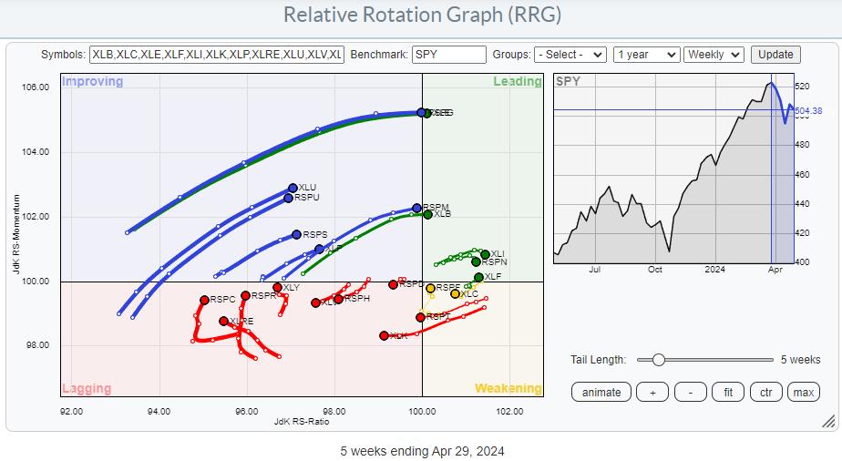
The difference between equal-weighted sectors and cap-weighted sectors is obvious. Namely, the cap-weighted variant is much heavier and is impacted by the changes in some heavy-weight, often mega-cap, stocks. Nevertheless, when you plot these sectors on Relative Rotation Graphs, you will often find that their tails generally move in the same direction and/or follow the same path.
When that does not happen, when the tails of the two versions of the same sector are on different paths or in completely different positions on the RRG, it's time to investigate.
The RRG above shows the two universes, cap-weighted and equal-weighted, plotted on the same RRG and against SPY as the benchmark. Looking closely, you will find most sector pairs on the same trajectory. If you have a SC account, you can click on the graph, open the RRG in your own account, and do a closer inspection.
*You can save RRGs as bookmarks in your browser. By doing that, you can create your own custom RRGs and save them for later retrieval. Scroll to the bottom of the page, click "permalink," and then copy and save this link as a bookmark in your browser.
Zooming In
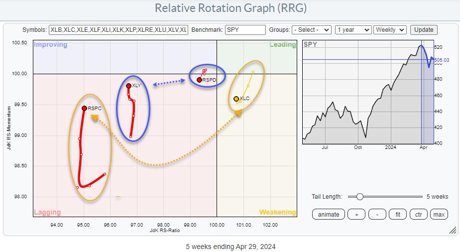 To get a better handle and a clearer picture, I have removed the sectors where both tails are on similar trajectories and positions and only left the tails on the graph where they differ. As a result, two sectors remain: Consumer Discretionary and Communication Services. To get a better handle and a clearer picture, I have removed the sectors where both tails are on similar trajectories and positions and only left the tails on the graph where they differ. As a result, two sectors remain: Consumer Discretionary and Communication Services.
Consumer Discretionary
Both tails are inside the lagging quadrant. However, that is as far as the comparison goes. XLY is moving higher on the RS-Momentum scale, indicating an improvement in relative momentum, while RSPD is moving lower and is on a negative RRG-Heading. Also, the tail on XLY is substantially longer than on RSPD, indicating the power behind the move.
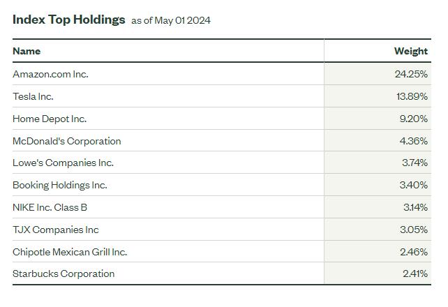
Looking at the composition of the sector, it's obvious which stocks inside Consumer Discretionary are causing the difference.

AMZN, TSLA, HD, and MCD comprise 50% of the index, while AMZN and TSLA are already 38%.

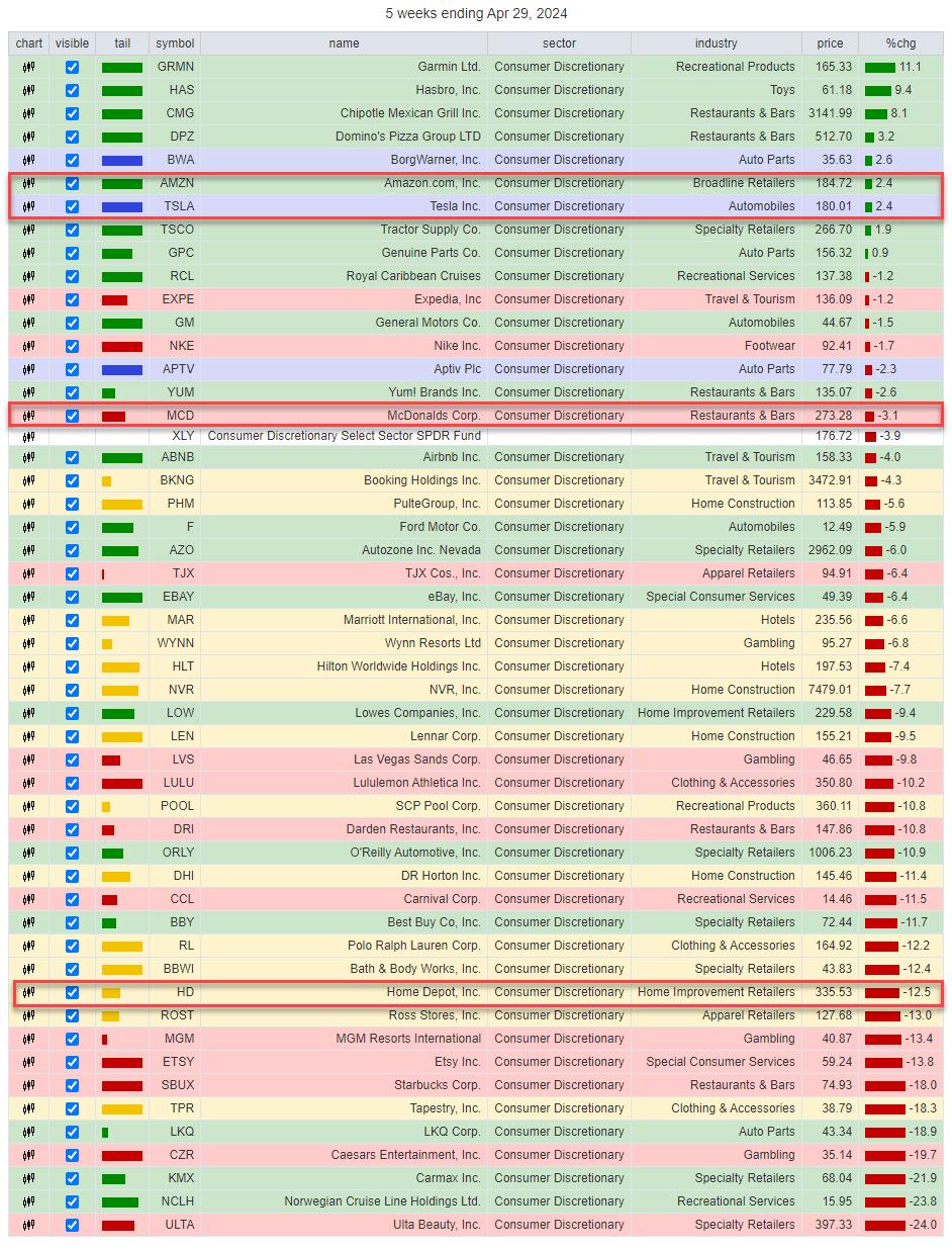
Looking at the performance over the last five weeks (tail length on the RRG), we can see how the sector's performance has shifted to the large names. The table above shows the top 50 stocks in the discretionary sector. AMZN and TSLA are in the upper end of the range, and MCD is just above XLY, which is at position 17 out of 50. This implies that most stocks are performing worse than that sector index.'
Roughly the bottom half is at double-digit declines. While AMZN and TSLA are "only" up 2.4%, they drag the sector index up to around 1/3 of the entire universe, even with HD showing a 12.5% decline over that period.
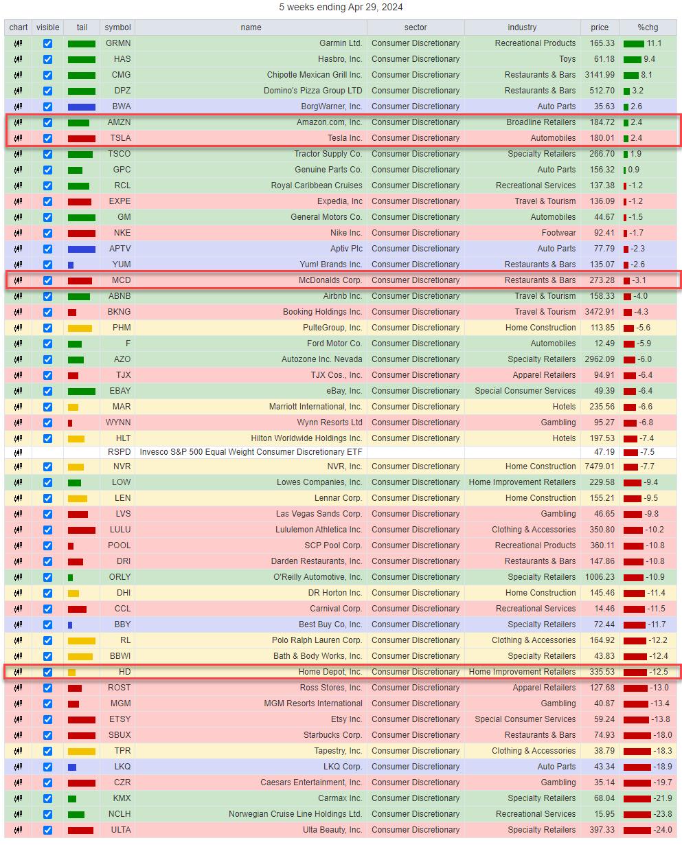
Now, look at the same table. Instead of using XLY as the benchmark, we are now using RSPD as the benchmark.

RSPD is showing up at position 27 / 50, right where you'd expect an equal weight benchmark -- in the middle of the universe, balancing out all the performances.
The bottom line is that XLY has been picking up recently only because of TSLA, AMZN, and MCD. But, under the hood, most discretionary stocks are going through a horrible correction.
From a trading perspective, such observations can offer great pair trading ideas.

Communication Services
The tails for XLC and RSPC are also far apart on the RRG. XLC is still inside the weakening quadrant and has just started to show the first signs of curling back up. RSPC is deep inside the lagging quadrant at a really low reading on the RS-Ratio scale overall, and is picking up relative momentum, but no relative trend (RS-Ratio) yet.
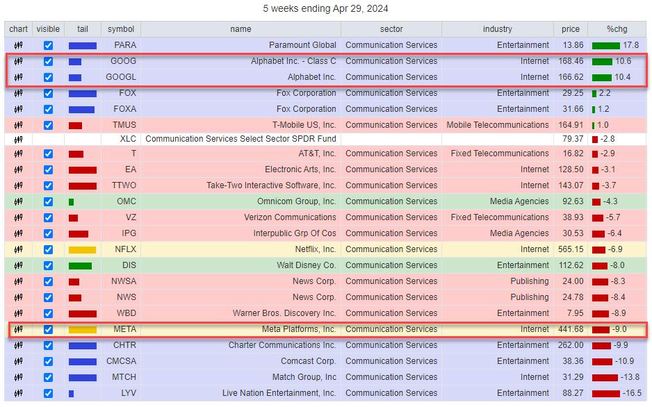
Over the five-week period, XLC lost 2.8%, while RSPC lost 4.3%. The composition for this sector is even more top-heavy than Consumer Discretionary.

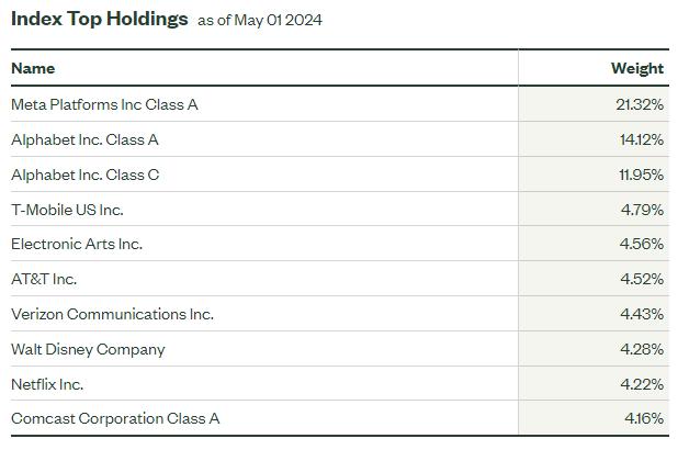
META is listed as the top holding in XLC at 21%. But when we add up the weights for Alphabet A and B, it comes out to 26%. So together, the top two stocks in XLC are a whopping 47% of the sector.
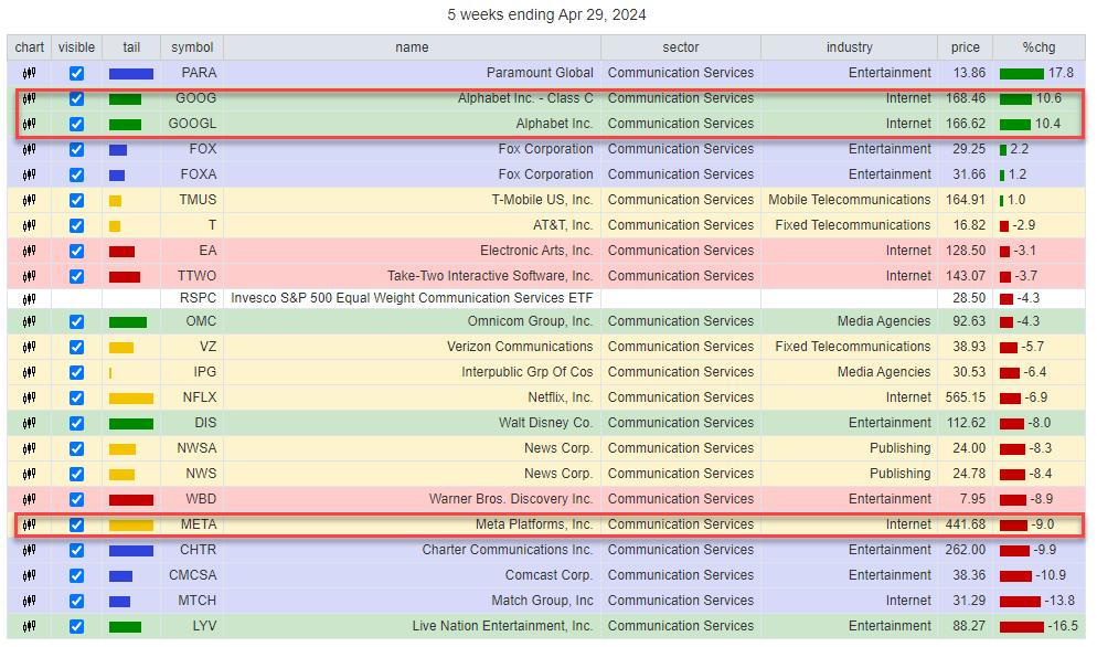
Looking at the same table for XLC, we find Alphabet at the top of the list over the last five weeks. Meta is in the lower part at -9%. The sector (XLC) comes in at -2.8%, which means that META is UNDERperforming (-9% + 2.8% =) -6.2%. But Alphabet Class A is OUTperforming (10.4% + 2.8% = ) 13.2% and Alphabet Class C is OUTperforming (10.6% + 2.8% = ) 13.4%. This is a way stronger upward pull for the index than the drag caused by META.
Changing the benchmark to the EW version of Communication Services shows this table.

Again, we see the equal-weight benchmark (RSPC) dropping to near the middle of the list, balancing out the return more evenly.
All in all, this provides a similar pair trading opportunity.

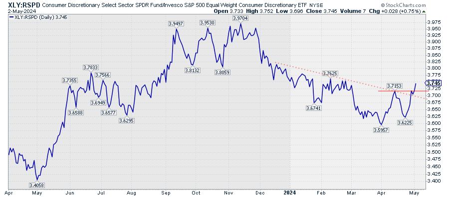
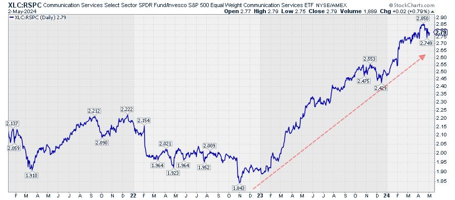
This relative trend is much more mature than the XLY:RSPD pair, but, as long as the rhythm of higher highs and higher lows continues, buying the dips in this relative line offers opportunities.
Most of the time, the cap-weighted and equal-weighted versions of a sector will move more or less in tandem. But when they don't, they're worth investigating, as they may offer interesting trading opportunities.
#StayAlert and have a great weekend, --Julius
|
| READ ONLINE → |
|
|
|
| MORE ARTICLES → |
|


 To get a better handle and a clearer picture, I have removed the sectors where both tails are on similar trajectories and positions and only left the tails on the graph where they differ. As a result, two sectors remain: Consumer Discretionary and Communication Services.