|
When key technical levels are broken on a daily chart, looking at a longer timeframe chart may ease the pain, at least by a little bit.
This week, the S&P 500 ($SPX), Nasdaq Composite ($COMPQ), and Dow ($INDU) closed well below their 200-day simple moving averages (SMAs). If you switch to a weekly chart, you'll find all three indexes trading below their 100-week SMA (100 weeks represents two years of data). The picture may be less drastic than what the daily charts display, but it’s still not that great.
However, if you pull up a monthly chart of the three indexes, things don't look so bad. Take the Nasdaq as an example. For the week, the Nasdaq fell 10%—a significant drop in value. But the monthly chart of the Nasdaq (see below) which spans 25 years, shows the uptrend is still intact.
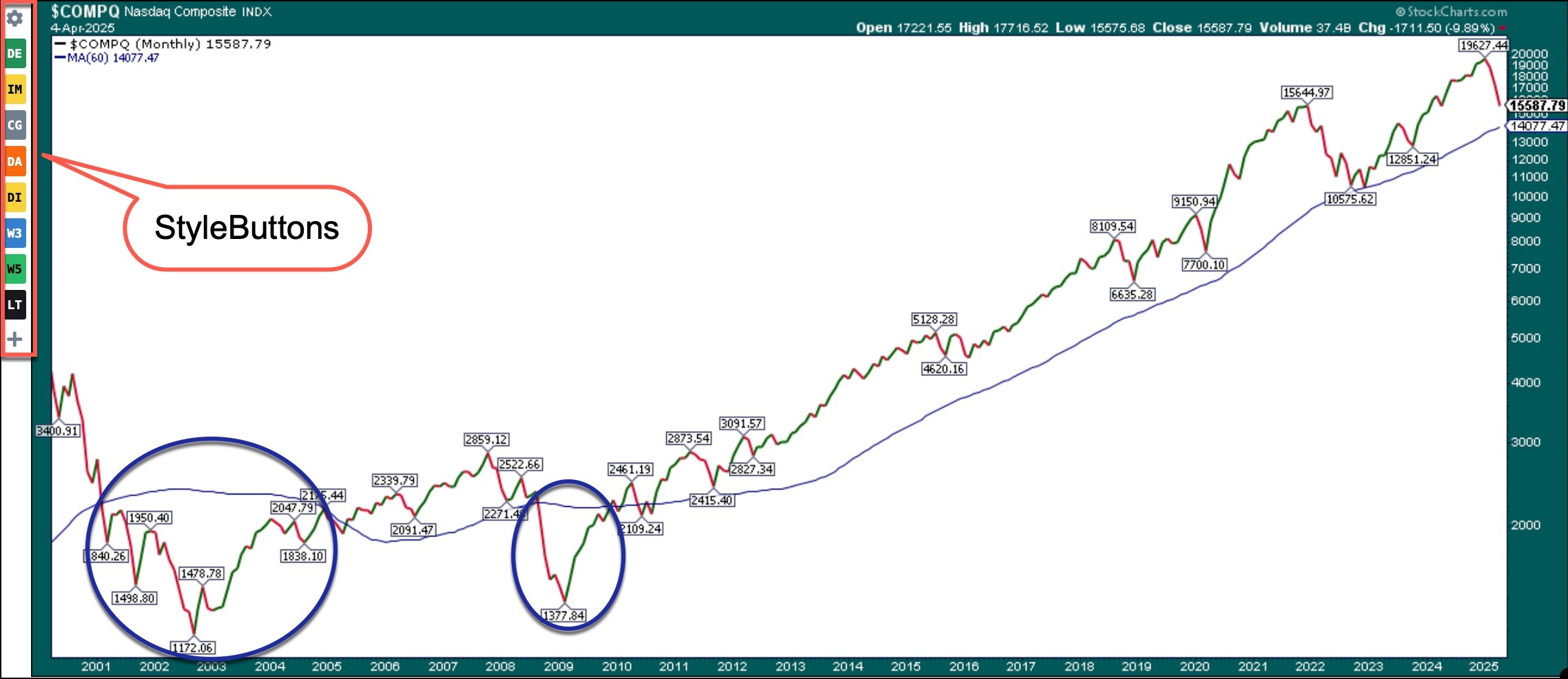
The Nasdaq is trading above its 60-month SMA (five-year average), which is sloping upward. In the last 25 years, there were two occasions when the index fell below its 60-month SMA—the dot com bubble burst and the 2008 financial crisis. Let’s see if the Nasdaq can hold on to its 60-month SMA.
If you set up your StyleButtons (the area to the left of the chart) for daily, weekly, and monthly timeframes, you can quickly switch from daily to weekly to monthly charts. It takes a few minutes of your time to set up but once that’s done it’s just a click of the StyleButtons on the left. To set up your StyleButtons, check out our Support Center article—something to keep you occupied while this market figures out how low it wants to fall.
While it’s painful to watch your portfolio value drop, the good news is that eventually, the selling will stop, buyers will be back, and the upward trend will resume. And if you keep a close eye on the charts, you can pick up some of those high-flying growth stocks at a bargain.
|