| THIS WEEK'S ARTICLES |
| The Mindful Investor |
| Leadership Rotation Could Confirm Corrective Phase |
| by David Keller |
There's no denying that the equity markets have taken on a decisively different look and feel in recent weeks.
We've compared the charts of the S&P 500 and Nasdaq 100, as well as leading growth stocks like Nvidia, to an airplane experiencing a "power-on stall". Basically, the primary uptrend has been paused, but it's unclear whether we'll resume the uptrend after a brief corrective period.
I stand by my previous comments that the 200-day moving average, as well as the price gap formed in early May, remains the most important "line in the sand" for this market. And, as long as the S&P 500 and other leading names remain above their 200-day moving averages, equities are still in decent shape.
One of the key features of this market off the early April has been the dominance of traditionally "offensive" sectors such as technology and consumer discretionary. But are these leading sectors maintaining their leadership role as we progress through the spring months into the summer?
Leading Sectors Off the April Low Starting to Falter
My Market Misbehavior LIVE ChartList includes a series of relative strength charts showing the performance of key sectors versus the S&P 500. When these lines are trending higher, the sector is outperforming the benchmark. Generally speaking, I'd prefer to own stocks where the relative strength line is trending higher, as that confirms I'm doing better than a passive investment strategy!
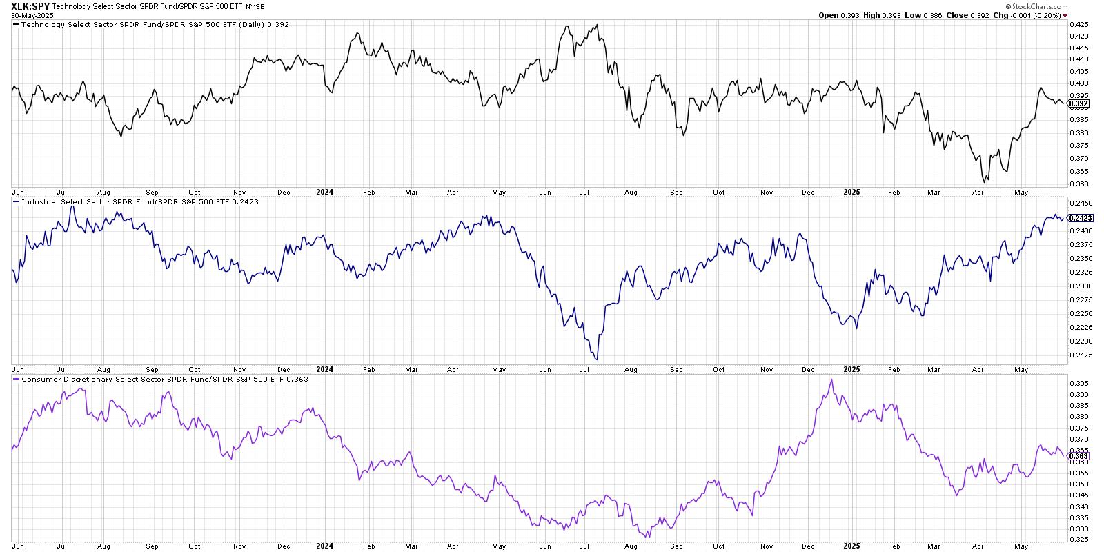
Only three sectors have outperformed the S&P 500 index over the last month: technology, industrials, and consumer discretionary. Notice how two of those sectors, technology and consumer discretionary, have been seeing a downturn in relative strength over the last week? It still may be early to declare a full leadership rotation, but this initial downturn in the relative performance could be a sign of further weakness to come.
Defensive Sectors Showing Early Signs of Strength
So if these leadership sectors are starting to slow down, which sectors are showing an improving relative strength? Our next chart shows the relative performance of the four traditionally defensive sectors, most of which have turned higher over the last two weeks.
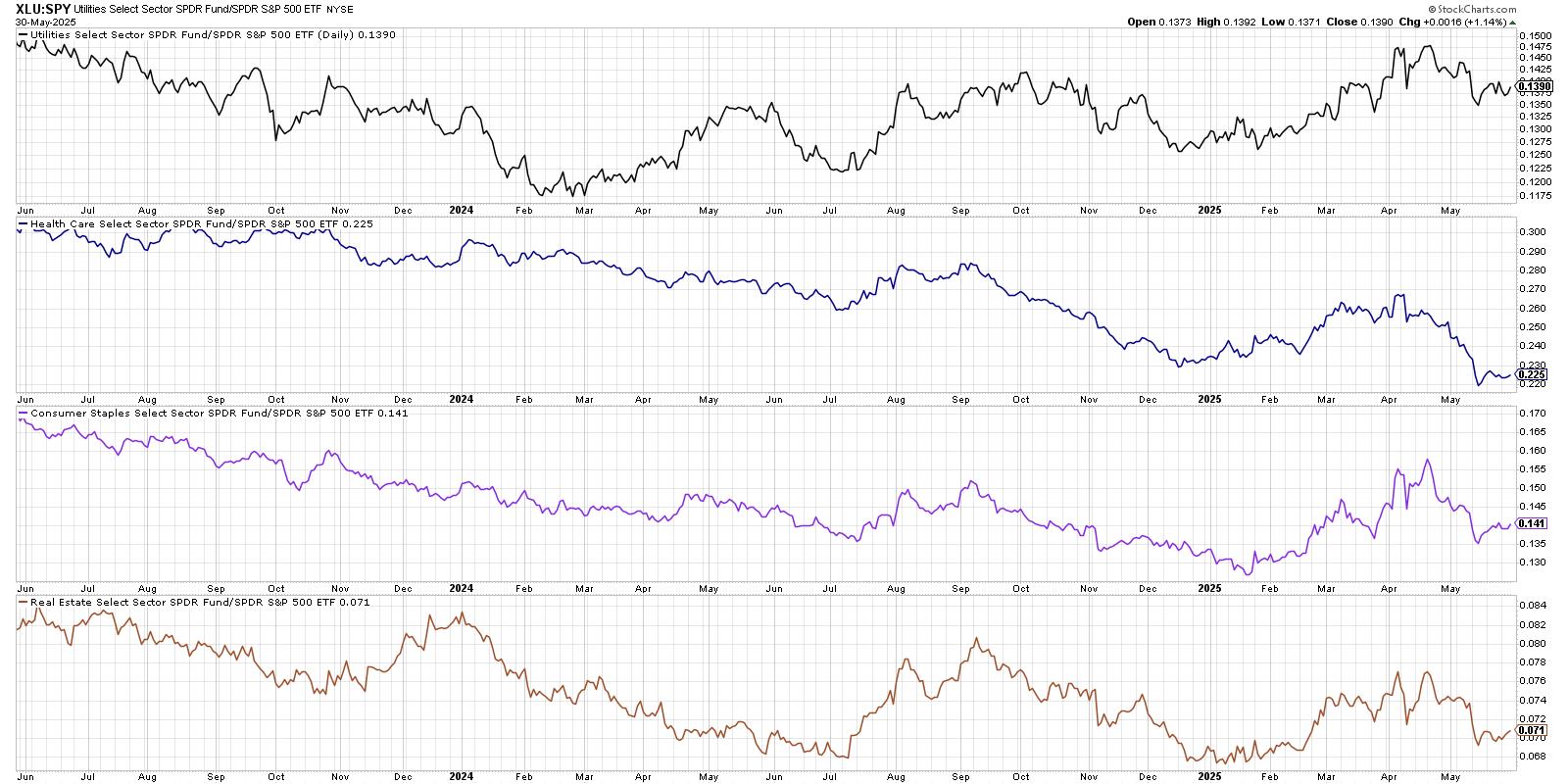
Again, I'd hesitate to declare this a full and confirmed rotation, but the fact that defensive sectors are improving here suggests investors are beginning to reallocate a bit to more risk-off positions. Over the next few weeks, improvement in these defensive sectors could provide a clear validation to a "market in correction" thesis.
Relative Rotation Graphs Confirm Defensive Rotation
Of course, when we're talking about sector rotation, I always want to bring up the Relative Rotation Graphs (RRG) and benefit from Julius de Kempenaer's innovative data visualization approach. First, let's see how the daily RRG showed the 11 S&P 500 sectors back in early May.
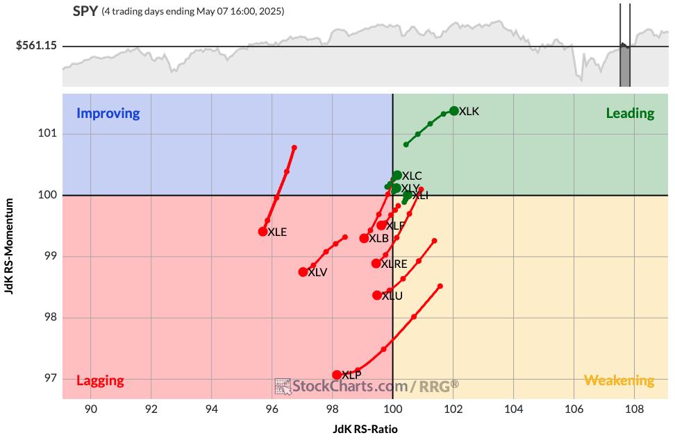
We can see that the Leading quadrant includes those leading sectors, such as technology. In the Lagging quadrant, meanwhile, we'll find pretty much everything else, including all four of the defensive sectors discussed above.
Now let's fast forward to the current RRG and see how things have rotated.
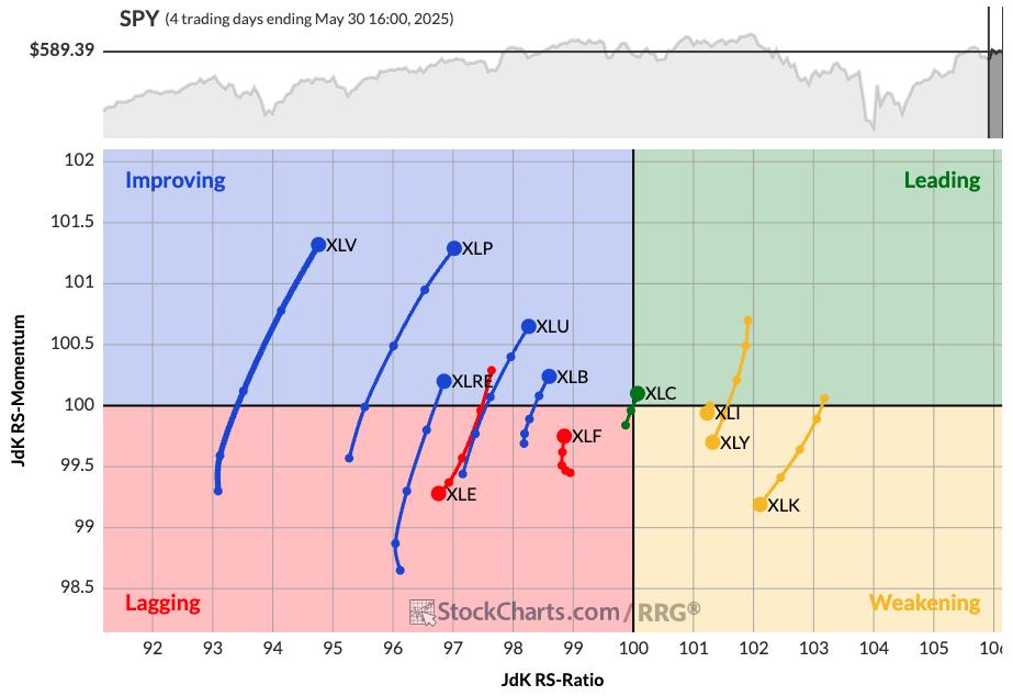
Here, you'll find health care, consumer staples, and other defensive sectors in the Improving quadrant. Technology, industrials, and consumer discretionary have now rotated down into the Weakening quadrant. So the RRG is showing at least an initial rotation away from the sectors that have been leading off the April market low.
One of the most important arguments from the bulls has been the dominance of offensive sectors over the last six weeks. But, as we've shown here today, the sector may be changing from a clearly bullish reading to a much more defensive warning sign for investors.
RR#6,
Dave
P.S. Ready to upgrade your investment process? Check out my free behavioral investing course!
David Keller, CMT
President and Chief Strategist
Sierra Alpha Research LLC
marketmisbehavior.com
https://www.youtube.com/c/MarketMisbehavior
Disclaimer: This blog is for educational purposes only and should not be construed as financial advice. The ideas and strategies should never be used without first assessing your own personal and financial situation, or without consulting a financial professional.
The author does not have a position in mentioned securities at the time of publication. Any opinions expressed herein are solely those of the author and do not in any way represent the views or opinions of any other person or entity.
|
| READ ONLINE → |
|
|
|
| CappThesis |
| Analyzing SIL, USO, and NVDA: Could These Bullish Patterns Trigger? |
| by Frank Cappelleri |
SIL Silver Miners
SIL was among the leaders yesterday and now is close to triggering this double-bottom bullish pattern. Staying above the 43-mark would target 47. That's not a big move, but let's remember that SIL is sporting bullish formations on its longer-term charts, too.
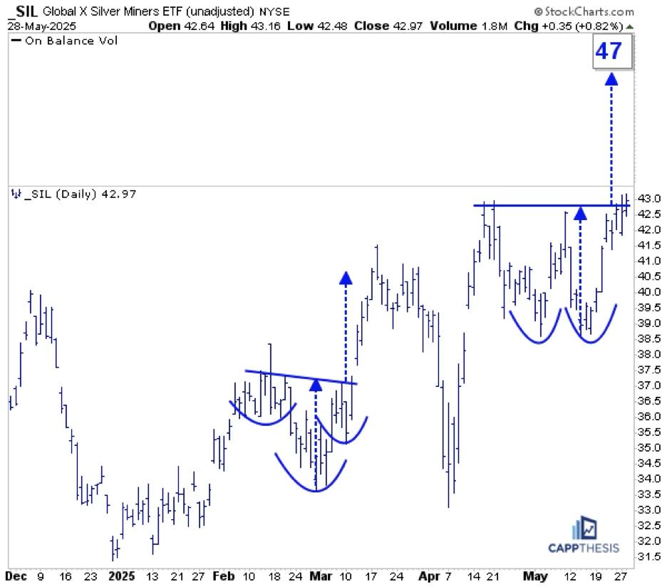 FIGURE 1. DAILY CHART OF GLOBAL X SILVER MINERS ETF (SIL). FIGURE 1. DAILY CHART OF GLOBAL X SILVER MINERS ETF (SIL).
 SIL – Weekly SIL – Weekly
Firstly, the double-bottom pattern on this weekly log chart annotated in blue remains alive. This objective is up near 49.
Secondly, the area highlighted in green here is the same pattern pictured on the daily chart above. That area is sitting at the very top of a much bigger bullish inverse head-and-shoulders pattern that extends all the way back to 2021. Thus, if the short-term breakout works, it will trigger this one, as well. That target is in the mid-70s...
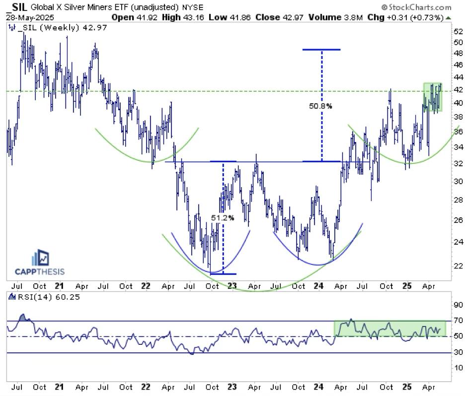 FIGURE 2. WEEKLY CHART OF GLOBAL X SILVER MINERS ETF (SIL). FIGURE 2. WEEKLY CHART OF GLOBAL X SILVER MINERS ETF (SIL).
SIL – Monthly
And that green pattern above is part of this MUCH larger, 13-year potential double bottom. We still have a while to go before this one is triggered, but it's important to keep all of these in the back of our minds.
Anyone who trades or tracks SIL knows that short-term whipsaws are the norm. So, while these breakouts may not be clean, the bullish structures are clear. The bottom line is that if SIL continues to make higher highs and higher lows, the patterns will continue to work.
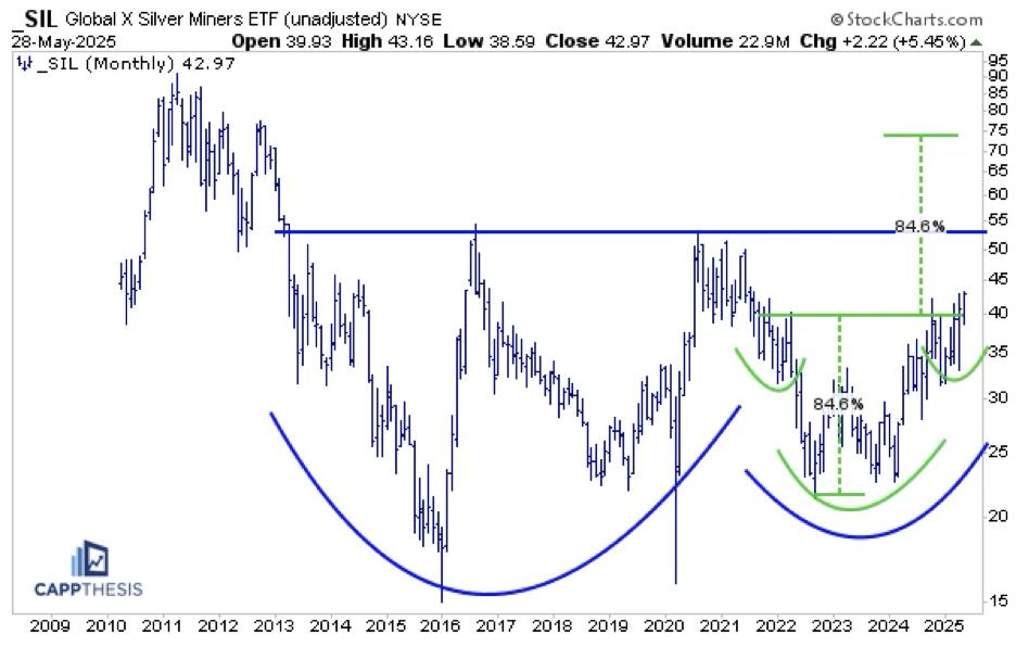 FIGURE 3. MONTHLY CHART OF GLOBAL X SILVER MINERS ETF (SIL). FIGURE 3. MONTHLY CHART OF GLOBAL X SILVER MINERS ETF (SIL).
USO Crude Oil
USO was among the leaders yesterday, but it's still trying to bust through its 50-DMA, which has been the sticking point the last few weeks. If it can soon, USO could complete this potential bullish inverse H&S pattern. The upside target would be in the 77-78 range, and that would align with key short-term tops from the last year. First step, push above the 50-day line...
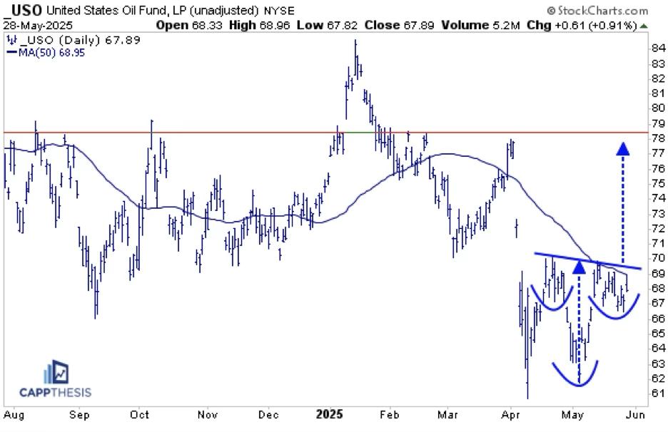 FIGURE 4. DAILY CHART OF US OIL FUND (USO). FIGURE 4. DAILY CHART OF US OIL FUND (USO).
NVDA
The obvious question every time NVDA rallies is whether it's too late to buy. To get a true sense of the stock's technical prospects, we need to view it across different charts and time frames.
First, here's a view of the bullish flag pattern we cited on Tuesday (along with TSLA, GOOGL and META). Given the preceding staircase-like advance, the starting point of the flagpole is subjective. We're using the early May low given that the stock avoided filling a gap from a few days earlier.
Regardless, the measured move counts to the 161 zone, which would be a new all-time high.
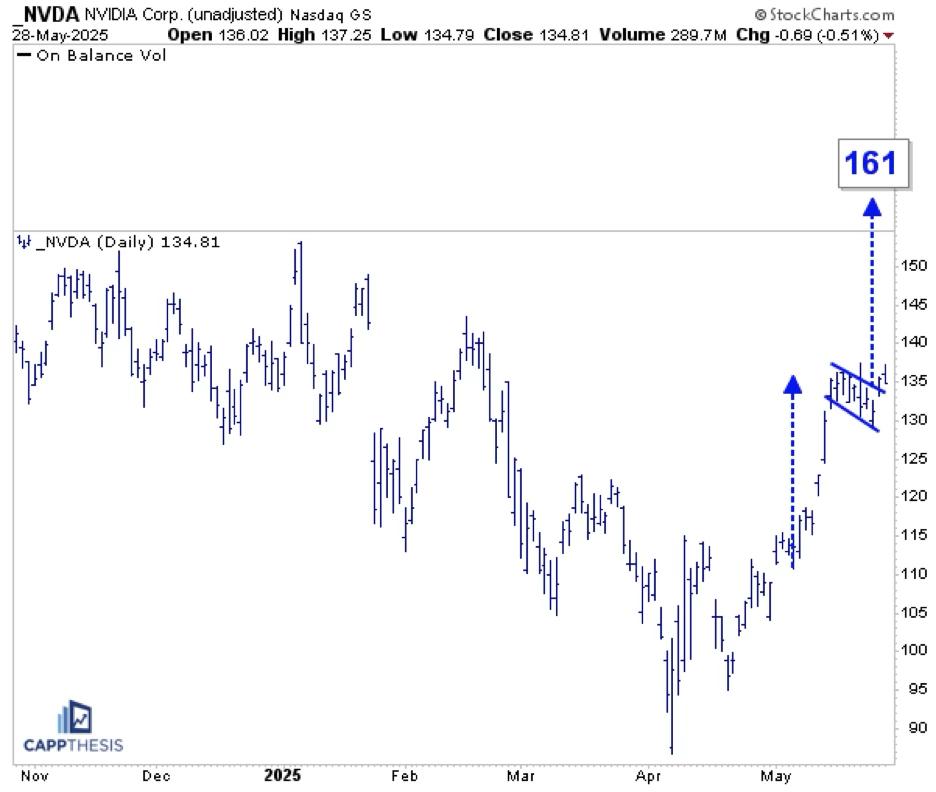 FIGURE 5. DAILY CHART OF NVIDIA CORP. (NVDA). FIGURE 5. DAILY CHART OF NVIDIA CORP. (NVDA).
This second one is a daily chart that extends all the way back to 2010 and shows times when breaking below or above the 200-DMA led to strong, extended moves for the stock. From this angle, the recent 200-day breach didn't last that long at all, and now NVDA has the chance to once again follow through after breaking back above it over the last few weeks.
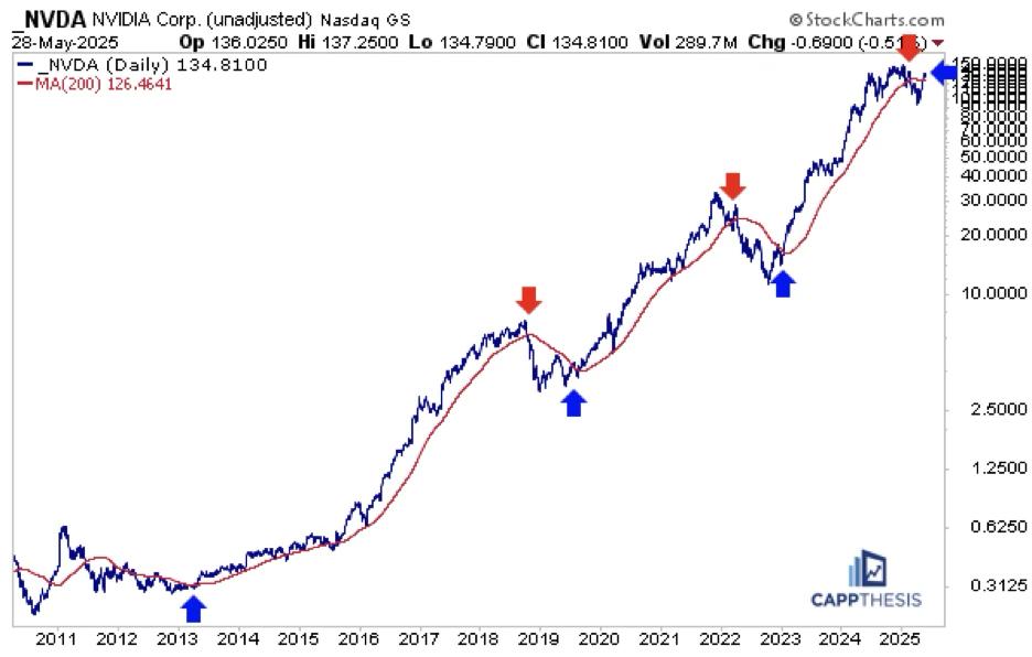 FIGURE 6. LONGER-TERM DAILY CHART OF NVIDIA CORP. (NVDA). FIGURE 6. LONGER-TERM DAILY CHART OF NVIDIA CORP. (NVDA).
Here's a weekly, log chart going back to the 2022 low. NVDA has leveraged three major pattern breakouts since then to power the astounding rally the last two-plus years. With the stock last having made a new high last October and being net flat since last July, an eventual push back above the 150-zone could prompt big pattern-breakout number four.
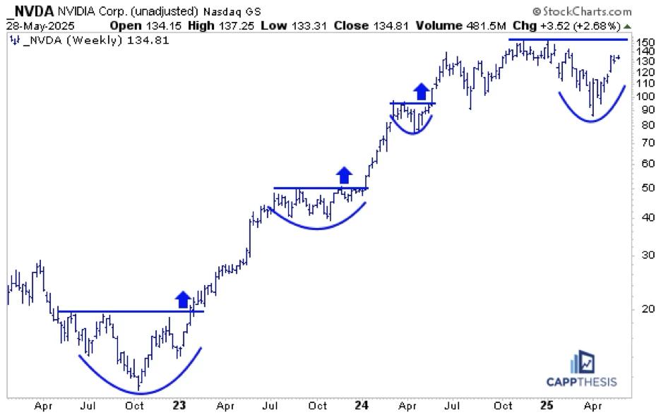 FIGURE 7. WEEKLY CHART OF NVIDIA CORP. (NVDA). FIGURE 7. WEEKLY CHART OF NVIDIA CORP. (NVDA).
Lastly, here are the biggest breakouts on this monthly chart that goes back over two decades. Again, looking at it from this viewpoint makes the last 11 months appear like a very small digestive phase, especially compared to the other three on the chart. Thus, the first step will be seeing how well NVDA can hold the opening gap. That's important for today, but much more important for the days and weeks to come.
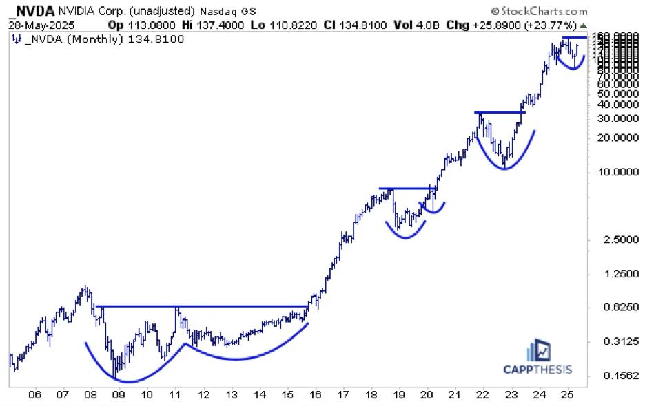 FIGURE 8. MONTHLY CHART OF NVIDIA CORP. (NVDA). FIGURE 8. MONTHLY CHART OF NVIDIA CORP. (NVDA).
|
| READ ONLINE → |
|
|
|
| Martin Pring's Market Roundup |
| MEMBERS ONLY |
| Five Charts I Am Watching Closely |
| by Martin Pring |
|
Each week, I monitor numerous charts to see if they have the potential for an important breakout. I tend to look at longer-term ones, because they set the scene as to whether the primary trend is bullish or bearish...
|
| READ ONLINE → |
|
|
|
| Trading Places with Tom Bowley |
| Learning Painful Lessons is the Start to Building a Successful Trading or Investing Strategy |
| by Tom Bowley |
In order to invest or trade successfully, you have to have conviction. Conviction does not equal stubbornness. It's very important to remain objective and occasionally question your conviction and adjust your strategy from time to time if signals warrant it. But I cannot trade personally if I believe there's a 50/50 chance the market is going higher. That doubt will resonate with each and every swing in the market. I'll chase at the wrong time and get whipsawed out of positions.
Instead, I evaluate those signals that work best for me - the same signals that have allowed me go against the grain and call significant market tops and bottoms over the past 5-7 years. Few were saying it was time to be long in early April, but I was quite clear. Topping signals were just as evident to me earlier this year, leading me to tell EarningsBeats.com members that I was 100% cash at the end of January. The technical confirmation of a market top occurred on Friday, February 21st. I published my belief of that confirmed market top in this same blog - again rather clearly:
You can click on this headline and read the whole story, if you'd like. After letting EB.com members know that I was fully committed on the long side in early April, because of bullish market maker manipulation, I have continued to track that market maker manipulation. Through Friday, it's still telling me the same thing - BUY US STOCKS!
The Manipulation Continues
Listen, we've seen a massive run higher off that early-April low and profit taking and pullbacks will occur. That cannot deter us and should not be misconstrued as distribution ahead of a major market decline. In fact, there are a lot of technicians and market analysts talking about the big selling that's taken place over the past week and how that will lead to further selling ahead. I completely disagree with this crew. We've seen almost zero selling or distribution in recent days. What we've seen are more gap downs, just like the ones that occurred after the March 13th low. Those opening and early morning selloffs saw subsequent buying throughout trading sessions. Check out the accumulation/distribution indicator on both the S&P 500 and NASDAQ 100 below:
S&P 500
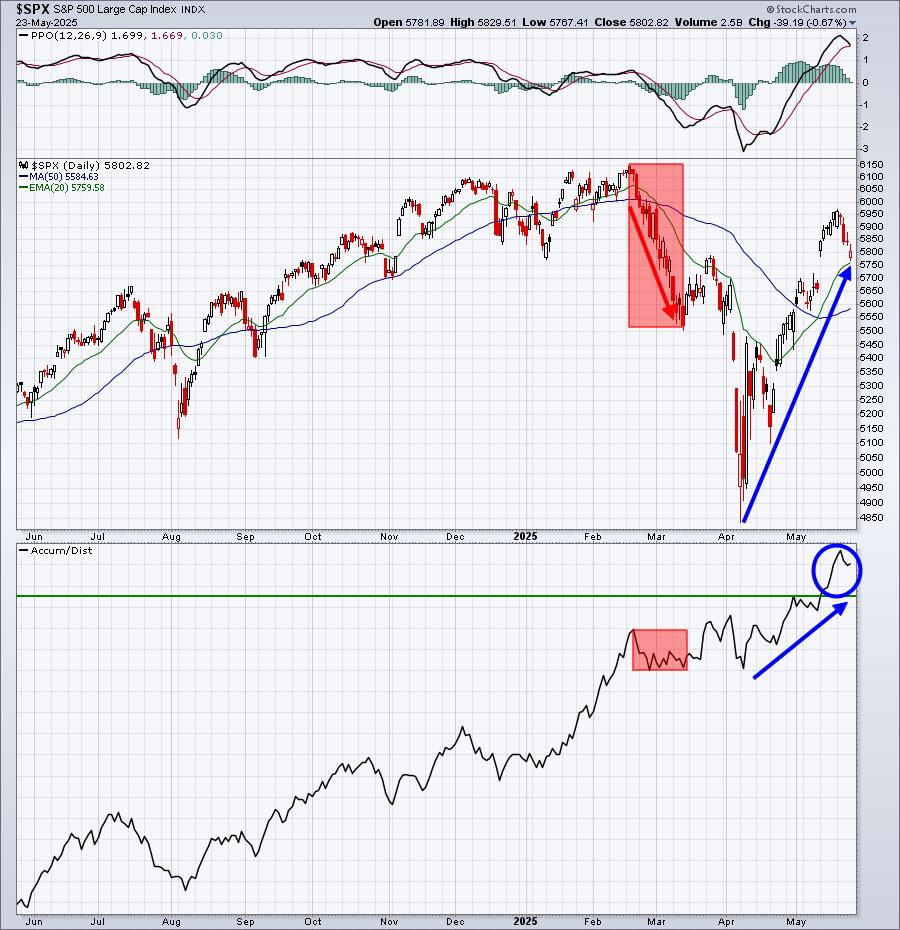
You can see the AD line take a bit of a hit during the true period of distribution in 2025. Currently, however, the AD line is very near its all-time high. Last week (since Monday's close), the SPY lost 15.74, falling from 594.85 to Friday's close at 579.11. That was roughly a 2.5% pullback, but here's what's interesting. The SPY had gap downs the past four trading days that totaled 13.65. Nearly all of last week's drop occurred at the opening bell. There was little selling during the trading day. We track this manipulative behavior in our "2025 Key Stocks Manipulation" excel spreadsheet, which we update for our members every Monday morning, so our members can clearly see the manipulation taking place on the SPY, QQQ, IWM, and 11 individual stocks, including Mag 7 stocks and a few others. It's independent research and has helped us completely ignore the bearish and biased media. They're interested in viewership and clicks and will scare the heck out of everyone to achieve their own selfish, money-making goals. EarningsBeats.com is interested in helping folks navigate a landscape designed to misinform and mislead. We're interested in making money, that's it. Follow the charts, not the headlines.
NASDAQ 100
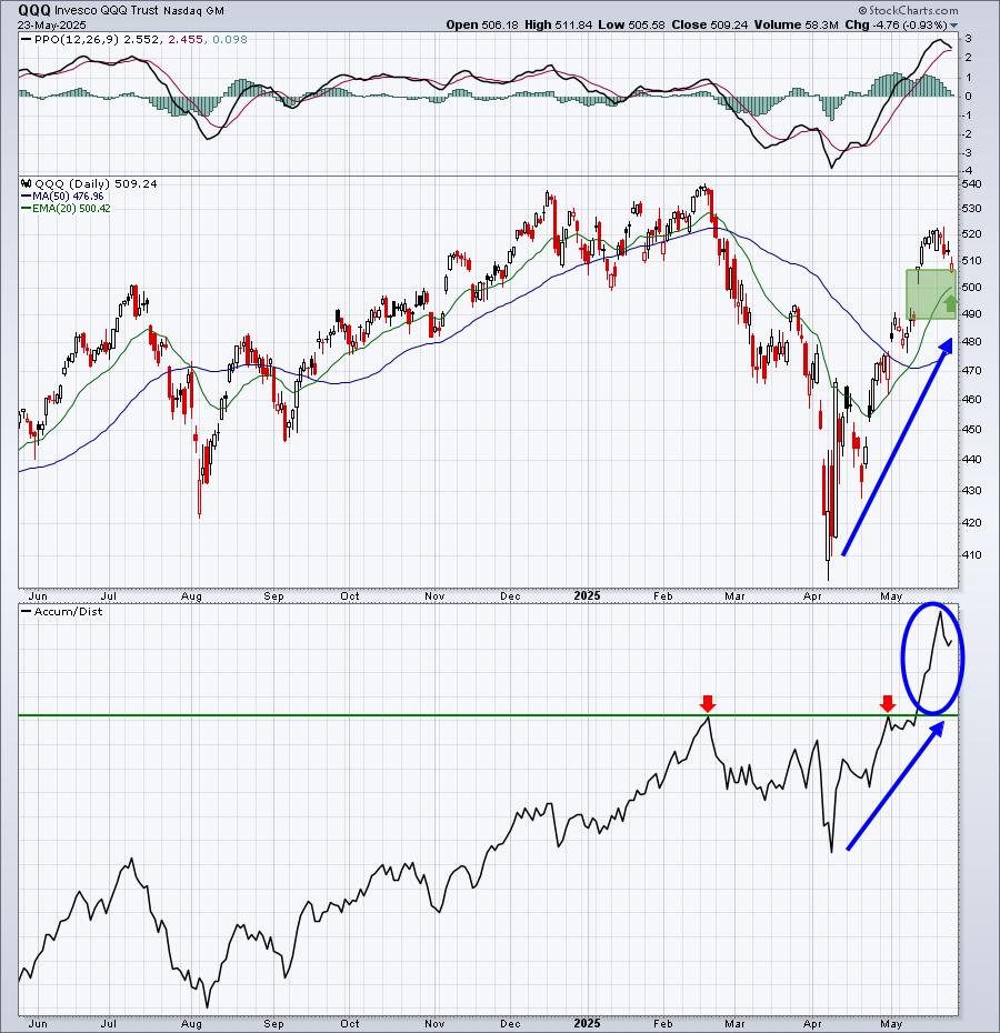
The AD line exploded higher on the NASDAQ 100, mostly because Mag 7 stocks were heavily accumulated during the early-April massacre. The same thing occurred in March 2020 during the pandemic, prior to these stocks skyrocketing later in 2020. Then we saw a repeat in 2022, before a massive explosion higher in 2023. Once again, we're seeing Wall Street's "rinse and repeat" strategy of effectively stealing shares from unsuspecting retail traders. And once again, these stocks have been flying again.
It's up to us to learn these lessons and not make the same mistakes over and over again during cyclical bear markets. At EarningsBeats.com, we take advantage of these selloffs before they occur. First, we move to cash. Next, we watch the stocks tumble. Third, we buy back in much cheaper at the same time that Wall Street does. Doesn't this sound like a much better strategy? Follow what Wall Street is buying, not what they're saying.
This manipulation applies to an even greater extent to individual stocks. One of my favorite stocks has been ridiculously-manipulated in 2025. Over the past four trading days, while the S&P 500 has been under pressure, this stock has gapped down 3.13, but has moved 8 bucks higher during the trading day. It's one of our 12 individual stocks that we track each week and showed the most manipulation last week. Its AD line is soaring again and its relative strength vs. its industry peers has exploded higher since the first week of March. Owning stocks like this help us significantly outperform the S&P 500.
I'm featuring this stock in our FREE EB Digest newsletter on Tuesday morning. To register for our newsletter and receive this stock Tuesday morning before the market opens, simply CLICK HERE and provide your name and email address. Again, it's free, there's no credit card required, and you may unsubscribe at any time.
Our Spring Special, HUGE Savings
We run specials from time to time to allow new members an opportunity to enjoy our service for a year at a major discount. We started our annual Spring Special this past week and it runs through Monday at midnight. If you'd like to change your approach to the stock market and be more proactive, please consider taking advantage of this special. For more information and to Start Your Annual Membership Today, follow this link.
Happy trading!
Tom
|
| READ ONLINE → |
|
|
|
| ChartWatchers |
| Nuclear Power Trio: OKLO, SMR, and CCJ in Focus |
| by Karl Montevirgen |
Nuclear energy stocks are on a tear, and Oklo Inc. (OKLO), Cameco Corp. (CCJ), and NuScale Power Corporation (SMR) are leading the charge, fueled by presidential executive orders, investor hype, and hopes for a nuclear-powered future.
Is It Time to Go Nuclear?
These names bucked the trend on Wednesday, rising even as the major U.S. indexes fell. I found all three while running a P&F Double Top Breakout scan, with SMR also appearing in the New 52-Week Highs scan. But are these gains a sign of genuine investment opportunities, or is this high-risk subsector just radioactive for your portfolio? To analyze this, let's break down their profiles and charts to see whether the "glow" here points to real promise—or simply masks a toxic risk.
Here's a PerfCharts snapshot of all three stocks against the SPDR S&P 500 ETF (SPY), our broader market proxy.
 FIGURE 1. PERFCHARTS OF SMR, OKLO, CCJ, AND SPY. FIGURE 1. PERFCHARTS OF SMR, OKLO, CCJ, AND SPY.
While CCJ steadily lagged behind the S&P 500 until this month, both OKLO and SMR began outperforming the broader market starting in mid-October of last year. Their relative performance to date is so strong that it appears almost unsustainable in the short term.
All three mid-cap stocks are also showing robust StockCharts Technical Rank (SCTR) scores—OKLO at 99.6, SMR at 99.3, and CCJ at 89.9 at the time of writing. While this can indicate technical strength, it can also signal irrational exuberance among retail investors.
Robust SCTR Scores but Divergent Fundamentals
Another thing to note is the notable difference in their fundamentals. SMR and OKLO have negative P/E ratios, suggesting that their surges are driven more by promise and speculation than by profits. CCJ, with a P/E ratio of 149, is raking in some profits, but may also be riding an overcrowded wave of hype.
Ultimately, while technical performance can sometimes lead to fundamental strength—or mask fundamental weakness—it's worth taking a closer look at these leading names in the nuclear subsector to understand the opportunities and risks they present. Let's break it down further by examining each stock's technical picture and what it suggests about investor conviction.
OKLO: Testing Highs, Buying the Dip?
To start, here's a daily chart of nuclear energy startup OKLO.
 FIGURE 2. DAILY CHART OF OKLO. In contrast to the other two nuclear stocks, OKLO is potentially experiencing higher levels of accumulation. FIGURE 2. DAILY CHART OF OKLO. In contrast to the other two nuclear stocks, OKLO is potentially experiencing higher levels of accumulation.
OKLO recently tested its all-time high of $59 before pulling back. The Relative Strength Index (RSI) shows the stock was deep within overbought territory, hinting at caution. Still, what's interesting is that OKLO's Accumulation/Distribution Line (ADL), plotted behind the price, remains strong. This suggests that even as the price retreats, buying pressure may still be present—hinting that investors might be looking to buy the dip rather than "sell the news."
The key thing to watch now is how deep this retracement goes. If investors are still optimistic about OKLO's fundamental outlook, you might see a bounce within the first two quadrants marked by the Quadrant Lines on the chart. Pay particular attention to the critical support range around the center line at $38, shown in the yellow-shaded area. If the price falls below this level, it could be a sign of weakness, suggesting the stock is more of a FOMO-driven trade than one backed by long-term conviction.
SMR: Hype or Healthy Pullback?
Next, we'll shift over to a daily chart of SMR. Among the three, SMR is the only to notch a new all-time high. But does this signal the beginning of a new leg up, or the end of a surge that lacks substance?
 FIGURE 3. DAILY CHART OF SMR. What happens next will show whether investors truly believe in the stock—or if the rally was driven by short-term hype. FIGURE 3. DAILY CHART OF SMR. What happens next will show whether investors truly believe in the stock—or if the rally was driven by short-term hype.
SMR immediately declined after making a parabolic move to a new all-time high. As the RSI confirms, the stock was well-overbought. Now, it's a matter of measuring the depth of the pullback.
I plotted a Fibonacci Retracement to highlight potential support levels. There are several zones of support from previous swing highs and a concentrated trading area between the 61.8% and 38.2% retracement levels. If investor confidence stays strong, expect a possible bounce between $21 and $24, marking the 61.8% and 50% Fib levels respectively. A deeper drop below the 61.8% level might still find support around $15, but that would also suggest that the rally was driven more by sentiment than strategic conviction.
CCJ: Underperforming Stock, Profitable Company
Lastly, let's take a look at the most earnings-positive company among the three. Here's a daily chart of CCJ.
 FIGURE 4. DAILY CHART OF CCJ. The critical level to watch is the range between $50 - $52. FIGURE 4. DAILY CHART OF CCJ. The critical level to watch is the range between $50 - $52.
CCJ has a similar technical profile to OKLO and SMR—it's overbought, and it tested its all-time high on a parabolic surge, leading to a pullback.
However, instead of measuring the various degrees of its potential retracements (using Fib or Quadrants), I'm focusing on the key range of $50–$52. Why? Because, in addition to marking a broad level that has acted as both support and resistance since October of last year, this range also shows a high concentration of trading activity, as indicated by the Volume-by-Price indicator.
If longer-term conviction holds, CCJ should bounce at this level. If not, expect the stock to decline further—although it may eventually find support at lower levels, it likely wouldn't be worth chasing at that point.
At the Close
Nuclear energy stocks like OKLO, SMR, and CCJ have captured market attention, defying broader trends and flashing bullish technical patterns. But while momentum and investor enthusiasm are driving these moves, each stock also faces questions about sustainability and fundamentals.
Are we looking at a healthy dip—or is Wall Street just selling the news? To answer that question, keep an eye on the key technical levels outlined above. With these standout names in an emerging (and therefore highly uncertain) subsector, the technicals will likely reveal whether the market's leaning toward conviction or just chasing the hype.

Disclaimer: This blog is for educational purposes only and should not be construed as financial advice. The ideas and strategies should never be used without first assessing your personal and financial situation, or without consulting a financial professional.
|
| READ ONLINE → |
|
|
|
|
|
| MORE ARTICLES → |
|

 SIL – Weekly