Well, we got our seasonally strong July, but now, like clockwork, August has arrived, and the market sells off. It eerily echoes last August’s decline. Back then, the stock market sold off the week of August 5 on a weak jobs report, came close to its 40-week moving average, and rebounded all the way into mid-February, when tariff concerns escalated (see chart below).
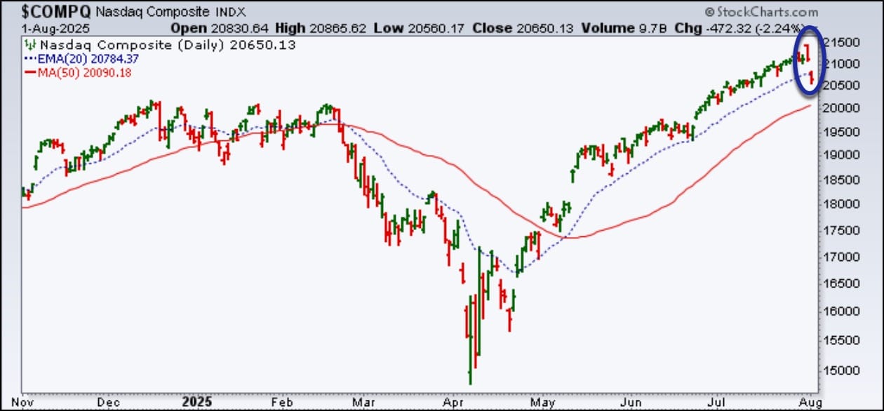
The market generally reverses quickly when it’s at highs, and this time it was no different. With the weaker-than-expected July jobs data, that reversal came quickly. After a powerful July, led by mega-cap tech stocks, we’re now looking at a Nasdaq Composite that closed below its 21-day exponential moving average for the first time since late April (see chart below).
The story is similar across the board.
Here’s how the major indexes closed on Friday:
Dow Industrials: 43,588.58 (-1.23%)
S&P 500: 6238.01 (-1.60%)
Nasdaq Composite: 20,650 (-2.24%)
This week’s drop was painful, but the bigger concern is how bad the damage was. From a short-term perspective, things may not look great, but the weekly chart paints a more optimistic picture. The S&P 500 is still trading above its mid-February high and 40-week moving average.
When a market rises over 30% from its April low to its July 31 high, a 10–15% pullback is healthy. Of course, a deeper correction would shift the tone. Either way, we will have to go through some pain.
While we wait for this pullback to run its course, now may be a good time to:
Identify which areas of the market are breaking down and which ones are resilient.
Create and refine your action plan, whether it's to buy the dip or have an action plan in the event of a deep correction.
We’ve packed this week’s newsletter with fresh insights and educational information from our experts. You’ll also want to check out The StockCharts Insider, our new article series highlighting tips & tricks and powerful ways to enhance your charting experience. Now’s a great time to reconnect with the charts that will better prepare you for what the market does next.
Relative Rotation Graphs can be rendered in similar intervals as regular bar- or candlestick charts. This article explains the differences between weekly and daily RRGs. ...
Stock market correction risks are rising as key indicators flash warnings. Discover sector correlations with SPY, potential safe havens, and how Bitcoin's surge aligns with QQQ in this data-driven analysis. ...
What are the different ways you can use technical analysis in your trading? And which is the best one for you? Today's Insider Tip: Know your charting "style" and focus on its strengths. ...
Was Thursday's market dip a warning sign or just noise? Explore market trends, sentiment, and sector rotation, and learn how the StockCharts Market Summary page can help you stay one step ahead. ...
Check these must-see StockCharts signals before you cast off for the summer and see whether August's market currents say "stay the course" or "make adjustments." ...
As a StockCharts Member, you unlock all of our most powerful tools and features, including saved charts and settings, custom scans, technical alerts and much more. Discover all that StockCharts can do with our
free 1-month trial and start charting like a true market pro.