The S&P 500 ($SPX), Nasdaq Composite ($COMPQ), and the Dow Industrials ($INDU) all flirted with record highs at some point during the week, small caps stole the spotlight for a couple of days, and some beaten-down names like UnitedHealth Group (UNH) and Intel Corp. (INTC) woke up and joined the party.
The market’s still chugging along, and you can see it for yourself on the Market Summary page. When you switch the view to One Month from the timeframe dropdown menu on the top left, you’ll notice that all US Indexes in the Equities panel are trading above their 200-day simple moving average (SMA), with the Nasdaq Composite and Nasdaq 100 ($NDX) leading the pack.
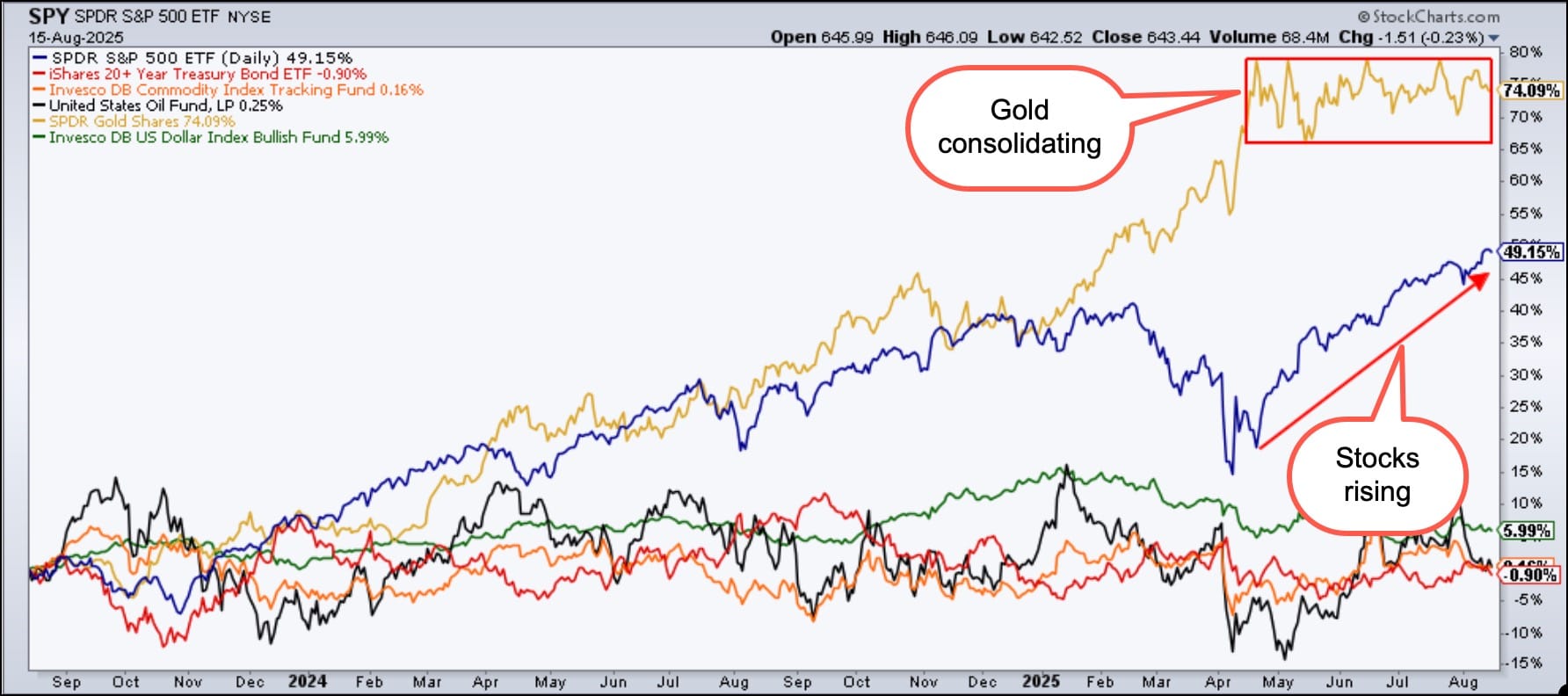
Here’s where it gets interesting. Check out the Intermarket Analysis panel, which examines the relationship between stocks, bonds, commodities, and currencies. The chart on the right of the panel (see below) analyzes the one-year performance of these different asset groups. Gold may be the one-year performance champ, but since mid-April, it has been moving sideways. Stocks, on the other hand, are climbing.
Intermarket analysis chart showing gold consolidating and stocks rising.
Click on the Charts button (at the top right of the panel) and scroll through the asset group charts. With these, you’ll see that equities are holding strong, whereas all other asset groups are at or slightly below key support levels, either the 200-day SMA or 50-day SMA. Further down, you’ll find the relative performance over the past year, and see that equities are outperforming all other asset classes. This type of price action in equities is likely to make investors feel complacent (the VIX closed at 15.09), but, as you know, this is exactly when the market loves to throw curveballs.
And speaking of curveballs, there are a couple of market movers that could impact the market next week. There’s the outcome of the meeting between President Trump and Putin, and further out, the Fed’s interest rate decision. These could quickly shake up the asset class leaderboard.
Bottom line: Whether you invest in stocks, bonds, commodities, or currencies, it pays to understand how they all dance together. The Market Summary page provides a quick visual pulse of the market’s action. It’s worth checking out daily, weekly, or, at the very least, monthly.
Equities are looking strong now, but next week’s a whole new ballgame. So kick back, pour yourself a cup of coffee, and enjoy this week’s collection of articles and videos. They’re packed with wonderful insights that’ll keep you on top of your investment game.
Get the latest S&P 500 analysis with a focus on RSI negative divergence, short-term swing setups, and market breadth trends. Learn what current patterns mean and how to spot the next move. ...
The stock market is showing strong momentum with small-cap strength, broader market participation, and rate cut optimism. See what key indicators say next and learn how StockCharts tools can help you spot opportunities before they hit the headlines. ...
Small-cap stocks are showing signs of strength. Investors should keep an eye on the performance of IWM and IJR, two small-cap ETFs, to determine if the small-cap rally has legs. ...
Before We Dive In…
Should I start with a blank chart or one pre-loaded with indicators? It’s a good question. There are pros and cons to both, and it depends on what you’re trying to do. In this quick post, I’ll break everything down so that you ...
With high-impact US data and geopolitical risks on tap this week, traders must assess the US dollar. Here are some outcomes that could surface in the dollar and gold. ...
As a StockCharts Member, you unlock all of our most powerful tools and features, including saved charts and settings, custom scans, technical alerts and much more. Discover all that StockCharts can do with our
free 1-month trial and start charting like a true market pro.