Ever get the feeling that the big players know something before the rest of us do? Thursday’s selloff sure made it seem that way.
On the surface, there wasn’t much to explain it. News of a potential ceasefire between Hamas and Israel affected gold, the dollar, and crude oil, as most would have expected it to. Stocks selling off, however, was puzzling.
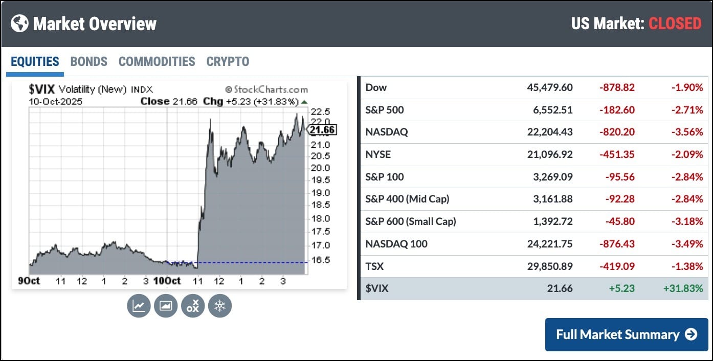
Then Friday rolled around, and the mystery cleared up. President Trump announced plans for steep tariff hikes on goods from China, sending stocks sliding and erasing all the gains since the week of September 15 in just one day.
Below is the Market Overview panel showing Friday’s action.
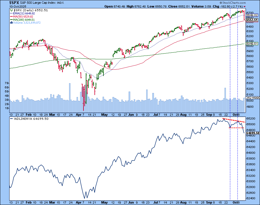
While reviewing my ChartLists after Thursday’s close, the one chart that caught my eye was the NYSE Advance-Decline Line (!ADLINENYA). The market breadth indicator is in the lower panel below the daily chart of the S&P 500 ($SPX).
What stood out on the chart was the divergence between market breadth and the S&P 500. Divergences like this can be early warning signs. The challenge, of course, is timing. You never know when the market will react. It’s easy to remain invested when the index keeps climbing, but sometimes those subtle indications, such as the lower peak on October 2 compared to the September 18 peak, are the clues that something is changing beneath the surface.
Another point to note: The Advance-Decline line is now below its September 25 low. If the S&P 500 falls below its 50-day SMA and the A-D Line continues its descent, it would reflect a weakening market.
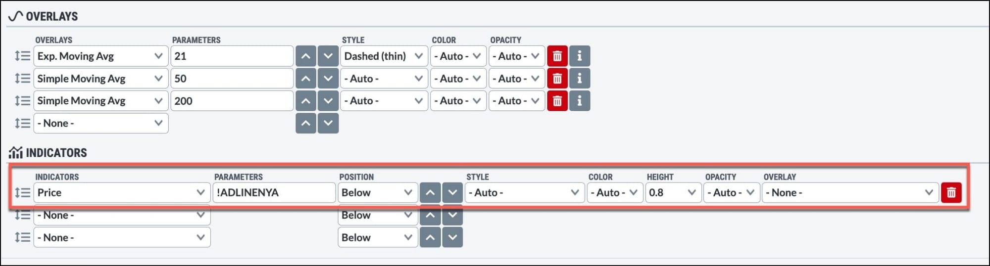
To see the chart settings, either click the chart or see the screen capture below.
Technical analysis isn’t just about numbers and charts. It’s also about trusting your instincts. When your gut says the market’s getting wobbly, it’s often worth paying some attention. You'll thank yourself later.
Next week, we get earnings from the big banks. Maybe they’ll give this market the boost it needs. Until then, review your charts and enjoy our collection of articles and videos.
The stock market pulled back sharply this week as volatility spiked. Learn what key support levels, sentiment shifts, and charts are telling investors. ...
Gold has pushed above $4000 for the first time in history! We'll recap this historic rally for gold, analyze recent pullbacks during the uptrend phase, and share trend following tools we're using to anticipate a potential downside reversal in gold stocks. ...
Earnings season is here with Delta Air Lines and PepsiCo on deck. Next week, the focus will be on big banks, which set the stage for the rest of the season. ...
Before We Dive In…
You can do a lot with MarketCarpets—analyze sectors, spot outliers, gauge technical strength, the whole deal. But let’s cut the fat. You just want a fast, visual read on what’s happening now. So, let’s get to it. I’ll show you how. ...
Japan's Nikkei surges and France faces fresh turmoil, shaking global rates as U.S. stocks hit records. Here's what it means for the dollar, gold, and bitcoin. ...
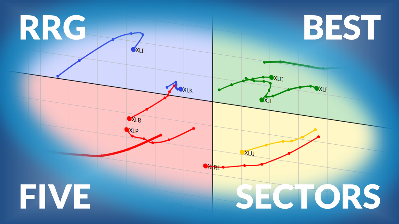
Martin Pring analyzes the Health Care sector, which is breaking out of a key resistance level. On a relative basis, the sector's performance may not be stellar. ...
As a StockCharts Member, you unlock all of our most powerful tools and features, including saved charts and settings, custom scans, technical alerts and much more. Discover all that StockCharts can do with our
free 1-month trial and start charting like a true market pro.
You can see recent IPOs that have been added to StockCharts and quickly chart each one from our Recent Data Adjustments page. Visit StockCharts.com/ipo to check it out.