This week may have felt a little déjà vu as, once again, the stock market gave investors a short-lived scare.
Thursday’s selloff had many investors wondering if something bigger was brewing, but afterwards, things seemed to stabilize. By Friday’s close, most major indexes managed to hold key support levels.
Breaking Down the Market Action
At one point, the S&P 500 slipped below its 100-day Simple Moving Average (SMA), but it closed back above it, telling us that buyers are still in control. The S&P 600 Small Cap Index ($SML), S&P 400 Mid Cap Index ($MID), and Dow Jones Industrial Average ($INDU) are all holding above their 21-day Exponential Moving Average (EMA).
So, where are we seeing weakness? Mostly in the Nasdaq Composite ($COMPQ) and Nasdaq 100 ($NDX). Tech stocks, especially the Magnificent Seven, have been under pressure as investors question AI-related spending. While this fear may have spread into other areas of the market, it’s not a broad market collapse. Some sectors are getting clobbered — Technology, Consumer Discretionary, Communication Services, and Financials — but others, such as Utilities, Real Estate, Materials, Energy, Industrials, and Health Care, are holding up. Overseas stocks are also rallying higher.
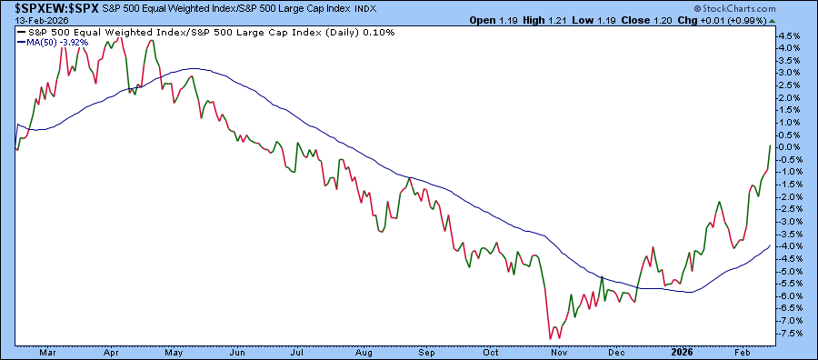
The chart below shows the performance of the S&P 500 Equal Weighted Index ($SPXEW) relative to the S&P 500 ($SPX). Note that, for much of the past year, the Equal Weighted S&P 500 lagged because mega-cap tech stocks dominated the market. Since November 2025, though, that relationship has started to reverse.
The chart also suggests that the average stock is beginning to participate more, meaning it’s not just a handful of mega-cap stocks moving the market higher.
How to Spot Strength Quickly
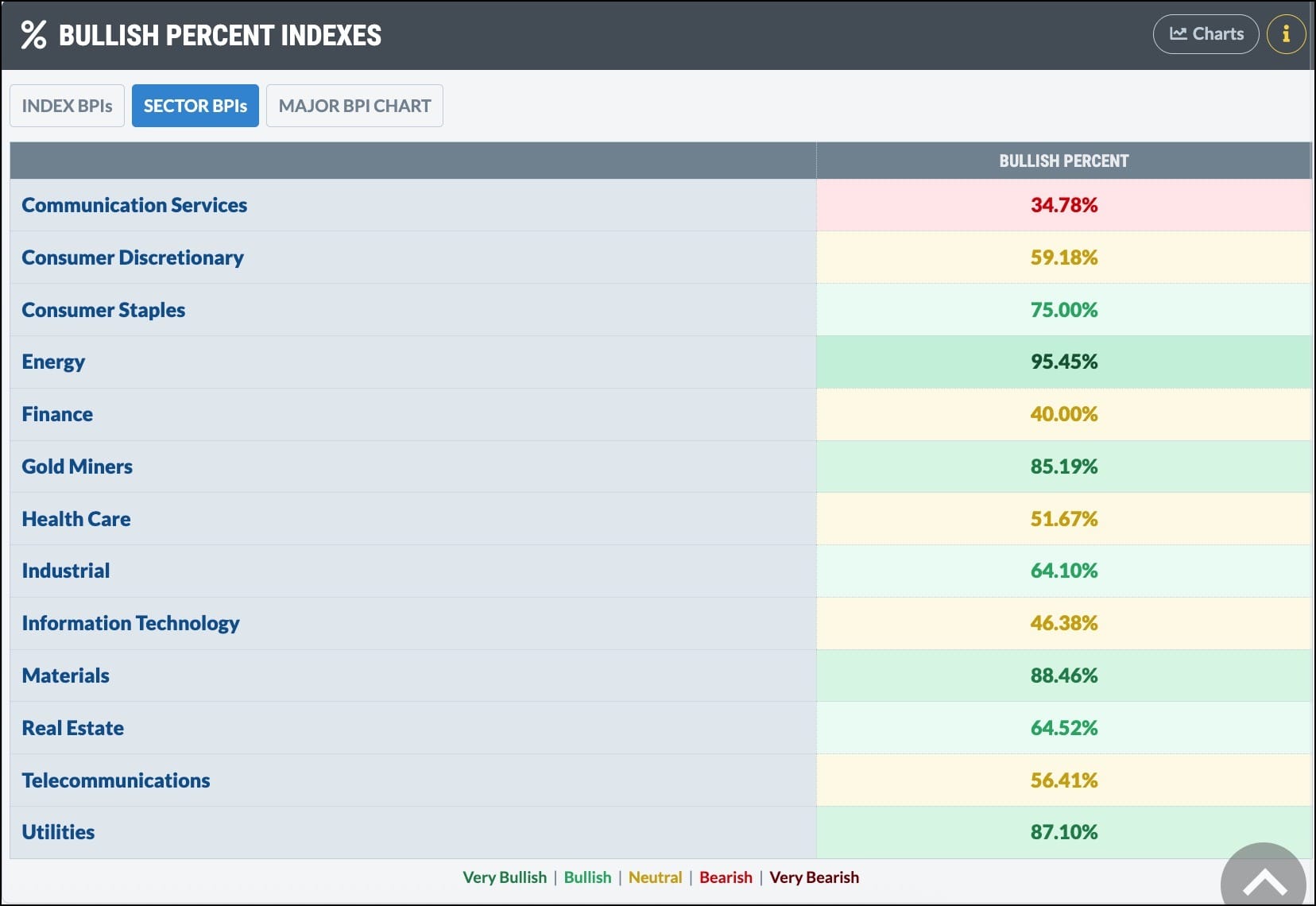
The Sector BPIs tab in the % Bullish Percent Indexes panel on the Market Summary page gives you a powerful bird’s eye view of which sectors are gaining strength. You can see from the screenshot below that Communication Services has been hit the hardest.
Does this mean that, if you are heavily invested in Technology and Communication Services, it’s time to reallocate some of your funds to other sectors? Not necessarily. Think of it more as a reminder that it always helps to be diversified. Even if diversification may not be exciting, this week showed us that it can be powerful. If you've allocated even modest portions of your portfolio to sectors outside of tech, chances are those groups are helping cushion the recent volatility.
This may be a good weekend to reassess your portfolio, analyze all your holdings, and ask yourself a few questions. Some important ones are:
Why did you invest in the stock or ETF?
Is it still meeting your income and growth objectives?
Is the longer-term trend still up?
Your Weekend Checklist
▢ Pull up a chart of all your portfolio holdings. ▢ Overlay the 21-day EMA and 100-day SMA. ▢ Check the relative strength of your holding vs. the S&P 500.
You don’t need to panic sell or buy on a whim. But regularly viewing charts of your portfolio holdings helps you stay informed and disciplined, two traits of an empowered investor.
The market is known to have mood swings, and having the right charts & tools makes it easier to make decisions.
Happy Valentine’s Day, and enjoy the long weekend.
A confirmed Hindenburg Omen signal and renewed rotation into defensive sectors are raising caution flags for US equities. While the S&P 500 remains in a neutral range, Dave Keller, CMT, highlights key support levels and breadth signals investors should monitor closely. ...
The large-cap tech universe is struggling; Arthur Hill analyzes how the weakness is spreading into the broader market and other sectors. Meanwhile, investors are moving money into bonds and utilities. ...
Martin takes a look at some important signs that suggest the Real Estate sector has reached the end of a corrective period and could be poised for a major breakout. ...
As the market experiences significant turbulence, Mary Ellen McGonagle talks ways to strategize beyond buy-and-hold. She also takes a look at EWJ in the wake of Japan's general election. ...
Before We Dive In…
The Sector Drill-Down is a popular and incredibly useful tool for observing relative sector rankings at a glance. But the data itself doesn’t give you a workflow, let alone a strategy. While many traders glance at the rankings and click a few charts, hoping something ...
As a StockCharts Member, you unlock all of our most powerful tools and features, including saved charts and settings, custom scans, technical alerts and much more. Discover all that StockCharts can do with our
free 1-month trial and start charting like a true market pro.