Yes, the stock market had to cope with rising geopolitical tensions in the Middle East. But for many in the technical analysis community, the week carried a heavier weight. We learned of the passing of John Murphy, one of the most respected and influential teachers of technical analysis.
John was a teacher, mentor, and pioneer who helped investors and traders learn to interpret charts and understand market relationships. Here at StockCharts, we had the privilege of working closely with John over the years.
In “A Tribute to John Murphy (1942 – 2026)”, StockCharts President Chip Anderson and several respected members of the technical analysis community share their memories of John and the impact he had on our industry. His books, articles, and teachings shaped how many of us look at the market today.
In the spirit of honoring John’s legacy, let’s do what he taught us to do: step back, look at the charts, and let the market (not the news) tell its story.
The Market Story This Week
This week’s spotlight was crude oil. Prices surged to above $90 per barrel, a level we haven’t seen since September 2023. At that time, crude briefly pushed toward $95 before beginning a steady decline that lasted well into late 2025.
The rise in oil prices raises concerns about inflationary pressures. This adds to investor anxiety.
What’s interesting is that despite the Middle East conflict, equity indexes have held up surprisingly well. That’s where one of John Murphy’s most important principles comes in.
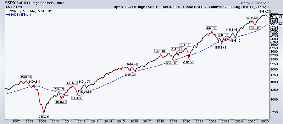
John often reminded investors to begin their analysis with long-term charts before focusing on shorter timeframes. With that in mind, let’s start by looking at a 20-year monthly chart of the S&P 500 ($SPX).
The recent selloff doesn’t look all that bad on the monthly chart. The uptrend is still intact.
The next step is to move down to the weekly chart (here’s the link). Does the uptrend still look healthy, or is it starting to show signs of strain?
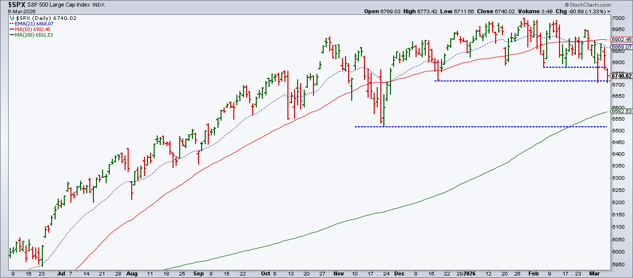
Let’s now take it one step further and analyze a daily chart of the S&P 500. In the chart below, you’ll notice the index below its February low, the first support level I was watching. It’s now attempting to hold on to the December 2025 low. It’s a little close for comfort, though. If it breaks below that level, the next support level is the November 2025 low.
Identifying support and resistance levels on a chart is another of John Murphy’s foundational principles. (To view a live chart, click the above chart.)
Many investors watch the 200-day Simple Moving Average (SMA). A decisive break below that line could signal a deeper structural shift, not just on the daily chart but on the weekly and even monthly charts as well.
Multi-time frame analysis and support and resistance levels are just the beginning. Drill down further, and you’ll find tools that help you measure retracements, indicators that help confirm trends, and identify turning points.
Instead of reacting emotionally to headlines, John’s methods help you approach the market with a calmer and clearer perspective.
One more thing …
If the recent stock market volatility has you wondering whether a pullback might be an opportunity to buy the dip, you may want to check out our upcoming webinar from OptionsPlay.
Pullback Playbook: How to Buy the Dip When Everyone Panics.
As you may have already heard, StockCharts' former Chief Technical Analyst, and a personal friend, passed away last month. It’s hard to put into words what John J. Murphy meant to me, to StockCharts, and to the entire technical analysis community.
John was one of the most influential ...
Rising oil prices are increasing investor fear. We're seeing a broad risk-off shift across institutional portfolios. Here's what you can expect, going forward. ...
Even as market breadth deteriorates and the S&P 500 slips below key support, strong setups still exist. Dave Keller, CMT, highlights Marathon Petroleum, Target, and Palantir — three charts showing breakouts, trend strength, and improving momentum into March. ...
Money has moved into agricultural commodities, which offer true diversification in a portfolio. Arthur Hills analyzes the chart of DBA and zeroes in in soybeans, wheat, and livestock. ...
Martin Pring analyzes the behavior of two inter-asset relationships, namely Stocks vs. Commodities and Stocks vs. Bonds. Read about his insights and know how to uncover the clues going forward. ...
As large-cap stocks dip to multi-month lows, some shifts are taking place that investors shouldn't ignore. Two indicators to watch are SPY distribution risk and the U.S. dollar's consolidation. Watch these charts closely. ...
As a StockCharts Member, you unlock all of our most powerful tools and features, including saved charts and settings, custom scans, technical alerts and much more. Discover all that StockCharts can do with our
free 1-month trial and start charting like a true market pro.