There was plenty to make investors uneasy this Friday the 13th. Recent economic data suggests inflation pressures remain, while the U.S. economy shows signs of slowing. Add in rising oil prices and ongoing geopolitical tensions and, understandably, the stock market ended the week on a cautious note.
Stocks, bonds, and precious metals all finished lower on Friday. The S&P 500 ($SPX), Nasdaq Composite ($COMPQ), and Dow Jones Industrial Average ($INDU) all closed near the low of the day. From a technical perspective, the S&P 500 is approaching its 200-day simple moving average (SMA), the Nasdaq is below it, and the Dow closed just a hair above it.
Market breadth has also softened. On the Market Summary page, the percentage of stocks trading above key moving averages has fallen below 50% across most indices. This means market participation has been narrowing.
There’s a similar shift in the Bullish Percent Index (BPI) for the major indexes. These readings have slipped below 50%, with the Dow Transports at around 30%. Just a month ago, transportation stocks were leading the market higher. Recently, though, supply chain challenges and rising costs have weighed on the group.
The market’s pullback so far has been relatively orderly. We haven’t seen widespread panic selling, but we haven’t seen dip buyers coming in either. This suggests investors are going into cash and waiting for clearer buy signals.
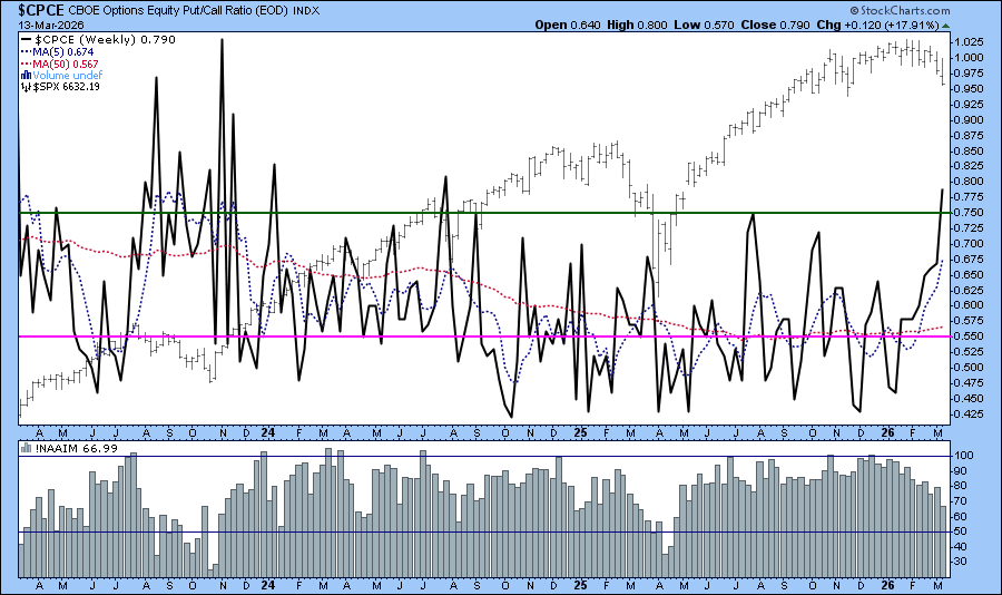
This is a good time to monitor sentiment indicators. The Cboe Volatility Index ($VIX) is trading between 20 and 30, which is elevated compared to calmer periods but not at the extreme levels we’ve seen during major market stress. Another sentiment indicator worth monitoring is the Cboe Options Equity Put/Call Ratio ($CPCE). The chart below shows the ratio is above 0.75 but is not yet at an extreme level. The last time the ratio went beyond 0.75 on the weekly chart was in late July/early August 2024. When both these indicators show extreme fear levels, they can often be contrarian signals.
The lower panel displays the National Association of Active Investment Managers (!NAAIM) Exposure Index. This shows that the professional investment managers have been reducing their exposure to U.S. equities.
💡
Click on above chart to see the live version.
Clearly, this isn’t the time to chase new long positions. Instead, it’s a good time to focus on risk management and preparation.
Take a few minutes to review the long-, intermediate-, and short-term charts of your positions. Where are they relative to key technical levels, such as moving averages or support zones? Are you comfortable with your position sizes? Would trimming or rebalancing positions help you feel more comfortable?
Want to explore how you can manage portfolio risk? One way is to adjust asset allocation based on market trends. When trends are weak, you can reduce your exposure. When trends start to strengthen, you can increase your exposure.
💡
If you’d like to learn how to approach this, take a look at our ChartSchool article, Trend Quantification and Asset Allocation. The Asset Allocation section explains how you can combine trend analysis with disciplined portfolio allocation to help manage risk.
Carve out some time this weekend to review your charts and outline a plan for the week ahead. Recent weekends have brought unexpected headlines, which can lead to a volatile start of the trading week. Being prepared makes you take action with a calmer mind rather than act emotionally.
Despite geopolitical tensions, the S&P 500 has held up well and is relatively close to its recent highs. When does the pullback turn into a long-term downtrend? Arthur Hill analyzes the market environment and highlights what investors should monitor. ...
Before the Iran conflict, the energy market had reached a point in the cycle where a major uptrend was overdue. Martin Pring does a deep dive into the technical backdrop of crude oil and shares his analysis. ...
Investors and traders should keep an eye on the trends developing in the tech stocks. NVIDIA's annual GTC AI conference could be the catalyst that moves the sector. ...
Though Technology has been among the weakest performers of late, recent action in XLK suggests that the sector has the potential to reclaim a leadership role. ...
As a StockCharts Member, you unlock all of our most powerful tools and features, including saved charts and settings, custom scans, technical alerts and much more. Discover all that StockCharts can do with our
free 1-month trial and start charting like a true market pro.
On our "Symbol Summary" page, you can read brief company descriptions to help you learn more about the stocks you're following. Look for the Profile section of the Symbol Summary.