Stocks sold off on Friday as Treasury yields climbed, oil prices moved higher, precious metals weakened, and the US dollar gained strength against major currencies. After what we saw earlier in the week, this was a sharp reversal. It almost felt like a delayed reaction to the inflation data we received a few days ago.
The spark was the global bond selloff. When bond prices fall, bond yields rise, which puts pressure on equities. AI-related stocks, which had rallied strongly, were hit especially hard as investors locked in profits.
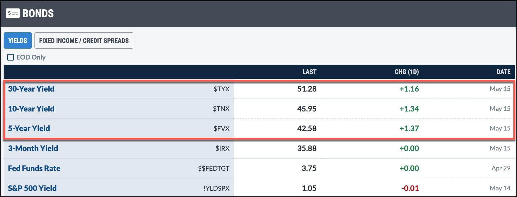
The Bonds panel in the Market Summary page shows where U.S. Treasury yields closed on Friday. These are some of the highest levels we’ve seen in the past year.
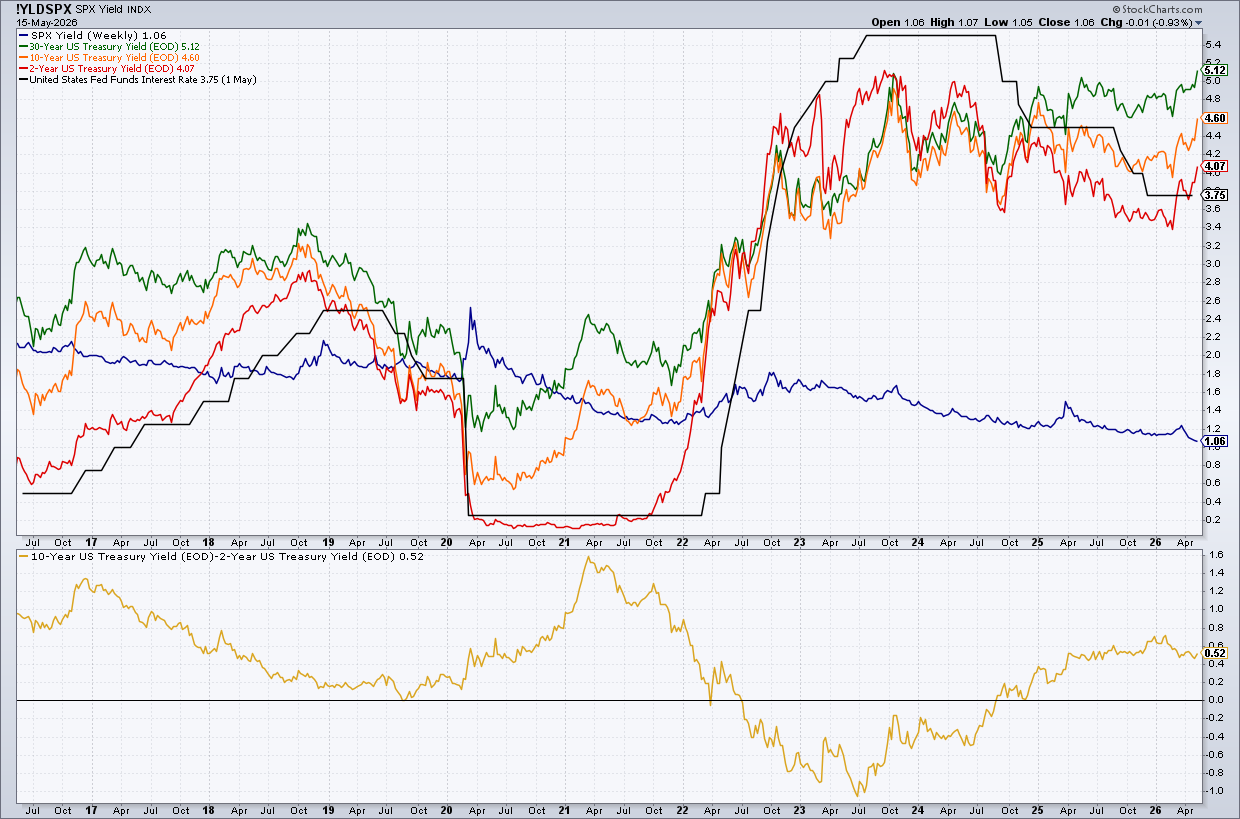
The Yield Comparison chart, one of the charts included in the Bonds ChartList in the Market Summary ChartPack, gives a broader view of where bond yields are trading relative to the Fed Funds rate.
Treasury yields are above the Fed Funds Interest Rate, so the market has likely priced in future interest rate hikes. It isn't exactly a security blanket for stock traders.
So, how much did Friday’s price action change the market structure? For the major indexes, not much. They’re still trading above their 21-day exponential moving average, an indication that the shorter-term uptrend is still in play. On the Market Summary page, when you sort the +/- SMA(200) column in the Equities panel from high to low, the Nasdaq 100 ($NDX) is on top, while Dow Utilities ($UTIL) is at the bottom.
The breadth data for the Nasdaq 100 leans slightly bullish. There are more new highs than new lows, more stocks trading above key moving averages, and the Bullish Percent Index (BPI) remains neutral.
As we head into the weekend, the S&P 500 ($SPX), Nasdaq Composite ($COMPQ), and Dow Industrials ($INDU) remain bullish. The big event to look forward to next week is NVIDIA earnings, which could bring another wave of optimism to AI-related stocks.
But the bigger question may be what happens to bond yields. Will they retreat, or will they keep rising? That could be the deciding factor. Keep a close eye on the charts in the Bonds panel, the overall market structure, and market breadth. Next week will be an interesting one.
And One More Thing …
Tom Bowley, Chief Market Strategist at Earnings Beats, is hosting a free training session on Saturday. He’ll walk you through his systematic framework for reading the broad market, identifying stocks with the strongest fundamentals and technicals, and recognizing when institutional money is aligned with your directional bias.
What: “5-Step Process to Trade with More Confidence”
Risk management should adapt to the chart’s trend phase. Dave Keller, CMT, compares Alphabet’s strong uptrend with Palantir’s sideways consolidation to explain how moving averages, support levels, and RSI can guide smarter stop loss and sell decisions. ...
Diversifying your portfolio is important and necessary. But it has to be done thoughtfully. Tom Bowley of EarningsBeats shows why it's important to regularly select leading stocks. ...
Despite the strong move in Technology and Communication Services, Energy and Utilities have the highest percentage of stocks in uptrends. Arthur Hill analyzes these two sectors and shows that their bullish breadth may lead them higher. ...
AI stocks are driving the stock market higher, but rising yields, food prices, and weak market breadth could signal trouble beneath the surface of this bull rally. ...
Retail stocks are underperforming the S&P 500. Will this change when major retailers start reporting earnings next week? These charts will paint the full picture. ...
Are you worried that the stock market rally is getting stretched? See how you can use RKLB puts and the OptionsPlay Strategy Center to identify defined-risk pullback setups. ...
With rising oil prices, a higher CPI is likely in the pipeline. If this is the case, how far can the CPI rise? Martin Pring studies the relationship between commodity prices and the CPI and discusses the likely outcome. ...
Healthcare stocks are showing signs of strength as earnings improve, Medicare Advantage updates lift sentiment, and GLP-1 developments fuel growth in key industry names. ...
As a StockCharts Member, you unlock all of our most powerful tools and features, including saved charts and settings, custom scans, technical alerts and much more. Discover all that StockCharts can do with our
free 1-month trial and start charting like a true market pro.
You can chart a ratio symbol to compare the performance of one symbol against any other by separating them with a colon. For example, create a chart of Apple's performance relative to the S&P 500, you can enter "AAPL:SPY" in the symbol entry box. The resulting chart will display the price history of Apple relative to the S&P 500.