The end of the week is the perfect time to step back, assess your portfolio holdings, and get a read on the overall stock market sentiment.
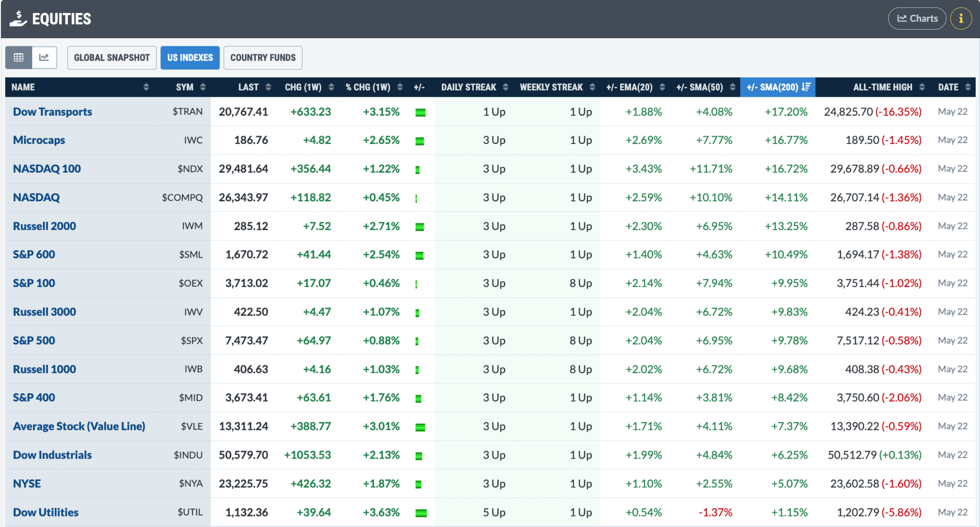
This week may have felt a bit uneventful. NVIDIA’s earnings failed to excite investors, consumer confidence came in weak, and there was still no peace deal between the U.S. and Iran. Yet the broader stock market indexes finished the week on solid footing, with the Dow Jones Industrial Average ($INDU) notching another record close.
Friday brought encouraging signs of broader participation. The S&P 500 Equal Weighted Index ($SPXEW) closed at a record high, while the S&P 600 Small-Cap Index ($SML) and S&P 400 Mid-Cap Index ($MID) posted three straight strong up days.
You can track all this in the Equities panel of the Market Summary page. In the Weekly Streak column, you’ll see that all the indexes had a healthy week, with some extending their winning streaks to eight straight weeks.
Scroll down to the Breadth panel and the picture improves. The percentage of stocks trading above key moving averages is trending higher, new highs are outpacing new lows, and advancing issues are outnumbering decliners.
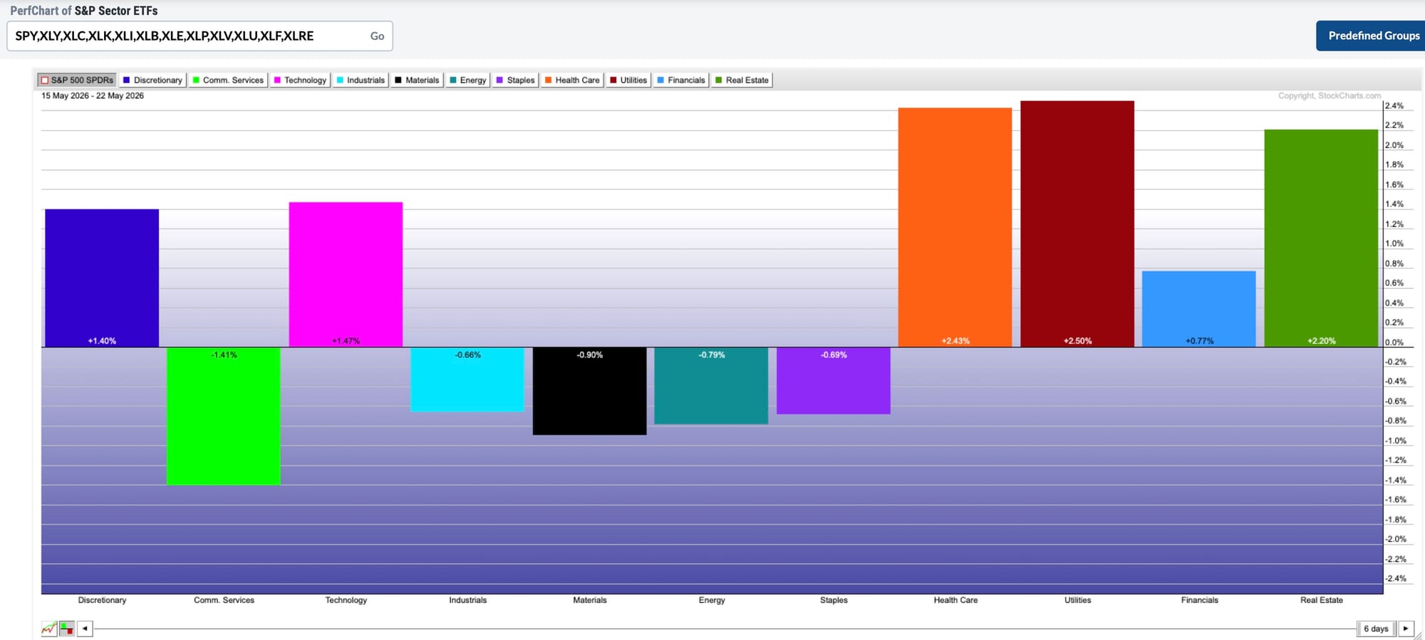
To dig a little deeper, select One Week from the Timeframe dropdown at the top of the page, then scroll down to the Sectors panel to review the weekly sector performance. Utilities rose to the top with a 2.50% gain, followed closely by Health Care, which gained 2.43%.
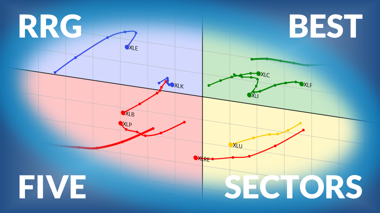
Are these gains sustainable? This is where Relative Rotation GraphsⓇ (RRG) can help. An RRG chart shows which sectors are leading, weakening, lagging, or improving.
Scroll down to the Sectors panel in the Market Summary page. Click the Chart icon. This displays thumbnail charts of each sector. Then click the Sectors RRG button that’s below the thumbnail charts. Look for the Utilities (XLU) and Health Care (XLV) and see where they sit on the RRG. You might be surprised by what you find.
RRG charts are one of the best ways to visualize sector rotation and relative strength. Julius de Kempenaer, the creator of RRG charts, publishes a weekly blog post focused on sector performance. Be sure to follow his work for expert insight into how the sector landscape is shifting.
The Market Summary page gives you everything you need for your end-of-week, or even end-of-day, review. Use it to see how the indexes closed (high or low of the day), which sectors led or lagged, whether market breadth is expanding or contracting, whether investor sentiment is bullish or bearish, and how different asset groups are moving relative to one another.
Once you make this part of your routine, you’ll begin to recognize patterns, trends, and sentiment shifts. This will better prepare you for the following week, or even the next trading day.
Add this to your calendar, too
Dave Keller is hosting a free live event that can help you become a more disciplined investor.
What: “The Art of the Exit: How Mindful Investors Use Stops”
When: Wednesday, May 27, 2026, at 1 PM ET.
You’ll learn how to set up an exit framework for all your positions so you don’t have to hesitate when it’s time to take action.
Breadth in the S&P 500 and SPY is bullish, which means bullish outcomes are more likely than bearish ones. Arthur Hill analyzes market breadth in SPY and RSP and shows that the overall tone is bullish. ...
Before We Dive In…
Whether you trade for the short-term or long-term, the first thing you probably do every morning is check the headlines: CNBC, Bloomberg, Fox Business, or whatever suits you. We all do this, because markets react to information. And we don't want to be caught ...
Learn how StockCharts and OptionsPlay help traders find risk-defined opportunities like LUNR as market breadth expands into small caps and industrials. ...
AI and quantum stocks rally as oil prices slide and IPO buzz builds. See what falling yields, semiconductor strength, and geopolitical headlines could mean for the market. ...
Martin Pring analyzes bond yields against CPI and international bond yields, and supports the thesis that a secular bull market is underway in U.S. Treasury yields. ...
As a StockCharts Member, you unlock all of our most powerful tools and features, including saved charts and settings, custom scans, technical alerts and much more. Discover all that StockCharts can do with our
free 1-month trial and start charting like a true market pro.
The "Rainbow" background shading option on the SCTR indicator in ACP adds a series of color bands to the indicator panel to help you better visualize the strength or weakness of a symbol's SCTR value as it changes over time.