When the stock market climbs as sharply as it has, a pullback is never out of the question. The difficult part is knowing when it will arrive.
After this week’s price action, the big question is if we’re starting to see the early signs of a narrative shift.
The market had a choppy week. On Tuesday, the S&P 500 ($SPX) closed at a record high, only to sell off on Wednesday. Thursday brought a strong close, giving investors reason to believe that the bullish sentiment was still alive. Then Friday came along and the tone changed again.
Something shifted. Maybe it was the strong jobs report, which reminded investors that a resilient labor market could raise the odds of a Fed interest rate hike by the end of this year. Treasury yields moved higher after the report was released, adding pressure to an overheated equity market.
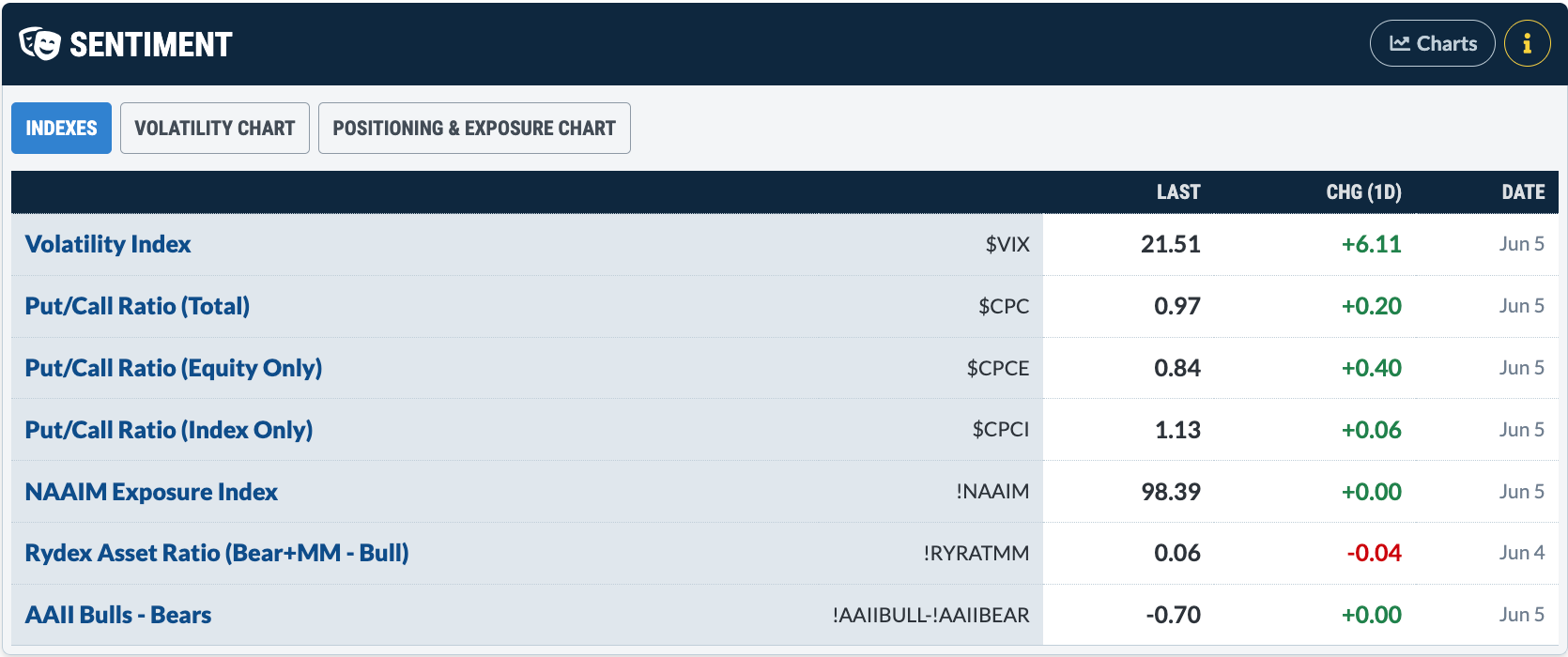
Let’s see what the sentiment indicators are suggesting. Hop over to the Market Summary page and scroll down to the Sentiment panel (see below).
The first thing that jumps out is the Cboe Volatility Index ($VIX), which rose over 39% to end the day at 21.51. It started to pull back a bit but then spiked into the close. The Cboe Options Equity Put/Call Ratio ($CPCE) rose over 90%. Overall, these aren’t exactly encouraging signs for the bulls.
The NAAIM Exposure Index and the AAII Bulls - AAII Bears aren’t showing a meaningful change in investor sentiment. If the selloff continues, though, these indicators could make noticeable changes.
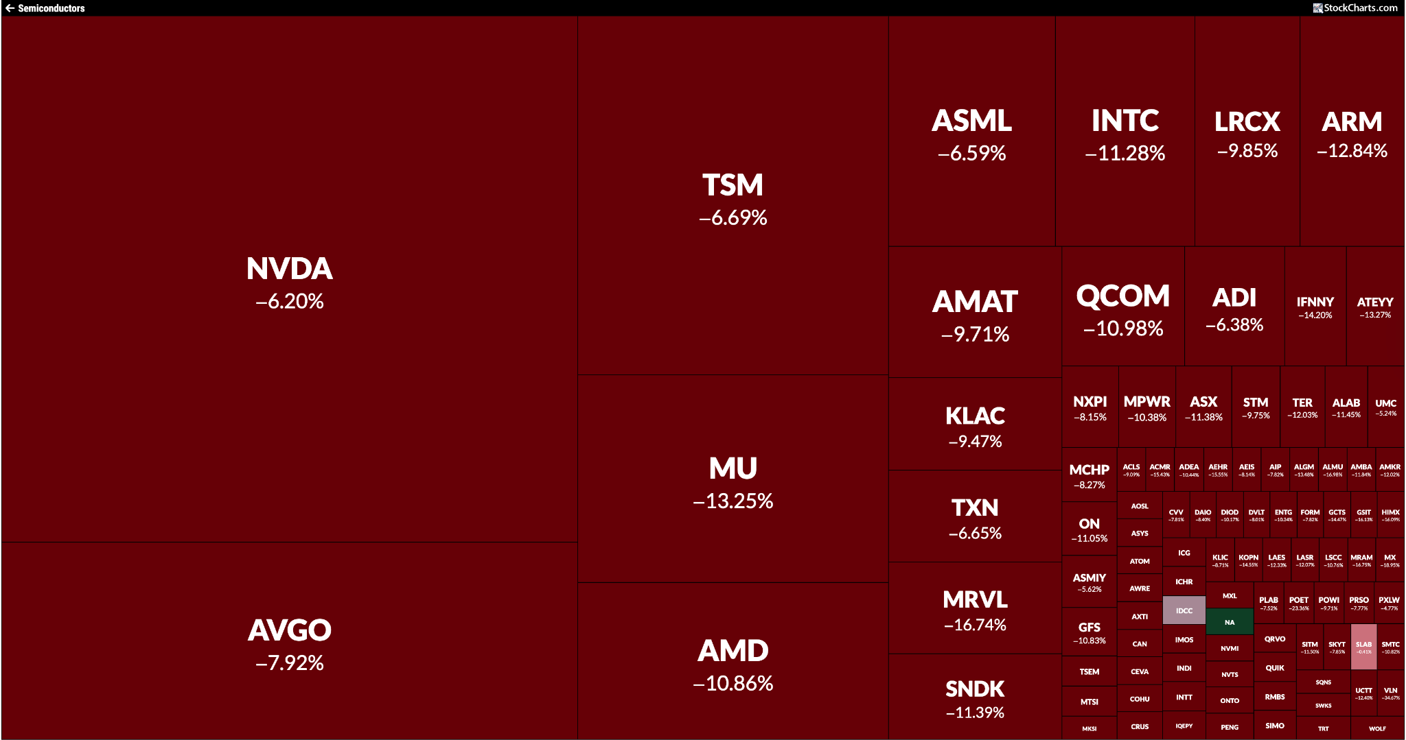
Another standout on the Market Summary page is the US Industries panel. Semiconductors, which have been leading the market higher, were hit hard on Friday. The SPDR S&P Semiconductor ETF (XSD) fell more than 11%. The MarketCarpet of the Semiconductors industry group tells you the story clearly. Look closely, and you’ll spot one tiny green square.
But the selling pressure wasn’t limited to equities. Bond prices, precious metals, and cryptocurrencies also came under pressure.
Next week, we have key economic reports, including the May CPI and PPI. If the numbers come in hot, investors could get more nervous. A strong labor market, combined with inflation, could further increase the odds of an interest rate hike this year, which would mean higher borrowing costs for businesses and consumers. Keep a close eye on those numbers on Wednesday and Thursday morning.
The biggest test, though, could be the SpaceX IPO, which is scheduled to start trading on Friday. Will investors embrace this hyped IPO, or will the excitement fade once the stock starts trading? Watch the action unfold using our intraday charts. There’s a lot going on next week!
Be Better Prepared
An overextended market is a tricky place to enter new positions. You don’t want to miss potential gains, but you also don’t want to be caught on the wrong side. Avoiding being in that kind of situation takes a mindset shift. It’s not easy, but Tony Zhang of OptionsPlay is hosting a live event designed to help you approach this kind of market with more clarity and confidence.
What: The Trading Strategy to Hit Options Home Runs
After a sharp June pullback, investors are reassessing the outlook for growth stocks. Dave Keller, CMT, outlines four possible paths for the Nasdaq 100 through late July, exploring how sector rotation, interest rates, and market leadership could shape the next move. ...
The Health Care sector is breaking above key resistance levels. Arthur Hill analyzes the chart of the sector ETF XLV and shows why there's potential for this sector to rise. ...
AI gains have influenced rallies in emerging market ETFs such as EEM and IEMG. Technical signals indicate that the upside in these ETFs may be ready for a pause. But this less volatile ETF could still have more upside. ...
Bruce explains the Wyckoffian notion of the Composite Operator, including what it is, how it is integral to the Wyckoffian trading philosophy, and how DLTR recently exemplified C.O. Accumulation in action. ...
Could Bitcoin provide a sign that the bear market is over? Martin takes a look at the $BTCUSD chart to examine what it means if Bitcoin breaks support -- and also what it means if it doesn't. ...
Before We Dive In…
Swing charting is one of the models featured in ChartSchool’s Trading Strategies & Models page. It’s a simple concept. But its simplicity is comparable to the bare foundations of an elaborate building. No matter how detailed and ornate a structure, if the foundation is ...
A second Hindenburg Omen confirmation has emerged as market breadth weakens beneath new highs in the S&P 500 and Nasdaq. Dave Keller, CMT, explains why the signal should be viewed as an early warning sign, not a prediction, and how investors can prepare for rising risk. ...
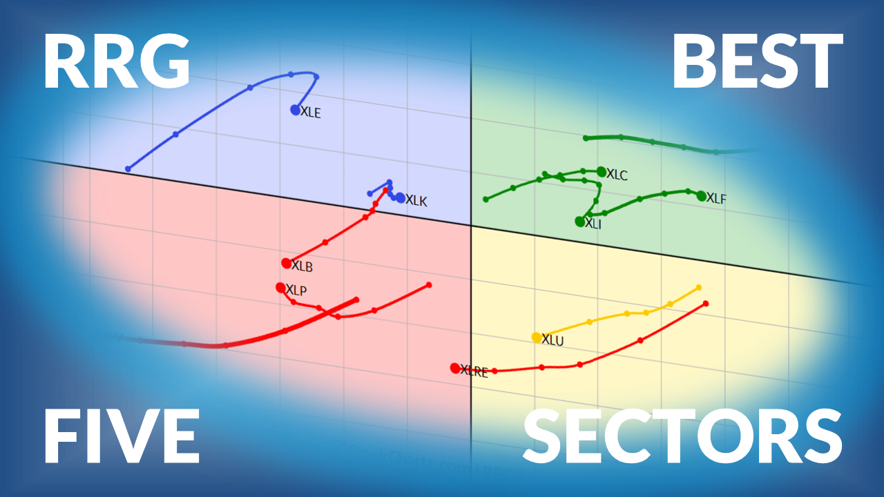
Julius presents his weekly update on US sector rotation, using Relative Rotation Graphs, with Technology now leading the rankings and real estate entering the top five. ...
As a StockCharts Member, you unlock all of our most powerful tools and features, including saved charts and settings, custom scans, technical alerts and much more. Discover all that StockCharts can do with our
free 1-month trial and start charting like a true market pro.
A ChartStyle is a chart template that can be combined with any ticker symbol to create a specially styled chart for that symbol. ChartStyles can be created for SharpCharts and also for ACP charts (our new interactive, full-screen Advanced Charting Platform).