A new Fed Chairman, a memorandum of understanding between the U.S. and Iran, and soaring semiconductors. For a short week, there was plenty to talk about.
In this update:
Semiconductors lead the market
New indicators and overlays
Upcoming virtual event
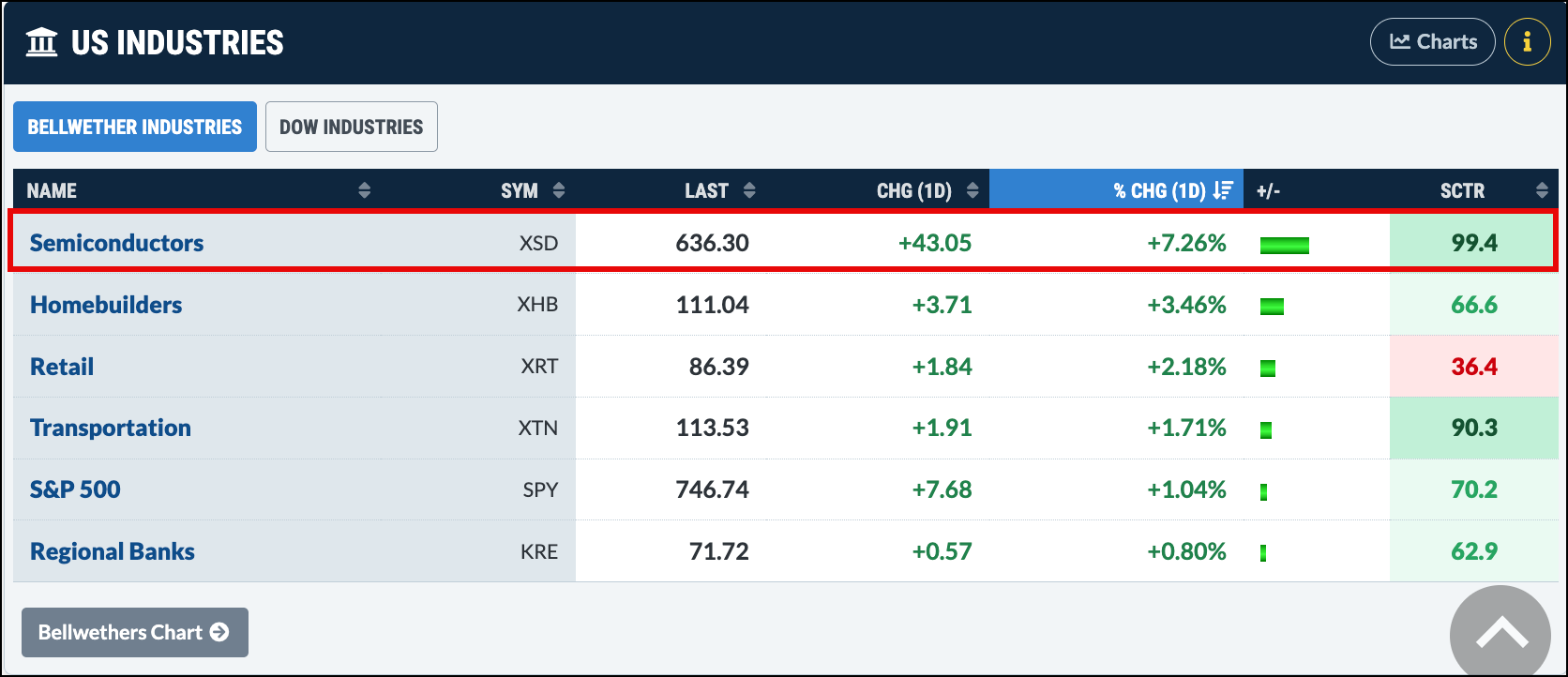
After such an eventful week, I was especially eager to visit the Market Summary page after Thursday’s close. One thing that jumped out was the strength in semiconductors. A +7.26% rise is hard to ignore!
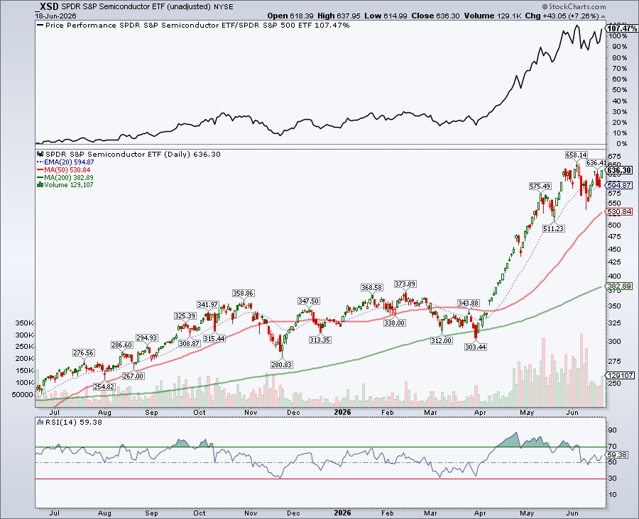
The chart of the SPDR S&P Semiconductor ETF (XSD) shows a clear uptrend, strong performance relative to the S&P 500 ETF (SPY), and a Relative Strength Index (RSI) sitting between neutral and overbought. This suggests that XSD may still have room to run.
After a few sleepy months, a new trend has awakened. XSD has been trending higher since April, and a further 2.11% gain would put the ETF at its 52-week high. It has also outperformed the S&P 500 by 133.80%. If momentum continues to build, this semiconductor rally could keep going and going.
Where did I get all this data from?
We’ve rolled out several new indicators and overlays in SharpCharts. OK, they’re not exactly “new.” They were already available in StockCharts ACP, but we’ve now brought them into SharpCharts so everyone can access them.
We’ll be talking more about these in the weeks to come. The Alligator, Distance to Highs, and Performance Spread are just three of the indicators you’ll now find in SharpCharts. There are plenty more to explore.
So the next time you pull up a chart, look through the Overlays and Indicators drop-down menus and try a few of them out. Some may become part of your regular process. At the very least, they may give you a fresh perspective.
So, in between the grilling, World Cup, U.S. Open, and Father’s Day festivities, maybe you can find a few minutes to explore these new tools.
And one more thing …
Dave Keller, CMT, will be hosting a webcast this week, where he’ll walk through his seven-point checklist for identifying a market peak.
What: The Market Top Checklist: 7 Red Flags of a Major Market Peak
During a business cycle, gold tends to lead copper, which leads crude oil. Martin Pring analyzes the intermarket relationships between the three and shows that crude oil prices are at a crucial level. ...
Will AI-related stocks keep climbing? Mary Ellen talks discusses why investors should focus on Treasury yields, AI spending trends, and earnings revisions. ...
Relative weakness in three Mag 7 stocks is hurting the strength of this group. Arthur Hill analyzes the performance of the Mag 7 stocks and one of the stocks in the group. ...
Before We Dive In…
You spot a clear market pattern. Maybe it’s a smooth upswing and pullback. Maybe it’s a symmetrical triangle, or a rectangle pattern. It’s ideal for a swing trade. You jump in. But once your position’s open, how far can it go? Where’ ...
With oil prices falling, are precious metals getting ready to rise? The charts of gold, silver, and gold miners indicate that it may be a while before the metals start shining again. ...
Market breadth often reveals what headline indexes miss. Dave Keller, CMT, explains the three breadth indicators at the core of his process - cumulative advance-decline lines, McClellan Oscillator, and percentage of stocks above key moving averages - and how they help confirm market trends. ...
As a StockCharts Member, you unlock all of our most powerful tools and features, including saved charts and settings, custom scans, technical alerts and much more. Discover all that StockCharts can do with our
free 1-month trial and start charting like a true market pro.
You can see recent IPOs that have been added to StockCharts and quickly chart each one from our Recent Data Adjustments page. Visit StockCharts.com/ipo to check it out.